
5 Ways of Effective Data Storytelling
Communicating with data is at times limited to just data visualization, meaning summarizing the data in aesthetic graphs, charts and dashboards. However, data storytelling goes beyond. Hard facts and logic is not enough to build a compelling reason. The narrative should also inspire emotions. A good story that is backed with data helps to remember the takeaway, persuades the audience more, because we tend to want to know where the story narrative would lead us to, thereby opening our minds a bit more to the messaging and consequently data storytelling invites more engagement.
Mathematician John Allen Paulos says, “In listening to stories we tend to suspend disbelief in order to be entertained, whereas in evaluating statistics we generally have an opposite inclination to suspend belief in order not to be beguiled.”
A forbes article states that Data storytelling is a structured approach for communicating data insights, and it involves a combination of three key elements: data, visuals, and narrative.
Data and Narrative
Data can be multiple types — comparative, in form of a time series or as plain standalone numbers, and hence the resulting narratives can be of the following types:
1.Factoid: when one data point is used because of it being an outlier or being the most common data point amidst the pool. It can be a simple descriptive statistic too, like a mean or a median. It gives the audience a starting point to think about our data.

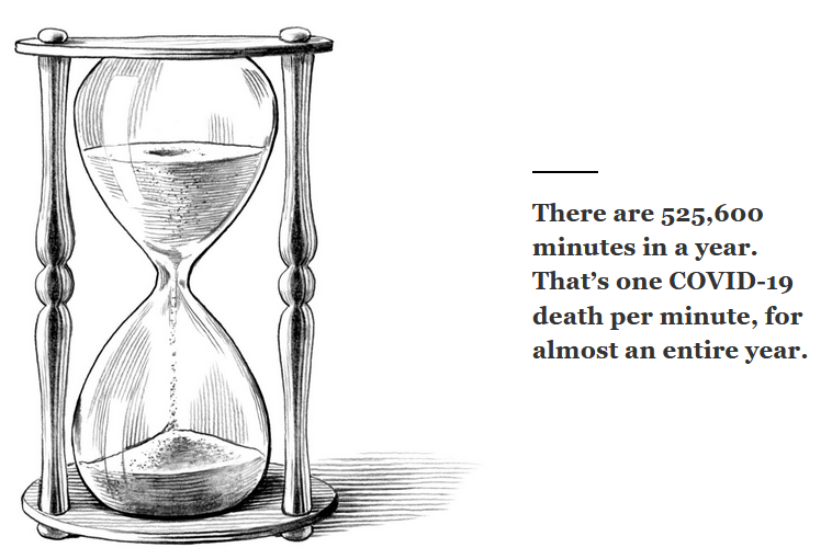
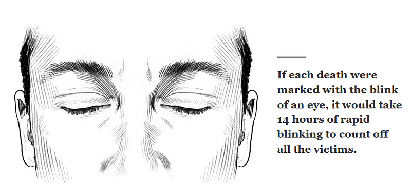
NatGeo used data storytelling to visualize COVID 19 deaths in US, some snippets:

2.Interaction: This one is about correlation. How different data points are related and what kind of patterns emerge with the combination of data? Bill and Melinda Gates Foundation’s Goalkeeper’s report 2019 demonstrates the layers inequality such as demographics, geography, socio economics, shocks and fragility and governance that impacts how severe the problem of inequality can be. The report considers the story of a girl born in Sahel, Africa for whom, the journey becomes harder and harder because of the layers of hurdles.
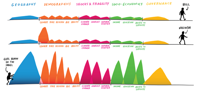
The report presents a macro view of Sahel as a region in Africa facing high child mortality rates. Within Sahel, the focus becomes on Chad, a country facing an even higher degree of of child mortality. Zooming in, there’s a drought prone region where conditions get worse due to climate change. Within this dry region, lives a marginalized community ethnic group whose girls are tapped by the social norms dictating her living.
So, while the layers of hurdles, viewed singly by itself would certainly make life hard but seen as a layer on top of each other, makes life ‘brutal’ for the young girl in Sahel. The report says:
“What is her life like? The data says she has probably been close to starving to death several times. The odds are that she never got the nutrients her body and brain needed to develop fully. It is likely that she can’t read or write, and that she will get pregnant well before she turns 20, although her body won’t be ready for the rigors of childbirth. And when the time comes, there is a good chance she will give birth alone.”
3.Comparison: How two data sets on common parameters, say of different things, geographies or phenomenon compare? This blog compares the data from Global Mobile consumer survey about Mobile phone behavior of citizens of Netherlands. The chord diagram presents a nice story —
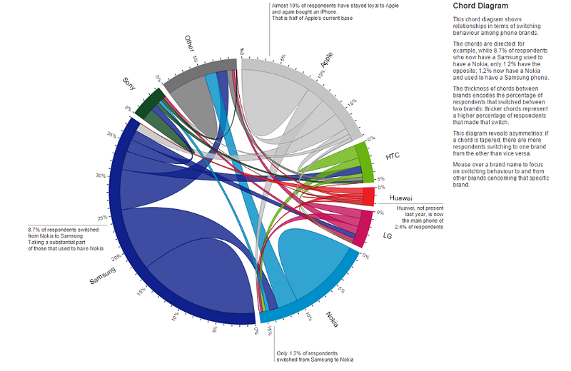
The mobile phone brands are differentiated by colours. The numbers in the outer ring show the market shares of each of the brand and the arcs represent the switching patterns between two given brands. Based on Michael Freeman’s structure for Storytelling, the author for the above chord diagram republished the same visualization here, albeit broken down in a framework as follows:
- Set the stage- Provide introduction and context
- Introduce your characters- Demonstrate the legend of all the encodings used of your variables
- Create tension- Present the data layer by layer, not all at once
- Provide resolution- Provide a conclusion or ending thoughts for the audience to think on
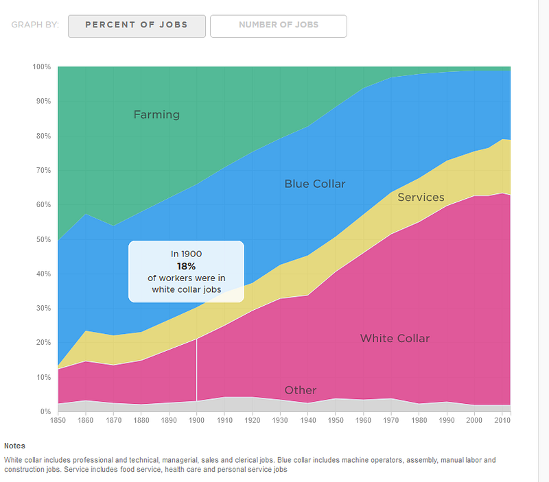
4.Change: How data evolves over time? This visualization shows how industrial revolution and technology, over the time has led to creating and destroying jobs and the pattern of change in jobs ranging from mining labour to accountants and factory workers, nurses to professors!
Some other stories-
5.Personal: This one relates to data as an experience. It consists of personal data — say of usage patterns of an app, history of viewed YouTube videos or even a country’s events over a span of time.
This company blog, ‘Dad Fishes for the Future’ talks about:
- The importance of oceans,
- The incomprehensible vastness of it and,
- how the oceans and its beaming life are changing
- How the company provides a sustainable solution
Another example is Oxfam’s year in review here.
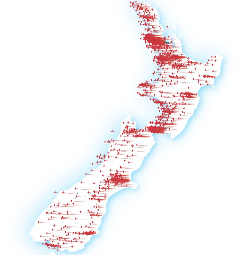
This blog presents an interactive picture of how in New Zealand, the political power shifted towards the left in the 2020 elections analyzing the voting patterns. Arrows on the map indicate the swing in each area — whether a region went further towards Labour compared to 2017, or further to National. The size represents the strength of the swing.
It’s nice when data can talk for itself :)