
Data Storytelling: 5 Simple Tips With Python Plotly to Spice Up Your Data
A rainbow of ways to tell great stories using Python Plotly

As a data science expert, I understand the power of a well-crafted narrative that makes data accessible, and interesting.
Python, with its Plotly library, is a great tool to visualize data sets in meaningful ways.
Here are 5 pro tips on how you can use the Python plotly library to spice up your data in relevant, meaningful, and visually appealing ways.
Accessing and Interpreting A Dataset
Description: Before jumping into data visualization, it’s important to understand the dataset you are working with.
Knowing the structure, content, and context of your data can significantly impact the story that you tell.
The dataset used in this guide is the “Electoral Democracy Index,” found HERE.
The fields in this dataset are:
- Country: The name of the country or region.
- Code: the ISO 3-letter country code
- Year: The year for which the data is recorded.
- Electoral Democracy Index: A numerical value representing the electoral democracy index for the entity in the given year. This index is likely a measure of the level of democratic practices in elections.
Accessing the Dataset: The Python code to access this dataset: you can use the following Python code:
import pandas as pd
# Path to the CSV file
file_path = 'path_to/electoral-democracy-index.csv'
# Load the dataset
data = pd.read_csv(file_path)
# Display the first few rows of the dataframe to understand its structure
print(data.head())
Code Description: This code snippet demonstrates how to load the Electoral Democracy Index dataset using pandas. The read_csv function is used to read the CSV file (make sure the path is correct for the location of your CSV file), and data.head() displays the first few rows of the data frame.
Now that we have some cool, relevant data to use, on to the tips!
1. Start with an Interesting Narrative
Every great data story begins with an interesting narrative. This narrative acts as the backbone of your data presentation, providing context and framing the data in a way that is relevant and insightful.
import pandas as pd
import plotly.express as px

data = pd.read_csv('electoral-democracy-index.csv')
latest_year_data = data[data['Year'] == max(data['Year'])]

fig = px.choropleth(latest_year_data, locations="Code",
                    color="Electoral democracy index",
                    hover_name="Entity",
                    color_continuous_scale=px.colors.sequential.Plasma)
fig.show()
Code Description: This code generates a choropleth map using the latest available data from the electoral democracy index dataset. It provides a visual representation of democracy levels across different countries, allowing for global analysis of democratic trends.
Data Visual:

For quantitative values that are represented by country, a choropleth map is a great way to provide an immediate global visual comparison tool.
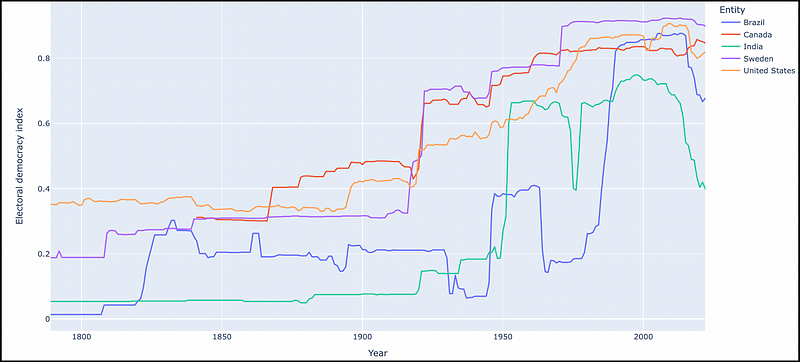
2. Highlight Key Insights
The core of data storytelling lies in highlighting the key points from your data.
From a quantitative view, it’s about guiding the audience’s attention to the most important numbers that you are trying to extract from your data.
Code:
countries_of_interest = ['United States', 'Canada', 'Sweden', 'India', 'Brazil']
filtered_data = data[data['Entity'].isin(countries_of_interest)]

fig = px.line(filtered_data, x='Year', y='Electoral democracy index', color='Entity')
fig.show()
Code Description: This line chart traces the democracy index over time for selected countries. It allows for an easy comparison of democratic trends, highlighting how different countries have evolved in terms of their democratic governance.
3. Use Interactive Elements
Interactive visualizations are the core of modern data storytelling. They engage the audience, allowing them to explore the data in a more hands-on manner.
Code:
top_10_2020 = data[data['Year'] == 2020].nlargest(10, 'Electoral democracy index')
fig = px.bar(top_10_2020, x='Entity', y='Electoral democracy index', color='Electoral democracy index')
fig.show()
Code Description: This interactive bar chart displays the top 10 countries in terms of the democracy index for the year 2020. It allows users to interact with the data, providing another perspective on leading countries in democratic governance.
Visual:
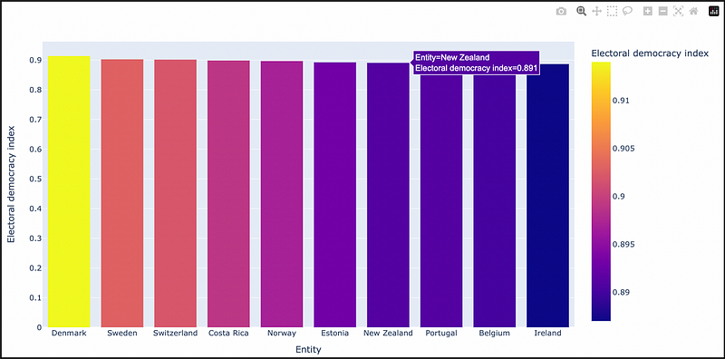
By hovering the mouse over each bar in the visualization, users can find more detailed information on each country that is displayed.
4. Utilize Dashboards for Complex Narratives
Integrating an interactive slider into a dashboard allows users to dynamically change the data being displayed.
This can be particularly useful for datasets that span over several years, as it lets users observe trends and changes over time.
Code:
import dash
from dash import html, dcc
from dash.dependencies import Input, Output
import plotly.express as px
import pandas as pd

# Load the dataset
data = pd.read_csv('electoral-democracy-index.csv')

# Filter out data before 1900 and create a 'Decade' column
data = data[data['Year'] >= 1900]
data['Decade'] = (data['Year'] // 10) * 10

# Initialize the Dash app
app = dash.Dash(__name__)

# Define the layout of the app
app.layout = html.Div([
    html.H1("Global Electoral Democracy Index by Decade"),
    dcc.Slider(
        id='decade-slider',
        min=data['Decade'].min(),
        max=data['Decade'].max(),
        value=data['Decade'].max(),
        marks={str(decade): str(decade) for decade in data['Decade'].unique()},
        step=None
    ),
    dcc.Graph(id='graph-with-slider')
])

# Define callback to update graph
@app.callback(
    Output('graph-with-slider', 'figure'),
    [Input('decade-slider', 'value')])
def update_figure(selected_decade):
    filtered_data = data[data.Decade == selected_decade]
    fig = px.choropleth(filtered_data, locations="Code",
                        color="Electoral democracy index",
                        hover_name="Entity",
                        color_continuous_scale=px.colors.sequential.Viridis)
    fig.update_layout(
        title=f'Electoral Democracy Index in the {selected_decade}s',
        geo=dict(showframe=False, showcoastlines=False, projection_type='equirectangular'),
        transition_duration=500
    )
    return fig

# Run the app
if __name__ == '__main__':
    app.run_server(debug=True)
Code Description: This Dash app features a slider and a choropleth map. The slider is set up to allow selection of a year (set up by decade for readability) from the dataset. When a user moves the slider, the map updates to display the democracy index data for the selected decade. This dynamic interaction is facilitated by a callback function in Dash, which listens to changes in the slider’s value and updates the figure accordingly.
Data Visual:
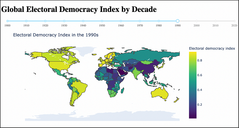
Plotly dashboards are an awesome way to allow user interactivity. With this example, users can click on the slider, by decade, to see the evolution (or devolution) of the electoral democracy index over time.
5. Share and Export Your Story
The final step in data storytelling is sharing your story. Plotly’s ability to export visualizations in various formats makes this step seamless.
Code:
fig.write_image("democracy_index.png")  # Save as image
fig.write_html("democracy_index.html")  # Save as interactive HTML
Code Description: This code demonstrates how to export your Plotly visualizations as both static images and interactive HTML files, facilitating easy sharing and dissemination of your data story.
In Summary…
Python Plotly is a terrific library for honing your craft in the art of data storytelling.
From cracking open the Electoral Democracy Index dataset to creating some relevant, and interesting, visualizations — we’ve seen first hand how Plotly provides detailed options and interactive capabilities for the modern data storyteller.
What’s next?
Well, this data is static in nature. How about real-time data feeds into our dashboards for live updates on global democracy indexes?
Or, using AI to predict future trends and showcasing them in our interactive maps and charts.
Lot’s of paths going forward from here. Personally, I am a big fan of the plotly dash library for interactive and multi-visual displays.
Pick the Plotly path that works for you.
Thanks for reading!
What is your experience using Python Plotly for data analysis and visualization?
I would love to hear/read your comments!
PlainEnglish.io 🚀
Thank you for being a part of the In Plain English community! Before you go:
- Be sure to clap and follow the writer️
- Learn how you can also write for In Plain English️
- Follow us: X | LinkedIn | YouTube | Discord | Newsletter
- Visit our other platforms: Stackademic | CoFeed | Venture