
Hands-on Tutorials
Data Densification in Tableau Desktop
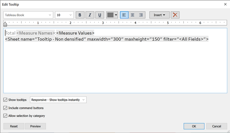
How to show detailed data in a Tooltip by Measures without an ETL
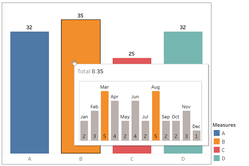
If you want to do the previous image can be challenging if you don't have a proper data model with a dimension that allows slices of data. I will explain a quick method to solve this problem without changing the original data.
The Data
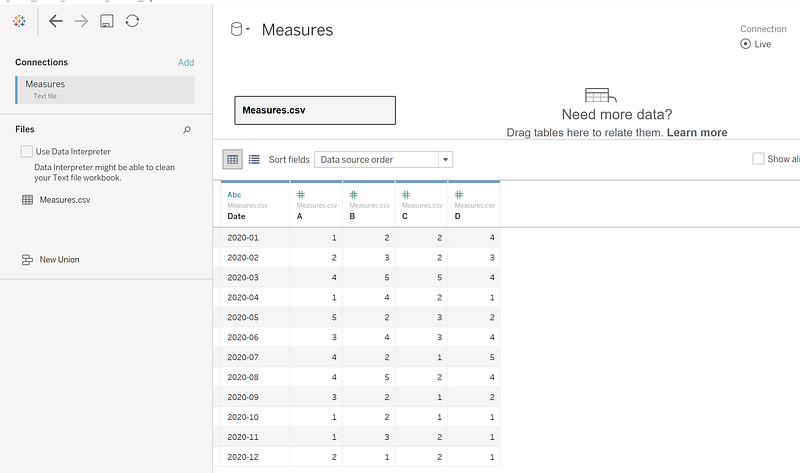
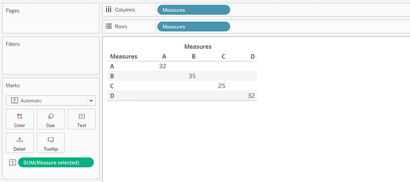
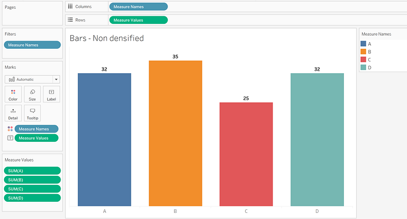
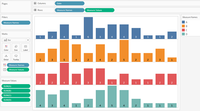
Many times we got trouble because our measures are coming as columns instead of rows, and we cannot find the values A, B, C, and D in one single column:
Suppose you have a small amount of data (a few million records or less). In that case, you can use the Data Densification method in Tableau Desktop to build the previous chart without modifying your Data Source.
If your data has a more significant volume, I recommend using a proper ETL or Data Flow Software like Tableau Prep Builder, Alteryx, Informatica, AWS Glue, etc. It also applies to SQL, Python Pandas, or Spark. And you can still use the Data Densification method there.
What is Densification?
Densification is the act of becoming or making denser.
What is Data context?
It means to produce more rows from your current data. In some cases, adding columns and doing feature engineering can also count as Data Densification, but I will focus only on rows to simplify.
To clarify, depending on your background, you can use different names to referees to rows, for example, records or observations, and to columns, in this context, features or measures.
Why do we need it?
As a general rule, to fill the gap with pre-calculated data to use it as a dimension, we can slice, for example, if you need to present LATAM and CAM as another bar in a list of countries, the missing days between dates to do a calculation.
How can I use it in Tableau Desktop to show more data in my Tooltip?
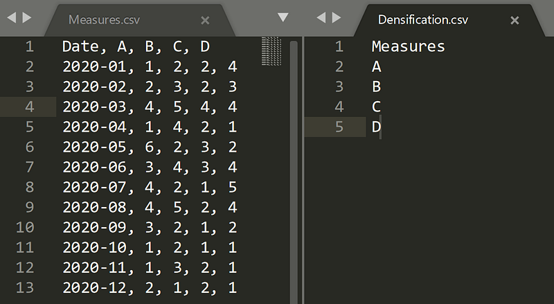
First, create a new file only with the list of measures or features.
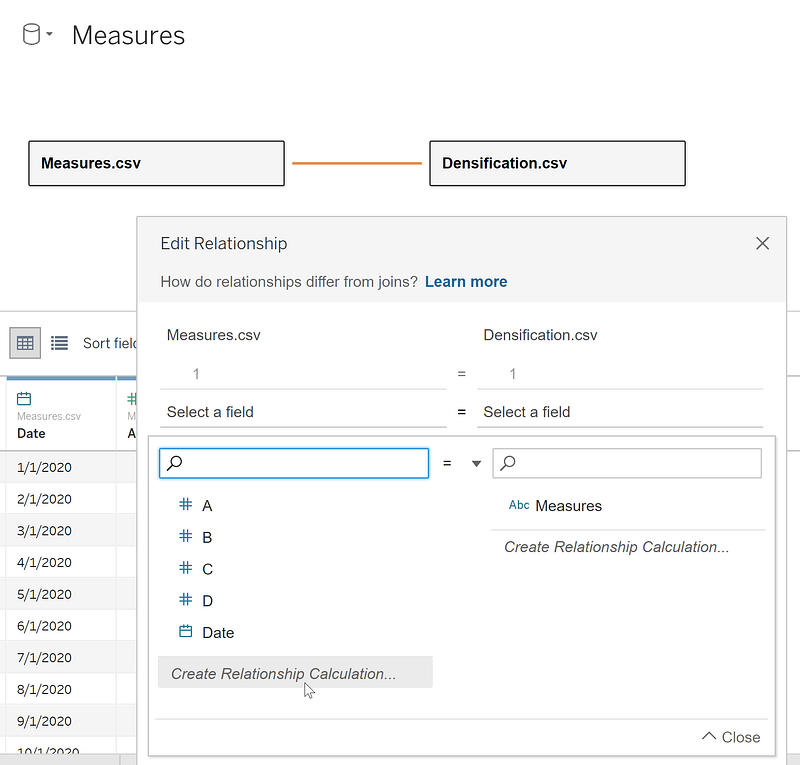
Second, create a relationship with the current data by dragging the file name into the canvas:
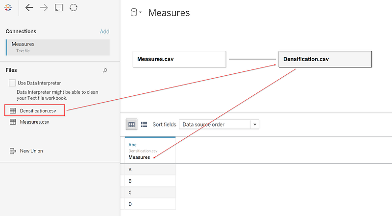
Modify the relation doing clicking over the orange line and creating Relationship Calculation with the number 1 on both sides. These will be used as a SQL Cross Join by Tableau when bringing the data.
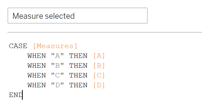
Create a new calculated field with the name Measure Selected as the following. Keep in mind that all the measures have to share the same Data Type and the same format.
CASE [Measures]
    WHEN "A" THEN [A]
    WHEN "B" THEN [B]
    WHEN "C" THEN [C]
    WHEN "D" THEN [D]
END
This calculated field is going to map the measures:
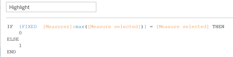
And create a new calculated field with the name Highlight as the following:
IF  {FIXED  [Measures]:max([Measure selected])} = [Measure selected] THEN
    0
ELSE
    1
END
I will highlight the bar's maximum values by dates in the Tooltip, comparing the full amount of a measure versus the current value.
You will then notice when you move the measures dimension, the new column from the densification.csv file produces dense data in each of the Measures Names.
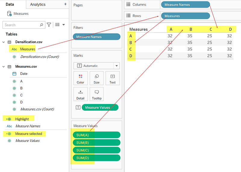
Using the Measure selected field, you will see only the relevant value by Measure dimension:
Because we are using relationships, you don’t need to worry about duplicate values when you group each of the measures separately. In older Tableau versions, you have to create an extra Set where choose one element of our measures list to filter the data.
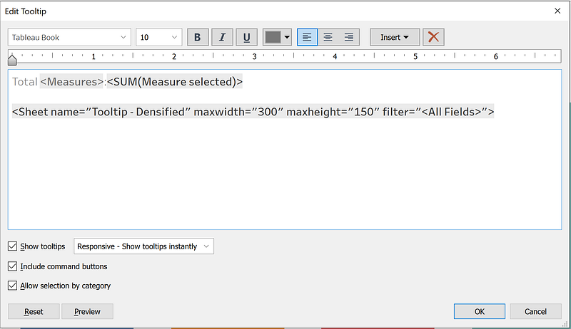
Now you can use it as a dimension to pass the value to the Tooltip sheet.
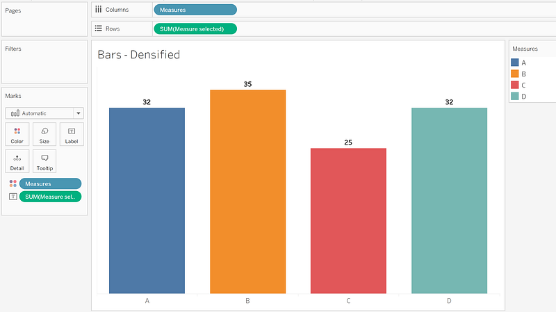
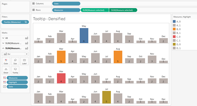
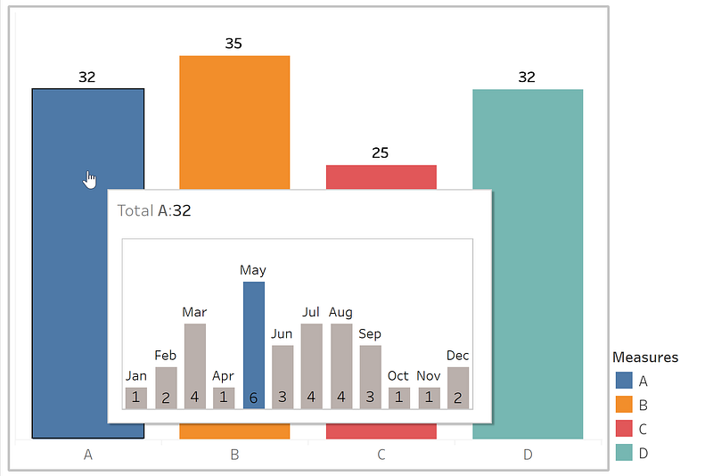
To produce the visualization that we were looking for:
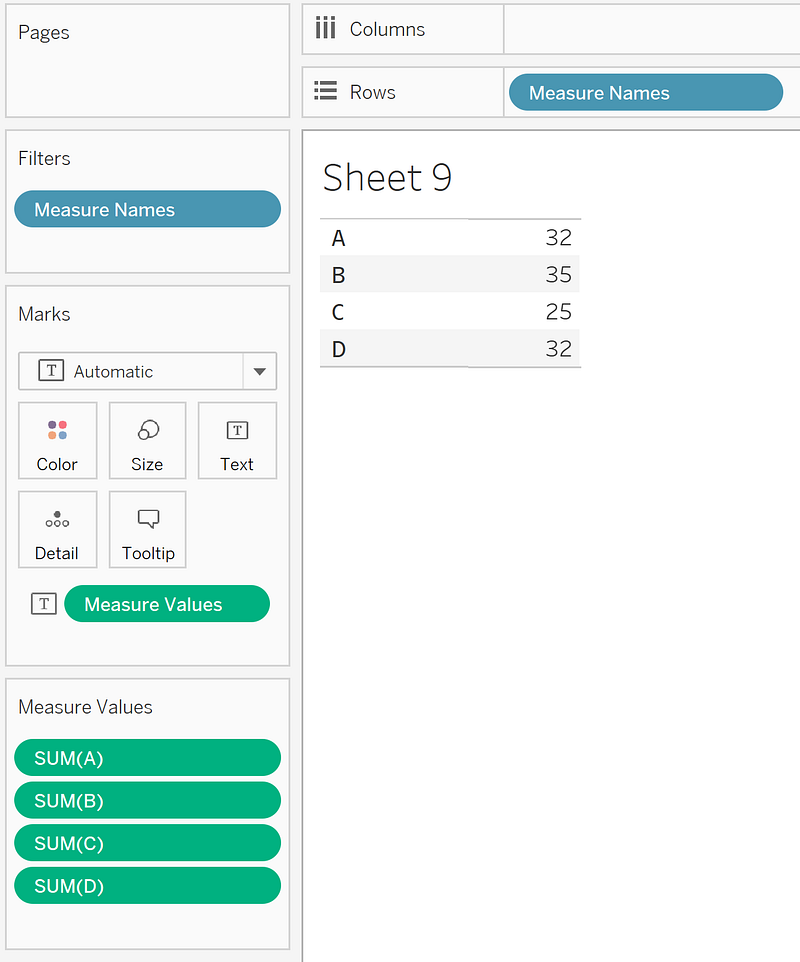
But why doesn't work with Measure Names?
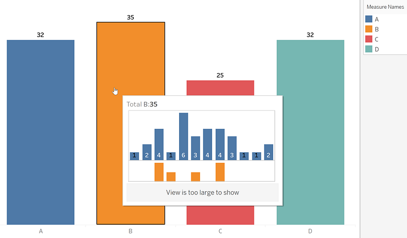
The main reason is that Measure Names is a calculated field that creates a discrete list of all the measures but doesn’t exist in the dataset and, because of that, cannot be passed as a value to the sheet referred by the Tooltip at least until the version of Tableau Desktop 2020.3.1
Conclusions
We learned about Data Densification and how to use it in Tableau Desktop to filter values through the Tooltip when your model doesn't have a dimension representing each of the measures' names.
Also, we saw that independent of how advanced is Software that you are using, the expertise or domain that you have, you always will find a limitation, and to solve it, you need to think out of the box and be creative.
Thanks
To finish, I want to thank Daniel Dorronsorro for asking me about it. And Rosario Gauna, who push me to continue writing about these topics.