
Dashboards in Python: 3 Advanced Examples for Dash Beginners and Everyone Else

A Second Look at Dash
I am diggin’ Dash so far, and I think Plotly offers a lot of customization when creating visualizations. Using them to power dashboards is simple if you’re familiar with a little Python. If you’re new to Dash, or have played around with a few concepts and want to see examples of advanced techniques, this article will help you bridge the gap! If you’re brand new to Dash and want to learn some basics while building something cool, check out my Intro to Dash article:
Improving the Dashboard
In the example covered in my Intro article, I explain how to create an interactive dashboard app that uses multiple tabs. Expanding on that example, I will show how to add the following to the dashboard:
Dynamic Droplist filters A Heatmap Navigation Bar
The complete code is available at the end of the article!
App File Structure
I structured the files in a way that make it easy to add additional tabs and functionality without bloating a single file or impacting the layout of the other tabs. Notice the new files I will be adding to the structure:
tab3.py navbar.py

Dash Refresher
Dash is a framework for Python written on top of Flask, Plotly.js, and React.js, and it abstracts away the complexities of each of those technologies into easy to apply components. Dash apps are composed of Layouts and Callbacks:
Layout
The layout is made up of a tree of components that describe what the application looks like and how users experience the content.
Callbacks
Callbacks make the Dash apps interactive. Callbacks are Python functions that are automatically called whenever an input property changes. It is possible to chain callbacks, making one change trigger multiple updates throughout the app.
Naming Convention
When assigning an ID to a component, I find it helps to have a naming convention. I always use lowercase and separate words using a dash. For example, ‘this-is-an-example’.
On to the fun stuff…
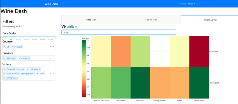
Creating Dynamic Droplist Filters
The Province and Variety multi-select droplists are dynamically populated! Province is populated based on the selected Countries. Variety is populated based on the selected Province.

Add Code to the Side Panel
The code for the droplists need to be added to the sidepanel.py file. Use the Dash Core Component dcc.Dropdown.
Add the Country droplist:
,html.Div([html.P()
     ,html.H5('Country')
     , dcc.Dropdown(id = 'country-drop'
                        ,options=[
                             {'label': i, 'value': i} for i in df.country.unique()],
                        value=['US'],
                        multi=True
                    )])
I use html.P() to prevent the droplist from overlapping with the price slider. I set the default value to US. Setting the multi property to True will allow the user to select more than one value at a time.
Add the Province and Variety Droplists:
,html.Div([html.P()
    ,html.H5('Province')
    , dcc.Dropdown(id = 'province-drop',
                    value=[],
                    multi=True
)]),html.Div([html.P()
,html.H5('Variety')
, dcc.Dropdown(id = 'variety-drop',
value=[],
multi=True
)])Notice no options were included in the code. That is because they will be dynamically generated using callbacks!
Create the Callbacks
After adding the code to the side panel file, create the callbacks. The callbacks can be added to the index to keep the sidepanel.py file clean. The callback takes in a value, and uses it to filter the wine dataframe.
Create Province Droplist Callback
@app.callback(Output('province-drop', 'options'),
[Input('country-drop', 'value')])
def set_province_options(country):

    if len(country)> 0:
        countries = country
        return [{'label': i, 'value': i} for i in sorted(set(df['province'].loc[df['country'].isin(countries)]))]

    else:
        countries = []
        return [{'label': i, 'value': i} for i in sorted(set(df['province'].loc[df['country'].isin(countries)]))]
Notice, the output is the options for the component with the ID province-drop. The value being passed in to the callback is provided by the country-drop component.
Create Variety Droplist Callback
@app.callback(Output('variety-drop', 'options'),
[Input('province-drop', 'value')])
def set_variety_options(province):

    if len(province)> 0:
        provinces = province
        return [{'label': i, 'value': i} for i in sorted(set(df['variety'].loc[df['province'].isin(provinces)]))]

    else:
        provinces = []
        return [{'label': i, 'value': i} for i in sorted(set(df['variety'].loc[df['province'].isin(provinces)]))]
Notice the two callbacks are nearly identical! Copy and Paste, then simply update the variables to the correct values.
Add the Heatmap
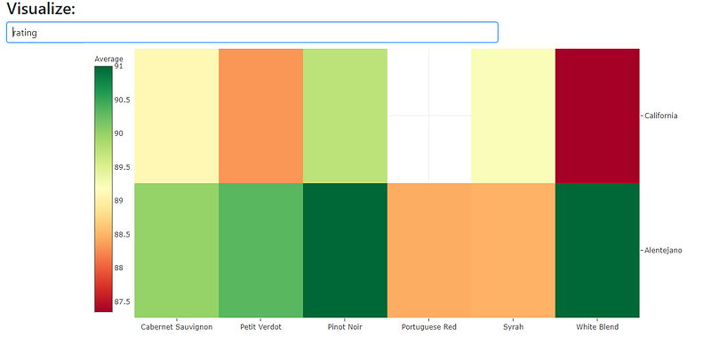
Heatmaps are a popular way to visualize data because they transform individual data values into colors within a matrix, using a warm-to-cold color spectrum. You get an X, Y, and Z dimension.
Notice the droplist under “Visualize:” At a glance, the heatmap shows the average rating or price by wine variety and province.
Create the Heatmap Layout
The tab3.py file stores the layout code for the heatmap. Start with the Visualize droplist code by using the Dash Core Component dcc.Dropdown.
html.Div([dcc.Dropdown(id="selected-feature", options=[{"label": i, "value": i} for i in ['price','rating']],
                       value='price'
                , style={"display": "block", "width": "80%"})
                ])
Next, use the Dash Core Component dcc.Graph to load the heatmap. I give the component an ID of ru-my-heatmap.
, html.Div([dcc.Graph(id="ru-my-heatmap"
, style={"margin-right": "auto"
, "margin-left": "auto"
, "width": "80%"
, "height":"700px"})
])
Finally, put it all together by wrapping the two components in an html.Div.
df = transforms.dflayout = html.Div([
html.Div([html.H3("Visualize:")], style={'textAlign': "Left"})
, html.Div([dcc.Dropdown(id="selected-feature", options=[{"label": i, "value": i} for i in ['price','rating']],
value='price'
, style={"display": "block", "width": "80%"})
])
, html.Div([dcc.Graph(id="ru-my-heatmap"
, style={"margin-right": "auto"
, "margin-left": "auto"
, "width": "80%"
, "height":"700px"})]
)])By now, the syntax is hopefully starting to look familiar!
Notice in the layout, I include the Dropdown component and let the user select between price and rating. The callback will use that as a value to determine which feature is visualized.
Notice the Graph component only contains the component ID and style. The figure’s data and layout will be constructed dynamically in the callback.
Create the Callback
The callback outputs the figure for the Graph component. Define the function that contains the filter logic and the trace to produce the heatmap. It will return the data and the layout of the graph.
def update_figure(country, province, feature, variety):return {"data": [trace]
,"layout": {
"xaxis": {"automargin": False}
,"yaxis": {"automargin": True, 'side': "right"}
,"margin": {"t": 10, "l": 30, "r": 100, "b":230}
}}I am passing four inputs from the callback into the function:
Country Province Variety Selected Feature (price or rating)
@app.callback(
Output("ru-my-heatmap", "figure"),
[Input("country-drop", "value")
, Input("province-drop", "value")
, Input("selected-feature", "value")
, Input("variety-drop", 'value')
])Next, define the filter logic. Since the heatmap has a Z dimension, I use Panda’s group by functionality to group the data and calculate the mean for each variety.
dff = transforms.df
dff = dff.groupby(['country','province','variety']).mean().reset_index()
dff = dff.loc[dff['country'].isin(country)]if province is None:
province = []
if variety is None:
variety = []
if len(country) > 0 and len(province) > 0 and len(variety) > 0:
dff = dff.loc[dff['country'].isin(country) & dff['province'].isin(province) & dff['variety'].isin(variety)]
elif len(country) > 0 and len(province) > 0 and len(variety) == 0:
dff = dff.loc[dff['country'].isin(country) & dff['province'].isin(province)]
elif len(country) > 0 and len(province)== 0 and len(variety) > 0:
dff = dff.loc[dff['country'].isin(country) & dff['variety'].isin(variety)]
elif len(country) > 0 and len(province)== 0 and len(variety) == 0:
dff = dff.loc[dff['country'].isin(country)]
else:
dffThe Complete Callback
This is the complete callback for the heatmap:
@app.callback(
Output("ru-my-heatmap", "figure"),
[Input("country-drop", "value")
, Input("province-drop", "value")
, Input("selected-feature", "value")
, Input("variety-drop", 'value')
])
def update_figure(country, province, feature, variety):
dff = transforms.df
dff = dff.groupby(['country','province','variety']).mean().reset_index()
dff = dff.loc[dff['country'].isin(country)]if province is None:
province = []
if variety is None:
variety = []
if len(country) > 0 and len(province) > 0 and len(variety) > 0:
dff = dff.loc[dff['country'].isin(country) & dff['province'].isin(province) & dff['variety'].isin(variety)]
elif len(country) > 0 and len(province) > 0 and len(variety) == 0:
dff = dff.loc[dff['country'].isin(country) & dff['province'].isin(province)]
elif len(country) > 0 and len(province)== 0 and len(variety) > 0:
dff = dff.loc[dff['country'].isin(country) & dff['variety'].isin(variety)]
elif len(country) > 0 and len(province)== 0 and len(variety) == 0:
dff = dff.loc[dff['country'].isin(country)]
else:
dfftrace = go.Heatmap(z= dff[feature]
, x=dff['variety']
, y=dff['province']
, hoverongaps = True
, colorscale='rdylgn', colorbar={"title": "Average", 'x':-.09}, showscale=True)
return {"data": [trace]
            ,"layout": {
                 "xaxis": {"automargin": False}
                 ,"yaxis": {"automargin": True, 'side': "right"}
                 ,"margin": {"t": 10, "l": 30, "r": 100, "b":230}
}}Notice after the dataframe is filtered by the IF/Else logic, the graph’s trace is constructed. The function returns the data and the layout for the heatmap’s figure.
Adding a Navigation Bar
A navigation bar makes it easy for users to access additional pages in the app. Using the Dash Bootstrap Component library, it is easy to create a responsive navigation header.

This example uses NavbarSimple. The NavbarSimple component is simpler but less flexible than the Navbar component. Navbar allows for more customization, but requires more boilerplate code.
Create navbar.py File
To get the navbar code to play nicely with the sidepanel layout, wrap it in a function.
import dash_bootstrap_components as dbcdef Navbar():
navbar = dbc.NavbarSimple(
children=[
dbc.NavItem(dbc.NavLink("Home", href="/index")),
dbc.DropdownMenu(
children=[
dbc.DropdownMenuItem("Page 2", href="#"),
dbc.DropdownMenuItem("Page 3", href="#"),
],
nav=True,
in_navbar=True,
label="More",
),
],
brand="Wine Dash",
color="primary",
dark=True,
)
return navbarNotice the value for brand is what displays in the nav bar when the dashboard loads. Adding additional pages to the navbar is easy. Simply add dbc.DropdownMenuItem components to the children list inside the dbc.DropdownMenu
Putting it all Together
The index.py file needs to be updated with the code that will call the navbar and the heatmap tab. I have included the layout and the callback in the code below.
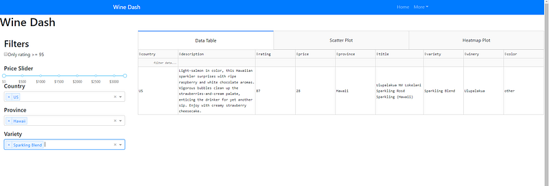
In addition to adding the new components to the dashboard, I updated the callback for the dataTable in tab1.py so it responds to the new dynamic droplist filters.
Update the index.py file
from app import app
from tabs import sidepanel, tab1, tab2, tab3, navbar
from database import transformsapp.layout = html.Div([navbar.Navbar()
, sidepanel.layout
])@app.callback(Output('tabs-content', 'children'),
[Input('tabs', 'value')])
def render_content(tab):
if tab == 'tab-1':
return tab1.layout
elif tab == 'tab-2':
return tab2.layout
elif tab == 'tab-3':
return tab3.layoutNotice tab3 and navbar are imported from tabs. Notice navbar.Navbar() was added to the app.layout call. Notice the render_content function has been updated to output tab3.layout.
The Complete Code
All of the new filtering is included in the index.py code below.
Coming Next
In my next Dash tutorial, I’ll add multiple pages that can be selected in the navbar as an example of URL routing. I’ll also introduce the Dash core component Store.
App.py
Since I am adding callbacks to elements that don’t exist in the app.layout as they are spread throughout files, I set suppress_callback_exceptions = True
import dash
import dash_bootstrap_components as dbc
app = dash.Dash(__name__, external_stylesheets = [dbc.themes.BOOTSTRAP])server = app.serverapp.config.suppress_callback_exceptions = TrueIndex.py
This code has been updated to include the new filters in the sidepanel. This is the file that will be run in the console. The app.layout returns sidepanel.layout. It also contains majority of the callbacks used in the app. The functionality for the sidepanel is written into the callbacks.
import dash
import plotly
import dash_core_components as dcc
import dash_html_components as html
import dash_table
from dash.dependencies import Input, Output
import dash_bootstrap_components as dbcimport sqlite3
import pandas as pdfrom app import app
from tabs import sidepanel, tab1, tab2, tab3, navbar
from database import transformsapp.layout = html.Div([navbar.Navbar()
, sidepanel.layout
])@app.callback(Output('tabs-content', 'children'),
[Input('tabs', 'value')])
def render_content(tab):
if tab == 'tab-1':
return tab1.layout
elif tab == 'tab-2':
return tab2.layout
elif tab == 'tab-3':
return tab3.layoutoperators = [['ge ', '>='],
['le ', '<='],
['lt ', '<'],
['gt ', '>'],
['ne ', '!='],
['eq ', '='],
['contains '],
['datestartswith ']]def split_filter_part(filter_part):
for operator_type in operators:
for operator in operator_type:
if operator in filter_part:
name_part, value_part = filter_part.split(operator, 1)
name = name_part[name_part.find('{') + 1: name_part.rfind('}')]value_part = value_part.strip()
v0 = value_part[0]
if (v0 == value_part[-1] and v0 in ("'", '"', '`')):
value = value_part[1: -1].replace('\\' + v0, v0)
else:
try:
value = float(value_part)
except ValueError:
value = value_part# word operators need spaces after them in the filter string,
# but we don't want these later
return name, operator_type[0].strip(), valuereturn [None] * 3@app.callback(
Output('table-sorting-filtering', 'data')
, [Input('table-sorting-filtering', "page_current")
, Input('table-sorting-filtering', "page_size")
, Input('table-sorting-filtering', 'sort_by')
, Input('table-sorting-filtering', 'filter_query')
, Input('rating-95', 'value')
, Input('price-slider', 'value')
, Input('country-drop', 'value')
, Input('province-drop', 'value')
, Input('variety-drop', 'value')
])
def update_table(page_current, page_size, sort_by, filter, ratingcheck, prices, country, province, variety):
filtering_expressions = filter.split(' && ')
dff = transforms.dflow = prices[0]
high = prices[1]dff = dff.loc[(dff['price'] >= low) & (dff['price'] <= high)]if province is None:
province = []
if variety is None:
variety = []
if len(country) > 0 and len(province) > 0 and len(variety) > 0:
dff = dff.loc[dff['country'].isin(country) & dff['province'].isin(province) & dff['variety'].isin(variety)]
elif len(country) > 0 and len(province) > 0 and len(variety) == 0:
dff = dff.loc[dff['country'].isin(country) & dff['province'].isin(province)]
elif len(country) > 0 and len(province)== 0 and len(variety) > 0:
dff = dff.loc[dff['country'].isin(country) & dff['variety'].isin(variety)]
elif len(country) > 0 and len(province)== 0 and len(variety) == 0:
dff = dff.loc[dff['country'].isin(country)]
else:
dffif ratingcheck == ['Y']:
dff = dff.loc[dff['rating'] >= 95]
else:
dfffor filter_part in filtering_expressions:
col_name, operator, filter_value = split_filter_part(filter_part)if operator in ('eq', 'ne', 'lt', 'le', 'gt', 'ge'):
# these operators match pandas series operator method names
dff = dff.loc[getattr(dff[col_name], operator)(filter_value)]
elif operator == 'contains':
dff = dff.loc[dff[col_name].str.contains(filter_value)]
elif operator == 'datestartswith':
# this is a simplification of the front-end filtering logic,
# only works with complete fields in standard format
dff = dff.loc[dff[col_name].str.startswith(filter_value)]if len(sort_by):
dff = dff.sort_values(
[col['column_id'] for col in sort_by],
ascending=[
col['direction'] == 'asc'
for col in sort_by
],
inplace=False
)page = page_current
size = page_size
return dff.iloc[page * size: (page + 1) * size].to_dict('records')if __name__ == '__main__':
app.run_server(debug = True)DataBase > transforms.py
The transforms file contains any transformations the data needs to go through before being called into the app.
import dash
import dash_bootstrap_components as dbc
import pandas as pd
import sqlite3
from dash.dependencies import Input, Outputconn = sqlite3.connect(r"C:\Users\MTGro\Desktop\coding\wineApp\db\wine_data.sqlite")
c = conn.cursor()df = pd.read_sql("select * from wine_data", conn)df = df[['country', 'description', 'rating', 'price', 'province', 'title','variety','winery','color','varietyID']]Tabs > navbar.py
Using Bootstrap Dash components, I implement a simple navbar and wrap it in a function so it plays nicely with the sidepanel.
import dash_bootstrap_components as dbcdef Navbar():
navbar = dbc.NavbarSimple(
children=[
dbc.NavItem(dbc.NavLink("Home", href="/index")),
dbc.DropdownMenu(
children=[
dbc.DropdownMenuItem("Page 2", href="#"),
dbc.DropdownMenuItem("Page 3", href="#"),
],
nav=True,
in_navbar=True,
label="More",
),
],
brand="Wine Dash",
color="primary",
dark=True,
)
return navbarTabs > sidepanel.py
This is where the power of Bootstrap CSS comes in. The layout grid makes it easy to control the look of the layout. There are three main layout components in dash-bootstrap-components: Container, Row, and Col.
import dash
import plotly
import dash_core_components as dcc
import dash_html_components as html
import dash_bootstrap_components as dbc
import dash_table
import pandas
from dash.dependencies import Input, Outputfrom app import appfrom tabs import tab1, tab2
from database import transformsdf = transforms.df
min_p=df.price.min()
max_p=df.price.max()layout = html.Div([
html.H1('Wine Dash')
,dbc.Row([dbc.Col(
html.Div([
html.H2('Filters')
, dcc.Checklist(id='rating-95'
, options = [
{'label':'Only rating >= 95 ', 'value':'Y'}
])
,html.Div([html.P()
,html.H5('Price Slider')
,dcc.RangeSlider(id='price-slider'
,min = min_p
,max= max_p
, marks = {0: '$0',
500: '$500',
1000: '$1000',
1500: '$1500',
2000: '$2000',
2500: '$2500',
3000: '$3000',
}
, value = [0,3300]
)
])
,html.Div([html.P()
,html.H5('Country')
, dcc.Dropdown(id = 'country-drop'
,options=[
{'label': i, 'value': i} for i in df.country.unique()
],
value=['US'],
multi=True
)
]),html.Div([html.P()
,html.H5('Province')
, dcc.Dropdown(id = 'province-drop',
value=[],
multi=True
)]),html.Div([html.P()
,html.H5('Variety')
, dcc.Dropdown(id = 'variety-drop',
value=[],
multi=True
)])], style={'marginBottom': 50, 'marginTop': 25, 'marginLeft':15, 'marginRight':15}
)#end div
, width=3) # End col,dbc.Col(html.Div([
dcc.Tabs(id="tabs", value='tab-1', children=[
dcc.Tab(label='Data Table', value='tab-1'),
dcc.Tab(label='Scatter Plot', value='tab-2'),
dcc.Tab(label='Heatmap Plot', value='tab-3'),
])
, html.Div(id='tabs-content')
]), width=9)
]) #end row
])#end div@app.callback(Output('province-drop', 'options'),
[Input('country-drop', 'value')])
def set_province_options(country):
if len(country)> 0:
countries = country
return [{'label': i, 'value': i} for i in sorted(set(df['province'].loc[df['country'].isin(countries)]))]
else:
countries = []
return [{'label': i, 'value': i} for i in sorted(set(df['province'].loc[df['country'].isin(countries)]))]@app.callback(Output('variety-drop', 'options'),
[Input('province-drop', 'value')])
def set_variety_options(province):# if province is None:
# provinces = []
if len(province)> 0:
provinces = province
return [{'label': i, 'value': i} for i in sorted(set(df['variety'].loc[df['province'].isin(provinces)]))]
else:
provinces = []
return [{'label': i, 'value': i} for i in sorted(set(df['variety'].loc[df['province'].isin(provinces)]))]Tabs > Tab1.py
This is the DataTable from the example at the beginning of the article. The callbacks are in the index. The callbacks include functionality for filtering using the sidepanel components.
import dash
import plotly
import dash_core_components as dcc
import dash_html_components as html
import dash_bootstrap_components as dbc
import dash_table
import pandas as pd
from dash.dependencies import Input, Outputfrom app import app
from database import transformsdf = transforms.dfPAGE_SIZE = 50layout =html.Div(dash_table.DataTable(
id='table-sorting-filtering',
columns=[
{'name': i, 'id': i, 'deletable': True} for i in df[['country','description','rating','price','province','title','variety','winery','color']]
],
style_table={'height':'750px'
,'overflowX': 'scroll'},style_data_conditional=[
{
'if': {'row_index': 'odd'},
'backgroundColor': 'rgb(248, 248, 248)'
}
],
style_cell={
'height': '90',
# all three widths are needed
'minWidth': '140px', 'width': '140px', 'maxWidth': '140px', 'textAlign': 'left'
,'whiteSpace': 'normal'
}
,style_cell_conditional=[
{'if': {'column_id': 'description'},
'width': '48%'},
{'if': {'column_id': 'title'},
'width': '18%'},
]
, page_current= 0,
page_size= PAGE_SIZE,
page_action='custom',filter_action='custom',
filter_query='',sort_action='custom',
sort_mode='multi',
sort_by=[]
)
)Tabs > Tab2.py
Instead of using the Dash Core component Graph, I am using Plotly’s Scattergl to get better performance visualizing the dataset. ScatterGL can use GPU instead of CPU, so it tends to provide better performance on large datasets.
import dash
import dash_core_components as dcc
import dash_html_components as html
import dash_bootstrap_components as dbc
import pandas as pd
import plotly.graph_objs as go
from dash.dependencies import Input, Output
import dash_table
from app import app
from database import transformsdf = transforms.dflayout = html.Div(
id='table-paging-with-graph-container',
className="five columns"
)@app.callback(Output('table-paging-with-graph-container', "children"),
[Input('rating-95', 'value')
, Input('price-slider', 'value')
])def update_graph(ratingcheck, prices):
dff = dflow = prices[0]
high = prices[1]dff = dff.loc[(dff['price'] >= low) & (dff['price'] <= high)]
if ratingcheck == ['Y']:
dff = dff.loc[dff['rating'] >= 95]
else:
dfftrace1 = go.Scattergl(x = dff['rating']
, y = dff['price']
, mode='markers'
, opacity=0.7
, marker={
'size': 8
, 'line': {'width': 0.5, 'color': 'white'}
}
, name='Price v Rating'
)
return html.Div([
dcc.Graph(
id='rating-price'
, figure={
'data': [trace1],
'layout': dict(
xaxis={'type': 'log', 'title': 'Rating'},
yaxis={'title': 'Price'},
margin={'l': 40, 'b': 40, 't': 10, 'r': 10},
legend={'x': 0, 'y': 1},
hovermode='closest'
)
}
)
])Tabs > tab3.py
Tab 3 contains the heatmap layout and the callback. Remember, the dataframe is transformed using groupby, so the mean value can be used as the Z value.
import dash_core_components as dcc
import dash_html_components as html
from dash.dependencies import Input, Output
import plotly.graph_objs as go
import pandas as pdfrom app import app
from database import transformsdf = transforms.dflayout = html.Div([
html.Div([html.H3("Visualize:")], style={'textAlign': "Left"})
, html.Div([dcc.Dropdown(id="selected-feature", options=[{"label": i, "value": i} for i in ['price','rating']],
value='price'
, style={"display": "block", "width": "80%"})
])
, html.Div([dcc.Graph(id="ru-my-heatmap"
, style={"margin-right": "auto", "margin-left": "auto", "width": "80%", "height":"700px"})]
)])
@app.callback(
    Output("ru-my-heatmap", "figure"),
      [Input("country-drop", "value")
    , Input("province-drop", "value")
    , Input("selected-feature", "value")
    , Input("variety-drop", 'value')
])
def update_figure(country, province, feature, variety):
dff = transforms.df
    dff = dff.groupby(['country','province','variety']).mean().reset_index()
    dff = dff.loc[dff['country'].isin(country)]
if province is None:
province = []
if variety is None:
variety = []
if len(country) > 0 and len(province) > 0 and len(variety) > 0:
dff = dff.loc[dff['country'].isin(country) & dff['province'].isin(province) & dff['variety'].isin(variety)]
elif len(country) > 0 and len(province) > 0 and len(variety) == 0:
dff = dff.loc[dff['country'].isin(country) & dff['province'].isin(province)]
elif len(country) > 0 and len(province)== 0 and len(variety) > 0:
dff = dff.loc[dff['country'].isin(country) & dff['variety'].isin(variety)]
elif len(country) > 0 and len(province)== 0 and len(variety) == 0:
dff = dff.loc[dff['country'].isin(country)]
else:
dfftrace = go.Heatmap(z= dff[feature]
, x=dff['variety']
, y=dff['province']
, hoverongaps = True
, colorscale='rdylgn', colorbar={"title": "Average", 'x':-.09}, showscale=True)
return {"data": [trace]
,"layout": {
"xaxis": {"automargin": False}
,"yaxis": {"automargin": True, 'side': "right"}
,"margin": {"t": 10, "l": 30, "r": 100, "b":230}
}}Find it on github here:
Thank You!
- If you enjoyed this, follow me on Medium for more
- Get FULL ACCESS and help support my content by subscribing
- Let’s connect on LinkedIn
- Analyze Data using Python? Check out my website


