
Dashboard using Streamlit with data from SQL database
An interactive dashboard from customer and sales data

Introduction
Streamlit is one of the most recent python libraries for powerful dashboard creation and an open source framework for machine learning and data science teams. It can produce industry standard and visually attractive dashboards with very simple coding. I have created a sales dashboard with interactive visuals and data from a SQL database using streamlit. In this article, I will walk through the dashboard creation by fetching the data using SQL.
Connect to database
A SQL database having customer and sales data named ‘sqlda’ is used for the demonstration in this article. It is a postgres database. Sqlalchemy is used for creating a connection and fetch the tables.
Regular SQL queries are called from python interface to get the data. First of all we need to know all the tables names in that database.

Seems like there are several tables but we are interested only in customer and sales data. The following two tables were called to get the data using regular SQL query.
The interface of the dashboard can be sliced into the number of columns we want. For example, let’s say we want the top row split into two columns. The left column will show the dashboard’s title and the right one will display the current date and time.
Dashboard configuration
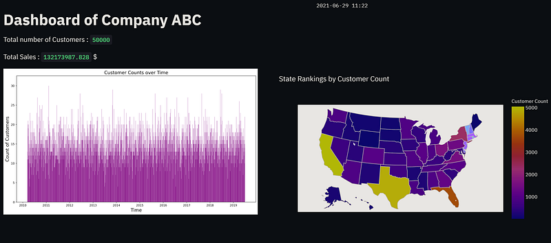
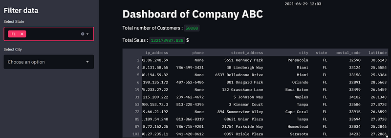
We can also display the total customer number as well as sales in two streamlit placeholders. The sidebars can be implemented to filter out data.
Plots like bar plot, pie chart and other necessary time series plots are defined for custom plotting.
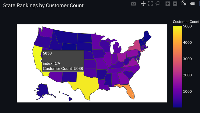
In order to map an interactive plot, I have used plotly express. When the user hovers the cursor over the plot, it can display the related data. For the purpose of demonstration, I have used US states map and then associate the states data with the map using cloropleth map which is composed of colored polygons.
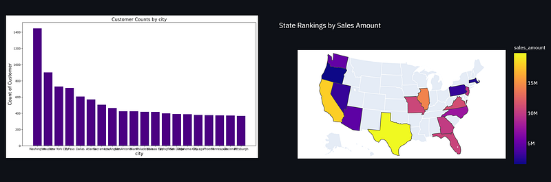
We then add more rows to the dashboard to display more data in visual form. One thing can be noted that we can perform SQL queries inside this interface of python. I have performed inner join of two SQL tables and extracted that data to plot.
Final Dashboard
The whole code block is saved with .py extension. In anaconda promt, the default directory is changed to the folder of the .py file and the following command is executed where Streamlit-01.py is the file name.
streamlit run Streamlit-01.py
It will provide the host address where the app is running. The following dashboard is created when the host address is reached.
The map is generated by plotly express and when the cursor is on any state, it shows the data associated with it.
The remaining of the dashboard is shown here.

The sidebars can be used to filter out data. When selected, the related data is shown in the dashboard.
Conclusion
In this article, I have demonstrated the creation of an interactive dashboard using streamlit. The data is fetched from SQL database and SQL queries were performed to obtain the data of interest. Plotly express is a great way to have the data visualized on the fly. The combination of streamlit with sql and plotly express can really enhance the robustness of a dashboard.


