
How to Use Sankey Chart to report business earnings via Python Plotly? Part 1
Sankey diagrams are a type of flow diagram in which the width of the arrows is proportional to the flow rate of the depicted extensive property. It is very useful to track the money flow direction for companies’ earnings and understand the where the revenues go.

In this series of article, we will discuss how to use Sankey Chart to report earning flow from static & manual data, dynamic &live data, to getting revenue segments, etc.
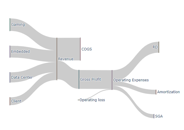
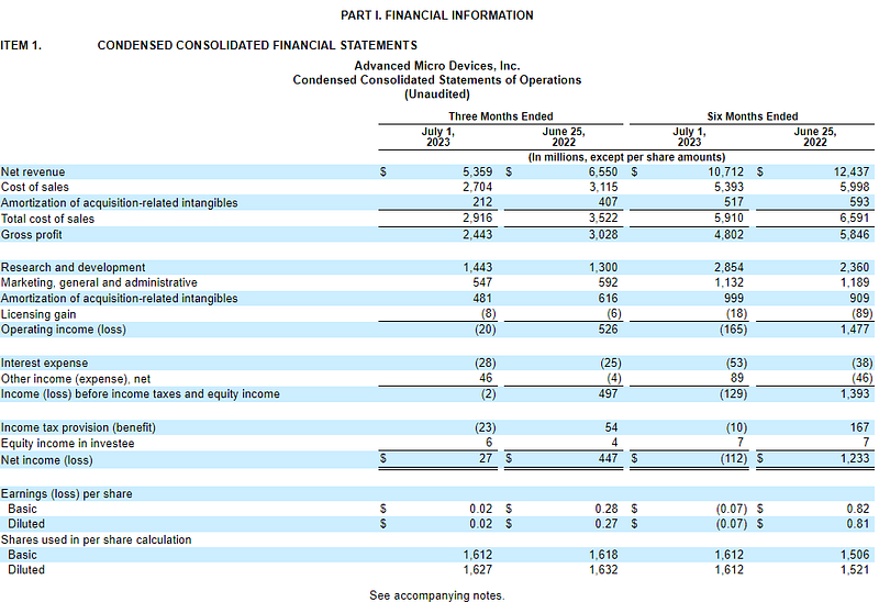
Let’s take AMD’s FY23 Q2 income statement as a demo. The final Sanky Chart will look like this.
First, we need to take a look at its earning to grab some numbers. You can go to Yahoo Finance or AMD’s official website to get the associate income numbers.
Steps of Sankey Chart
Step 0: Install and import plotly
!pip install plotly
import plotly.graph_objects as go
Step 1: Create Labels and values from Income Statements. The order of these labels matters in the next step so I mark the serial numbers for them.
# data
label = ["Data Center", "Client", "Gaming", "Embedded", "Total_Revenue" , "COGS" , "Gross Profit" ,  "Operating loss",  "Operating Expenses" , "RD" , "Amortization",  "SGA" ]
value = [1.3, 1.0, 1.6, 1.5, 2.92, 2.44, 2.44, 0.02, 1.44, 0.48, 0.55]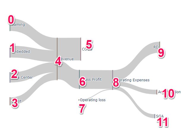
**Step 2**: This one is crucial part to determine the flow and direction.
- Source: This is to define where each arch (line or link) source from. For example, the first arch flows from the first (0) element “Gaming or 0” and the last three arches flow from the ninth (8) element “Operating expenses or 8”, etc.
- Target: This is to define where each arch (line or link) flows to. For example, the first arch’s destination is fifth (4) element “Revenue or 4” and the last three arches flow into RD (9), Amortization (10) and SGA(11)
source = [0, 1, 2, 3, 4, 4, 6, 7, 8, 8, 8]
target = [4, 4, 4, 4, 5, 6, 8, 8, 9, 10, 11]
Step 3: Construct and plot the chart.
link = dict(source = source, target = target, value = value)
node = dict(label = label, pad=50, thickness=1)
data = go.Sankey(link = link, node=node)

# plot
fig = go.Figure(data)
fig.show()
We will discuss more on how to report these components dynamically and source the data from the live source instead of using static numbers.
Enjoy it! If you want to support Informula, you can buy us a coffee here :)
Thank you and more to come :)


