
Customizing Leanback for Android TV
Putting round pegs in square holes
The leanback library provides a templated UI so developers can focus on the important parts of their app.
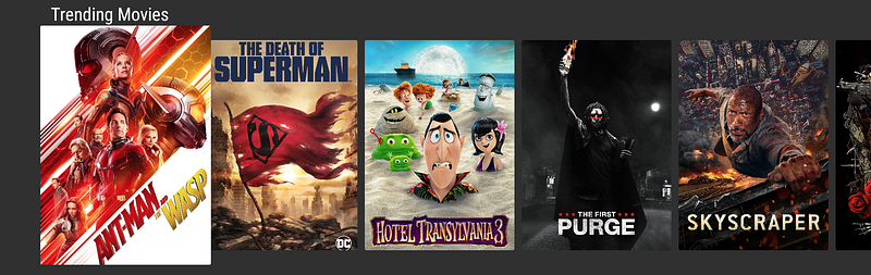
When using leanback, content is shown in rows. Leanback supplies a rectangular card view, ImageCardView, to easily display content. The card size scales when selected and has shadows to accent the content. This is great for content such as movie posters and album art.
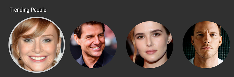
Sometimes it is a better design to show content in other ways than a rectangle. For example, when displaying the cast of a movie, it is better to use a circular avatar design (round peg, get it?). This is a pretty common design for displaying avatars.
In this article we are going to dive into how to customize a card view to be a circle instead of the default square and configure the drop shadows and dimming effects.
Creating a Circular Image
There are many ways to apply circular bounds to an image. If you use Glide, this is as simple as calling circleCropTransform().
val requestOptions = RequestOptions
.circleCropTransform()Glide.with(context)
.load(personImage)
.apply(requestOptions)
.into(vh.personImageView)Depending on the library, your mileage may vary.
Disabling Selected Shadow
Even though the image is circular, leanback adds drop shadows which do not match the circular image. We need to customize leanback to disable the drop shadows.
ListRowPresenter adds a shadow around each card when selected. It also controls the style of the row and the interactions between cards in a row.
You can disable shadows by setting the shadowEnabled flag to false. This tells leanback not to add a shadow around the selected card.
val customListRowPresenter = object : ListRowPresenter().apply {
    shadowEnabled = false
}
The picture below shows the selected card with its shadow:
The shadow disappears when you set the value of `shadowEnabled` false:
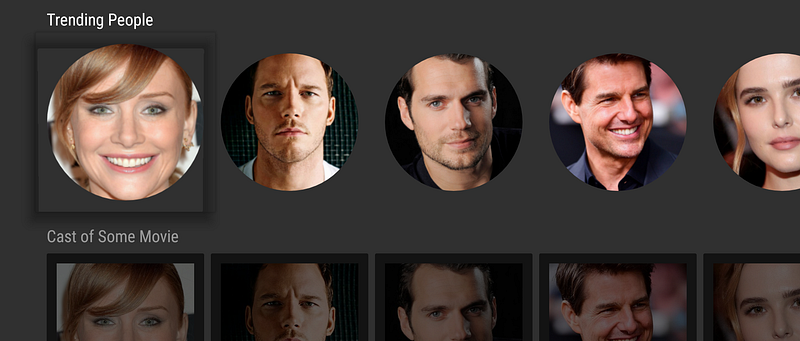
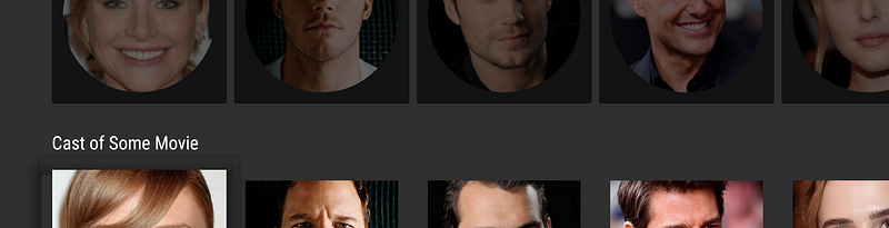
However, there is still a shadow when the row is inactive. The shadow is more noticeable when the image is circular as shown in the image below. Next we will remove that shadow.
Active and Inactive Rows
By default, when the user selects a row, other rows are dimmed. This effect is controlled by ListRowPresenter.
There is a method in ListRowPresenter that can be overridden to disable the effect. Extend the presenter and override isUsingDefaultListSelectEffect() to return false.
val customListRowPresenter = object : ListRowPresenter() {
    override fun isUsingDefaultListSelectEffect() = false
}
This removes the shadow effect from the inactive rows.
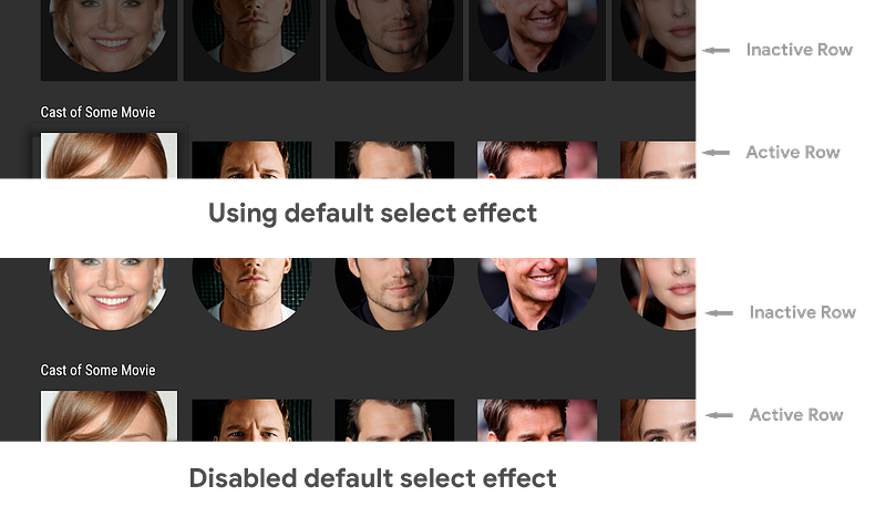
Please be careful. When you disable the dimming of inactive rows it becomes quite hard to determine which card is selected.
Putting it all together
Customizing ListRowPresenter with just a few lines of code can remove the shadowing effects and allow us to build a custom user experience with leanback components.
val customListRowPresenter = object : ListRowPresenter() {
        override fun isUsingDefaultListSelectEffect() = false
    }.apply {
        shadowEnabled = false
    }
Adding borders to the selected card
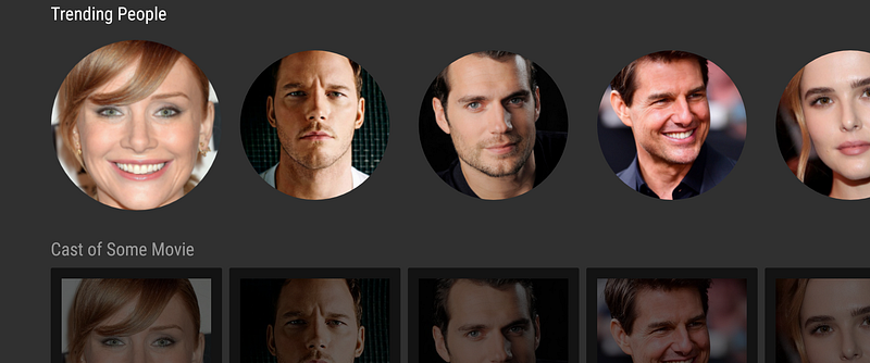
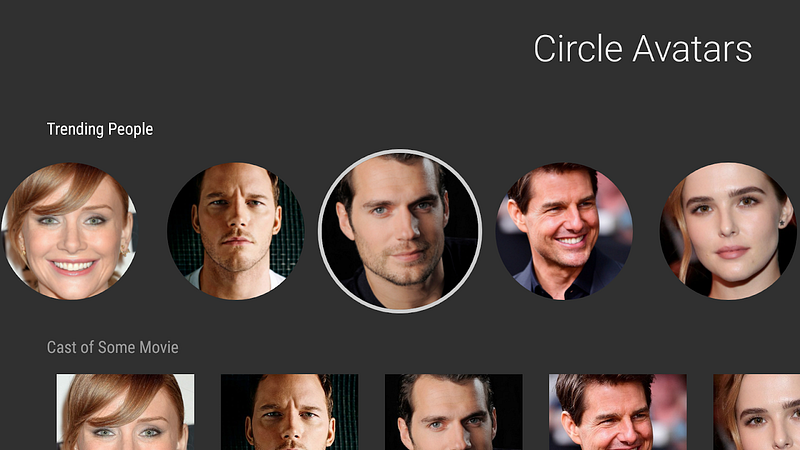
When you’ve removed shadows, you can make a selected card more noticeable by adding a border. It is clear that the third person is selected in the picture below.
If you use a custom view for the card, add a border to the layout.
<?xml version="1.0" encoding="utf-8"?>
<FrameLayout
    xmlns:android="http://schemas.android.com/apk/res/android"
    android:layout_width="wrap_content"
    android:layout_height="wrap_content"
    android:padding="8dp">
<FrameLayout
android:layout_width="wrap_content"
android:layout_height="wrap_content"
android:id="@+id/imageBackground"
android:background="@drawable/bg_avatar_border"
android:padding="4dp"> <ImageView
android:id="@+id/personImage"
android:layout_width="@dimen/card_avatar_width"
android:layout_height="@dimen/card_avatar_width"
android:adjustViewBounds="true"
/>
</FrameLayout>
</FrameLayout>Add a background to the view surrounding the image view. The background should be a selector that sets the background when selected and removes it otherwise.
<?xml version="1.0" encoding="utf-8"?>
<selector xmlns:android="http://schemas.android.com/apk/res/android">
<item android:state_selected="true"
android:drawable="@drawable/bg_avatar" />
<item android:state_selected="false"
android:drawable="@android:color/transparent" /></selector>In this example, an oval drawable resource was used as the background.
<?xml version="1.0" encoding="utf-8"?>
<shape xmlns:android="http://schemas.android.com/apk/res/android"
    android:shape="oval">
<size android:width="@dimen/card_avatar_border_width"
android:height="@dimen/card_avatar_border_width" /> <stroke android:color="@color/lb_tv_white"
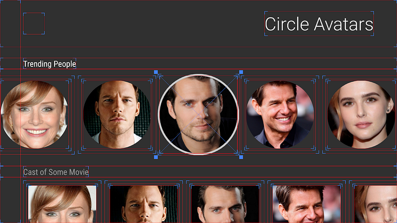
android:width="4dp" /></shape>Use the view hierarchy tool in Android Studio or enable show layout bounds in the developer options to better understand how the padding and margins around each card affects the spacing between them and the border around the image.
What have you customized?
Leanback offers a lot of flexibility for building templated UIs for Android TV. In five short lines of code, we are able to customize the leanback component to support circular imagery! This is one example of how to customize leanback.
What use cases do you have where you needed to customize leanback? Leave a comment or send me a tweet (@benjamintravels) to continue the discussion.


