
Custom View with UIKit vs SwiftUI: BadgeView

Customizing views during an iOS app/framework development could be a very common task. In this article, I’ll present how to creating a customized view, a Badge View, in both SwiftUI and UIKit.
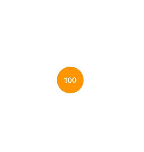
Here is an image of what we expect as the final result:
With UIKit ,
//
//  BadgeView.swift
//
//  Created by Antonio081014 on 2/11/23.
//  Copyright © 2023 Antonio081014.com. All rights reserved.
//

import UIKit

class BadgeView: UIView {
    private lazy var displayLabel: UILabel = {
        let label = UILabel()
        label.textAlignment = .center
        label.translatesAutoresizingMaskIntoConstraints = false
        return label
    }()

    private static let defaultTextFont = UIFont.preferredFont(forTextStyle: .headline)
    private static let defaultTextColor = UIColor.white
    private static let defaultBadgeBackgroundColor = UIColor.systemOrange

    private override init(frame: CGRect) {
        super.init(frame: frame)
    }

    private func setupViews() {
        self.backgroundColor = BadgeView.defaultBadgeBackgroundColor
        self.displayLabel.textColor = BadgeView.defaultTextColor
        self.displayLabel.font = BadgeView.defaultTextFont

        self.addSubview(self.displayLabel)
        NSLayoutConstraint.activate([
            self.displayLabel.topAnchor.constraint(equalTo: self.topAnchor, constant: 16),
            self.displayLabel.bottomAnchor.constraint(equalTo: self.bottomAnchor, constant: -16),
            self.displayLabel.leadingAnchor.constraint(equalTo: self.leadingAnchor, constant: 16),
            self.displayLabel.trailingAnchor.constraint(equalTo: self.trailingAnchor, constant: -16),
            self.displayLabel.widthAnchor.constraint(equalTo: self.displayLabel.heightAnchor)
        ])
    }

    required init?(coder: NSCoder) {
        fatalError("init(coder:) has not been implemented")
    }

    /// Designate Initializer.
    init(withSize size: CGFloat) {
        let frame = CGRect(x: 0, y: 0, width: size, height: size)
        super.init(frame: frame)
        self.setupViews()
    }

    override func layoutSubviews() {
        super.layoutSubviews()
        self.layer.cornerRadius = self.bounds.height / 2
    }
}

extension BadgeView {

    var displayText: String? {
        get {
            self.displayLabel.text
        }
        set {
            self.displayLabel.text = newValue
        }
    }

    var badgeTextColor: UIColor {
        get {
            self.displayLabel.textColor
        }
        set {
            self.displayLabel.textColor = newValue
        }
    }

    var badgeTextFont: UIFont {
        get {
            self.displayLabel.font
        }
        set {
            self.displayLabel.font = newValue
        }
    }

    var badgeBackgroundColor: UIColor {
        get {
            self.backgroundColor ?? BadgeView.defaultBadgeBackgroundColor
        }
        set {
            self.backgroundColor = newValue
        }
    }
}
This code pretty much explains itself.
- We have a private property UILabel to display the text, which is a subview of BadgeView. It contains the possibility of customizing text’s color, font and content.
- We use AutoLayout to make it have height and width equal, while expanding it’s area to its parent, while being given proper padding.
- In a view’s lifecycle, `layoutSubviews` will be called once everything is ready to be presented/seen. It’s the best place to do the layer level customization. Setting layer’s `cornerRadius` will make view to be a circle.
In SwiftUI , the Code is a little more straight forward.
//
//  BadgeView.swift
//
//  Created by Antonio081014 on 2/11/23.
//

import SwiftUI

struct BadgeView: View {
    @State var displayText = "100"
    @State var badgeBackgroundColor = Color.orange
    @State var badgeTextColor = Color.white
    @State var badgeTextFont = Font.system(.headline)

    var body: some View {
        Text(displayText)
            .foregroundColor(badgeTextColor)
            .font(badgeTextFont)
            .padding(EdgeInsets(top: 16, leading: 16, bottom: 16, trailing: 16))
            .background(badgeBackgroundColor)
            .clipShape(Circle())
    }
}
We have for State properties to modify style and content of BadgeView.
Conclusion:
Here, I am not trying to say which is better, but trying to present different solutions to solving the same problem. I believe whatever works for you, then it’s good enough to be chosen.