
Css trick: add colour and linear-gradient to a background image
— a css trick that may save your time 🦋
Implementing responsive background-image is very simple, but combining it with additional background-color and linear-gradient is not as simple as imagined, and if you also have to make the background image light and transparent, and also with some text on it that should not be transparent …
Yeah, it sounds cumbersome 🙈, but this is the task I encountered in my current project, let me explain the purpose with pictures first.
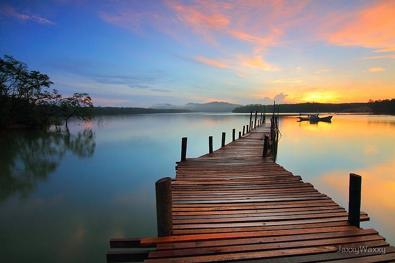
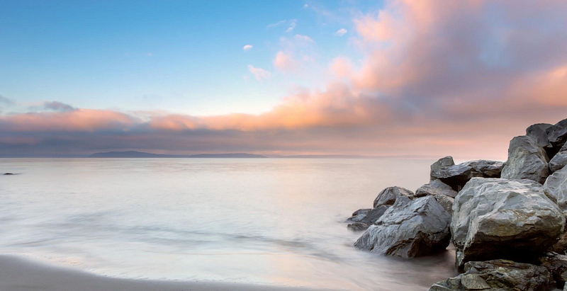
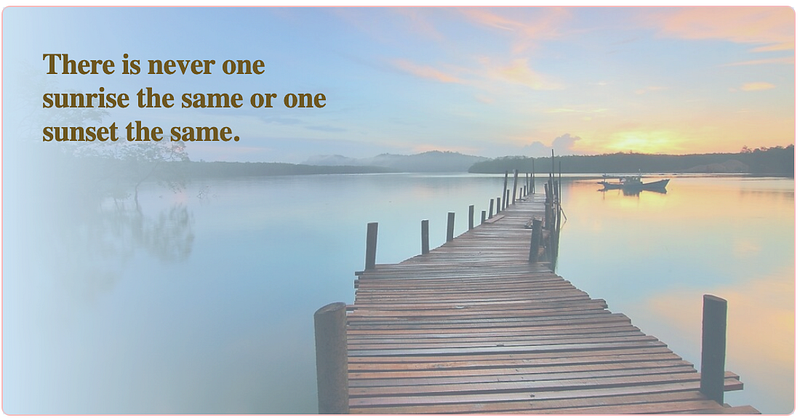
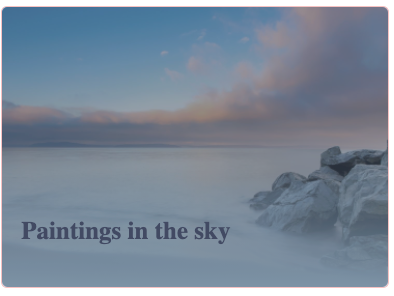
We have two different images ( I’m using example images here ) that need to be displayed according to the screen size, mobile version and desktop version: 👇
For the component I created the example code below:
My purpose is to use css property “display” to confirm which image is displayed on which device according to screen sizes.
✂️ Implementing them is simple, but here comes the requirement, the final effect should look like these below:
Ok, after first glance, what I see is that we maybe need some linear-gradient, some additional background colors, some text positions, some image opacity rules…
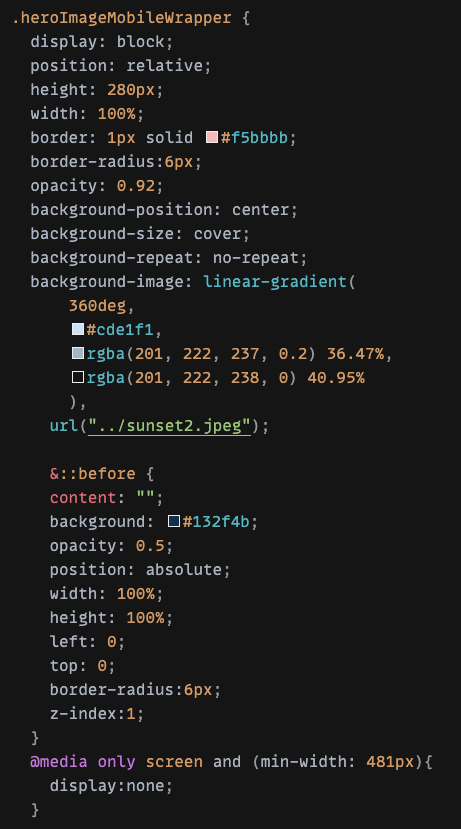
Let’s start with the first image (desktop version) 🌸
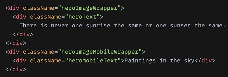
First, create CSS for the desktop image wrapper, I named it “heroImageWrapper”, see example code screenshot below: 👇 ( click on the screenshot for the complete view )
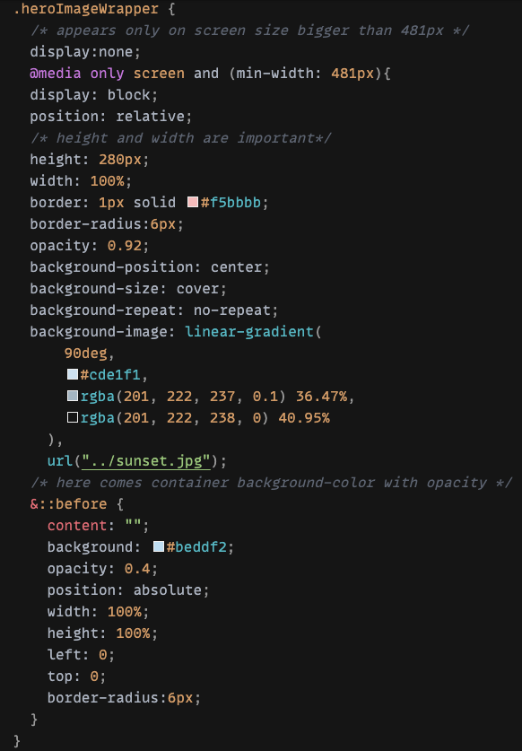
height and width is very important- With CSS “display”, we could determine that this image should only appear on screen size that is bigger than 481px as “desktop” version
- Give the wrapper an “relative” position so that we can position the text within it later
- Define linear-gradient with 90deg (the values
0deg,180deg,270deg, and90deg, are equivalent toto top,to bottom,to left, andto rightrespectively) and opacity: 0.92 to blur the left side a little - … add some border, border-radius …
🌱 Now comes the interesting part, as we see from final effect, there should be some additional colors, opacity … , until now we have only implemented the linear-gradient and some opacity, but the picture should be darker and more blurred, how can we add another color to overlap the entire image?
Maybe we can imagine with something like an overlay between the image and the text. Either way, we need a CSS technique to introduce this kind of coverage. 🍁
Natively, CSS provides the powerful ::before, ::after elements for adding stylistic content to the page that shouldn't affect markup.
In this case, my solution was use “before” to add a “pseudo” content which is actually only a “placeholder” without any content except an additional background color #beddf2.
👉 One important note, all pseudo-elements require a content CSS property to display. In our case, this will just be a blank string.
The ::before above inserts a dynamic element before the selected element, in my case heroImageWrapper.
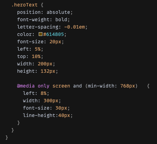
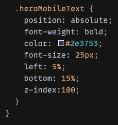
- Last step, give the text content position:absolute for different screen sizes up to 481px, 768px …, you can define more CSS rules, but here I just keep it simple👇
👐 That was for the desktop image!
Now let’s continue with the second image (mobile) 🌸
It should be quite straightforward after desktop version, the only changes are the appearance on screen size ( smaller than 481px ), the linear-gradient direction ( this time with 360deg that blurs the bottom a little bit), and the “overlay” color, opacity …
I am sure there is a better way to achieve these effects on background images, but I think at least these two examples are interesting, I hope you enjoy it!
Thank you for reading! 👐


