CSS Grid (Part 23)— Full Bleed Blog Layout
Project case study — Building a responsive blog layout
Live dev notes taken throughout the CSS Grid course by Wesbos — cssgrid.io
Today we look at building a Full Bleed Blog Layout inspired by Phillipp Rudloff.
Wesbos has provided us with a single base HTML file which also houses the base CSS at the bottom.
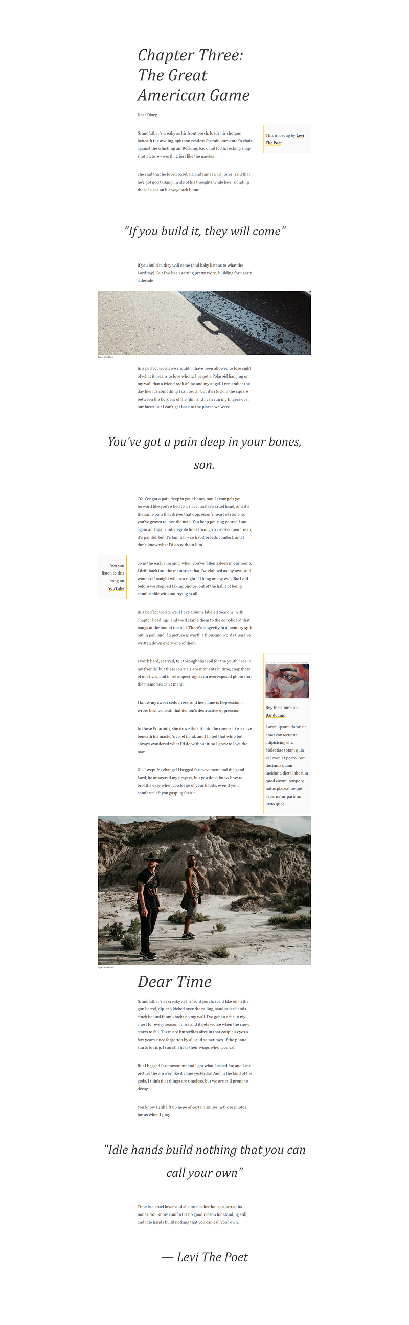
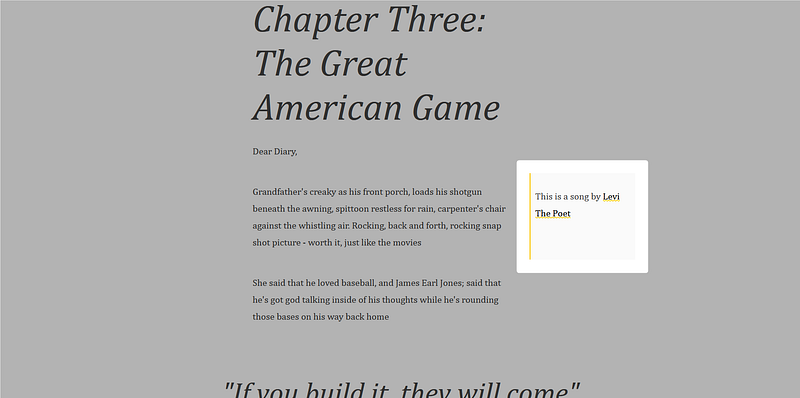
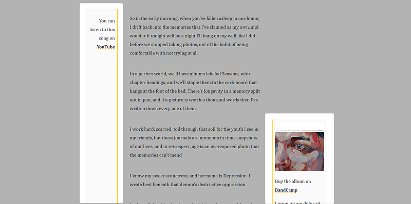
Below is what we’re working with.
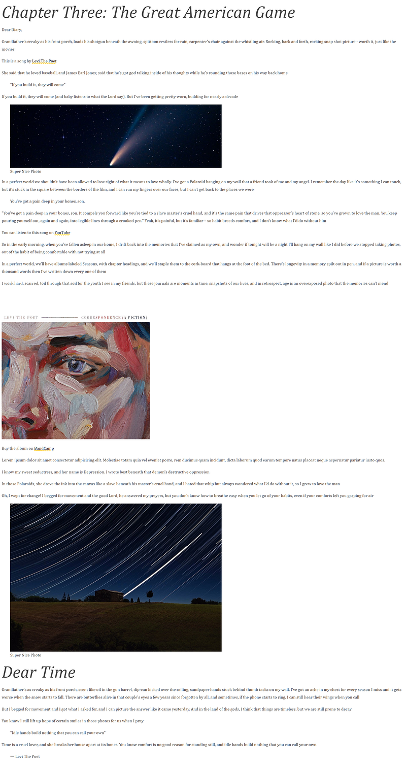
CSS grid has shown it’s capabilities in application layouts, but in this project we tap into the benefits of using it for laying out text on a page.
To do this, we’ll turn the post into a grid with 3 columns, where:
- Most of the content is going to fill up the centre column
- Occasionally images are going to spill out across the 3 columns with a figure caption
- Blockquotes are styled to stand out
- divs classed as
tipwill sit on either the left or right side of the main centre content column
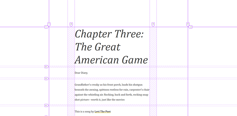
Set up the grid
To begin, we’ll first apply the following to our article element classed as post:
displayof gridmax-widthof 1000pxmarginof 200px (top/bottom) and auto (left/right)grid-gapof 10px (horizontally) and 50px (vertically)grid-template-columnsof 3fr, 12fr and 5fr to make up the 3 grid column
.post {
    display: grid;
    max-width: 1000px;
    margin: 200px auto;
    grid-gap: 10px 50px;
    grid-template-columns: 3fr 12fr 5fr;
}
Notice is that each piece of content has been placed in order of the grid using up every empty spot.
What we want to do instead is select all elements and place them only in the centre column for now. This means, every child of the post will start at column 2 and span across 1 column.
.post > * {
    grid-column: 2 / span 1;
}
Similarly, we can write this:
.post > * {
    grid-column: 2 / -2;
}
Which is the preferred option because of the fact that if you added a fourth column, the span of the main content would fill all columns that are in the middle. For example:
.post {
    display: grid;
    max-width: 1000px;
    margin: 200px auto;
    grid-gap: 10px 50px;
    grid-template-columns: 3fr 12fr 4fr 5fr;
}
.post > * {
grid-column: 2 / -2;
}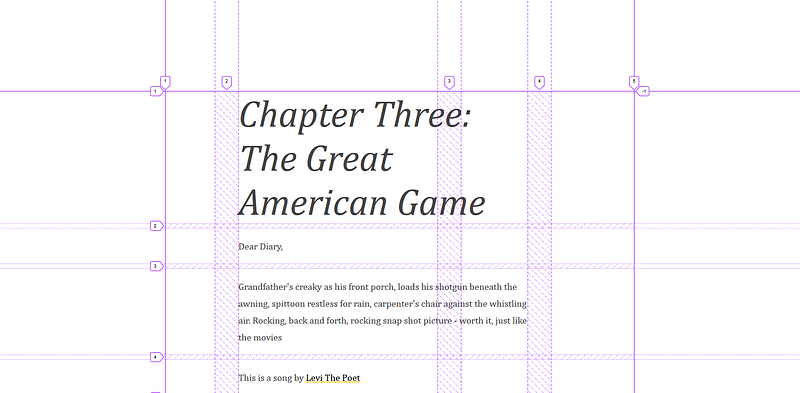
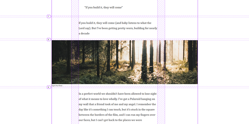
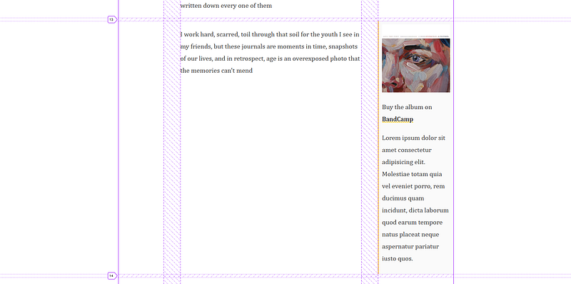
Figure Images and Captions
The HTML structure of the figure looks like this:
<article class="post">...
    <figure>
        <img src="" alt="Big Image">
        <figcaption>Super Nice Photo</figcaption>
    </figure>
...
</article>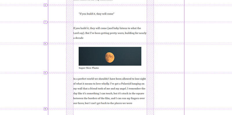
We want to span the image across all columns, to do this:
- Remove the
margin - Position the start and stop of the
grid-columnto the entirety of the grid - Style the caption
.post > figure {
    margin: 0;
    grid-column: 1 / -1;
}
figcaption {
font-size: 10px;
}
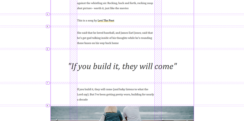
Styling Blockquotes
Similar to the figure images, we’ll span the blockquote to the start and end columns of the grid, and add:
font-sizeof 60pxfont-styleof italictext-alignit to the centre- Remove the
margin
.post > blockquote {
    margin: 0;
    grid-column: 1 / -1;
    font-size: 60px;
    font-style: italic;
    text-align: center;
}
Finally, we’ve got these tips that will sit on either the left of right column gutters.
To style the tips, add:
backgroundof#FAFAFA- a
padding10px
.tip {
    background: #FAFAFA;
    padding: 10px;
}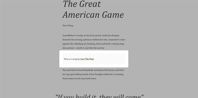
The left and right tips will have slightly different styling to suit its position.
So for the tips called with tip-left, we’ll apply the following:
grid-columnto start on the first column and span 1 columntext-alignto the right- add a
border-rightwith a solid yellow line of 2px
.tip-left {
    grid-column: 1 / span 1;
    text-align: right;
    border-right: 2px solid var(--yellow);
}
When we move the tip to the first column, this means that the content below will shift up in line with the tip.
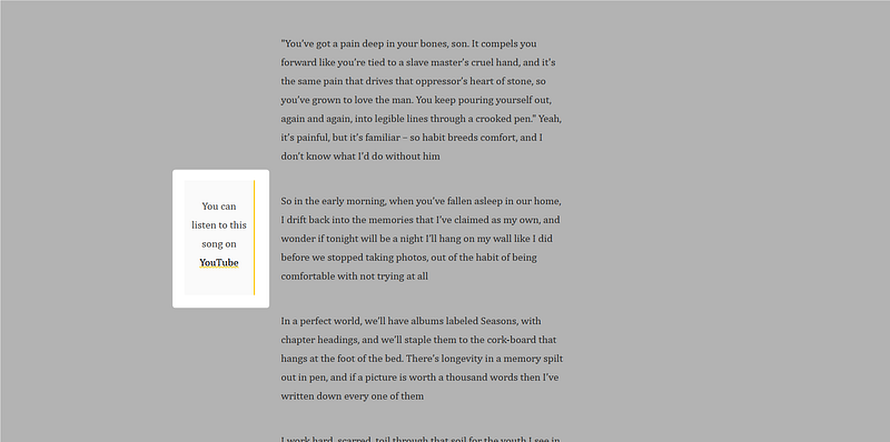
Similarly, we’ll apply styling to the right, but arranging it in the opposite direction.
.tip-right {
    grid-column: span 1 / -1;
    border-left: 2px solid var(--yellow);
}
One thing to note is that if the tip has beyond a certain amount of content than it’s adjacent grid item, it will stretch the row causing a massive gap in the centre column. Like so:
A way around this is to increase the number of grid-rows from a default of 1 to say 5
.tip {
    background: #FAFAFA;
    padding: 10px;
    grid-row: span 5;
}
But this will cause other tips to stretch. To stretch only to its content, we can then align-self at the start.
.tip {
    background: #FAFAFA;
    padding: 10px;
    grid-row: span 5;
    align-self: start;
}
Below is the final result, which concludes the CSS Grid Series.