
Mastering Interactive Data Visualizations: A Beginner’s Guide to Streamlit

Creating your first Streamlit app may seem daunting, but in this tutorial, I will show you how simple and straightforward it can be! We will walk through the process of generating valuable insights and telling a story by creating charts and building a Streamlit app.
For this tutorial, I have chosen a trending dataset from Kaggle.com on product defects. You can follow along to build your first Streamlit app by downloading the data here.
In this post, I will cover:
- Creating charts using Matplotlib and Seaborn libraries
- Streamlit App: How to quickly get started
- Streamlit App: Creating visualizations
First, let’s read our data and generate some useful insights!
# Import libraries
import matplotlib.pyplot as plt
import seaborn as sns
import pandas as pd

# Read data
df = pd.read_csv('defects_data.csv')
After importing our data, the first step is to examine it to understand the available features:
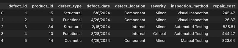
Our dataset is relatively small, consisting of 1,000 rows and 8 columns, with no missing values. This is almost the perfect scenario where we barely have any preprocessing to do! Just one thing, the column defect_date is not of date type:

To ensure accurate analysis and visualization, let’s convert the defect_date column to the appropriate date type :
# Convert to date
df.defect_date = pd.to_datetime(df.defect_date)
Data Visualization — Matplotlib and Seaborn Charts for Storytelling
In this post, the goal is to explore the following questions and build charts to visualize the answers:
- How many defective products are reported on a monthly basis?
- How do repair costs vary by severity?
- How do trends in repair costs vary by inspection method?
These visualizations will help us derive meaningful insights and tell a compelling story about the data. Let’s dive into each question and create the corresponding charts using Matplotlib and Seaborn.
1. Monthly Defective Products
To analyze the number of defective products reported each month, we can group the data by month and count the defects:
# Add a column with defect month, eg: '2024-06'
df = df.assign(defect_month = df.defect_date.dt.strftime('%Y-%m'))

# Count the number of product_ids with defects on a monthly basis
monthly_defects = df.groupby('defect_month', as_index=False).product_id.count()
monthly_defects
Here I use the barplot function from Seaborn to create the bar chart and add a title, xlabel and ylabel:
# Create bar chart
fig, ax = plt.subplots(figsize=(10,6))
g = sns.barplot(data=monthly_defects, x = ‘defect_month’, y = ‘product_id’,
ax=ax, color=’blue’)
# Update title and labels
_ = ax.set_title('Number of Defects by Month')
_ = ax.set_xlabel('')
_ = ax.set_ylabel('count')
The resulting chart is:

This visualization provides a clear view of the number of defective products reported each month. This is a good start as it tells us that there are between 150–175 defects on a monthly basis, and that this appears to be a consistent trend in the 6 months of data that we have.
But what if we wanted to make our chart stand out a bit more? Let’s change the color of the title and add the number of defects to each bar container:
# Create bar chart
fig, ax = plt.subplots(figsize=(10,6))
g = sns.barplot(data=monthly_defects, x = ‘defect_month’, y = ‘product_id’,  ax=ax, color=’blue’)
# Updste title color
_ = ax.set_title(‘Number of Defects by Month’, color=’red’)
# Add a label to each bar container and specify the format, color and font style
_ = ax.bar_label(ax.containers[-1], fmt='Total Defects:\n%.0f',
                 label_type='center', color='white',
                 size=10, font='Verdana', style='oblique')
# Update axes labels
_ = ax.set_xlabel('')
_ = ax.set_ylabel('count')
Here is the updated chart:
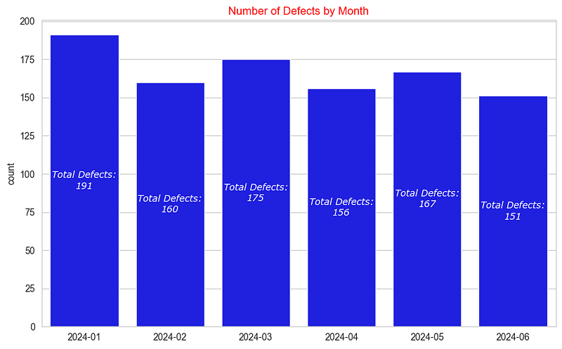
In this enhanced version, we used bar_label from Matplotlib to add text to each container, specifying the color, size, font, and font style. This technique provides a more engaging and informative visualization.
The format string 'Total Defects: \n%.0f' is used to format the output text and number in a specific way:
Total Defects:: This is the text string that will be included in the output.\n: This is a newline character, which means the number will appear on the next line.%.0f: This is a format specifier for a floating-point number:%: Indicates the start of a format specifier..0: Specifies that there should be no digits after the decimal point (i.e., the number will be rounded to the nearest integer).f: Indicates that the number is a floating-point number.
Next, we are going to explore repair costs by severity levels and how to quickly add additional information to our visualization by utilizing the hue parameter!
2. Repair Cost by Severity and Monthly Trends
To examine the average repair cost by severity, we group by severity and take the mean:
# Group by severity and calcualate the average
severity_cost = df.groupby(['severity']).agg({'product_id':'count','repair_cost':'mean'})

# Create bar chart
fig, ax = plt.subplots(figsize = (10,6))
sns.barplot(data=severity_cost, x='severity', y='repair_cost', palette='Set1')
# Add a title
_ = ax.set_title('Average Repair Cost by Severity')
Our resulting chart is:

While it’s interesting to see that the average repair cost is consistent and stable across severity types, examining the cost trend over time would provide deeper insights. Let’s add severity levels to our visualization and create a monthly defect repair cost chart:
# Create chart - add severity using hue parameter
fig, ax = plt.subplots(figsize=(10,6))
g = sns.lineplot(data=df, x = 'defect_month', y = 'repair_cost', estimator='mean', ax=ax,
                 hue='severity', errorbar=None, palette='Set1')
# Update legend position
_ = ax.legend(bbox_to_anchor=(1.2, 1))
# Set title and axes labels
_ = ax.set_title('Monthly Repair Cost by Defect Severity',
                 fontdict={'size':16, 'style':'italic', 'color':'DarkRed'})
_ = ax.set_xlabel('')
_ = ax.set_ylabel('Average cost')
In this visualization, we are highlighting variations in the repair costs by severity level by setting the hue parameter and using the Set1 palette. The legend position is placed outside of the plot for clarity, and the title is styled in dark red and italicized for emphasis. This approach provides a clear and informative view of how repair costs vary by month and severity level.
The resulting chart looks like this:

This chart shows that repair costs peak in March for critical and minor product defects, while moderate defect repairs decline during the same period. This raises questions about why March sees a spike in costs for critical and minor defects but not for moderate ones. What factors are influencing this trend, and what insights can we draw from it? We might speculate that minor parts could be specialty items that are harder to source, leading to higher repair costs in March. However, without additional analysis and more data, this remains an assumption.
3. Product Repair Cost by Inspection Method
To show the relationship between numerical values and categorical ones, we are going to use Seaborn’s catplot function:
# Create catplot
g = sns.catplot(data=df, x = 'defect_month', y='repair_cost',  col='inspection_method',
col_order=['Manual Testing','Visual Inspection', 'Automated Testing'],
kind='point', errorbar=None, color='blue', aspect=.95)
# Assign labels
g.set_xlabels('')
g.set_ylabels('Avg Repair Cost')
In this visualization, catplot is used to show the average repair cost by inspection method. There is a col for each inspection method, and they share the y-axis so that we can compare trends across. We specify the column order using the col_order parameter and adjust the size with the aspect parameter. We set the kind parameter to point, but other options are available:

The resulting chart is:

This chart shows the average repair cost trend for manual, visual and automated inspection methods. We notice that the cost increases for manually tested defective products, while the average cost decreases for products that are automatically tested.
This raises interesting questions: Why do manual inspections lead to higher costs, and what factors in automated testing contribute to cost savings? Additionally, it would be valuable to explore whether the types of defects identified by each method play a role in these cost variations. Understanding these dynamics could offer deeper insights into optimizing inspection processes.
Now that we have covered different types of charts, such as barplot, lineplot, and catplot, we can use this knowledge to learn how to create our Streamlit app and incorporate visualizations into it!
Streamlit
First, what is Streamlit? Streamlit is an open-source Python library that simplifies the creation and sharing of custom web applications tailored for machine learning and data science. It’s pretty awesome, you can get up and running in a few minutes to showcase your data science project!
Streamlit turns data scripts into shareable web apps in minutes. All in pure Python. No front‑end experience required.
To get started with Streamlit, we first need to install it and then import it. Start by creating a file called app.py, where we will import the necessary libraries for data manipulation and chart creation, and where we will built our first Streamlit app!
While we will use Pandas to read our CSV file, Streamlit also supports connecting to various data sources such as AWS S3, BigQuery, and many more, providing flexibility for your data needs.
# app.py

# Install streamlit
!pip install streamlit

# Import libraries
import matplotlib.pyplot as plt
import seaborn as sns
import streamlit as st
import pandas as pd

# Read data
df = pd.read_csv("defects_data.csv")
Next we will add a title for our app and show the first 20 rows of our data:
# Configure page to wide layout
st.set_page_config(layout="wide")

# Add app title
st.title("Defective Producs Insights")

# Show data
st.dataframe(
    data=df.head(20),
    hide_index=True,
    use_container_width=True,
)
Once you have saved the file, you can run by entering streamlit run app.pyin the terminal. Voila! It should look like this:

Notice that we set the hide_index parameter asTrue, which hides the index column that we don’t need in this case. Additionally, use_container_width is set as True to ensure that the table utilizes the full width of the page.
The table is interactive, allowing you to sort by different columns, download the data as CSV and even search within the dataset! By the way, Streamlit supports the data ability to edit dataframes in real-time through st.data_editor, allowing you to make updates to your data and charts on the fly!
Next, we will add charts to our app!
Streamlit Charts
Streamlit can create its own charts or it can also display Matplotlib, Plotly and other charts! Let’s add a section to show the monthly defects table and create a trend line using Streamlit’s line chart:
# Add a subheader
st.subheader("Monthly Product Defect Trends")
st.write("  ")

# Add left and right columns
left, right = st.columns(2, gap="small")
# Create line chart for monthly trends in left column
left.line_chart(
    data=monthly_defects,
    x="defect_month",
    y="product_id",
    color="#FF3389",
    x_label="",
    y_label="Defective Products",
    use_container_width=True,
)
# Show summary data on the right side
right.dataframe(
    monthly_defects.style.format(thousands=",", precision=2).highlight_max(
        subset=["product_id"]
    ),
    use_container_width=True,
)
Our app now includes the line chart and table:

In the code above, we did the following:
- Sub-header: Added a sub-header for the monthly product defect trends.
- Columns: Created two columns, left and right, to organize our layout. This is completely optional but I find it useful when building apps.
- Line Chart: Plotted a line chart on the left column to display the trend of monthly defects.
- Data: Displayed the summary data on the right column with the highest number of defects highlighted in yellow.
This approach provides a clear and interactive view of our data trends and summary. Next, we’ll add charts created using Matplotlib and Seaborn to our app!
Imagine you are tasked with investigating which products incurred the highest repair costs. One approach to answering this question is to group the data by product_id and calculate the total repair cost:
# Group data by product_id and calculate the total repair cost
product_stats = df.groupby('product_id', as_index=False).agg({'defect_id': 'count','repair_cost':'sum'}).sort_values(by='repair_cost', ascending=False)
top_repairs = product_stats[:10]
Next, let’s create a bar chart to show the top 10 products by repair cost:
# Create chart
fig, ax = plt.subplots(figsize = (8,6))
g = sns.barplot(data=top_repairs, y = 'product_id', x =  'repair_cost',
                order = top_repairs.product_id, palette='Set1',
                errorbar=None, orient='h')
# Specify formatting and labels
_ = ax.get_xaxis().set_major_formatter(ticker.FuncFormatter(lambda x, p: format(int(x), ',')))
_ = ax.set_xlabel("Total Repair Cost")
_ = ax.set_ylabel("Product Id")
Now, let’s add a section in our app.py file to display the top repair costs and the bar chart:
# Add a subheader and divider for a new section
st.subheader(
    "Top 10 Product Repair Cost",
    divider="blue",
)
# Create 2 new columns
left_col, right_col = st.columns(2, gap="small")

# Plot figure on the left
left_col.pyplot(fig=fig, use_container_width=True)

# Show dataframe on the right
right_col.dataframe(
    top_repairs.style.format(thousands=",", precision=2).highlight_max(
        subset=["repair_cost"]
    ),
    use_container_width=True,
    hide_index=True,
)
And our app now contains a new section, showcasing product repair costs.
Here is a look at the final app:

Now our app contains a new section, showcasing the top 10 products by repair cost:
- Sub-header: Introduces the new section.
- Left Column: Displays the bar chart of the top 10 products by repair cost.
- Right Column: Shows the corresponding data in an interactive table.
Final Thoughts
In this tutorial, we explored various methods to visualize and analyze defect data using Matplotlib, Seaborn, and Streamlit. We started by creating simple charts to gain insights into monthly defect trends, repair costs by severity, and inspection methods. By leveraging the power of Streamlit, we demonstrated how to build an interactive web application to present visualizations effectively.
Key takeaways from this tutorial include:
1. Data Visualization: Using Seaborn’s barplot, lineplot, and catplot functions to create clear and informative charts.
2. Data Analysis: Grouping and aggregating data to extract meaningful insights, such as identifying the top products by repair cost.
3. Streamlit Integration: Embedding Matplotlib charts into a Streamlit app to create an interactive and user-friendly interface for data exploration.
By combining these tools and techniques, you can transform raw data into valuable insights and build powerful data applications. Whether you’re investigating defect patterns or tracking repair costs, these methods provide a robust foundation for your data analysis projects.
I hope this tutorial has been helpful and inspires you to create your own Streamlit apps for data visualization and analysis.
Useful Resources:
https://docs.kanaries.net/topics/Streamlit/streamlit-vs-dash
https://www.geeksforgeeks.org/difference-between-matplotlib-vs-seaborn/


