
Creating Histograms in R
An introductory guide

Introduction
Histograms are a powerful tool in data visualization, allowing you to understand the distribution of a dataset. In the R programming language, creating histograms is straightforward and can be done using the hist() function. In this article, we will explore the process of creating histograms in R, discussing various customization options and providing examples to illustrate the concepts.
Getting Started
Before we begin, make sure you have R and RStudio installed on your system. You can download and install R from https://www.r-project.org/ and RStudio from https://www.rstudio.com/. Once installed, open RStudio and create a new R script or R Markdown document for better organization and reproducibility.
Basic Histogram Creation
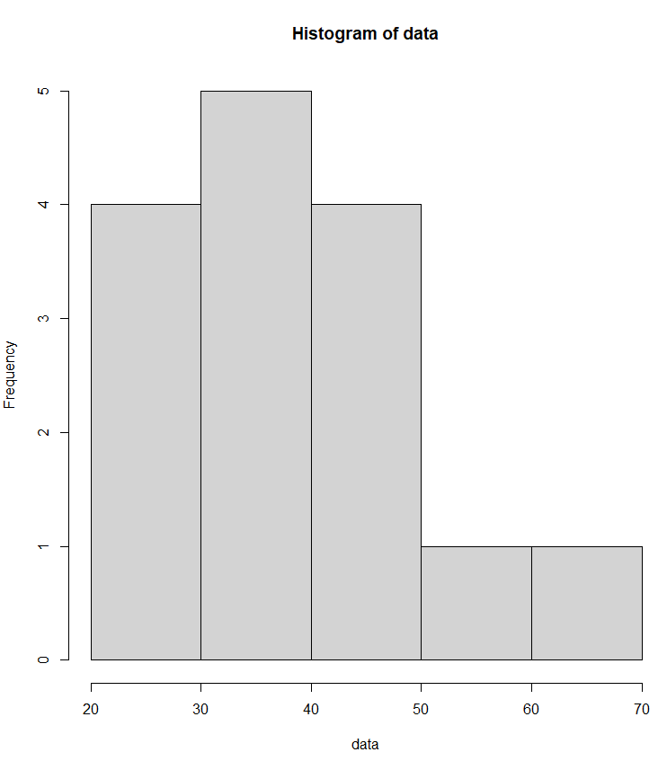
Let’s start with a basic example of creating a histogram. Suppose we have a dataset named data.
# Sample data
data <- c(22, 34, 45, 28, 55, 67, 40, 31, 25, 50, 42, 38, 29, 33, 48)
Now, let’s create a simple histogram:
# Create a basic histogram
hist(data)
This code will generate a histogram of the data with default settings. You will see a graphical representation of the distribution of values in the dataset.
Customizing Histograms
Titles and Labels
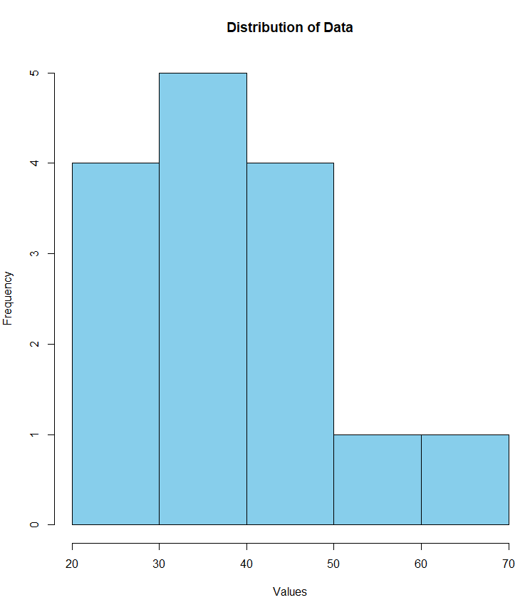
To enhance the interpretability of your histogram, add titles and labels. For example:
# Customizing the histogram with titles and labels
hist(data,
main = "Distribution of Data",
xlab = "Values",
ylab = "Frequency",
col = "skyblue")
Here, main sets the main title, xlab sets the label for the x-axis, ylab sets the label for the y-axis, and col sets the color of the bars.
Number of Bins
Adjusting the number of bins can impact the granularity of your histogram. By default, R chooses the number of bins automatically, but you can specify a specific number:
# Specify the number of bins
hist(data, breaks = 5, col = "green", main = "Histogram with 5 Bins")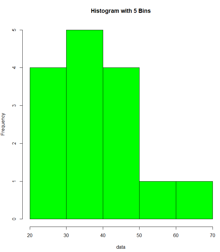
Adding Grid Lines
You can add grid lines to make it easier to read the values on the axes:
# Add grid lines
hist(data, col = "salmon", main = "Histogram with Grid Lines")
grid()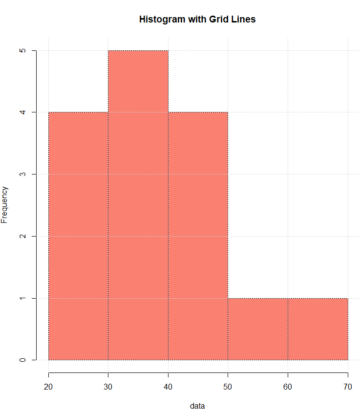
Density Plot
Include a density plot to visualize the probability density function:
# Add a density plot
hist(data, prob = TRUE, col = "blue", main = "Histogram with Density Plot")
lines(density(data), col = "darkorange", lwd = 2)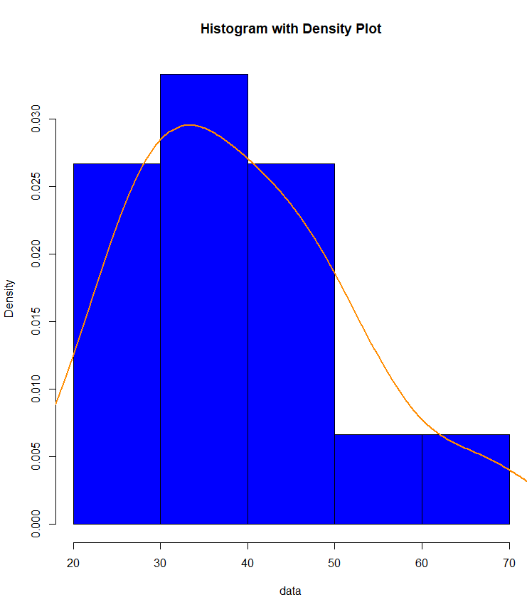
Multiple Histograms
If you have multiple datasets to compare, you can create multiple histograms on the same plot:
data1 <- rnorm(100, mean = 30, sd = 5)
data2 <- rnorm(100, mean = 40, sd = 8)
hist(data1, col = "lightblue", main = "Comparison of Two Datasets", xlim = c(0, 60), ylim = c(0, 0.12), prob = TRUE)
hist(data2, col = "lightgreen", add = TRUE, alpha = 0.5)
legend("topright", legend = c("Dataset 1", "Dataset 2"), fill = c("lightblue", "lightgreen"))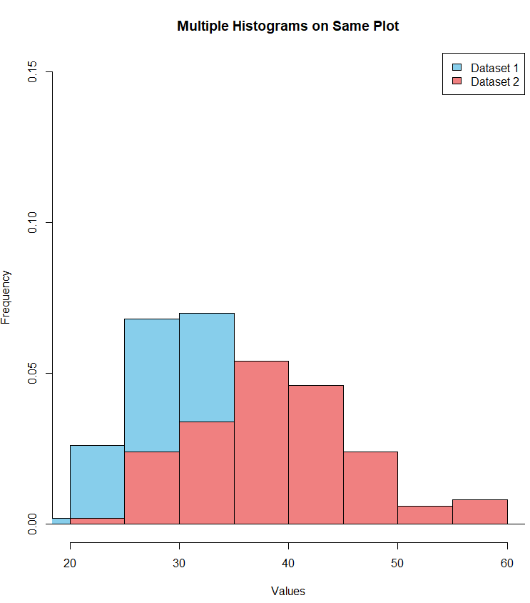
Conclusion
Creating histograms in R is a fundamental skill for data analysis and visualization. By customizing various aspects of the plot, you can effectively communicate the distribution of your data. Experiment with different options, and use the examples provided to create insightful and visually appealing histograms for your own datasets.


