
Creating Candlestick Charts Using Python Plotly
This article will introduce the detailed steps of:
- Downloading of historical price data for stocks and cryptocurrencies
- Plotting candlestick charts using the OHLC data & some chart variations
Environment and tools I am using:
- OS: Windows
- Programming Language version: Python 3.9
Let’s get started!
Data Preparation
Two different Python libraries for downloading of historical OHLCV (open, high, low, close & volume) data for stocks and cryptos:
# Stock Data from Yahoo Finance
pip install yfinance
# Crypto Data from Major Exchanges
pip install ccxtDownloading Data — Stocks
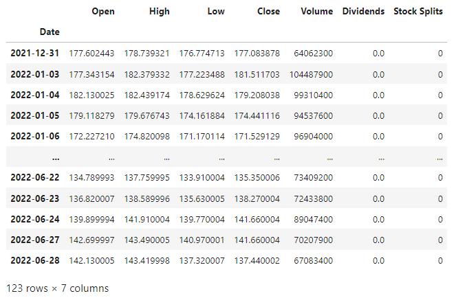
For stocks, we could use yfinance to download historical data. Using AAPL as an example for the daily data since beginning of the year:
Downloading Data — Crypto Products
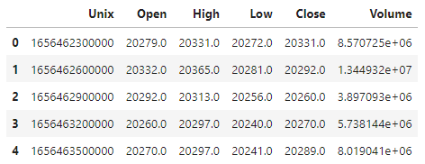
For stocks, we could use ccxt to download historical data and name the columns in accordance as above:
Here I am fetching the data from FTX, but there is a wide range of exchange available, including Binance, OKX, BitMEX, Coinbase etc, where you could use ccxt to fetch data from, simply refer to the ccxt documentation for the list of supported crypto exchanges.
There are multiple timeframes for you to choose. Here I am fetching the 5-minute OHLCV and limiting the number of entries to 100 (It allows a maximum limit of 5000 entries, 1500 by default). The first few rows looks like the following:
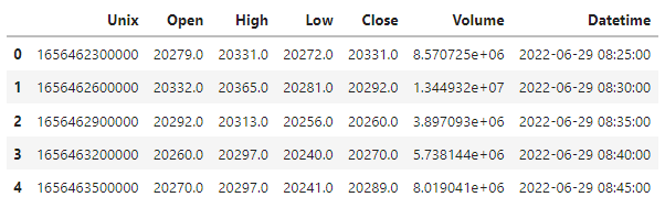
For a clearer axis, we convert the unix timestamp to datetime:
Here I added + timedelta(hours=8) for local date time in time zone UTC+8, simply delete this part for UTC, or update the hours parameter according to your own time zone. Head of the updated dataframe:
Plotting Candlestick charts
Overview of the variations of the candlestick chart I am going to demonstrate: 1. Candlestick Chart with/without SlideBar 2. Candlestick Chart and Volume Separately 3. Candlestick Chart with Volume Embeded
All the plots will be using Python library plotly and the daily data of BTC-PERP from FTX.
Candlestick Price Chart
However the chart produced has a strange dimension, and is without any label or title:
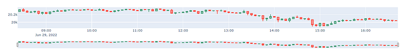
Set the layout specifics using update_layout function.
fig.update_layout(title="BTC-PERP: 5-minute OHLC",
                  yaxis_title="Price (USD)",
                  width=900,
                  height=600)
The chart looks much greater now!
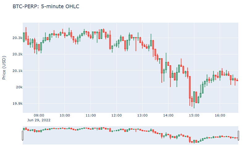
The candlestick chart produced by plotly naturally comes with the slidebar below for range selections. To disable it, simply add another statement below the chart creation:
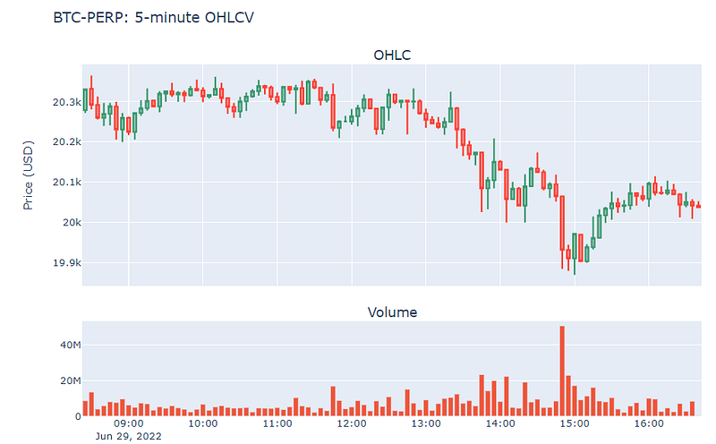
fig.update(layout_xaxis_rangeslider_visible=False)Candlestick Chart and Volume Separately
Plot generated with separate graphs for OHLC candlestick and volume bars:
Candlestick Chart with Volume Embeded
To create a graph with both price and volume data in the same plot, using separate y-axes:
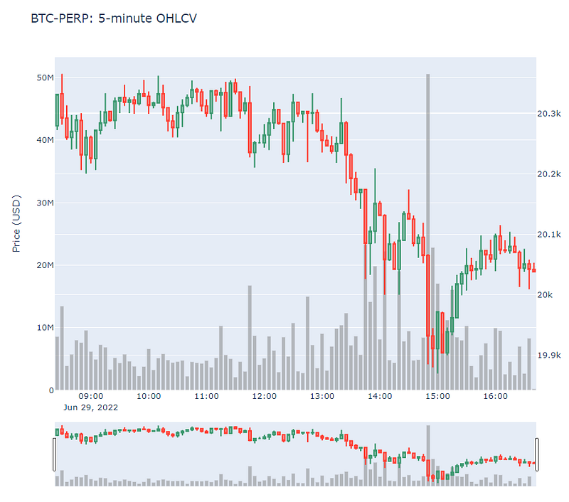
Here I create the subplot with additional specs of a secondary_y and changed the color of volume bar to light grey. Detailed code as follows:
Using plotly , you could easily add other features such as commonly-used technical indicator MACD or RSI band. Hope it could help to make the analyzing process or trading demonstrations a more pleasant experience.
Thanks for reading and stay tuned for more!


