
Creating a segmented progress bar in SwiftUI with Swift Playgrounds
Building custom controls in a declarative style is easy with SwiftUI — and you can do it all on an iPad if you like
Apple’s declarative visual design framework SwiftUI, introduced in 2019, ushered in a very different way of thinking for those of us used to building user interfaces in Xcode’s Interface Builder.
While those differences can take a while to get used to, experience in building web components with a framework like ReactJS can be hugely beneficial to understanding how SwiftUI components composite together to create larger views.
For a project I’m currently working on, I wanted a view that showed how far along in a series of steps a particular project has got. Each project progresses through a fixed number of stages, but the amount of time they take within each isn’t fixed. That means that expressing step 3 of 7 as, say, 42% wouldn’t necessarily be meaningful or accurate.
Instead, I want an indicator that shows progress as a number of steps, with the completed ones showing clearly. Something like this:
SwiftUI makes it super easy to create custom views, and Xcode’s ability to show live previews alongside your code as you design is brilliant. I’ve also found it super buggy at times, the preview crashing on what seems to be a whim.
For that reason, I’ve started doing my experiments within a Swift Playground, which gives the same rapid visual feedback with fewer crashes. There is also the benefit that you can experiment within the Swift Playgrounds app on an iPad or Mac, without needing to fire up Xcode in full.
As I build up this control, you can follow along within Xcode if you prefer. But if you want to fire up a Playground, start with this initial template:
import SwiftUI
import PlaygroundSupport
struct SegmentedProgressView: View {
var body: some View {
Text(“Hello World”)
}
}PlaygroundPage.current.liveView = UIHostingController(rootView: SegmentedProgressView())We’re going to start off by setting up a row of 10 segments, evenly spaced across the view (later on, we can pull out this and other ‘magic’ numbers and make the control customisable).
Thankfully, the HStack container makes this easy:
var body: some View {
  HStack {
    ForEach(0 ..< 10) { _ in
      Rectangle()
    }
  }
}
This doesn’t look very pretty at the moment:

The view is basically taking up as much space as it can, and HStack is deciding for itself how much spacing will be between each segment. Let’s fix that:
var body: some View {
  Stack(spacing: 4) {
    ForEach(0 ..< 10) { _ in
      Rectangle()
    }
  }
  .frame(maxHeight: 20)
}
A definite improvement:

And we can get the basic shape we want using a clipShape modifier:
var body: some View {
  HStack(spacing: 4) {
    ForEach(0 ..< 10) { _ in
      Rectangle()
    }
  }
  .frame(maxHeight: 20)
  .clipShape(Capsule())
}
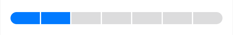
Obviously we don’t want our segments to be black. If we knew they would all be the same colour, we could add a foregroundColor modifier to the whole HStack, but we’ll need some to be highlighted and some to be fainter, so instead we’ll apply colours within the ForEach block. While we’re prototyping, let’s say we want the first 4 of our segments to be highlighted. For this, we’ll need the index value that ForEach passes into its block:
ForEach(0 ..< 10) { index in
  Rectangle()
   .foregroundColor(index < 4 ? .accentColor
                              : Color.secondary.opacity(0.3))
}
Here, I’m using the control’s default accent colour to indicate highlighted segments, and the secondary colour (which is by default a dark grey), lightened by reducing its opacity. This is a trick which works because the default backing of the view is white; if the control were to be sitting above some other colour we might need to adjust these. But these will do for now.
And now it’s starting to look right:
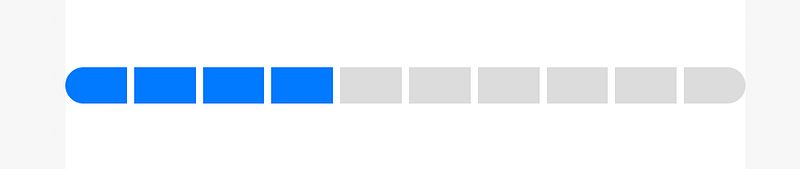
Let’s refactor the component by moving a lot of those ‘magic’ values into variables that will make the bar easier to customise:
struct SegmentedProgressView: View {
  var value: Int = 4
  var maximum: Int = 10
  var height: CGFloat = 20
  var spacing: CGFloat = 4
  var selectedColor: Color = .accentColor
  var unselectedColor: Color = Color.secondary.opacity(0.3)
var body: some View {
HStack(spacing: spacing) {
ForEach(0 ..< maximum) { index in
Rectangle()
.foregroundColor(index < self.value ? self.selectedColor : self.unselectedColor)
}
}
.frame(maxHeight: height)
.clipShape(Capsule())
}
}It’s now easier to see what this control looks like with different settings. For example, with just a few tweaks to those values we can get something like this:
Because Swift creates a default initializer for structs with optional arguments for any variables with default values, we can override any of those values when adding this view into a parent view.
We can also remove the default values from any variables that ought to always be specified. In this case, the value — the number of segments to highlight — isn’t something that you’d ever want to have a default. You could make the same argument for maximum, too, but when you’re building something for your own project you may decide that setting a sensible, but changeable, default is enough.
If we remove the default from value, our storyboard will no longer compile because we need to specify a value. That means the whole storyboard code, with adjusted variables to suit my own need, is now:
import SwiftUI
import PlaygroundSupport
struct SegmentedProgressView: View {
var value: Int
var maximum: Int = 7
var height: CGFloat = 10
var spacing: CGFloat = 2
var selectedColor: Color = .accentColor
var unselectedColor: Color = Color.secondary.opacity(0.3) var body: some View {
HStack(spacing: spacing) {
ForEach(0 ..< maximum) { index in
Rectangle()
.foregroundColor(index < self.value ? self.selectedColor : self.unselectedColor)
}
}
.frame(maxHeight: height)
.clipShape(Capsule())
}
}PlaygroundPage.current.liveView = UIHostingController(
rootView: SegmentedProgressView(value: 2)
)If you’re following along, you’ll notice that there’s no extra padding around the component: it runs right to the edge of your preview area, whether that’s an iPhone mockup in Xcode’s preview panel or the edges of the LiveView in Swift Playgrounds. This is intentional: you apply the necessary spacing around the control in its parent view, which will be aware of what other visual elements it will be sharing a screen with.
Managing changes
Displaying a component on its own in a preview is all well and good, but what does it look like as the value changes?
Rather than previewing the component directly, let’s embed it into a new view. We’ll build something that increases the value by 1 every time you tap on a button, resetting to zero once the value hits the maximum.
Add this view to your playground underneath the SegmentedProgressView:
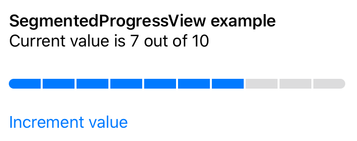
struct ExampleOfProgress: View {
  @State var value = 0
  var maximum = 10
var body: some View {
VStack(alignment: .leading) {
Text("SegmentedProgressView example")
.font(.headline)
Text("Current value is \(value) out of \(maximum)")
.font(.body)
SegmentedProgressView(value: value, maximum: maximum)
.padding(.vertical)
Button(action: {
self.value = (self.value + 1) % (self.maximum + 1)
}) {
Text("Increment value")
}
}
.padding()
}
}Adjust your preview so that it loads this new view:
PlaygroundPage.current.liveView =
  UIHostingController(rootView: ExampleOfProgress())
And now we can see that the progress bar updates whenever value changes:
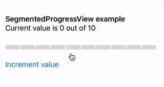
That is pretty good for such a small amount of code, isn’t it?
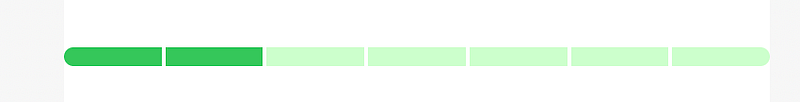
At the moment, though, as soon as the value changes, the change on the progress bar is instantaneous. But a little bit of animation could make the transition look that little bit slicker, without slowing the user down.
The good news is that SwiftUI supports animation out of the box. Indeed, you can apply some animation to the custom control by applying a modifier within its parent, and not changing a line of the progress bar’s code at all!
In ExampleOfProgress, change the call to SegmentedProgressView:
SegmentedProgressView(value: value, maximum: maximum)
  .animation(.default)
  .padding(.vertical)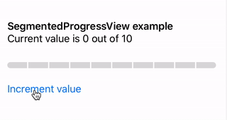
Now, whenever a segment changes colour, the transition from one hue to the other is gradual rather than instant.
SwiftUI does this by noticing that the only attribute changing is each segment’s foregroundColor property, so it manages the animation for each changing Rectangle for us.
If I wanted this animation everywhere I was going to use SegmentedProgressView, I could move that modifier into the custom control. It’s kind of great that SwiftUI lets the parent of this component make that decision, though, so right now I’m happy leaving it out.
Ultimately, I’d prefer a different animation — maybe having the segment’s highlight color ‘swipe’ in and out from left to right, as you’d expect with a continuous percentage-based progress bar. But for now, this component does its job, showing me the information I want in the manner I want it.
And so, I’m going to leave any further tweaks until a later date, while I get on with the rest of my app.
The full Swift code for the above is available in this GitHub gist.


