
Creating a Sales KPI with Line Graph in Power BI
In today’s data-driven world, visualizing key performance indicators (KPIs) is crucial for making informed business decisions. Power BI, a robust business analytics tool by Microsoft, empowers users to create dynamic and interactive visualizations. One of the most effective ways to track and analyze sales data is by using line graphs to represent sales KPIs.
Why use line graphs for sales KPIs?
- Trend Analysis: Line graphs are excellent for identifying trends and patterns over time, allowing businesses to spot growth or decline in sales performance.
- Comparative View: Easily compare different sales metrics or time periods to gauge performance and make data-driven decisions.
- Clear Visual Representation: With their simple, clean design, line graphs make complex data easy to understand at a glance.
Steps to create a sales KPI with a line graph in Power BI:
- Data Preparation: Ensure your sales data is clean, organized, and imported into Power BI.
- Setting up the Line Graph: Select the line graph visual and drag your sales KPIs onto the X and Y axes.
- Customization: Customize the graph with titles, labels, and colors to enhance readability and relevance.
- Interactivity: Add filters and slicers to allow users to interact with the data and focus on specific areas of interest.
Creating a sales KPI with a line graph in Power BI is an invaluable skill for any business looking to leverage data for strategic insights.
This is how our end result is going to look like:
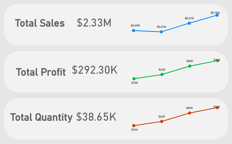
Building the KPI
We will go through these steps:
- Creating the Base for the KPI
- Creating the heading Text Box
- Creating the Sales KPI card
- Creating the Line Chart
- Creating other two KPIs
- Adjusting the Canvas
Happy learning!

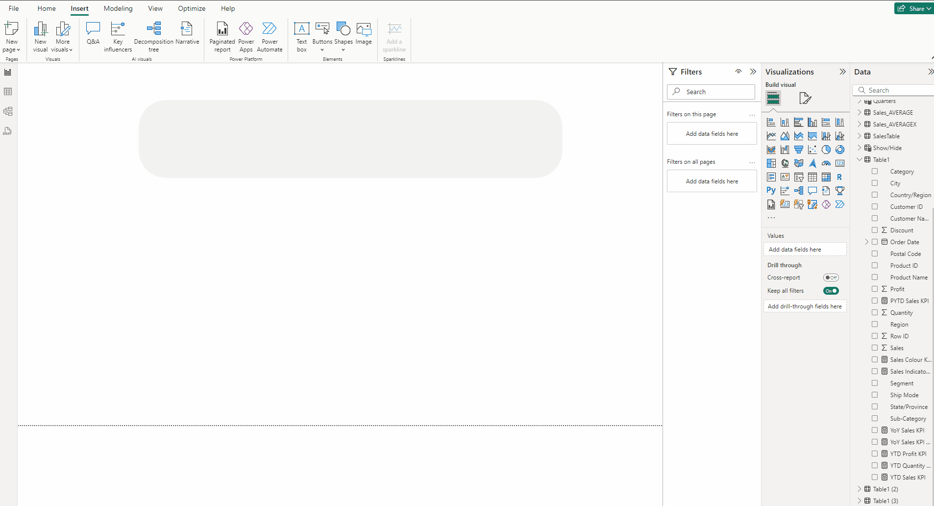
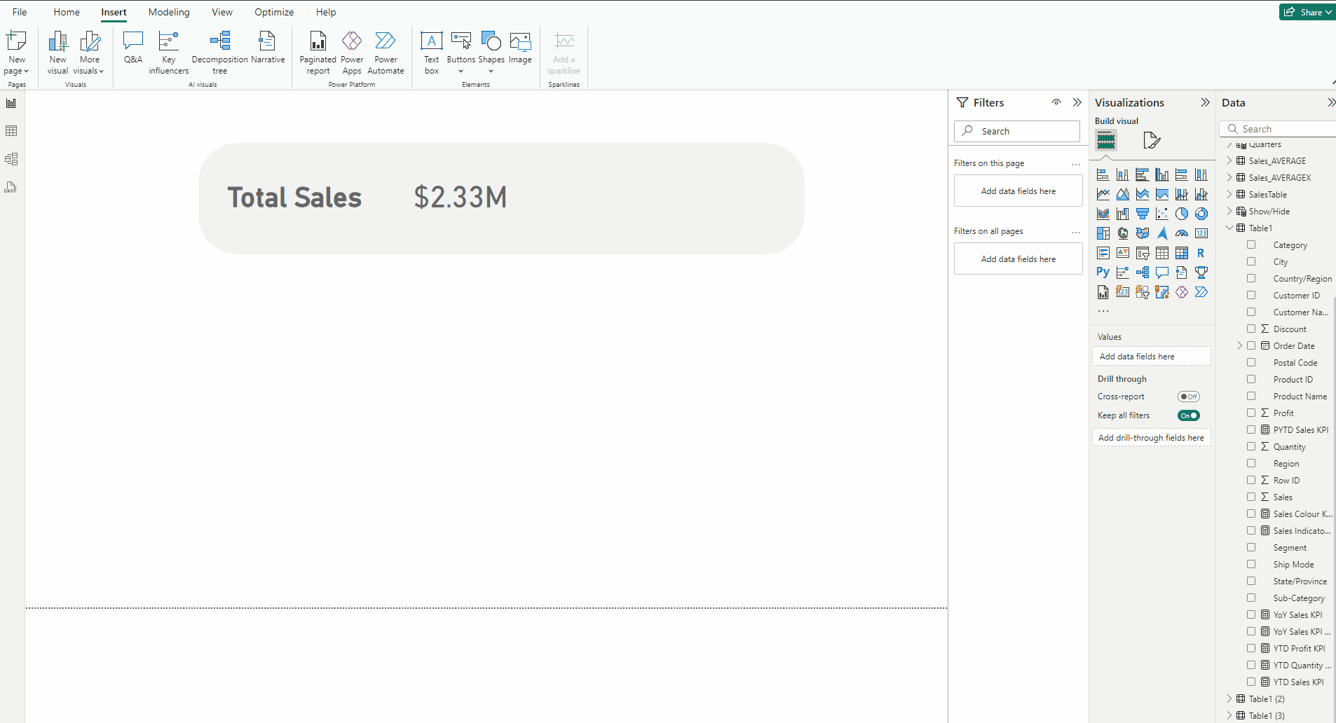
Creating the Base for the KPI:
- Go to the Insert tab and select Rounded Rectangle from Shapes.
- Expand Shape and use 35% in Rounded Corners.
- Expand Style and in Color use #F2F2F2.
- In the Format visual → General →Properties set Height to 155 and Width to 841.
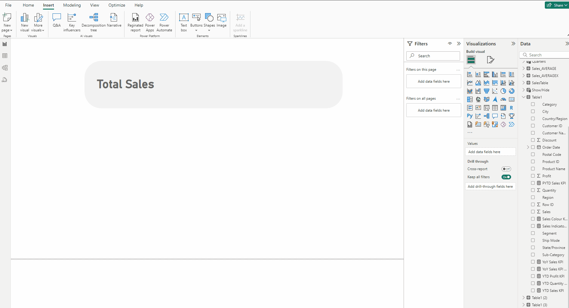
Creating the heading Text Box:
- In the Insert tab select Text box.
- Type Total Sales.
- Set Font to DIN.
- Set size to 32 and Bold the Font.
- In the Format visual → General →Effects turn off Background.
Creating the Sales KPI card:
- Add a Card visual and put Sales measure to it.
- Set Font to DIN, size to 35 and Color to #666666.
- In the Format visual → General →Effects turn off Background.
- Turn off Category label.
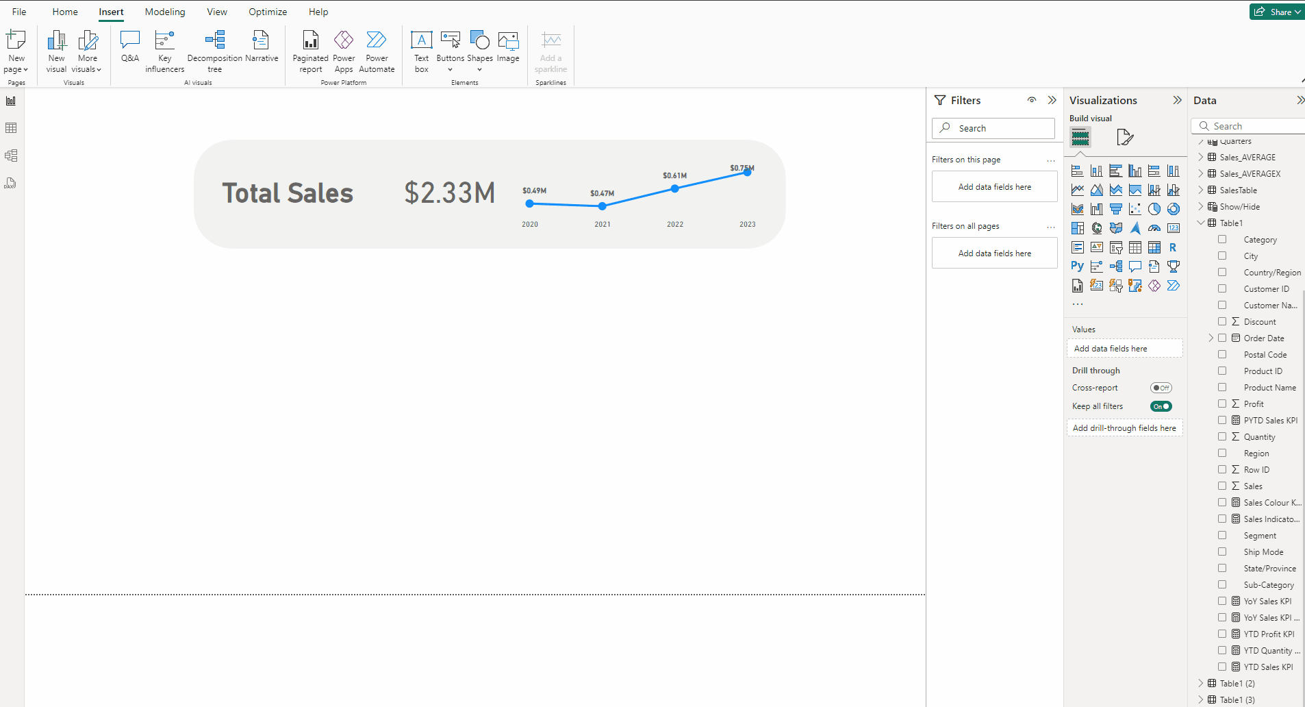
Creating the Line Chart:
- Add a Line chart and put Order Date in X-axis and Sum of Sales in Column Y-axis.
- In the Format visual → General →Properties set Height to 111 and Width to 343.
- Turn off Title and in Effects turn off Background.
- Expand Y-axis, turn off Title and Values. Repeat the same for X-axis.
- Expand Gridlines, turn off Horizontal.
- Turn on Data labels.
- Expand Markers turn on Show for all categories.
- Set size to 7.
- In Lines →Color use this #118DFF.
- In Data labels →Value set font to DIN, Bold the font and set Color to #666666.

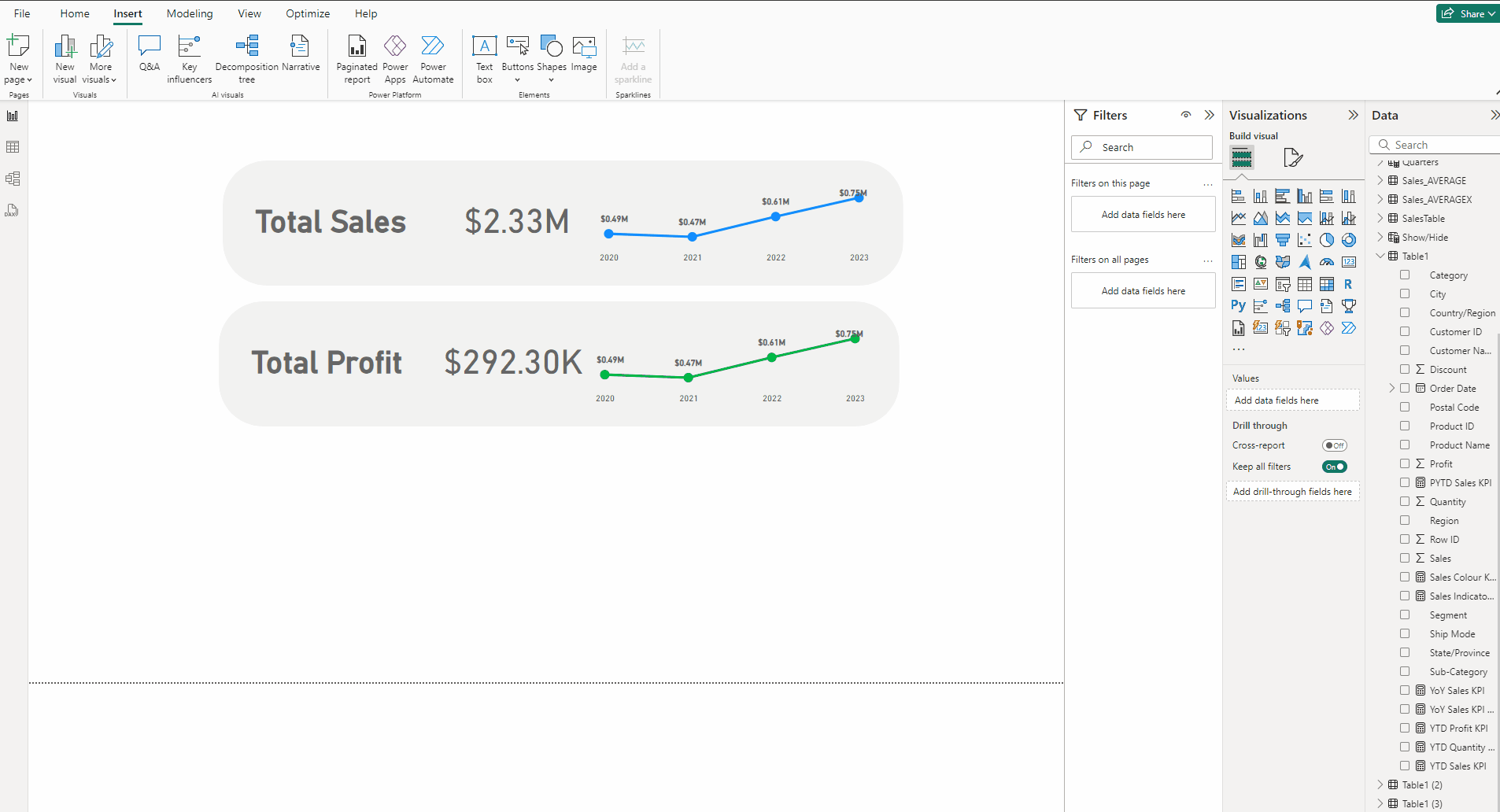
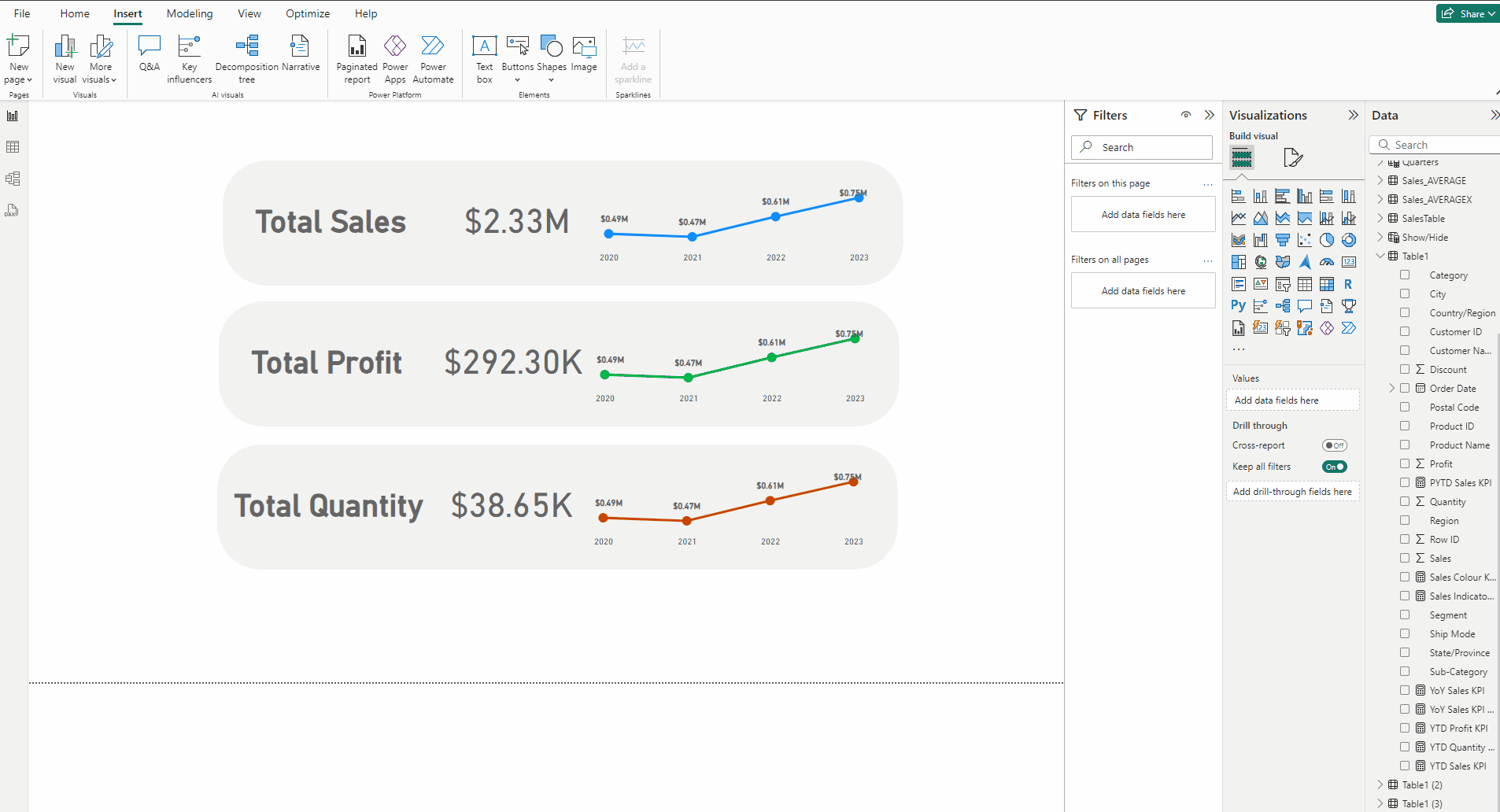
Creating other two KPIs:
- Copy and paste the entire KPI.
- Replace Total Sales with Total Profit.
- In KPI card and line chart replace Sales with Profit.
- In Lines →Color use this #00B947.
- Copy and paste the entire KPI.
- Replace Total Sales with Total Quantity.
- In KPI card and line chart replace Sales with Quantity.
- In Lines →Color use this #CB4501.
Adjusting the Canvas:
- Deselect everything.
- Expand Canvas background.
- Set Color to #E6E6E6 and set Transparency to 0%.
Download the data for the KPI from this link.
Download the PBIX file for the KPI from this link.
Thank you for your attention!
Follow me or subscribe to get all my Power BI articles!
Don’t forget to subscribe to
👉 Power BI Publication
👉 Power BI Newsletter
and join our Power BI community: