
Creating a Dynamic Table Management Dashboard with Tailwind CSS and DaisyUI


Developing a comprehensive leads management dashboard is crucial for efficient business operations. In this article, we’ll explore how to use Tailwind CSS and DaisyUI to build a feature-rich leads management dashboard. The provided code snippets will guide you through the process of setting up your project.
Tailwind CSS Configuration
To get started, configure Tailwind CSS with DaisyUI in your tailwind.config.js file:
/** @type {import('tailwindcss').Config} */
export default {
  content: ['./index.html', './src/**/*.{js,ts,jsx,tsx}'],
  theme: {
    extend: {},
  },
  plugins: [require('daisyui')],
};
This configuration ensures that Tailwind CSS is applied to the specified files, and DaisyUI is included as a plugin.
Leads Component
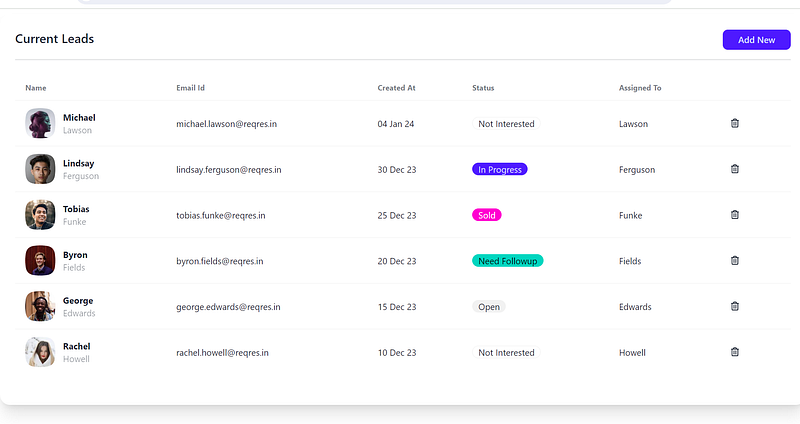
Now, let’s dive into the Leads.jsx file, where we define components for our leads management dashboard. The code includes a TopSideButtons component for adding new leads and a DeleteCurrentLead component for deleting leads.
import moment from 'moment';
import { FaRegTrashAlt } from 'react-icons/fa';

const TopSideButtons = () => {
  return (
    <>
      <div className="inline-block float-right">
        <button
          className="btn px-6 btn-sm normal-case btn-primary"
          onClick={() => document.getElementById('my_modal_1').showModal()}
        >
          Add New
        </button>
      </div>
      <dialog id="my_modal_1" className="modal">
        <div className="modal-box  ">
          <form method="dialog">
            <button className="btn btn-sm btn-circle absolute right-2 top-2">
              ✕
            </button>
            <h3 className="font-semibold text-2xl pb-6 text-center">
              Add New Lead
            </h3>
            <div className="form-control w-full mt-4">
              <label className="label">
                <span className="label-text text-base-content undefined">
                  First Name
                </span>
              </label>
              <input
                type="text"
                placeholder=""
                className="input  input-bordered w-full "
                defaultValue=""
              />
            </div>
            <div className="form-control w-full mt-4">
              <label className="label">
                <span className="label-text text-base-content undefined">
                  Last Name
                </span>
              </label>
              <input
                type="text"
                placeholder=""
                className="input  input-bordered w-full "
                defaultValue=""
              />
            </div>
            <div className="form-control w-full mt-4">
              <label className="label">
                <span className="label-text text-base-content undefined">
                  Email Id
                </span>
              </label>
              <input
                type="email"
                placeholder=""
                className="input  input-bordered w-full "
                defaultValue=""
              />
            </div>
            <p className="text-center  text-error mt-16" />
            <div className="modal-action">
              <button className="btn btn-ghost">Cancel</button>
              <button className="btn btn-primary px-6">Save</button>
            </div>
          </form>
        </div>
      </dialog>
    </>
  );
};

const DeleteCurrentLead = ({ email }) => {
  return (
    <>
      {/* Open the modal using document.getElementById('ID').showModal() method */}
      <button
        className=" btn btn-square btn-ghost"
        onClick={() => document.getElementById('my_modal_2').showModal()}
      >
        <FaRegTrashAlt className="w-5 " />
      </button>

      <dialog id="my_modal_2" className="modal">
        <div className="modal-box">
          <h3 className="font-bold text-lg">Delete Email</h3>
          <p className="py-4">Do you want to delete email: {email} </p>
          <div className="modal-action">
            <form method="dialog">
              {/* if there is a button in form, it will close the modal */}
              <div className="flex gap-3">
                <button className="btn">Close</button>
                <button className="btn btn-error">Delete</button>
              </div>
            </form>
          </div>
        </div>
      </dialog>
    </>
  );
};

function Leads() {
  const leads = [
    {
      id: 7,
      email: '[email protected]',
      first_name: 'Michael',
      last_name: 'Lawson',
      avatar: 'https://reqres.in/img/faces/7-image.jpg',
    },
    {
      id: 8,
      email: '[email protected]',
      first_name: 'Lindsay',
      last_name: 'Ferguson',
      avatar: 'https://reqres.in/img/faces/8-image.jpg',
    },
    {
      id: 9,
      email: '[email protected]',
      first_name: 'Tobias',
      last_name: 'Funke',
      avatar: 'https://reqres.in/img/faces/9-image.jpg',
    },
    {
      id: 10,
      email: '[email protected]',
      first_name: 'Byron',
      last_name: 'Fields',
      avatar: 'https://reqres.in/img/faces/10-image.jpg',
    },
    {
      id: 11,
      email: '[email protected]',
      first_name: 'George',
      last_name: 'Edwards',
      avatar: 'https://reqres.in/img/faces/11-image.jpg',
    },
    {
      id: 12,
      email: '[email protected]',
      first_name: 'Rachel',
      last_name: 'Howell',
      avatar: 'https://reqres.in/img/faces/12-image.jpg',
    },
  ];

  const getDummyStatus = (index) => {
    if (index % 5 === 0) return <div className="badge">Not Interested</div>;
    else if (index % 5 === 1)
      return <div className="badge badge-primary">In Progress</div>;
    else if (index % 5 === 2)
      return <div className="badge badge-secondary">Sold</div>;
    else if (index % 5 === 3)
      return <div className="badge badge-accent">Need Followup</div>;
    else return <div className="badge badge-ghost">Open</div>;
  };

  return (
    <>
      <div className={'card w-full p-6 bg-base-100 shadow-xl mt-2'}>
        {/* Title for Card */}
        <div className={`text-xl font-semibold inline-block`}>
          Current Leads
          {/* Top side button, show only if present */}
          {<TopSideButtons /> && (
            <div className="inline-block float-right">{<TopSideButtons />}</div>
          )}
        </div>
        <div className="divider mt-2"></div>

        {/** Card Body */}
        <div className="h-full w-full pb-6 bg-base-100">
          {/* Leads List in table format loaded from slice after api call */}
          <div className="overflow-x-auto w-full">
            <table className="table w-full">
              <thead>
                <tr>
                  <th>Name</th>
                  <th>Email Id</th>
                  <th>Created At</th>
                  <th>Status</th>
                  <th>Assigned To</th>
                  <th></th>
                </tr>
              </thead>
              <tbody>
                {leads.map((l, k) => {
                  return (
                    <tr key={k}>
                      <td>
                        <div className="flex items-center space-x-3">
                          <div className="avatar">
                            <div className="mask mask-squircle w-12 h-12">
                              <img src={l.avatar} alt="Avatar" />
                            </div>
                          </div>
                          <div>
                            <div className="font-bold">{l.first_name}</div>
                            <div className="text-sm opacity-50">
                              {l.last_name}
                            </div>
                          </div>
                        </div>
                      </td>
                      <td>{l.email}</td>
                      <td>
                        {moment(new Date())
                          .add(-5 * (k + 2), 'days')
                          .format('DD MMM YY')}
                      </td>
                      <td>{getDummyStatus(k)}</td>
                      <td>{l.last_name}</td>
                      <td>
                        <DeleteCurrentLead email={l.last_name} />
                      </td>
                    </tr>
                  );
                })}
              </tbody>
            </table>
          </div>
        </div>
      </div>
    </>
  );
}

export default Leads;
The Leads component integrates the TopSideButtons and DeleteCurrentLead components to create a dynamic leads management dashboard.
App Component
Finally, in the App.jsx file, we import the necessary styles and our Leads component to render the entire application.
import './App.css';
import Leads from './components/Leads';

export default function App() {
  return <Leads />;
}
This simple App component sets up our leads management dashboard within the application.
Demo
To experience the functionality of the leads management dashboard, check out the live demo on StackBlitz: Leads Management Demo
Feel free to customize the code according to your specific requirements and explore the versatility offered by Tailwind CSS and DaisyUI in building modern and responsive web applications. Happy coding!


