
Creating a dual-axis Combo Chart in Python
A hands-on tutorial to create a dual-axis combo chart with Matplotlib, Seaborn, and Pandas plot()

Visualizing data is vital to analyzing data. If you can’t see your data — and see it in multiple ways you‘ll have a hard time analyzing that data.
Source from Python Data [1]
There are many different graphs to visualize data in python and thankfully with Matplotlib, Seaborn, Pandas, Plotly, etc., you can make some pretty powerful visualizations during data analysis. Among them, the combo chart is a combination of two chart types (such as bar and line) on the same graph. It’s one of Excel’s most popular built-in plots and is widely used to show different types of information.
It’s pretty easy to plot multiple charts on the same graph, but working with a dual-axis can be a bit confusing at first. In this article, we’ll explore how to create a dual-axis combo chart with Matplotlib, Seaborn, and Pandas plot(). This article is structured as follows:
- Why use dual-axis: the problem using the same axis
- Matplotlib
- Seaborn
- Pandas plot()
Please check out the Notebook for the source code. More tutorials are available from Github Repo.
For the demo, we’ll use the London climate data from Wikipedia:
x_label = ['Jan', 'Feb', 'Mar', 'Apr', 'May', 'Jun', 'Jul', 'Aug', 'Sep', 'Oct', 'Nov', 'Dec']
average_temp = [5.2, 5.3,7.6,9.9,13.3,16.5,18.7, 18.5, 15.7, 12.0, 8.0, 5.5]
average_percipitation_mm = [55.2, 40.9, 41.6, 43.7, 49.4, 45.1, 44.5, 49.5, 49.1, 68.5, 59.0, 55.2]
london_climate = pd.DataFrame(
{
'average_temp': average_temp,
'average_percipitation_mm': average_percipitation_mm
},
index=x_label
)1. Why use dual-axis: the problem using the same axis
It’s pretty easy to plot multiple charts on the same graph. For instance, with Matplotlib, we can simply call the chart function one after another.
plt.plot(x, y1, "-b", label="average temp")
plt.bar(x, y2, width=0.5, alpha=0.5, color='orange', label="average percipitation mm", )
plt.legend(loc="upper left")
plt.show()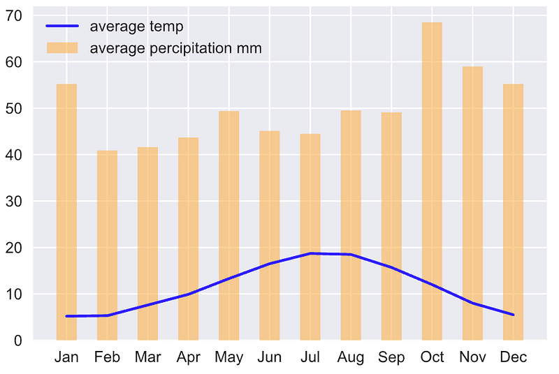
This certainly creates a combo chart, but line and bar graphs use the same y-axis. It can be very difficult to view and interpret, especially when data are in different ranges.
We can solve this issue effectively using the dual-axis. But working with dual-axis can be a bit confusing at first. Let’s go ahead and explore how to create a dual-axis combo chart with Matplotlib, Seaborn, and Pandas plot().
2. Matplotlib
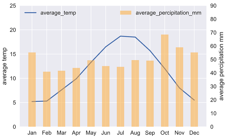
The trick to make a dual-axis combo chart is to use two different axes that share the same x-axis. This is possible through the twinx() method in Matplotlib. This generates two separate y-axes that share the same x-axis:
# Create figure and axis #1
fig, ax1 = plt.subplots()
# plot line chart on axis #1
ax1.plot(x, average_temp)
ax1.set_ylabel('average temp')
ax1.set_ylim(0, 25)
ax1.legend(['average_temp'], loc="upper left")# set up the 2nd axis
ax2 = ax1.twinx()# plot bar chart on axis #2
ax2.bar(x, average_percipitation_mm, width=0.5, alpha=0.5, color='orange')
ax2.grid(False) # turn off grid #2
ax2.set_ylabel('average percipitation mm')
ax2.set_ylim(0, 90)
ax2.legend(['average_percipitation_mm'], loc="upper right")plt.show()The line chart is plotted on the ax1 as we normally do. The trick is to call ax2 = ax1.twinx() to set up the 2nd axis and plot the bar chart on it. Note, ax2.grid(False) is called to hide the grid on the 2nd axis to avoid a grid display issue. Since the two charts are using the same x values, they share the same x-axis. By executing the code, you should get the following output:
3. Seaborn
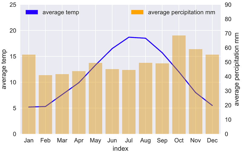
Seaborn is a high-level Data Visualization library built on top of Matplotlib. Behind the scenes, it uses Matplotlib to draw its plots. For low-level configurations and setups, we can always call Matplotlib’s APIs, and that’s the trick to make a dual-axis combo chart in Seaborn:
# plot line graph on axis #1
ax1 = sns.lineplot(
    x=london_climate.index,
    y='average_temp',
    data=london_climate_df,
    sort=False,
    color='blue'
)
ax1.set_ylabel('average temp')
ax1.set_ylim(0, 25)
ax1.legend(['average_temp'], loc="upper left")
# set up the 2nd axis
ax2 = ax1.twinx()# plot bar graph on axis #2
sns.barplot(
x=london_climate.index,
y='average_percipitation_mm',
data=london_climate_df,
color='orange',
alpha=0.5,
ax = ax2 # Pre-existing axes for the plot
)
ax2.grid(b=False) # turn off grid #2
ax2.set_ylabel('average percipitation mm')
ax2.set_ylim(0, 90)
ax2.legend(['average_percipitation_mm'], loc="upper right")plt.show()sns.lineplot() returns a Matplotlib axes object ax1. Then, similar to the Matplotlib solution, we also call ax2 = ax1.twinx() to set up the 2nd axis. After that, the sns.barplot() is called with the argument ax = ax2 to plot on the existing axes ax2. By executing the code, you should get the following output:

You may notice that the legend has been displayed incorrectly with the bar chart in black color. One fix we can do is to create a custom legend using mpatches.Patch():
import matplotlib.patches as mpatches# plot line graph on axis #1
ax1 = sns.lineplot(
x=london_climate.index,
y='average_temp',
data=london_climate_df,
sort=False,
color='blue'
)
ax1.set_ylabel('average temp')
ax1.set_ylim(0, 25)
ax1_patch = mpatches.Patch(color='blue', label='average temp')
ax1.legend(handles=[ax1_patch], loc="upper left")# set up the 2nd axis
ax2 = ax1.twinx()# plot bar chart on axis #2
sns.barplot(
x=london_climate.index,
y='average_percipitation_mm',
data=london_climate_df,
color='orange',
alpha=0.5,
ax = ax2 # Pre-existing axes for the plot
)
ax2.grid(False) # turn off grid #2
ax2.set_ylabel('average percipitation mm')
ax2.set_ylim(0, 90)
ax2_patch = mpatches.Patch(color='orange', label='average percipitation mm')
ax2.legend(handles=[ax2_patch], loc="upper right")plt.show()mpatches.Patch() creates a Matplotlib 2D artist object and we pass it to the axes’ legend. By executing the code, you shall get the following output:
4. Pandas plot
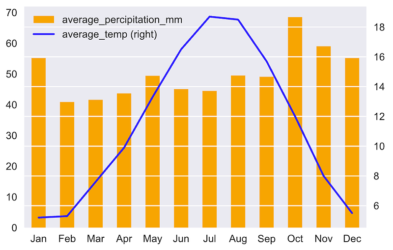
Pandas use plot() method to create charts. Under the hood, it calls Matplotlib’s API to create the chart by default (Note: the backend defaults to Matplotlib). The trick is to set the argument secondary_y to True to allow the 2nd chart to be plotted on the secondary y-axis.
# Create the figure and axes object
fig, ax = plt.subplots()
# Plot the first x and y axes:
london_climate.plot(
use_index=True,
kind='bar',
y='average_percipitation_mm',
ax=ax,
color='orange'
)# Plot the second x and y axes.
# By secondary_y = True a second y-axis is requested
london_climate.plot(
use_index=True,
y='average_temp',
ax=ax,
secondary_y=True,
color='blue'
)plt.show()Note, we also set use_index=True to use the index as ticks for the x-axis. By executing the code, you should get the following output:
Conclusion
In this article, we have learned how to create a dual-axis combo chart with Matplotlib, Seaborn, and Pandas plot(). The combo chart is one of the most popular charts in Data Visualization, knowing how to create a dual-axis combo chart can be very helpful to analyzing data.
Thanks for reading. Please check out the Notebook for the source code and stay tuned if you are interested in the practical aspect of machine learning. More tutorials are available from the Github Repo.
References
- [1] Python Data — Visualizing data- overlaying charts in python


