
Creating a customizable Python Visual in Power BI
Hello World!

Today we are going to create a python visual in Power BI that can be changed dynamically by using an external slicer.
First thing we need to do is import some data. For this example we are going to import some Pokedex data from github, by using a python Data Source:

After this step, we can select the tables that we need:

If you have done everything correctly, the two tables should be related by the id column.
Let’s have a look at the python script we’ve just used:
In the first part we open the url from github to retrieve the pokedex json using urllib (this will work only in python 3.x). After we have sent the GET request we can create a dict with the data by using json.loads on the decoded response.
In this second part we are going to do some transformation. You can bypass this part and just do this edits in Power Query if you prefer.
With this code we create 3 dataframes, the first is the main one with all the columns. The other ones are pokedex_main which contains everything except the pokemon types and pokedex_type which contains the exploded Pokemon types and their Pokemon id.
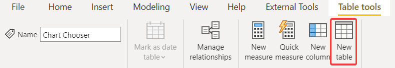
Now we need to add a few things before we can start writing the python visual.
First we need to create a new DAX Table that contains the chart types we are going to use:
Now that we have created the table we are going to need a measure that checks which chart is selected:
If you take a closer look at this formula (and you know a bit of DAX) you are going to notice that there is something strange going on. Why are we checking if the column Type has no selected values? The answer is that we need to do this to avoid the measure being calculated on every possible combination of rows between the tables. Using that check we can assure that the measure will be calculated only on a valid type->id relation.
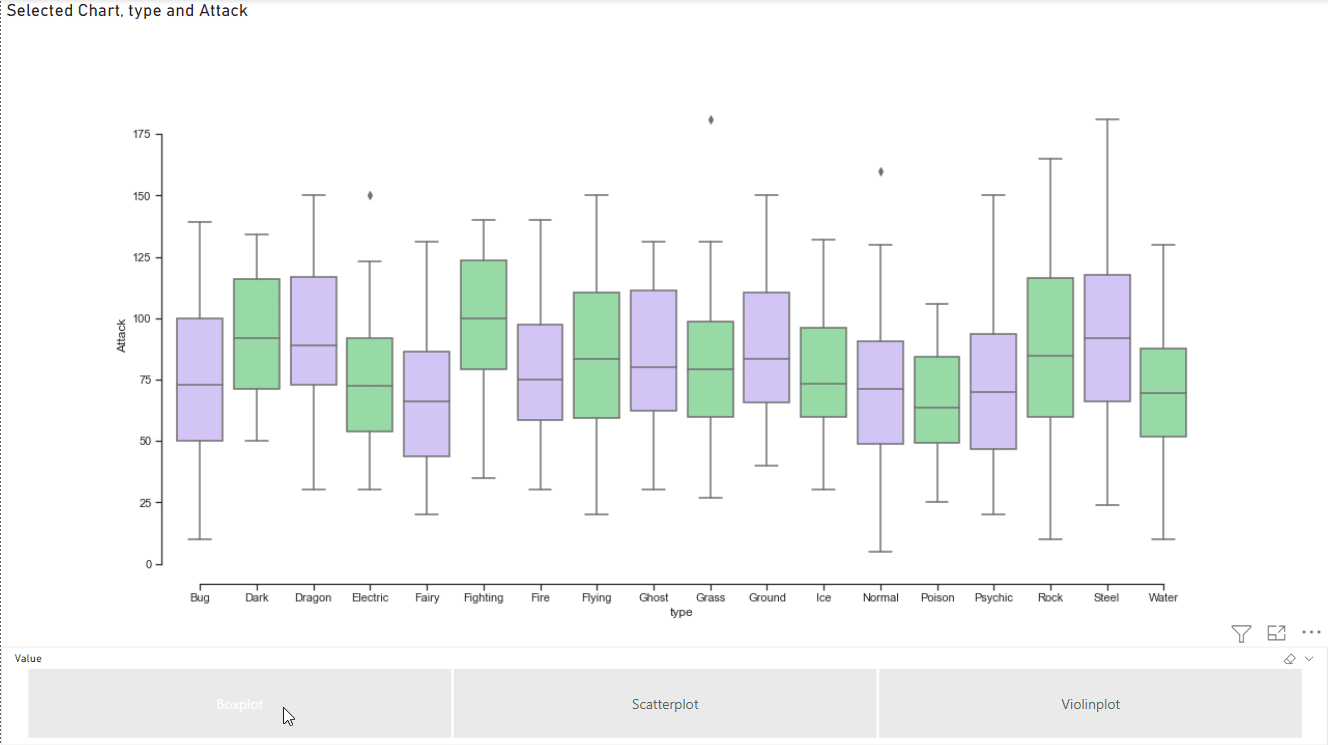
Now we can add the python visual and the slicer using the Value field from our Chart Chooser table:
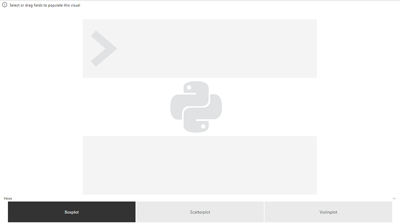
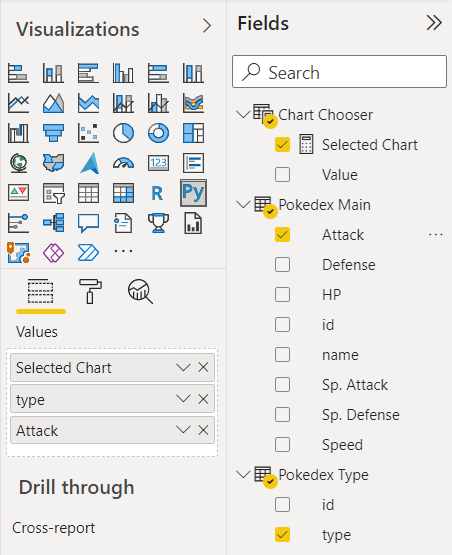
We can now add the fields to the visual:
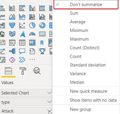
Pay attention that we need to make sure that the Attack column is not summarized otherwise the charts we are going to use won’t work correctly:
Now we can write the code for the visual:
Let’s have a look at what this code does. When you use a python Power BI visual, your data will always be in a dataframe called dataset, so that’s what you’ll need to read your data from.
We know that the measure Selected Chart we’ve added to the fields will always be the same on all the rows of the dataset variable, so we just need to check for the first “cell” to identify which chart we need.
After that we can use seaborn to make a different chart based on what the user has selected on the report:
That’s all for today, you can find the report and the code on my github as usual.
If you’d like to support me consider subscribing to Medium using my referral link:
If you’d like to know more about me here are my personal links: Personal Website: https://inzaniak.github.io
Social Links: https://inzaniak.github.io/links.html
Linkedin: https://www.linkedin.com/in/umberto-grando-a8527b150/


