avatarNaveen Venkatesan

Free AI web copilot to create summaries, insights and extended knowledge, download it at here

3327

Abstract

">0</span>, <span class="hljs-number">0</span>]) <span class="hljs-attr">ax2</span> = fig.add_subplot(gs[<span class="hljs-number">0</span>, <span class="hljs-number">1</span>]) <span class="hljs-attr">ax3</span> = fig.add_subplot(gs[<span class="hljs-number">1</span>, :])</pre></div><figure id="f9cc"><img src="https://cdn-images-1.readmedium.com/v2/resize:fit:800/1*lv4TdARFXdrxxWRPM61_0A.png"><figcaption>Basic gridspec layout</figcaption></figure><p id="b2eb">There it is! We have the basic layout we were trying to create initially. The current layout is using 4 equally-sized squares with the default amount of spacing between them. Say we wanted a bit more control of the layout — we can start with the horizontal and vertical gaps between the individual plot in the figure, we can pass <code>hspace</code> (height space) and <code>wspace</code> (width space) as arguments. These keyword arguments take in a float value corresponding to a fraction of the average axes height and width.</p><div id="97e4"><pre><span class="hljs-comment"># Edit gridspec to change hspace and wspace</span> gs = fig.add_gridspec(<span class="hljs-attribute">nrows</span>=2, <span class="hljs-attribute">ncols</span>=2, <span class="hljs-attribute">hspace</span>=0.5, <span class="hljs-attribute">wspace</span>=0.5)</pre></div><figure id="50b4"><img src="https://cdn-images-1.readmedium.com/v2/resize:fit:800/1*4AuKZqC_g2_DOf5-LNRvjg.png"><figcaption>Gridspec layout with hspace and wspace values of 0.5</figcaption></figure><p id="4d4d">As you can see, the plots are now farther spaced out because the space is being calculated as half of the average axis width and height. Now, say that we actually wanted <code>Plot 1</code> to be twice the width of <code>Plot 2</code>, and <code>Plot 3</code> to have half the height of <code>Plot 1</code> and <code>Plot 2</code>. We can adjust this using the <code>height_ratios</code> and <code>width_ratios</code> keyword arguments. Both these arguments take a list of floats that describe the ratios of the axes heights and widths, respectively.</p><div id="18cb"><pre><span class="hljs-comment"># Edit gridspec to change height_ratios and width_ratios</span> <span class="hljs-attribute">gs</span> = fig.add_gridspec(nrows=<span class="hljs-number">2</span>, ncols=<span class="hljs-number">2</span>, height_ratios=[<span class="hljs-number">2</span>, <span class="hljs-number">1</span>], width_ratios=[<span class="hljs-number">2</span>, <span class="hljs-number">1</span>])</pre></div><figure id="e9b3"><img src="https://cdn-images-1.readmedium.com/v2/resize:fit:800/1*4dYLDB7iOFmEPD-61Pbg7w.png"><figcaption>Gridspec layout with height_ratios and width_ratios changed</figcaption></figure><p id="5bd6">There we have very simply created our more complex grid layout with different heights and widths. So now, let’s use our last layout to create our final panelled figure:</p><div id="c197"><pre><span class="hljs-comment"># Styling</span> <span class="hljs-attribute">plt</span>.style.use(<span class="hljs-string">"seaborn-darkgrid"</span>) <span class="hljs-attribute">plt</span>.rcParams[<span class="hljs-string">"font.family"</span>] = <span class="hljs-string">"Avenir"</span> <span class="hljs-attribute">plt</span>.rcParams[<span class="hljs-string">"font.size"</span>] = <span class="hl

Options

js-number">16</span></pre></div><div id="a886"><pre><span class="hljs-comment"># Create Blank Figure</span> <span class="hljs-attribute">fig</span> = plt.figure(figsize=(<span class="hljs-number">10</span>, <span class="hljs-number">10</span>))</pre></div><div id="7a2b"><pre><span class="hljs-comment"># Create 4x4 Grid</span> <span class="hljs-attribute">gs</span> = fig.add_gridspec(nrows=<span class="hljs-number">2</span>, ncols=<span class="hljs-number">2</span>, height_ratios=[<span class="hljs-number">2</span>, <span class="hljs-number">1</span>], width_ratios=[<span class="hljs-number">2</span>, <span class="hljs-number">1</span>])</pre></div><div id="20c2"><pre><span class="hljs-comment"># Create Three Axes Objects</span> <span class="hljs-attr">ax1</span> = fig.add_subplot(gs[<span class="hljs-number">0</span>, <span class="hljs-number">0</span>]) <span class="hljs-attr">ax2</span> = fig.add_subplot(gs[<span class="hljs-number">0</span>, <span class="hljs-number">1</span>]) <span class="hljs-attr">ax3</span> = fig.add_subplot(gs[<span class="hljs-number">1</span>, :])</pre></div><div id="f873"><pre><span class="hljs-comment"># Dummy Data</span> <span class="hljs-attribute">x</span> = np.linspace(<span class="hljs-number">0</span>, <span class="hljs-number">2</span>*np.pi, <span class="hljs-number">1000</span>)</pre></div><div id="fe7c"><pre># Plot Data ax1.plot(x, <span class="hljs-built_in">np</span>.<span class="hljs-built_in">sin</span>(x)) ax2.plot(x, <span class="hljs-built_in">np</span>.<span class="hljs-built_in">sin</span>(x)**<span class="hljs-number">2</span>) ax3.plot(x, <span class="hljs-built_in">np</span>.<span class="hljs-built_in">sin</span>(x) + <span class="hljs-built_in">np</span>.<span class="hljs-built_in">cos</span>(<span class="hljs-number">3</span>*x))</pre></div><div id="2117"><pre><span class="hljs-comment"># Set axis labels</span> ax1.set_ylabel(<span class="hljs-string">"y"</span>, <span class="hljs-attribute">size</span>=20) ax3.set_xlabel(<span class="hljs-string">"x"</span>, <span class="hljs-attribute">size</span>=20) ax3.set_ylabel(<span class="hljs-string">"y"</span>, <span class="hljs-attribute">size</span>=20)</pre></div><figure id="d09a"><img src="https://cdn-images-1.readmedium.com/v2/resize:fit:800/1*AgMgkqr-LhMDgXmxZBYXpA.png"><figcaption>Final panelled plot</figcaption></figure><p id="d124">And there we have it! We were able to create our panelled figure very simply using <code>gridspec</code> in <code>matplotlib</code>.</p><h1 id="513d">Conclusion</h1><p id="b27c">This was a very basic introduction to using <code>gridspec</code> to create your panelled figures with multiple plots. You can use the settings shown in this article to create some very sophisticated layouts, even taking advantage of using blank plots in some of the grid elements to create areas of space. The <code>gridspec.ipynb</code> notebook from this article will be available at this <a href="https://github.com/venkatesannaveen/python-science-tutorial">Github repository</a>.</p><p id="1294">Thank you for reading! I appreciate any feedback, and you can find me on <a href="https://twitter.com/naveenv_92">Twitter</a> and connect with me on <a href="https://www.linkedin.com/in/naveenvenkatesan/">LinkedIn</a> for more updates and articles.</p></article></body>

Python Science Plotting

Create Panel Figure Layouts in Matplotlib with Gridspec

Use gridspec to layout your figure without the need to export multiple plots and use another program to put them together

Photo by Daniel McCullough on Unsplash

Publication figures typically require multiple plots placed into a panelled layout to tell a story. A simple drag-and-drop method to do this could be to individually create each plot, and then use either an image-editing program or even Powerpoint to arrange plots into a full figure and save as one image. The problem with this approach; however, is that size consistency between fonts, etc. is difficult if you have to keep editing the individual plots, resizing, and moving to fit into your figure layout. One way to ensure consistent formatting amongst all of the individual plots is to directly create the panelled figure in matplotlib and export as one image. Fortunately for us, there is a powerful tool called gridspec that we can use to let matplotlib do most of the work for us. Let’s start out by creating a blank figure with a size of 10 x 10 inches:

# Import Libraries
import matplotlib.pyplot as plt
import numpy as np
# Create Blank Figure
fig = plt.figure(figsize=(10, 10))

Let’s say that this is the layout that we want to ultimately produce from our script:

Desired layout for our panelled figure

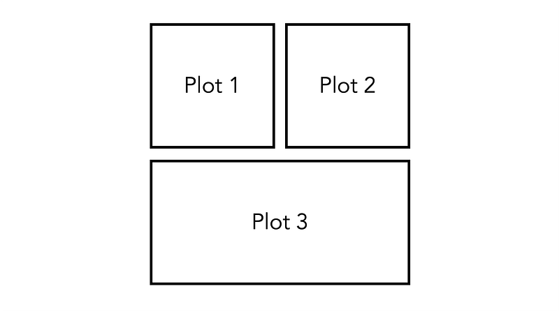
If we want to use gridspec to our advantage, we need to simplify our layout into a grid. So to design the layout, we can think of the above figure as a 4 x 4 grid, with Plot 3 taking up the two bottom squares. We can create this initial grid as follows:

# Create 4x4 Grid
gs = fig.add_gridspec(nrows=2, ncols=2)

Now that we have our grid, we can create three axes objects corresponding to the three plots in the layout above. We can index our gridspec much like we would any two-dimensional array or list. Note that for ax3 we index gs[1, :], meaning that the axis object will span the second row and both of the columns.

# Create Three Axes Objects
ax1 = fig.add_subplot(gs[0, 0])
ax2 = fig.add_subplot(gs[0, 1])
ax3 = fig.add_subplot(gs[1, :])
Basic gridspec layout

There it is! We have the basic layout we were trying to create initially. The current layout is using 4 equally-sized squares with the default amount of spacing between them. Say we wanted a bit more control of the layout — we can start with the horizontal and vertical gaps between the individual plot in the figure, we can pass hspace (height space) and wspace (width space) as arguments. These keyword arguments take in a float value corresponding to a fraction of the average axes height and width.

# Edit gridspec to change hspace and wspace
gs = fig.add_gridspec(nrows=2, ncols=2, hspace=0.5, wspace=0.5)
Gridspec layout with hspace and wspace values of 0.5

As you can see, the plots are now farther spaced out because the space is being calculated as half of the average axis width and height. Now, say that we actually wanted Plot 1 to be twice the width of Plot 2, and Plot 3 to have half the height of Plot 1 and Plot 2. We can adjust this using the height_ratios and width_ratios keyword arguments. Both these arguments take a list of floats that describe the ratios of the axes heights and widths, respectively.

# Edit gridspec to change height_ratios and width_ratios
gs = fig.add_gridspec(nrows=2, ncols=2, height_ratios=[2, 1], width_ratios=[2, 1])
Gridspec layout with height_ratios and width_ratios changed

There we have very simply created our more complex grid layout with different heights and widths. So now, let’s use our last layout to create our final panelled figure:

# Styling
plt.style.use("seaborn-darkgrid")
plt.rcParams["font.family"] = "Avenir"
plt.rcParams["font.size"] = 16
# Create Blank Figure
fig = plt.figure(figsize=(10, 10))
# Create 4x4 Grid
gs = fig.add_gridspec(nrows=2, ncols=2, height_ratios=[2, 1], width_ratios=[2, 1])
# Create Three Axes Objects
ax1 = fig.add_subplot(gs[0, 0])
ax2 = fig.add_subplot(gs[0, 1])
ax3 = fig.add_subplot(gs[1, :])
# Dummy Data
x = np.linspace(0, 2*np.pi, 1000)
# Plot Data
ax1.plot(x, np.sin(x))
ax2.plot(x, np.sin(x)**2)
ax3.plot(x, np.sin(x) + np.cos(3*x))
# Set axis labels
ax1.set_ylabel("y", size=20)
ax3.set_xlabel("x", size=20)
ax3.set_ylabel("y", size=20)
Final panelled plot

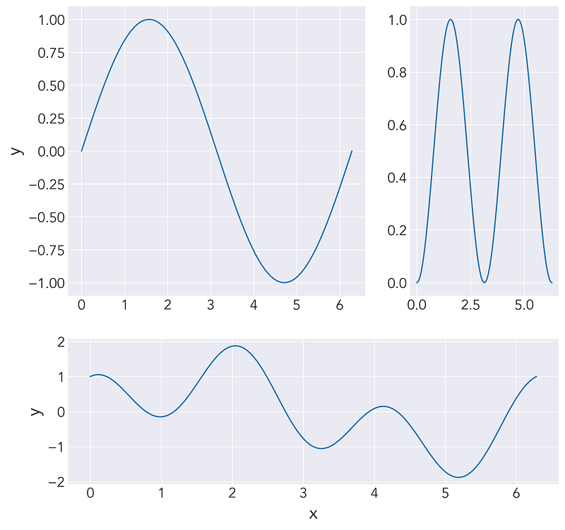
And there we have it! We were able to create our panelled figure very simply using gridspec in matplotlib.

Conclusion

This was a very basic introduction to using gridspec to create your panelled figures with multiple plots. You can use the settings shown in this article to create some very sophisticated layouts, even taking advantage of using blank plots in some of the grid elements to create areas of space. The gridspec.ipynb notebook from this article will be available at this Github repository.

Thank you for reading! I appreciate any feedback, and you can find me on Twitter and connect with me on LinkedIn for more updates and articles.

Python
Data Science
Science
Data Visualization
Python Science Plotting
Recommended from ReadMedium