
Create organization diagrams in a few lines of code (The 5-minute learn)
How to do it in R and in Python
Organization diagrams are very popular but can be a real headache to create. Manual software for creating them is annoying and time consuming. Wouldn’t it be great if we could just spin them up with a few lines of code?
Well the good news is you can with the right data, because an org diagram is a special type of graph called a tree or dendrogram. A tree is a graph where there is only one path between any two vertices. Because we have the tools to work with and visualize graphs in data science languages, we can use these to create org diagrams. In this article I’ll show you how, first using R and then using Python. R has better viz options, but you can generate a basic org chart in Python too.
To illustrate we will use the Chinook open source database which you can download here. Download it and unzip it to find a file called chinook.db. This is an example database not dissimilar from those you’ll find in any organization, but obviously a little smaller and simpler for demo purposes.
How to do it in R
In R, after we have done a little data manipulation, we will do this by creating an igraph object from the data and then visualizing it using the awesomeggraph package.
First let’s use the RSQLite package to connect to our database and take a look at the tables:
library(RSQLite)con <- dbConnect(
drv = RSQLite::SQLite(),
"chinook.db"
)RSQLite::dbListTables(con)## [1] "albums" "artists" "customers" "employees" "genres" "invoice_items"
## [7] "invoices" "media_types" "playlist_track" "playlists" "sqlite_sequence" "sqlite_stat1"
## [13] "tracks"Let’ s download and take a quick look at the field names of theemployees table:
employees <- dbGetQuery(con, "SELECT * FROM employees")
colnames(employees)
## [1] "EmployeeId" "LastName" "FirstName" "Title" "ReportsTo" "BirthDate" "HireDate" "Address" "City"
## [10] "State" "Country" "PostalCode" "Phone" "Fax" "Email"Can you see how we can use the ReportsTo column to form the basis of an org diagram? In fact, all we need from this database to do this are the EmployeeId and ReportsTo fields, but we will also use FirstName to make it friendlier (assuming they are all unique).
library(dplyr)
(emps <- employees |>
  dplyr::select(EmployeeId, FirstName, ReportsTo))
## EmployeeId FirstName ReportsTo
## 1 1 Andrew NA
## 2 2 Nancy 1
## 3 3 Jane 2
## 4 4 Margaret 2
## 5 5 Steve 2
## 6 6 Michael 1
## 7 7 Robert 6
## 8 8 Laura 6 Now we can do a join of the table on itself using EmployeeId and ReportsTo to create a reporting relationship edgelist for use in a graph:
(edgelist <- emps |>
  dplyr::inner_join(
    emps,
    by = c("EmployeeId" = "ReportsTo")
  ) |>
  dplyr::select(from = FirstName.x, to = FirstName.y))
## from to
## 1 Andrew Nancy
## 2 Andrew Michael
## 3 Nancy Jane
## 4 Nancy Margaret
## 5 Nancy Steve
## 6 Michael Robert
## 7 Michael LauraNow we have everything we need to create our graph object in igraph:
library(igraph)
(orgchart <- igraph::graph_from_data_frame(
  edgelist
))
## IGRAPH e155618 DN-- 8 7 --
## + attr: name (v/c)
## + edges from e155618 (vertex names):
## [1] Andrew ->Nancy Andrew ->Michael Nancy ->Jane Nancy ## ->Margaret Nancy ->Steve Michael->Robert
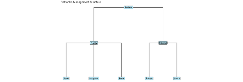
## [7] Michael->LauraNice! The final step is to visualize it. You can create a nice visualization with ggraph using a dendrogram layout, elbow edges and labels for nodes:
library(ggraph)
ggraph(orgchart, layout = "dendrogram") +
  geom_edge_elbow() +
  geom_node_label(aes(label = name), fill = "lightblue") +
  theme_void()
How to do it in Python
To connect to chinook and get the employee details:
import sqlite3, pandas as pd
con=sqlite3.connect('chinook.db')qry="""
SELECT EmployeeId, FirstName, ReportsTo
FROM employees
"""emps=pd.read_sql(qry, con)## EmployeeId FirstName ReportsTo
## 0 1 Andrew NaN
## 1 2 Nancy 1.0
## 2 3 Jane 2.0
## 3 4 Margaret 2.0
## 4 5 Steve 2.0
## 5 6 Michael 1.0
## 6 7 Robert 6.0
## 7 8 Laura 6.0To generate the edgelist:
edgelist=pd.merge(emps, emps, left_on='EmployeeId', right_on='ReportsTo')edgelist.rename(
columns={'FirstName_x' :'from', 'FirstName_y' :'to'},
inplace=True
)edgelist=edgelist[['from', 'to']]## from to
## 0 Andrew Nancy
## 1 Andrew Michael
## 2 Nancy Jane
## 3 Nancy Margaret
## 4 Nancy Steve
## 5 Michael Robert
## 6 Michael LauraTo create a networkx graph object:
import networkx as nxorgchart=nx.from_pandas_edgelist(edgelist,
source='from', target='to')Python’s support for graph visualizations is definitely more basic than R’s. However, if you have graphviz installed on your system (eg brew install graphviz or sudo apt-get install graphviz) and the pydot package installed, you can use this to get a basic visual:
p=nx.drawing.nx_pydot.to_pydot(orgchart)
p.write_png('orgchart.png')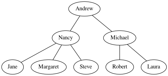
Originally I was a Pure Mathematician, then I became a Psychometrician and a Data Scientist. I am passionate about applying the rigor of all those disciplines to complex people questions. I’m also a coding geek and a massive fan of Japanese RPGs. Find me on LinkedIn or on Twitter. Also check out my blog on drkeithmcnulty.com or my textbook on People Analytics.


