
Create custom info HUDs in SwiftUI
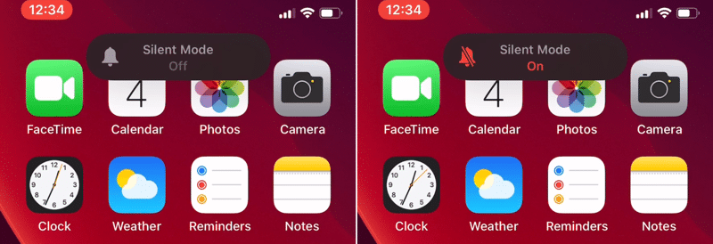
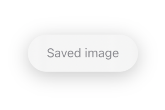
With iOS 13 Apple changed from a big, disruptive UI for silent mode and volume to smaller and more focused UIs, that don’t take up the whole screen. There are buttons in your app, where a feedback is more intuitive for the user, but not so important to disrupt the whole screen with an ActionSheet . Examples are “Added to favorites” or “Saved image”. For that, a simple info sheet at the top is great.
Building your quick info sheet
The HUD will be displayed in a layer above the main app interface. To do so, wrap the view elements in your ContentView in a ZStack . Than we can add the HUD in the ZStack . First, we create an simple HUD with only a Text as content. The modifiers create the iOS-HUD style. As background we use a blur UIViewRepresentable , but you can also use Color(.systemBackground) or any other color.
This looks great! When we put the HUD() in our ContentView , the HUD is in the middle of the view, instead of the top. Simply set the alignment of the ZStack to .top , and the OS does the rest. Via the safe margins, the HUD is always placed right.
Animating the HUD
We want the HUD to be hidden by default, and moves from the top when we tap the Button .

The animation is beautiful, but we want the button to only activate the HUD(), and that the HUD dismisses itself after time.
With the function added, the button only shows the HUD, and it dismisses itself after 2 seconds. Depending on what content you display, you can change the time in the dismissHUDAfterTime() method.
Change the HUD’s content
The HUD should only contain limited content. To amplify the message, add a system image to the HUD.
Change the Text to a Label and the HUD is instantly much more appealing and information rich. If you want to know more about LabelStyles , check my article about this topic out.

Adding actions to the HUD
The HUD shouldn’t be used to add actions, but simple functionality can be very useful. For example when tapping the HUD, it dismisses itself.
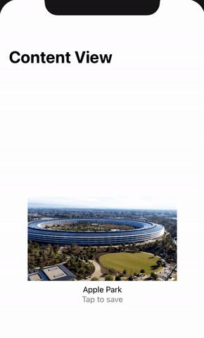
Or you can add message specific action like opening the Photos app.
Using the HUD in a detail view
When you use the HUD in a detail view, and not in the main view, you should still put the main view in the ZStack . Then add an @Binding and the Button in the detail view and it works perfectly fine.
More ideas
You have limited, but still many options on what to display in the HUD. For example, when you have a Slider or Picker to change the brightness in your app, you could display the brightness value in a HUD.

The same approach can be used, when you have a custom volume control. Together with .matchedGeometryEffect() you can create great transitions like this:
Although that looks complex, this is very very easy and needs only some lines of code.
The most is only styling, but the important parts are the @Namespace , the .matchedGeometryEffect() modifiers and the if showHUD {} .
Conclusion
When you want to give the user quick feedback, that an action happened, HUDs are the ideal element for you. They are not as interruptive than ActionSheets but can display much information with less content.


