
Create a Responsive Grid With React, Flexbox & Styled-Components
There are a ton of CSS frameworks out there: Bootstrap, Foundation, Materialize. Do you know what all of these have in common? Responsive grid systems! And do you know what else? One massive load of unnecessary shite.
With the creation of flexbox & powerful frontend frameworks like React, there is literally no reason to use CSS frameworks anymore. You don’t need all that stuff.
If you know how to write your own responsive grid, you’ll be able to implement only what you need. Furthermore, you can make it exactly the way you want, with any tweaks or additions. Heck, you can name your Grid component <MargaretThatcher /> if you like. The possibilities are endless.
Spend some time today seeing how easy it is to build a basic responsive grid with react, flexbox & styled-components. By the end of this short piece, you’ll be able to create complex grids with whole sections that can collapse & re-appear depending on your screen size. I guarantee you’ll pee your pants with excitement, and if you don’t, I’ll pee them for you.
Let’s go.
Pre-requisites
Basic understanding of React
I won’t be going over how to create a component, pass props or anything like that.
Basic understanding of CSS
I will explain some Flexbox stuff but not how to create a CSS file or add a border.
A React project ready to go, with styled-components installed
I recommend using create-react-app for speed. Once it’s ready, install styled-components by running npm i styled-components at your project’s root.
Getting Started
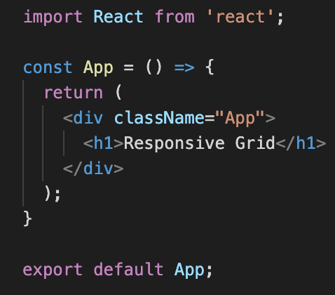
Make sure you’re starting with a root component looking something like this:
Styled Components
Before getting started on the grid, we need to understand styled-components. A styled component is just a React component with CSS styling applied, but they’re created through the styled-components library. We can, of course, do this using the styles object in jsx, but I hope by the end of this you’ll see why using this library is a much better method.
Here’s what creating & using one looks like:
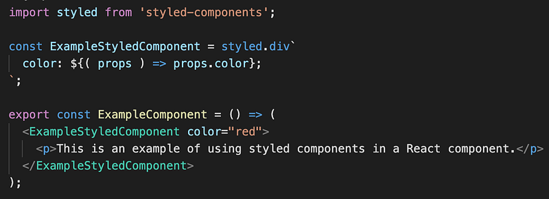
Here, the call to styled.div says that we want to create a React component that renders a div. Under the hood, styled-components builds the correct jsx and then assigns the div a randomly-generated class.
Once it has done that, it reads all the CSS between the backticks `` and uses the class to apply those styles to the div.
Note: the CSS between the backticks in the image above is actually just a string. It’s only syntax highlighted because of a plugin.
The line color: ${( props ) => color} is using interpolation, a feature of template literals in javascript. Interpolation is a way of executing code within a multiline string, i.e. the stuff between the backticks. Anything inside ${} is executed as code, and the result of the execution is rendered as part of the string.
Here, we create a function which receives the props passed to ExampleStyledComponent — in this case, color="red" — and then immediately returns it. After execution, the CSS reads color: "red", and that’s it.
There’s a lot more to styled-components than just this, but already you know how to create a component, pass it props and then use those props to conditionally generate styles for your component. Literally, OMG. Amazing.
The Grid
Now that you understand styled-components, we can look at the code for the grid.
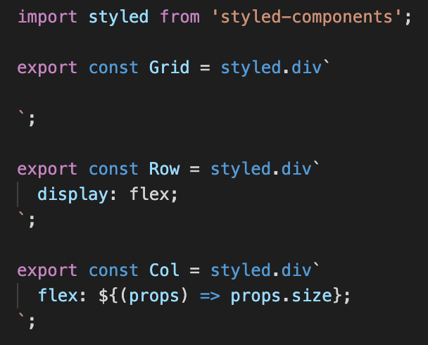
We don’t really need Grid, but it allows us to keep our rows and columns nicely contained, and means we can add a border later to see things better.
The first important part of this is the display: flex; property on Row. Having a display of flex allows all children of the Row component to use certain flex properties. It also applies some default styles. In our case, all children of Row will be Col components, which are divs. The display: flex property on Row will make them all sit side-by-side as if they each have a display of inline-block. This is the default behavior of elements within a flex container.
The second important part of this is what Col is doing with the flex property. By default, this property controls how much horizontal space a child container will take up of its parent flex container. Let me explain this with an example.
Say we had the following jsx:
<Row>
  <Col size={1} />
  <Col size={2} />
</Row>
We would end up with two Cols, one with flex: 1 & another with flex: 2. The column with flex: 2 would be double the width of the column with flex: 1. If they were both flex: 1, though, they’d be the same size. If one was flex: 3 and the other was flex: 1, then it would be 3 times the size, and so on. The formula is as follows:
col width = (row width / number of cols) * (flex value)
With this in mind, we can build out multi-row grids where each has a different number of columns at varying sizes, and by default, it will be responsive. The columns will shrink with the screen, but they will always take up the same proportion of the space.
Rendering the Grid
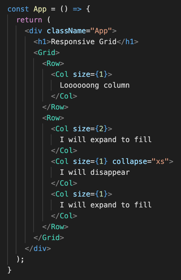
With the Grid, Row & Col components in place, we can build out a grid. I’ve added a red border to the Grid component & a green border & padding to each Col so it’s clear what’s happening. Then, in <App />, I wrote:
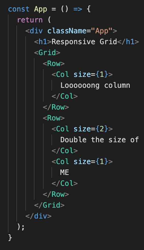
Which resulted in the following on-screen:
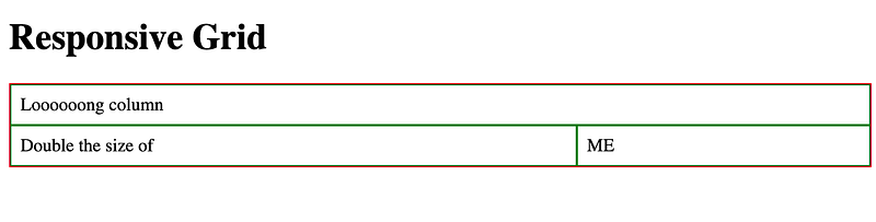
Hopefully, now you can see how you’d build out entire page layouts using this system, and it took minimal coding. But what if you wanted certain columns to disappear on smaller screens? Well, that’s easy, too.
Collapsing Columns
Now that we know how to access props in our styled-components, we can easily add a collapse prop to our columns.
You’d do it like this:
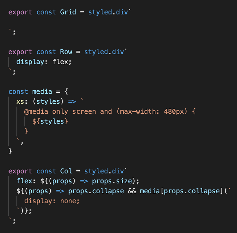
Nothing has changed with Grid or Row.
We’ve now got an object which exposes one property: xs – a function that returns a media query. We pass it some styles to render within the media query. This object could expand to contain all the different screen sizes you might need, but just one is fine for our purposes.
In Col, we again use interpolation to access the props object. It has a property called collapse, which should be equal to one of the properties on the media object. We first check that collapse is defined, and if it is, we access the correct property using props.collapse. Then we pass the styles we want, which in this case will be display: none. In the end, with xs as the value of props.collapse, we end up with the following CSS:
@media only screen and (max-width: 480px) { display: none; }
And now, if we add collapse to one of our columns in <App />:
It should disappear when we resize the screen:
With just these two things — grid & collapse — you can create complex and responsive layouts. With minimal code. You don’t need to download bootstrap. You don’t need to learn Foundation. You don’t need to eat 22lbs of Fray Bentos Steak Pie. You are your own master. Isn’t it glorious?
That’s all. Thanks for reading. You can find more of my stuff on my Medium profile & follow me on twitter (if you like) @lm_writing.


