
Data Science / Power BI Visualization
Create a Network Graph in Power BI
A quick start guide on building a network graph with a few simple clicks of the mouse.

In a previous article, I wrote a quick start guide to visualize a Pandas dataframe using networkx and matplotlib. While it was fun to learn and explore more about network graphs in Python, I got to thinking about how to present the results to others who don’t have Python or Jupyter Notebook installed in their machines. At TaskUs, we use Power BI for most of our reporting so I began to search for a custom Power BI visualization that can take the data and transform it into a meaningful network graph.
Enter Network Navigator.
Network Navigator is a custom visual in Power BI that is created by Microsoft. It allows you to “explore node-link data by panning over and zooming into a force-directed node layout (which can be precomputed or animated live).”¹ In this post, we’ll walk through the steps needed to create a network graph using the custom visual.
First, let’s get our data. You can download the sample dataset here. Then, we could load the data into Power BI Desktop as shown below:

Select Text/CSV and click on “Connect”.

Select the file in the Windows Explorer folder and click open:

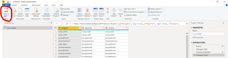
Click on “Transform Data”.

Click on “Use first Row as Headers”.

Click on “Close & Apply”.
Next, find the three dots at the end of the “Visualizations” panel.

And select “Get more visuals”.

Point your mouse cursor inside the search text box and type in “network” and hit the “Enter” key and click on the “Add” button.


Wait a few moments and you’ll see the notification below. Click on the “OK” button to close the notification.

You’ll see a new icon appear at the bottom of the “Visualizations” panel as shown below.

Click on the new icon and you will see something similar to the picture below.

With the new visual placeholder selected, click on “Reporter” and “Assignee” in the “Fields” panel and it will automatically assign the columns as the Source and Target Node.

Let’s add labels by clicking on the paintbrush icon.
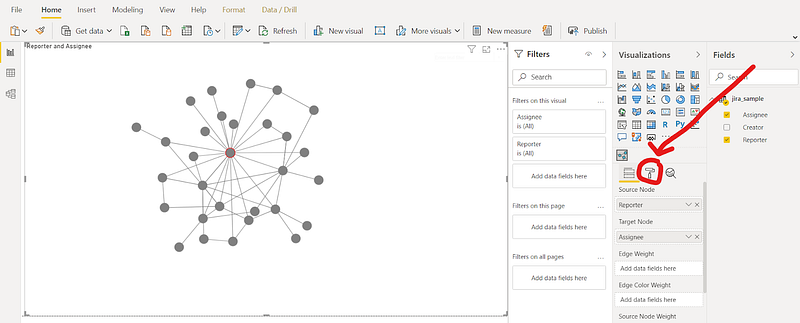
Click on “Layout” to expand the section and scroll down until you see the “Labels” section.

Click on the toggle switch under “Labels” to turn it on

and voila!
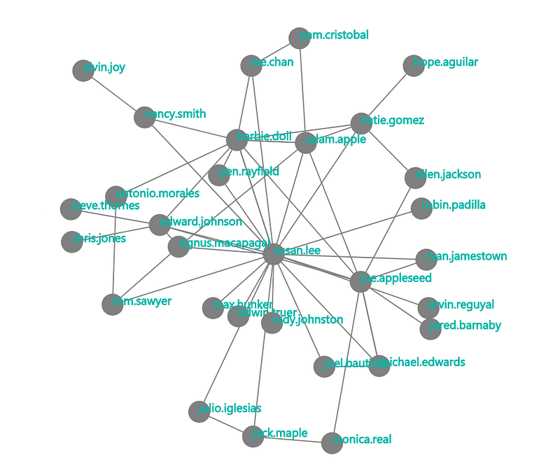
That’s it! With a few simple clicks of the mouse, we’re able to create a network graph from a csv file.
I hope you enjoyed today’s post on one of Power BI’s coolest visuals. Network graph analysis is a big topic but I hope this gentle introduction will encourage you to explore more and expand your repertoire.
In the next article, I’ll share my journey from slacker to data scientist and I hope it will inspire others instead of being dissuaded by haters.
Stay tuned!
You can reach me on Twitter or LinkedIn.
[1]: Business Apps — Microsoft AppSource. (May 16, 2020). Network Navigator Chart https://appsource.microsoft.com/en-us/product/power-bi-visuals/WA104380795?src=office&tab=Overview


