
Coronavirus Chronicles 2: The Curse of the Exponential
What will happen if we do nothing
Trigger Warning: What I show here can be extremely anxiety-inducing. My intention is not to stoke fear, pessimism or despair, but to offer a rational way of thinking about this epidemic.
Exponential processes can be deceiving. They start gradually so it looks like things are going to develop slowly, but all of a sudden things seem to explode and everything gets out of control. Our mind tends to assume that things change linearly and are quite unprepared to confront exponential processes. Unfortunately, epidemics are exponential phenomena until herd immunity or vaccination puts a brake on their development.
This is an exercise in mathematical modeling to answer a few basic questions about the coronavirus epidemic in the USA:
1. How long will it take until things get bad?
2. How many people are likely to get infected?
3. How many people are likely to die?
An important caveat: this model assumes that we do nothing to control the epidemic or that whatever we do has little effect on its spread. However, China and South Korea have been quite successful in curtailing the epidemic, so we know that this is possible.
Exponential progression in the number of cases
What I did is to take the number of reported coronavirus cases and deaths published in El País and used them for computer modeling using the scientific software program Prism 3 (GraphPad Software).
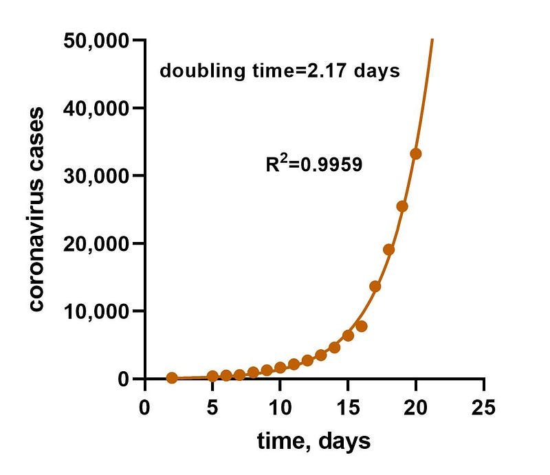
Figure 1 fits an exponential function [Y=Y0*exp(k*X)] to the number of cases of coronavirus in the USA reported until now. The goodness of fit is excellent, as shown by a high correlation coefficient (R2) of 0.9926. A perfect fit would have a value of 1. This means that the progression of the number of cases is really an exponential process. The parameters of the function, Y0 and k, do not have a straightforward interpretation, but the doubling time can be calculated as ln(2)/k. I got a value of 2.17 days, which is the time that it takes for the number of cases to double. So, not only we get an exponential progression, but the doubling time is alarmingly high.
When will the epidemic stop in the USA?
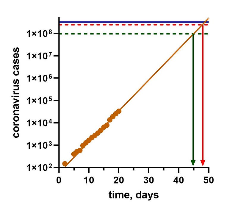
In Figure 2, I changed the scale of the Y-axis from linear to logarithmic so that I can include very large numbers of cases. With a logarithmic scale, the exponential curve becomes a straight line. The blue horizontal line at the top of the graph is the total population of the USA: 330,485,819 people. Obviously, the number of cases of coronavirus cannot exceed this number. The brown line intersects the blue line at about day 50, which is when everybody in the USA will get infected, theoretically. However, this will not happen due to the phenomenon of herd immunity: people that got infected with the virus and survived become immune to the virus and do not longer transmit it. This acts as a barrier for the infection, just like a vaccine, so when the number of immune people goes over a certain threshold, the epidemic stops. The Herd Immunity Threshold (HIT) can be calculated from the basic reproduction number (R0), which is the average number of new infections caused by each case. For COVID-19, Wikipedia gives R0 values of 1.4–3.9, and the corresponding HIT values are 29% to 74%. Multiplying these numbers by the population of the USA, we get 95,840,887 for 29% and 224,559,506 for 74%, which are the green and the red dashed lines in Figure 2. Even though this is quite a large range, on a logarithmic scale these two lines are close together and close to the total population of the USA (blue line). The graph shows that the first HIT will be reached at 45 days and the second HIT at 48 days so, even if the HITs are quite different, this doesn’t make a big difference in terms of the time we reach them. If this is true, everything will unfold before the end of April.
Potential problems with this method
There are several potential problems with Figures 1 and 2. First, since very few people are tested for the coronavirus, the number of cases is probably an underestimate. If so, then the actual exponential curve is to the left of the curve in Figure 1 and the process is even faster. Second, in a process this fast herd immunity may not actually work. Herd immunity assumes that people cannot be re-infected, which is still an unknown for COVID-10. And even if people do not get re-infected, they will carry the virus for several days, so herd immunity cannot be achieved in a matter of days, which is the time scale we are dealing with here. If there is no herd immunity, close the entire population of the USA may get infected.
What does this mean in terms of the number of deaths?
The mortality rate of COVID-19 is highly variable: it is very high in Spain and Italy (over 5%), but in low in Germany (0.4%) and South Korea (0.7%). This is probably because the total number of cases is known due to the lack of tests. However, since South Korea and China are the countries that have tested more extensively, a good estimate of the mortality rate is 1%.
In the USA, assuming this mortality rate of 1 % and that the disease runs its course unimpeded, reaching the first HIT would mean a total of deaths of about 960,000. If the disease stabilizes at the second HIT, the number of deaths would be 2,240,000. And if there is no herd immunity and the entire population of the USA gets infected, the number of deaths could be as high as 1% of the population: more than 3 million people dead.
The progression of the number of deaths
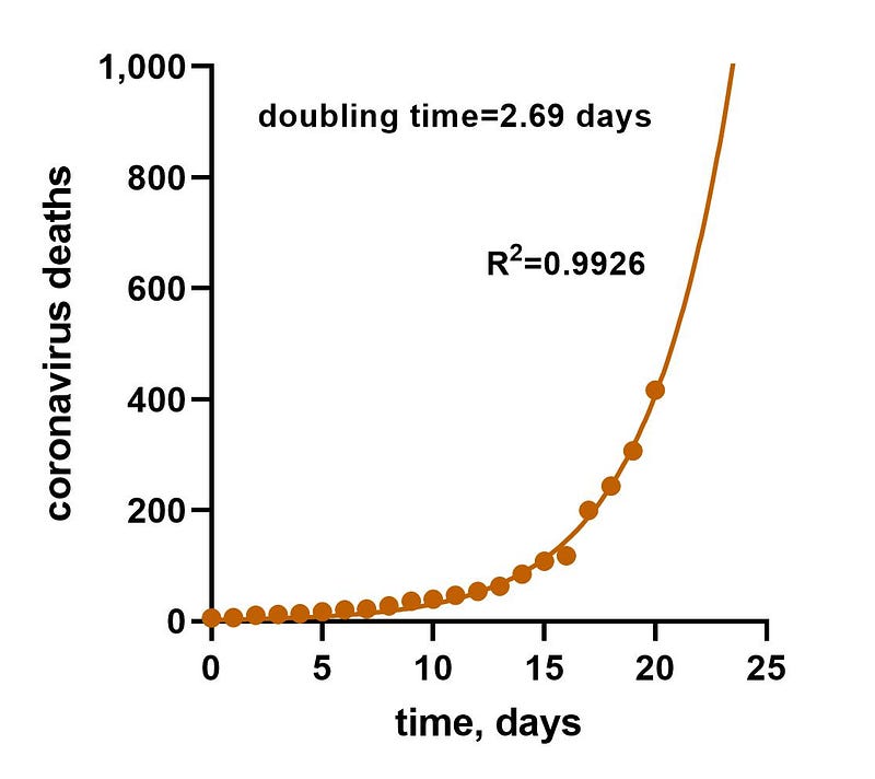
Another way to look at this issue, which avoids the problems of trying to estimate the number of cases without tests, is to look at the progression in the number of deaths of coronavirus. Figure 3 is a graph of the number of deaths in the USA taken from El País. Again, an exponential function fits the data very well, with a correlation coefficient of 0.9926. The doubling time is 2.69 days: this is how long it takes for the number of deaths to double.
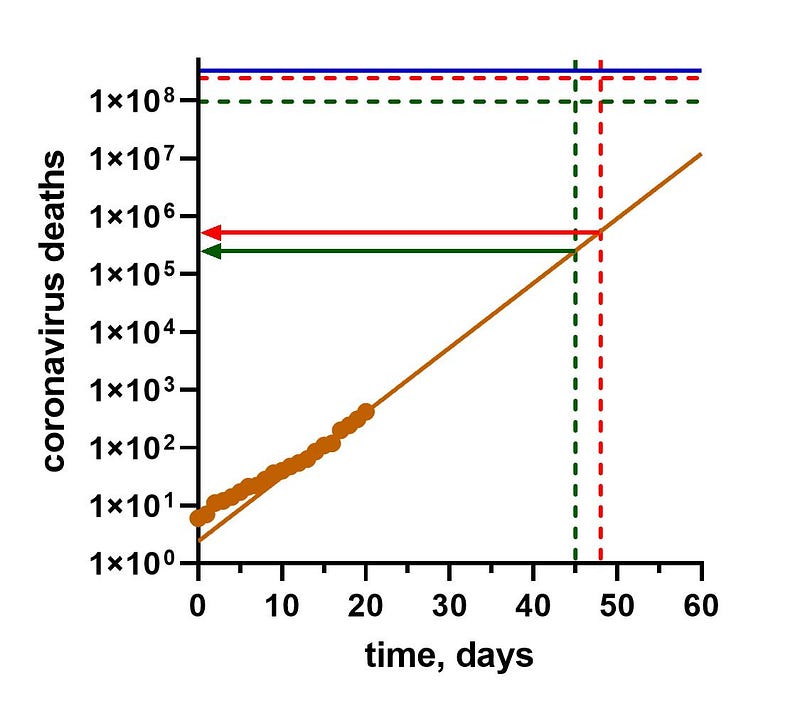
Figure 4 uses a logarithmic scale to extrapolate how this will unfold over time. Again, the exponential function becomes a straight line (in brown). The vertical green and red dashed lines are the times to reach the HITs, according to Figure 2. The intersects of the brown line with these lines give us the number of deaths when the HITs are reached. These range from 250,000 to 500,000 deaths, much more optimistic than what I got by applying a 1% mortality rate to the HITs. But still quite appalling.
Conclusions
I am not an epidemiologist, so something may be wrong with these projections. I have trouble believing that things will happen so fast. If you find a mistake, please point it out in the Comments. In the next Coronavirus Chronicles I will try to explore the ways we have to get out of the curse of the exponential and avoid this impending catastrophe. In any case, wash your hands, stay home and avoid physical contact.