
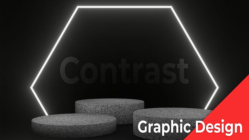
Contrast In Graphic Design (Definition And Guide)
There is a lot of discussion in the graphic design world about the use of contrast. Some designers swear by it, while others believe that it can be overused and can actually make a design look worse.
So, what is contrast and why is it so important in graphic design? Contrast is the use of different elements in a design to create visual interest. These elements can be different colors, shapes, sizes, or textures.
When used correctly, contrast can make a design more visually appealing and help it stand out from the competition.
However, it is important to use contrast sparingly. If you use too much contrast, your design can quickly become overwhelming and chaotic. So, it is important to find the right balance and use contrast in a way that is both visually appealing and effective.
If you surf the internet without security, consider using Nord VPN as it keeps you and your family safe. Follow this affiliate link to learn more about NordVPN.
What is a Contrast In Graphic Design
A contrast in graphic design is the intentional use of opposites to create visual interest. This can be done through the use of different colors, shapes, sizes, or textures.
When used correctly, contrast can help to draw the viewer’s eye to specific elements of a design and create a more visually interesting composition.
Contrast In Graphic Design Can Be Used To Create Emphasis, Visual Interest, And To Guide The Viewer’s Eye.
When used correctly, contrast can make your graphic design stand out from the rest. It can also be used to create a hierarchy of information so that the most important elements are the most visible.
In addition, contrast can be used to add visual interest to a design, and to create a sense of movement.
There are three types of contrast:
1) Contrast of value- This is the easiest type of contrast to create, and simply involves using light and dark colors. Dark colors tend to recede into the background, while light colors stand out.
2) Contrast of size- This type of contrast is used to create a visual hierarchy, by making some elements of the design larger than others. This is often used to draw attention to the most important elements of the design.
3) Contrast of shape- This type of contrast is used to create visual interest, and can be used to make a design more interesting and visually appealing. It can also be used to create a sense of movement.
Contrast Can Be Used To Create A Visual Hierarchy, Guiding The Viewer’S Eye To The Most Important Elements.
When used effectively, contrast can be a powerful tool for graphic designers. It can be used to create a visual hierarchy, guiding the viewer’s eye to the most important elements.
Contrast can also be used to create a sense of movement and dynamism.
Contrast can also be used to create a sense of movement and dynamism. In the example below, the designer has used contrast to create a sense of motion. The black and white circles appear to be moving toward the viewer.
Contrast can be used to create a sense of depth and perspective.
Contrast can also be used to create a sense of depth and perspective. In the example below, the designer has used contrast to create the illusion of depth. The circles appear to be receding into the distance.
Contrast can be used to create a sense of unity and cohesion.
Contrast can also be used to create a sense of unity and cohesion. In the example below, the designer has used contrast to create a sense of unity. The black and white shapes are all the same shape and size, and they are all positioned in the same way. This creates a sense of unity and cohesion.
Contrast Can Be Used To Create Visual Tension, Adding Interest And Excitement To A Design
In graphic design, contrast is the use of opposite elements to create visual tension. This can add interest and excitement to a design, making it more visually appealing to the viewer. There are a few different ways to create contrast, and each can be used to achieve different effects.
One way to create contrast is by using opposites. This can be done in terms of color, value, size, or shape. For example, using a bright, bold color against a muted background can create a striking contrast. Or, using a large shape against a small background can create a visual contrast.
Another way to create contrast is by using different textures. This can be done by using a smooth texture against a rough texture, or a light texture against a dark texture. This can add visual interest and create a more three-dimensional design.
Contrast can also be used to create a sense of balance in a design. For example, if a design is too busy, adding a contrasting element can help to ground it and make it more visually appealing. Or, if a design is too bland, adding a splash of contrast can add visual interest.
Ultimately, contrast is a great way to add interest and excitement to a design, and can be used to achieve a variety of different effects. By using opposites, different textures, or a sense of balance, you can create a design that is both visually appealing and unique.
Contrast Can Be Used To Create A Sense Of Movement And To Direct The Viewer’S Eye Around The Design
One effective way to use contrast is by incorporating it into the graphic design in order to create a sense of movement. This can be done by using different shapes, colors, and sizes to create a visual “dance” on the page.
Additionally, contrast can also be used to direct the viewer’s eye around the design. This can be accomplished by using strategically placed elements of high contrast to draw attention to specific areas of the layout.
When used correctly, contrast can be a powerful tool that can help to create a more dynamic and visually appealing design.
Here are 5 key takeaways from the contrast in graphic design
1. Contrast is the difference in lightness and darkness between two elements in a design.
2. Contrast can be used to create visual interest and to guide the viewer’s eye.
3. Contrast can be used to create a sense of depth and to create focal points.
4. Contrast should be used in moderation, as too much contrast can be jarring and distracting.
5. When creating contrast, it is important to consider the color of the elements involved, as different colors can create different types of contrast.

If you found the article beneficial, smash the clap button as it helps others find my work. Don’t forget to sign up for my email list as I scour the web for useful information. Also, consider subscribing to Medium as it’s an amazing platform for people who enjoy learning from others. Please join through my affiliate link here Subscribe to Medium.
If you need art for your social media accounts, consider using Canva as their Pro Version has the largest selection of social media templates. Follow this affiliate link to learn more about Canva. -Don’t forget the Pro Version.


