
Compare Multiple Frequency Distributions to Extract Valuable Information from a Dataset (Stat-06)
How to Compare Multiple Frequency Distribution and Get Important Information

A frequency distribution is a graphical or tabular representation that shows the number of observations within a given interval. Bar plot, pie chart, and histogram are used to visualize the frequency distribution of an individual variable. What if when we need to compare multiple frequency distribution tables at once. Simple bar plots, pie charts, etc. won’t work for comparing multiple frequency tables. No worries, there might be alternative ways to do so. And this article will cover all the techniques to accomplish our job. All you need is to read the article till the end.
Road map……..
- Why do we need to Compare the Frequency Distribution?
- Grouped Bar Plots
- Kernel Density Estimate Plots
- Strip Plots
- Box Plots
Here our journey starts
Familiarize with Dataset
Throughout this article, we are using the
Prior knowledge of frequency distribution and visualization
To have a better insight into the necessity of comparing the frequency distribution, you need to have prior knowledge of frequency distribution and its visualization. If you haven’t any idea about it, you may read out my previous articles on frequency distribution and visualization.
Why do we need to Compare the Frequency Distribution?
For better explanation, we will use the wnba.csv dataset so that you can learn with a real-world example.
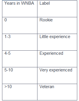
At first, we try to represent the experience column into Exper_ordianl column which variable measured in ordinal scale. In the below table, we try to describe the level of experience of players according to the following labeling convention:
Now, we are highly interested to know about the distribution of the ‘Pos’(Player position) variable with the level of experience. For example, we want to compare among the positions of experienced, very experienced, and veteran players.
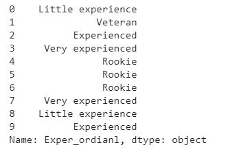
We have used the below code to convert the experience of players according to the above labeling convention.
Output:
Now we try to segment the dataset according to the level of experience. Then we generate frequency distribution for each segment of the dataset. Finally, we try to have a comparative analysis of the frequency distribution.
Output:
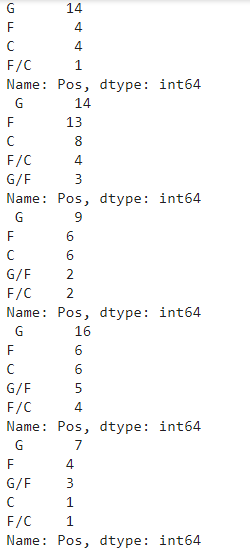
The example shows that it’s a bit tricky to compare the distribution of multiple variables. Sometimes you have represented data in front of a non-technical audience. Understanding the above scenario is so difficult for the non-technical audience. Graphical representation is the best way to present our findings to a non-technical audience. In this article, we’ll discuss three kinds of graphs to compare the frequency of different variables. The following graphs will help us to get our job done —
(i)Grouped Bar Plots
(ii)Kernal Density Plot
(iii)Box Plot
Grouped Bar Plots
A grouped bar plot (aka clustered bar chart, multi-series bar chart) extends the bar plot, plotting numeric values for two or more categorical variables instead of one. Bars are grouped by position for levels of one categorical variable, with color indicating the secondary category level within each group.
- How to generate Grouped bar plot
The seaborn.countplot() function from the seaborn module, are using to generate grouped bar plot. To generate grouped bar plot, we’ll use the following parameter
(i)x — specifies as a string the name of the column we want on the x-axis.
(ii)hue — specifies as a string the name of the column we want the bar plots generated for.
(iii)data — specifies the name of the variable which stores the data set.
import seaborn as sns
sns.countplot(x = ‘Exper_ordianl’, hue = ‘Pos’, data = wnba)
Output:
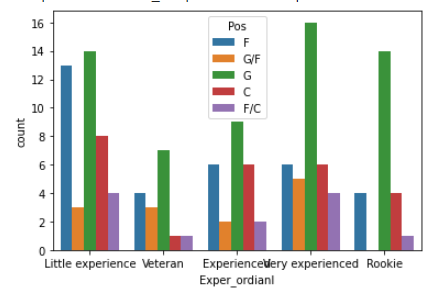
Here, we use Exper_ordianl column to the x-axis. Here, we generate the bar plots for the Pos column. We stored the data in a variable named wnba.
- How to Customize Grouped Bar Plot
The seaborn.countplot() function from the seaborn module has many parameters. By changing those parameters we can customize the graph according to our demand. We can also set the order of the x-axis value in ascending order and change the hue order using hue_order parameter.
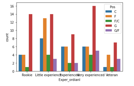
import seaborn as snssns.countplot(x = ‘Exper_ordianl’, hue = ‘Pos’, data = wnba,
order = [‘Rookie’, ‘Little experience’, ‘Experienced’, ‘Very experienced’, ‘Veteran’],hue_order = [‘C’, ‘F’, ‘F/C’, ‘G’, ‘G/F’])Output:
It’s your turn to think a little bit and find the answer to the question.
Exercise Problem: Do Older Players Play Less? Use the mentioned dataset and the above knowledge to answer the question.
Kernel Density Estimate Plots
A kernel density estimate (KDE) plot is a method for visualizing the distribution of observations in a dataset, analogous to a histogram. KDE represents the data using a continuous probability density curve in one or more dimensions.
Each of the smoothed histograms above is called a kernel density estimate plot or, shorter, kernel density plot. Unlike histograms, kernel density plots display densities on the y-axis instead of frequencies.
- Why Kernel Density Estimate Plots are used?
The Kernel Density Estimate Plots(KDE plots) are mainly used to comparing the histogram. Now we try to understand the need for KDE plots.
The easiest way to compare two histograms is to superimpose one on top of the other. We can do that by using the pandas visualization methods mission.
import matplotlib.pyplot as pltwnba[wnba.Age >= 27][‘MIN’].plot.hist(histtype = ‘step’, label = ‘Old’, legend = True)wnba[wnba.Age < 27][‘MIN’].plot.hist(histtype = ‘step’, label = ‘Young’, legend = True)Output:
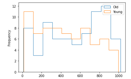
In the above, We want to compare two different scenarios. One for the players who have aged above 27 and others for the players who have aged below 27. We draw two histograms one over another so that we can compare them easily. We can easily compare between two histograms. What if for the number of histograms more than two. Is it easy to compare between those histograms? The necessity of KDE plot comes in for such kinds of scenarios.
- How to generate KDE plots?
The Series.plot.kde() method are used to generate kde plots.
wnba[wnba.Age >= 27][‘MIN’].plot.kde(label = ‘Old’, legend = True)wnba[wnba.Age < 27][‘MIN’].plot.kde(label = ‘Young’, legend = True)Output:
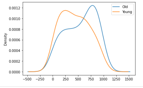
Here, we execute same process using KDE plots.
Strip Plots
A strip plot is a graphical data analysis technique for summarizing a univariate data set. The strip plot consists of:
Horizontal axis = the value of the response variable;
Vertical axis = all values are set to 1.
In fact, strip plots are actually scatter plots.
When one of the variables is nominal or ordinal, a scatter plot will generally take the form of a series of narrow strips.
- How to generate Strips plots
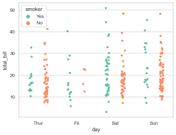
The sns.stripplot() function are used to generate strips plots.
sns.stripplot(x = ‘Pos’, y = ‘Height’, data = wnba)Output:
We place Pos variable on the x-axis and the Height variable on the y-axis.The pattern we can see in the graphs that most of the short players played for the Goalkeeper position and most of the tall players played for the Center Back position. You can also try it for the weight variable. The number of narrow strips is the same as the number of unique values in the nominal or ordinal variable.
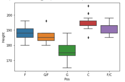
Box Plots
A boxplot is a standardized way of displaying the distribution of data based on a five-number summary (“minimum”, first quartile (Q1), median, third quartile (Q3), and “maximum”).
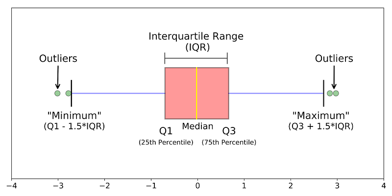
The above graph shows the boxplot. A boxplot is a graph that gives you a good indication of how the values in the data are spread out.
median (Q2 or 50th Percentile): It represents the middle value of the dataset.
first quartile (Q1or 25th Percentile): It represents the middle value between the smallest and median value dataset.
third quartile (Q3 or 75th Percentile): It represents the middle value between the highest and median value of the dataset.
interquartile range (IQR): It represents the value between 25th and 75th percentiles
whiskers: The whiskers are the two lines outside the box that extend to the highest and lowest observations. In the above graph, one line in the left and others in the right represent the whiskers.
outliers: A data point that is located outside the whiskers of the box plot. In the above graph, green points represent the outliers.
- How to generate Box Plot
The sns.boxplot() function is used to generate box plots.
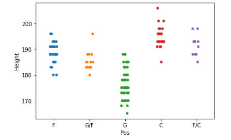
sns.boxplot(x = ‘Pos’, y = ‘Height’, data = wnba)Output:
Using sns.boxplot(), generate a series of box plots to examine the distribution of players’ height as a function of players’ position. Place the Pos variable on the x-axis and the Weight variable on the y-axis.
Outlier point denotes — -
- If the points are larger than the upper quartile by 1.5 times the difference between the upper quartile and the lower quartile (the difference is also called the interquartile range).
- If the points are lower than the lower quartile by 1.5 times the difference between the upper quartile and the lower quartile (the difference is also called the interquartile range).
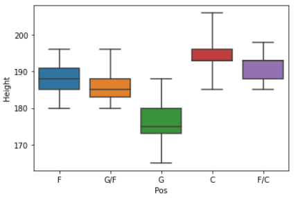
We can also change the factor from 1.5 to custom value using whis parameter.
sns.boxplot(x = ‘Pos’, y = ‘Height’, data = wnba, whis=4)Output:

Conclusion
In this article, we try to learn how to compare frequency distribution using graphs. Grouped bar plots are used to compare the frequency distributions of nominal or ordinal variables. If the variables are measured in interval or ratio scale, we can use the kernel density plots and strip plots or box plots for better understanding.
If you are a data science enthusiast, please stay connected with me. I will come back shortly with another interesting article.
Complete series of articles on statistics for Data Science
- Less is More; the ‘Art’ of Sampling (Stat-01)
- Get Familiar with the Most Important Weapon of Data Science ~Variables (Stat-02)
- To Increase Data Analysing Power You Must Know Frequency Distribution (Stat-03)
- Find the Patterns of a Dataset by Visualizing Frequency Distribution (Stat-04)
- Compare Multiple Frequency Distributions to Extract Valuable Information from a Dataset (Stat-05)
- Eliminate Your Misconception about Mean with a Brief Discussion (Stat-06)
- Increase Your Data Science Model Efficiency With Normalization (Stat-07)
- Basic Probability Concepts for Data Science (Stat-08)
- Road Map from Naive Bayes Theorem to Naive Bayes Classifier (Stat-09)
- All You Need To Know About Hypothesis Testing for Data Science Enthusiasts (Stat-10)
- Statistical Comparison Among Multiple Groups With ANOVA (Stat-11)
- Compare Dependency of Categorical Variables with Chi-Square Test (Stat-12)


