
Color Theory
Color Theory: Color perception spans light, vision, psychology, and hues.

Color perception is how someone perceives color in their environment, but it’s far more complex than you think with physical and non-physical properties.
Common elements of color perception include vision, visible light, color consistency, complementary colors, color psychology, experience, white, black, impossible colors, spectral colors, primary colors, color temperature, culture, symbolism, and nostalgia.
As you can see, a lot goes into creating a split-second interpretation of messaging for your audience using color.
The human aspects of color perception.
Humans receive ideas and information from different wavelengths. These wavelengths stimulate different parts of the eye, and the brain processes these different signals as color. The three primary colors are red, green, and blue.
These colors create the foundation for all other colors because they can be combined to create any other hue. The human eye can see a spectrum of about 10 million different hues.
Color psychology is the study of how color affects human behavior. It looks at the effects of color on mood, emotions, and physical reactions.
Color consistency is important for branding purposes. It ensures that your audience will always mentally associate your brand with the same colors.
Nostalgia is often evoked by color. Certain colors can trigger happy memories or a sense of comfort. Think back to your favorite childhood toy or your grandmother’s house. Chances are, those memories are accompanied by a flood of particular colors. How about the film Annie? You think of red hair and a red dress.
Culture also plays a role in color perception. In the Western world, white is often associated with purity, while black is associated with death or evil. In China, red is a lucky color. Read more here, Color Theory: Color symbolism
Visible light plays a role in color perception, but there is also something called “impossible colors.” These are colors that the human eye cannot see, but they can be created by combining different wavelengths of light. An article in ThoughtCo by Helmenstein states, “Impossible colors like reddish-green or yellowish blue are trickier to see. To try to see these colors, put a yellow object and blue object right next to each other and cross your eyes so that the two objects overlap.”
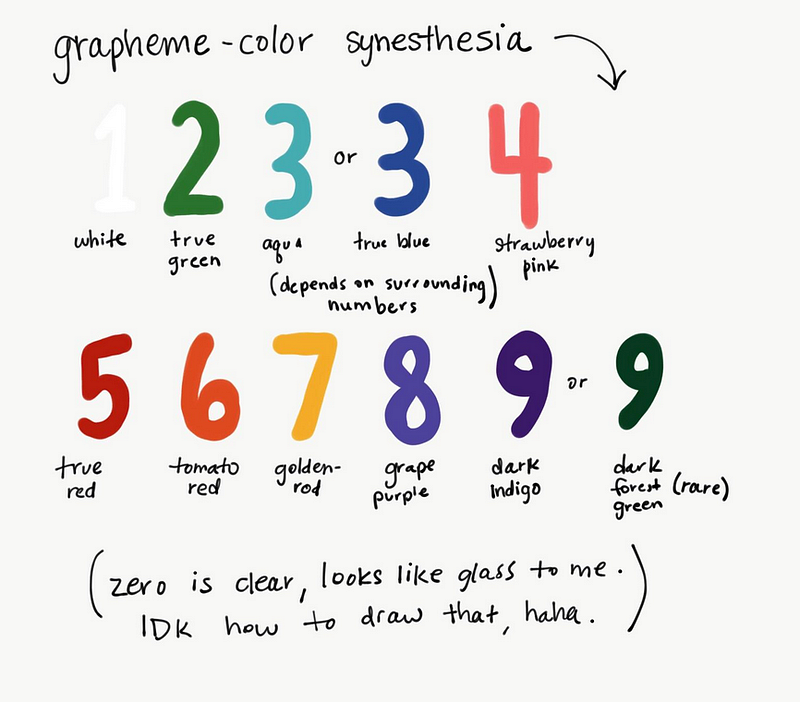
Persons with grapheme color synesthesia see letters or numbers as having color. This means that they might see the number five as being green, for example.
The physical aspects of color perception.
Color temperature is another element that can affect color perception. Color temperatures above 5000K are called “cool colors” while those below 4000K are “warm colors.”
What makes a color “cool” is the blue light that is emitted at a high color temperature. The “warmth” of color comes from the red and yellow light that is emitted at a lower color temperature.
Spectral colors are the colors that make up the visible spectrum of light. These colors are seen when white light is passed through a prism. The colors are arranged in order from longest wavelength to shortest: red, orange, yellow, green, blue, and violet.
- HUES: The colors in the middle of the spectrum, green, yellow, and orange, are called “hues.”
- SHADES: The colors at the end of the spectrum, blue and violet, are called “shades.”
- TINTS: The colors in between the hues and shades, red, orange, and yellow, are called “tints.”
- TONES: The colors at the very beginning and end of the spectrum, red and violet, are called “tones.”
A final element that can affect color perception is the light source. The three most common light sources are sunlight, artificial light, and incandescent light.
Sunlight is the most natural light source and it has the widest range of colors. Artificial light is created by man-made light sources like fluorescent lights and LED lights. Incandescent light is created by heating a metal filament until it glows.
All of these light sources can affect the way we see color. For example, fluorescent lights tend to make colors look bluer than they actually are and fluorescent light also makes it difficult to see warm colors like red and orange.
Understanding color perception is important because it can help us to understand how we see the world and how others see the world. It can also help us to create more effective designs.
Also, read
Color Theory is a complex study related to the properties of light and human perception.
If you’ve enjoyed my writing, please consider supporting me by becoming a Medium Member, accessing unlimited Medium articles. Follow the link to subscribe for $5 a month or $50 per year. Thank you!


