
Circles, Paraboles, and Kandinsky’s Theory of Composition
The Endgame of My Reflections on the Revolutionary Book “Concerning the Spiritual in Art” by Wassily Kandinsky from 1912.
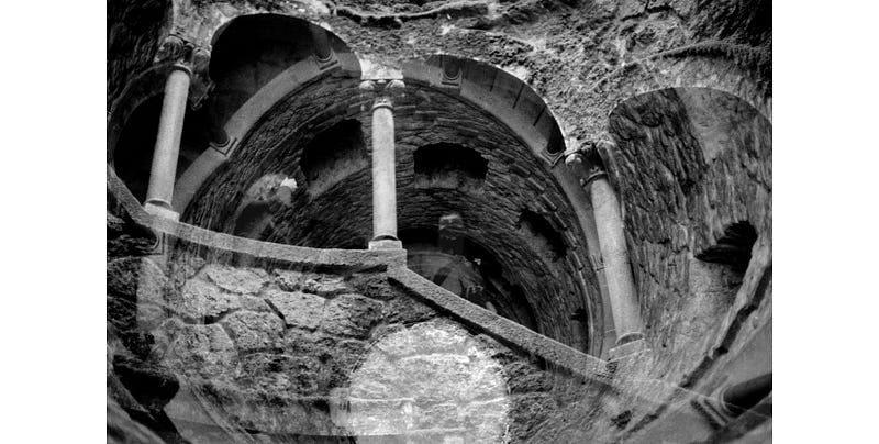
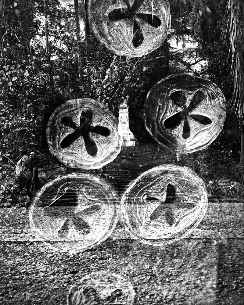
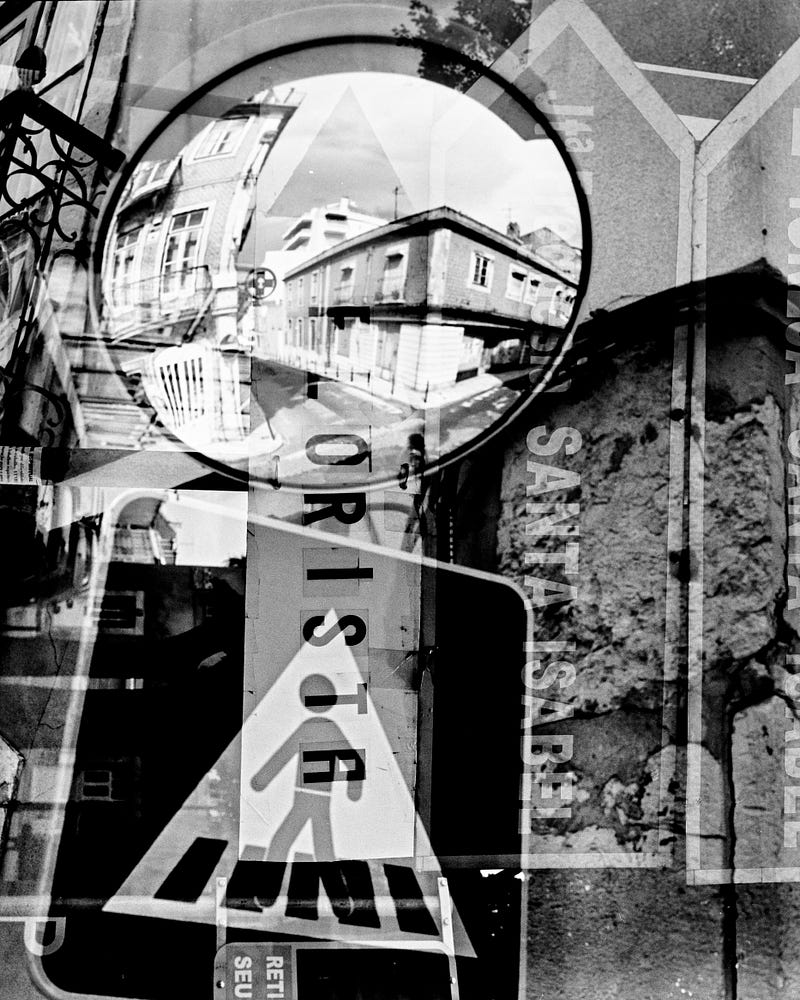
Three of the images were taken in mystical places in Portugal, which, for me, seem suited to the painter’s ideas. All share the predominance of round geometric forms.
The Language of Form and Color
Understanding the connection between color and form takes us to the question of the influence of shape on color. As already pointed out for color, the structure of a surface also has the power of inner suggestion.
Imagine a simple triangle, and you realize it has a spiritual value. The same is true for any conceivable geometrical figure. The mutual influence of form and color becomes apparent as you envision a yellow acute triangle, a blue circle, a green square (keep imagining the structures in your mind), a green obtuse triangle, and a blue square.
All these have different spiritual values.
Colors have their effect hampered or nullified when mixed in different forms. But this doesn’t mean an unsuitable combination is necessarily discordant, as the result can show fresh possibilities of harmony. Effectively, for an artist, the material at hand is inexhaustible.
My previous story, “About Color” concludes that harmony in color and form are the first two inner needs’ guiding principles. Just as color, by definition, is subjective in the sense it cannot stand alone, the limited surface where it exists is the objective. Form can be defined as the separating line between surfaces of color. The varying intensity provoked by this object is the outward expression of its meaning.
Shapes are objective and outward expressions of the inner meaning. This external expression can come in two fashions: either the limiting surfaces show the form of some material object, or the structure represents abstraction, describing a non-material entity.
Between the extremes of material and abstract lies the myriad of expressions an artist has to work with, with a preponderance either of the first or the latter. Purely abstract forms are too indefinite and limiting and would weaken the power of expression. Diminished as the importance of the organic part may be, it will still strengthen or destroy the appeal of the abstract element. The correct choice of material and abstract objects is vital for a robust composition of the entire picture.
For the artist’s individuality, this choice is the third guiding principle of the inner need, which is involved in the harmony of form. The more an artist uses meaningfully chosen abstract shapes, the deeper and more confidently the mind will advance into the kingdom of the abstract. For the viewer, the composition will become more apparent and with greater appeal.
The above paragraph addresses the problem of composition as a whole. The second problem in design is the creation of the single elements that compose the whole. The same form in the same circumstances will always have the same inner appeal. Only the events are constantly varying.
The parallel in the photographic moment can be seen in the fact that the photographer was there. The artist's inner need decided on the intention for the moment to be and remain as that. Among the variables available to play with are the depth of field, framing, contrast of the exposure, and front or backlighting. Capturing the moment is a game of experimentation between these choices. A game that requires hard work.
Another aspect to consider is that complement and opposition increase the wealth of expression of forms because they act as a counterpoint in art. Examples are the variation of shapes and motion induced in the picture, its continuity or separation, the combination of veiled and openly expressed appeals, and the use of rhythmical or unrhythmical forms.
To illustrate this, let’s take an example of the use of the red color in material objects. Suppose a sad picture where a figure wearing a red garment is the central point where sadness is concentrated. The warmness of red provides an acute discord of feeling, emphasizing the overall gloom of the scene. Red cannot have a sad effect on the spectator, just as using a cold color would weaken the impact of the dramatic whole. Coherence is essential in achieving harmony, whether through concord or plain opposition.
Theory (and Action)
When visiting an art exhibition, the spectator might be eager to find the meaning of an artist’s work. Mostly, “connoisseurs” are not simply content to put themselves opposite a picture and let it say its message. They will worry about the work’s temperament, tonality, perspective, or all other outer expressions. Then, to fully appreciate the work, the viewers must force themselves to probe less into the externals to arrive at the inner meaning. Like in engaging in an exciting conversation, we endeavor to reach our partner's fundamental ideas and feelings, disregarding, as inconsequential, the spelling of words, the movement of the lips, or the sound the terms produce in our ears. At the moment, this might seem important, but ultimately, we feel urged to give importance to the meaning of the ideas of this intelligent being and the new thoughts they might awaken in us. For a work of art that has achieved this importance, the artist has dispensed with natural form and expressed himself in purely artistic language.
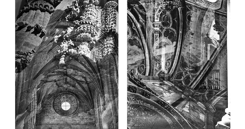
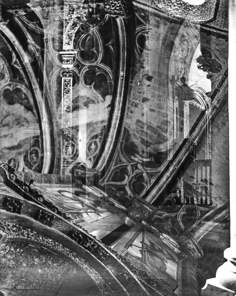
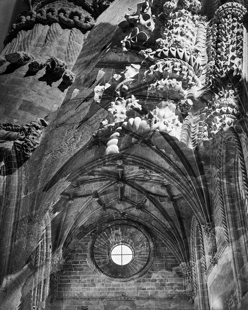
The two works from Convent of Christ are formed by images that are well-known architectural elements of the famous Templar Castle. They try to answer my interpretation of another of Kndinsky’s possibilities. Non-material may have a “literary” appeal, and the picture works like a fable.
In the photos, the spectators are put in an atmosphere that does not disturb them because they accept it as fabulous. The viewer tries to trace the separate exposures and goes through the various appeals present. If the viewer can abstract from the outward effect of recognizable objects, the image will no longer have the aspect of a fable. The free working and movement of the picture will be unhampered and become a form of expression separated from nature.
The conviction that nothing mysterious can happen in our everyday lives destroys the joy of abstract thought. For those in such a mood, practical considerations have ousted all else. Art has become abstract because it has learned that every harmony and every discord springing from the inner spirit is beautiful and that source is essential and the only one.
In Kandisky’s theory, abstract art became a reality during the twentieth century because the artist's inner need succeeded in providing for one of its three mystical elements. As a servant of art, every artist has to help the cause of art. The painter called this achievement pure artistry and is constant in all ages and nationalities.
If art refrains from doing this work, a chasm remains unbridged, for no other power can replace art in this activity. Art is inextricably connected to the human spirit. As the latter gains strength, so does the former. Conversely, art becomes purposeless when the mind is choked by material disbelief. At these times, it’s heard that art exists for art’s sake alone.
The artist needs that position right and honor the duty to art. This is hard work that often proves to be a cross to be borne. The inner need is the lubricating oil, which facilitates the irresistible movement of the triangle of life, onwards and upwards. Full circle, ail to Kandinsky!
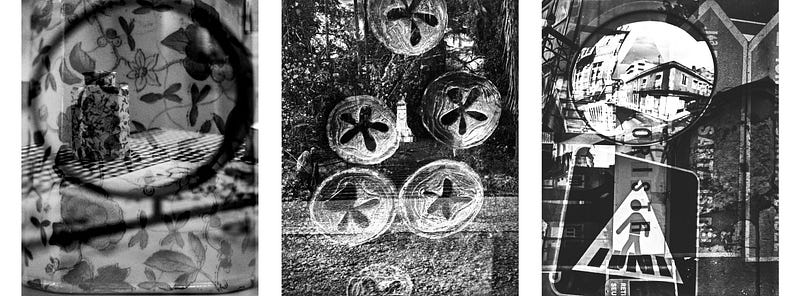
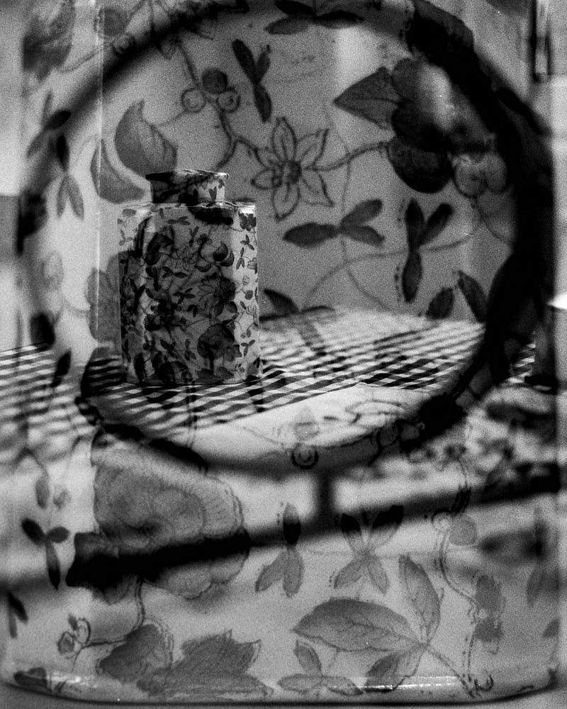
Before the conclusion, Let me share the individual images from the panels so you can easily zoom in and check the details.
Conclusion / Final words on the series
In this series of essays on Kandinsky’s art theories, I tried to bring his message in a way that speaks closer to our present. In 1912, a time of radical new ideas brought in various areas by the names of Picasso or Einstein, the artist felt like it was the end of an age and that his generation was preparing a new world like nothing had been seen before.
For him, the impressionists and the primitives were the naturalists. I think we mostly live in the world Kandinsky imagined in this book. He was realistic, which is probably also a needed base for abstraction. So, I built on this pillar to adapt the concepts.
In 2005, my first reading and experimenting with the ideas from this book was on creating drawings and schemas of geometric figures. At present, the pictures from the stories were taken before reading back the corresponding chapters on which the stories are based.
The selection was made after reading the texts. For the color story, on Saturday evening, when we started the walk in Herdade do Freixo do Meio, I gazed at the sky and saw how the sky was colored west and east of me, then south and north; I knew it was a win! Primary colors and their mix abound.
I tried to remove Kandinsky’s reference to colors in this last story. In those cases and others, I followed to adapt with similar ideas closer to the result of my inner expression, black and white photography, and the search for its meaning as abstract art. As always, the text is the company to my photographic work I want to share on medium.
If you want to read more stories from me, browse through the list of topics in my profile. Please clap stark before moving onwards. And upwards!
Links to the two other stories of this series:


