
Central Limit Theorem — Recommended Visualisations
Animated charts that properly capture the sample mean’s convergence in accordance with the Central Limit Theorem.

This is the third post in my Central Limit Theorem series, see links to the other posts in at the end. We started our analysis by first having a look at the most common misconceptions surrounding the Law of Large Numbers and the Central Limit Theorem, and then we discussed why using histograms as a tool to demonstrate the theorem can be misleading.
I consider this third post to be the most important achievement of the project: we are finally looking at the charts that I think are good visual representations of the theorem.
The underlying code is mostly straightforward, the whole project can be followed on my GitHub. There is one area where I include code in the post, in the part where we create the animated charts.
Our Test Distribution
Like in the second post, we are going to use a Bernoulli distribution to showcase the Central Limit Theorem, referred to as CLT in the future. This random variable can have two values, with probability p it will be 1, and with probability 1-p it will be 0 (0≤p≤1).
Our Bernoulli distribution will have a constant p = 0.3, which means the expected value μ = 0.3, and the variance σ² = 0.3 * 0.7 = 0.21.
And a quick refreshment on our math notations, X(1), X(2), …, X(n) are going to be the individual Bernoulli variables, n is the sample size, and S(n) is the average of the X’s, so S(n) = [X(1) + … + X(n)] / n. It is S(n) that is going to converge to a normal distribution.
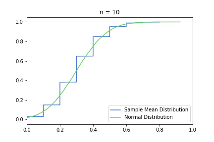
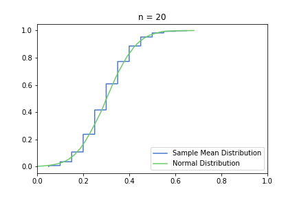
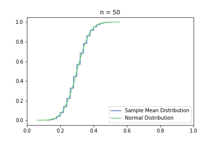
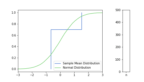
Cumulative Distribution Function
You might have noticed how we avoided putting an actual normal distribution on the charts in the previous post. That is because I think it would have lead to more confusion. But now, we are finally plotting S(n) and the approximating normal distribution on the same chart, using a framework that enables us to visualise discrete and continuous variables: the cumulative distribution function, or CDF.
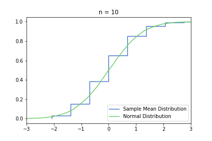
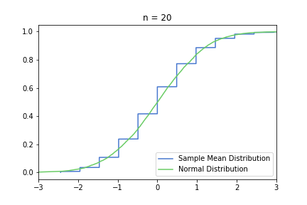
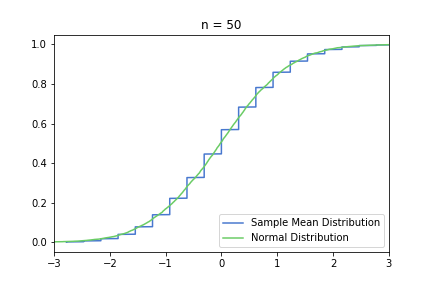
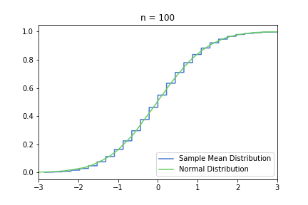
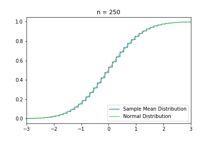
In the pictures below, green is a normal distribution, and please note again, that it is a different distribution for each n, it is N(μ, σ² / n) to be precise, where μ and σ are from the Bernoulli distribution defined above. The expected value is constant, but as n increases, the variance decreases, resulting in an almost vertical green line for higher n’s. Blue line is the CDF of S(n), plotted using the simulated balanced sample we created in the previous post. And of course the phenomena we are observing is how the blue line is getting closer and closer to the corresponding green line.
Plotting lower n = 10, 20, 50 first:
just to be safe, let’s see our usual 100, 250, 500 from the previous post:
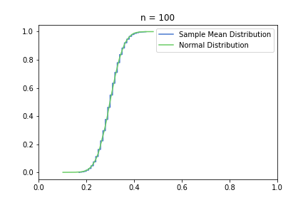
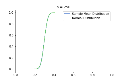
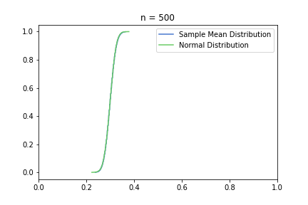
Great, I think the charts above capture the CLT very well. The Law of Large Numbers, LLN is also hinted at: notice how the distribution is more and more condensed around the expected value of the underlying Bernoulli distribution, μ = 0.3. This visually supports the concept that we o-so-sloppily described in the first post: sample mean converges to a normal distribution in distribution and it also converges to the original distribution’s expected value in probability.
In order to show the convergence in the same magnitude, we can also transform the S(n) by subtracting μ and multiplying by [sqrt(n) / σ], I’m calling this new distribution Standardised S(n). See CLT’s Wikipedia page for more details on the math. With this transformation, N(0,1) will be the approximating normal distribution, regardless of n.
Standardised CDF charts for n = 10, 20, 50:
and for n = 100, 250, 500:

The smoothing effect is much more visual in this second, standardised set, because the underlying normal distribution does not get more and more concentrated around 0.3. However, it can be misleading, and it can encourage the common misconception that S(n) converges to one specific normal distribution.
Animated CDF’s
Finally! This is what we were building up to! In this section we are going to create animations of the CDF charts. It’s basically the same information as we had in the previous section, just more mesmerising:
Once again, the CLT and the LLN can be observed beautifully at the same time. The animation above is my absolute favourite one, if anyone asked me to “show” the Central Limit Theorem, that is the visualisation I would pick.
Throughout this post, I did not include code snippets, but I think creating a gif is not entirely straightforward. I experimented with matplotlib’s animation package, but found it cumbersome to work with. The good news is, you can easily create gif’s just by saving your charts as pictures. Once you have a pyplot chart, you can save it as png:
plt.savefig(./pictures_folder/name_of_pictures_<number>.png)Change pictures_folder and name_of_pictures_ to whatever you want to use, and make sure you put a number at the end of the file names. The gif will be created by taking the files in alphabetical order, so if you go from 1 to 100, make sure to encode it as 001, 002, …
Once you have your pictures saved, you have to navigate there and enter the following command in your terminal:
convert -delay 10 name_of_pictures_*.png name_of_gif.gif(At least that is how it works on MacOS, I’m sure something similar exists for other systems.) Just make sure you replace name_of_pictures_ to whatever you used to save the png files.
While we are at it, we can do the same for the standardised CDFs. For the non-standard case, I only ran the animation until n = 100, because not much is changing at this scope afterwards, but we can go nuts with the standardised distribution. Below, we are plotting it between n = 1 and n = 500.
Same outcome as in the previous section, the convergence shows a nicer pattern, but we lose the shrinking aspect, and the LLN is not visualised.
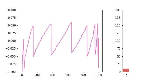
Difference from the Normal Distribution
Another way we can think about S(n) in relation to a normal distribution is by calculating the differences between the two distributions.
Once again, we are going to use our “accurate” samples that we created for the PMFs in the previous post. This is our way of getting around the sampling issue. Please note that randomly generating a sample with a higher magnitude would doubtless yield very similar results. Our approach is just computationally less expensive.
So, for each n, we have a list of 1,000 numbers, which are from the “accurate” sample, ensuring that there is no significant sampling error. For each n, we are also generating the corresponding normal distribution with 1,000 samples. We sort both lists in an ascending order, and calculate the difference. On the charts below, xlabel is simply the position of the element in the list. It does not really have an intrinsic meaning, so I omitted them from the charts below. If we had a sample size of 10,000 instead of 1,000, the shapes would be very similar, with different numbers in the xlabel, which seemed confusing to me. Hence the lack of label below on the x axis.
Plotting this difference for n = 10, 50, 100:
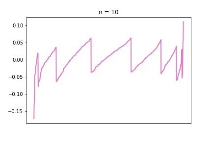
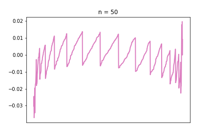
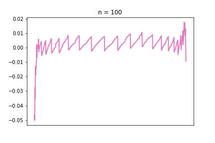
Looks a bit ugly compared to the other charts in the series, but I like the irregular nature of these charts, you can really see that they are imperfect representations of a strict underlying pattern.
If the line is far from 0, in positive or negative direction, that means there is a large difference between the S(n) and the normal distribution. The pattern is very visible: as we increase n, the line gets closer and closer to 0. The “teeth” are also getting smaller and smaller, meaning there are more and more different values the S(n) distribution potentially takes, meaning it is getting closer and closer to a continuous normal distribution.
One really interesting feature we had not seen before is the large relative differences at the two tails. This brings up a very interesting problem, because as we can see, it is the tails where the approximation is the worst, and, ironically, the tail is what we need the normal approximation for. When we calculate things like confidence intervals with the normal approximation, we are mostly interested in the top and bottom x% of the distribution. In the CDF visualisations in the previous sections, those tail areas were kind of hard to see and the blue and green just blended together. With this new visualisation tool, this phenomena is very much visible. And this is the reason why I decided it’s important to include this visibly less appealing chart as well.
In case you are wondering, we are not going to do the standardised versions for this particular chart type, (plotting Standardised S(n) against a N(0,1)), I do not think it would be significantly different from the charts above.
Animated Differences from Normal
Just like for the CDFs, let’s see how the charts look if we put everything in one animated gif.
We can see how the lines are getting closer and closer to 0, with the exception of the tails, which can show wild, unexpected behaviour.
Summary
And that was the Central Limit Theorem in a nutshell.
In summary, we went through the long process of a Bernoulli sample mean converging to a normal distribution. We proposed two visualisation methods for the Central Limit Theorem: combined cumulative distribution functions and the sorted differences between normal and sample mean.
As far as I’m concerned, the most significant achievement of this project were the animated charts, I feel like they are as useful as they are pleasing to the eye. Hopefully, we all learned something, and our understanding of this widely used but scarcely understood concept deepened and solidified.
The story, for now, does not continue, see links below for my other posts on the topic.
Part 2 — The Case Against Histograms
Part 3 — Recommended Visualisations
However, in the future, I think it would be worth spending some time on running normality tests on sample mean samples, and see if there is any truth behind the “magic number 30” concept that we discussed in the first post.