
Canvas, Colour, and Blending in SwiftUI With iOS 15
A look at the new Canvas View together with new shapes, colours, and blends
In the mid-1970s, a man called Alvy Ray Smith III co-invented the concept of the alpha channel together with making a major contribution to the creation of the HSV colour space at the Xerox PARC. A decade later that space had become a research area with a very notable contribution by two individuals Thomas Porter and Tom Duff who, working together at Lucasfilm [Star Wars fame], developed the Porter-Duff composing technique.
Today, blending colours, changing their saturation, luminosity and hue is a critical aspect of designing an app. A critical aspect not only from an appeal/lure point of view, but an accessibility one too.
And well with the launch of Canvas in SwiftUI 3.0 colour blending images has come under the spotlight again. In the WWDC talk about the subject, we’re told the number of static/standard colours in Swift UI has more than doubled as has direct support for the three main types of colour CGColors, NSColor and UIColor. Colour is a subject I wrote about last summer. You can read more below:
But wait. I don’t want to talk about colour so much; this article is all about blending. Blending using the standard modes with the new Canvas View together with an example of using the Port-Duff modes which come in their own set of blending modes. Join me to take a tour of the new options available.
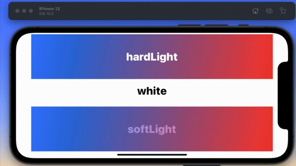
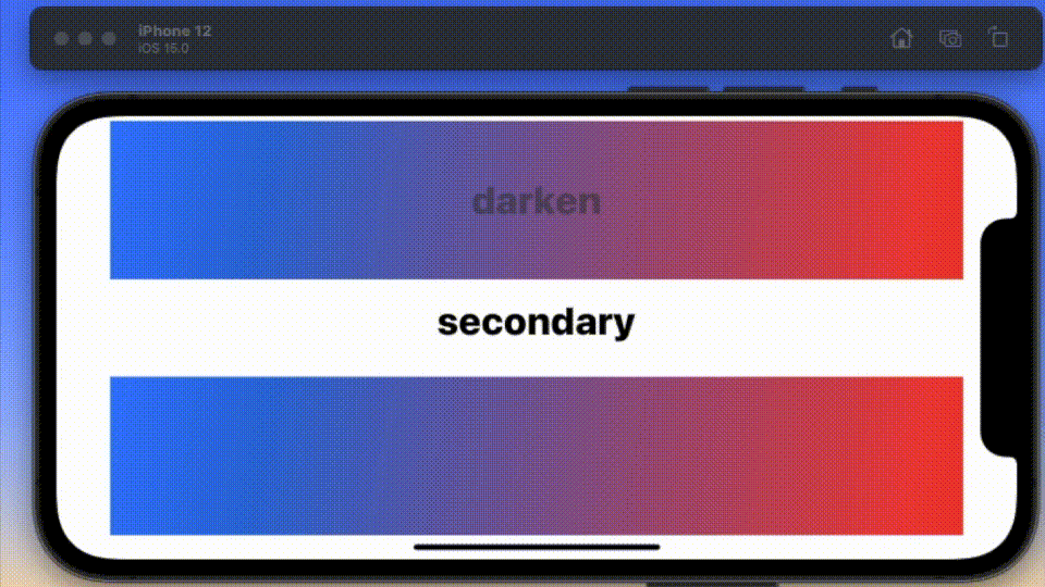
I start with two blends that are surely a pair. The animated GIF you are looking at is a TimelineView around which I am cycling through some seventeen foreground colours for the text and blending said text against a gradient running from blue to red. Here is the basic code it is running through:
With the ContentView as shown below:
struct ContentView: View {
  var body: some View {
    BlendS()
      .foregroundColor(.white)
  }
}
Next up is another pair, which is interesting because it illustrates that some combinations just don’t work. I’d love to give you some rules, but unfortunately, it is very much a case of try and see.
The code to show this is identical to the piece already presented. Now some of the filters are so obvious as to their effect, so I am not going to present them as animated GIFs, but just list them here. You got filters like the following:
- hue
- saturation
- luminosity
- normal
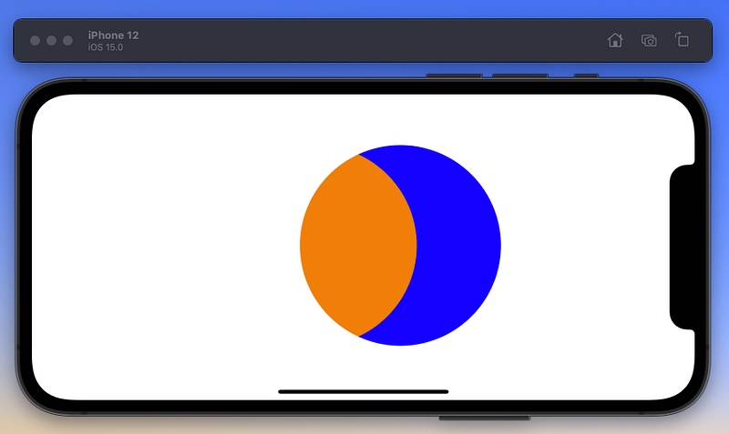
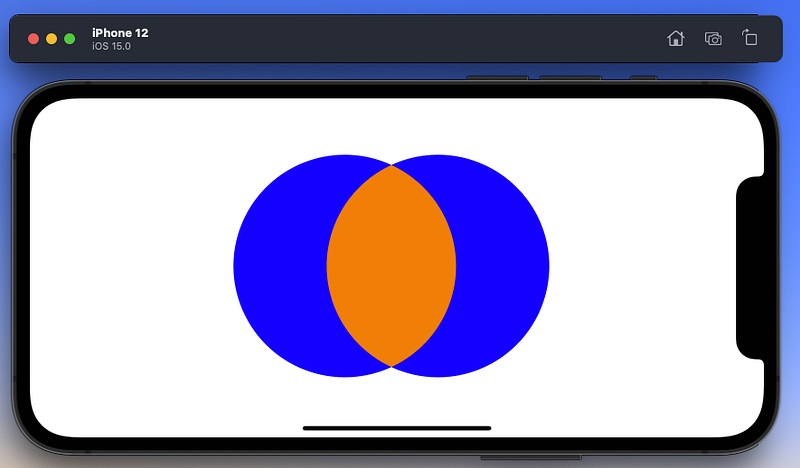
The next pair I want to illustrate is colorBurn and colorDodge, which as you can see also work with some combinations, and not with others.

Porter-Duff Modes
Now on to Porter-Duff Modes blends, which almost need an article in their own right. These are filters that apply some math to the colours of the images to get a different colour entirely and/or make the overlapping section disappear.
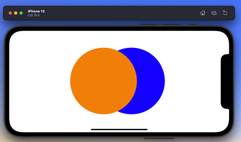
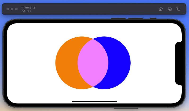
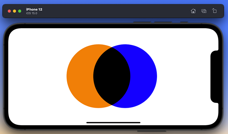
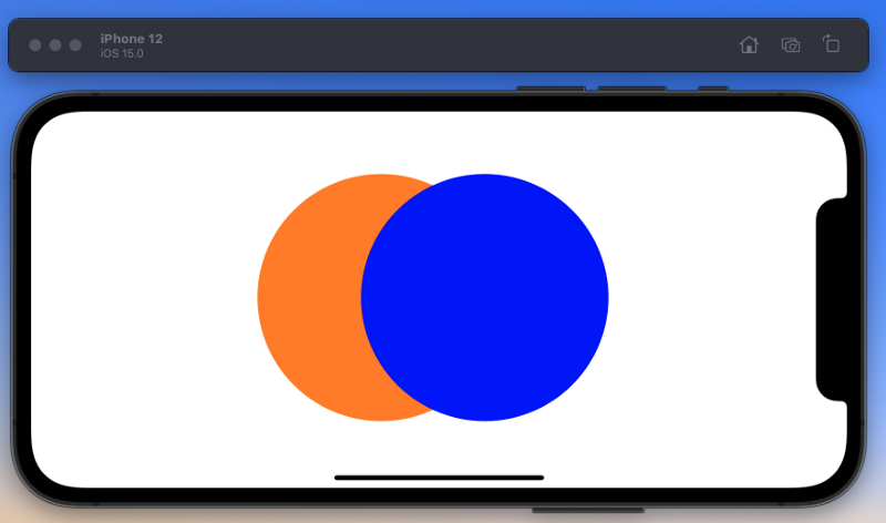
To show these in action, I am going to use a Venn diagram of sorts with two circles: an orange and a blue circle on a white background. Again I will cycle through the options using a TimelineView to do so.
But before I show you the results, here is the code that is generating them. Note: I initially didn’t use any filter but applied the filter on the second image to get the results.
You can see all the filters below. The first circle you draw is considered the destination; the second is the source.
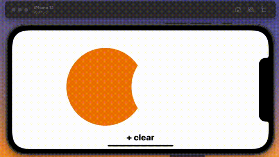
But wait — it isn’t quite that simple — because you can apply a second filter with the same shape to get a different result. Let’s look through these again.
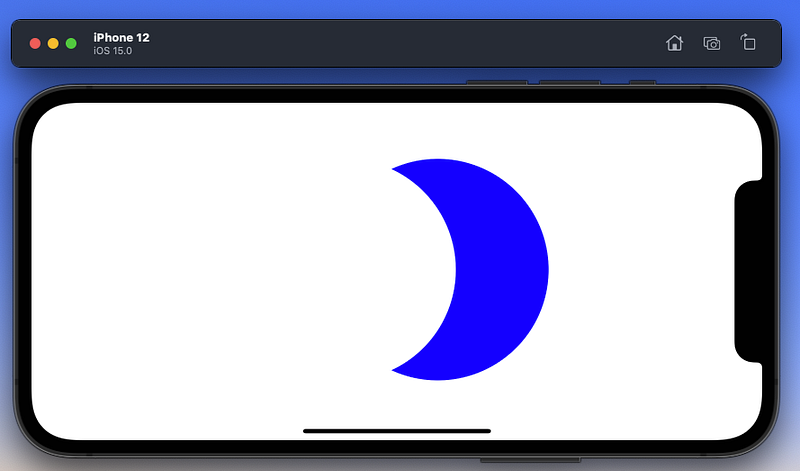
More than one filter
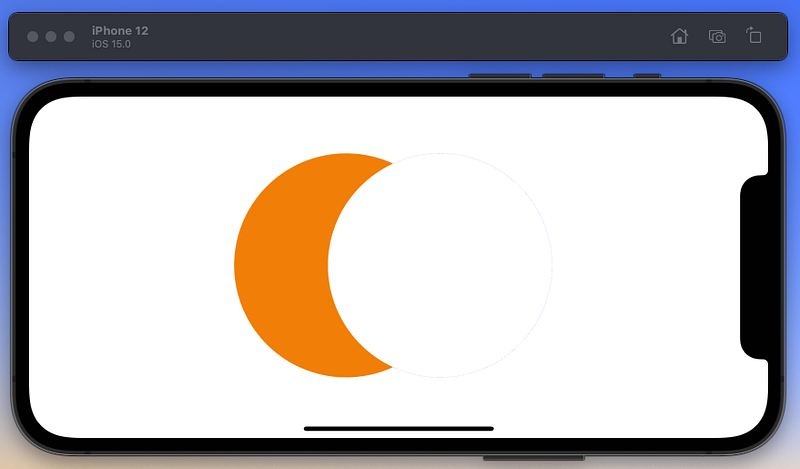
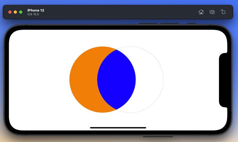
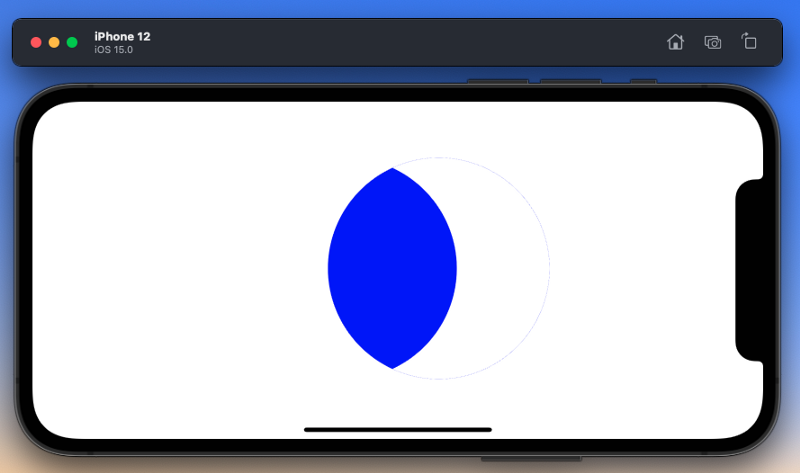
And it goes on, the most useful filters [combinations] are surely those that help you remove parts of your image based on their interactions with other parts — so, as in the blue shape you see above.
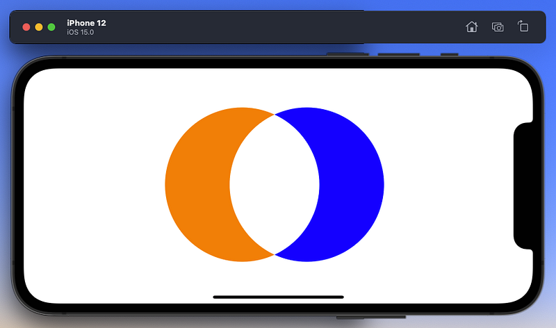
Now you have almost all the sets you could want, with one exception that I invite you to figure out: you don’t have an orange eye, like the blue one shown above. How can you make this set?
At which point I am going to bring this paper to an end. Take some time to play with the filters, and see if you can answer that last question I asked.
The code to do this is given below. I have changed rectA and rectB so that they are aligned on top of each other.
All of which brings me to the end of this piece. Have a go with filters, and work out how you can make them work for you.


