
Candlestick Patterns Suck

Hello!
Recently I’ve been losing money on the stock market. In order to stop losing money, I’ve been reading some books and articles to see if there’s any way that a savvy guy like me can get a read on the markets by just looking really hard at it. I mean, how hard could it be?
If you’ve never seen the stock market, it’s just a bunch of companies and the prices for their stock plotted over time. These days it looks something like this:
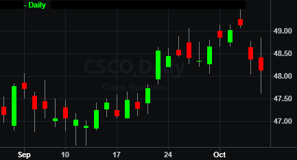
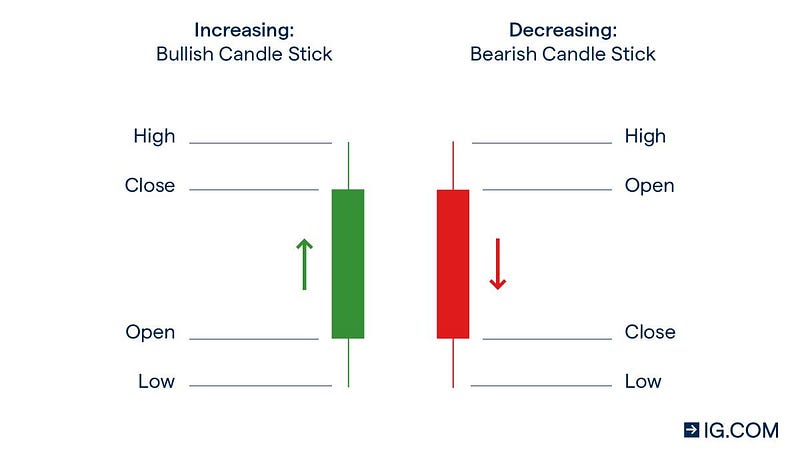
This modern chart is called a candlestick chart, and each of the green/red things is a candle. Here’s their anatomy:
Since these candlesticks are so distinctive in their size and shape, it’s only natural that there are a plethora of candlestick patterns that experienced traders will try to teach young players to help them figure out how a particular stock will move.
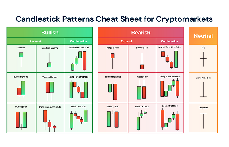
With cool names like “Hammer”, “Doji”, and “Morning Star”, these patterns can often lure in newbie traders — they have a characteristic look, there are a ton of them, and they promise a certain statistical repeatability should you study them well. Some stock market gurus even sell small pamphlets of candlestick patterns that work great in simulations.
After finding out about candlestick patterns, I went looking for a comprehensive list so I could put my memorization skills to work. In total, I recall finding well over a hundred different patterns, each classified by how many candles, the color successions, etc. etc. I felt incredibly overwhelmed. Had all the good traders learned these patterns by heart?
The problem with candlestick patterns
The kicker about candlestick patterns lies in how candlesticks are created. As an example, we take every trade occurring in a 5 minute interval of 9:30:00 am to 9:34:59 am and incorporate them into the candlestick at 9:30. The candle’s close is determined by the last trade executed in that timeframe, open is determined by the first trade, and so on.
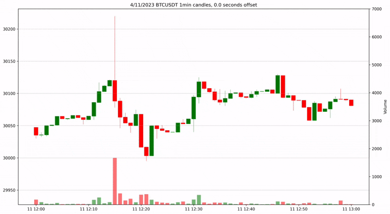
Let’s get an actual example. Here is a Bitcoin price chart from a few days ago. Each candle represents 1 minute of trading.
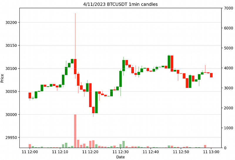
What I always found weird about these charts is that the shape of the candle changes drastically depending on when a “timestep” begins. For instance, this one minute chart starts each candle at some whole number of minutes like 11:01:00 or 9:43:00. What would this chart look like if each candle instead started at a whole number plus an offset of a few seconds, like 11:01:13 or 9:43:55?
If the candles change appearance with this small of an offset, then the patterns that rely on the candle’s shape will no longer work, despite the chart maintaining the same information.
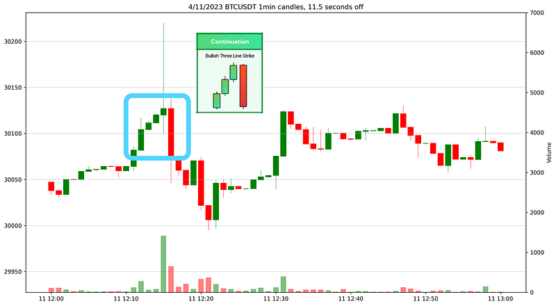
Concrete example. Adding 11.5s of offset to each trade alters the chart, and we can see a clear bullish candlestick pattern. We need to buy this thing before it goes up!
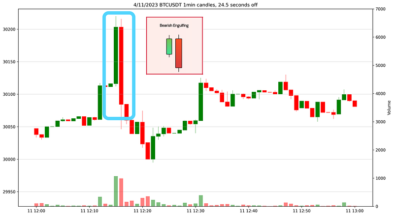
Now if we look instead of an offset of 24.5s, we see the complete opposite signal on the very same data — a very bearish candle pattern indeed!
When you consider that a large price movement can be regularly be interpreted as any pattern at all, it’s no wonder candle pattern performance is regularly 50%.
Here’s a GIF of the entire 60-minute chart, with the offset varied from 0–60 seconds. Watch how the higher volume candles undergo the most drastic changes as we shift the offset.
Keep in mind, every frame contains the exact same information. It just looks different due to the time offset.
One takeaway from this is that any candlestick pattern which appears in the same area in this chart should be seen as equivalent, since they are followed by the same price movement. Another is that the highs and lows are unaffected by the offset, and potentially are better levels to watch than the open and close.
If people react to these patterns, then don’t they BECOME valid?
This is somewhat true. It’s possible that many newbies will see a buy pattern and begin to buy the stock, thereby making price move up. But I think reversing every newbie signal you can find will have the complementary success rate of the newbie signal itself, namely 50%.
Is this also true for longer timeframes?
Daily closes are seen as a pretty important to many traders, and I don’t disagree. The problems I see mainly come from fitting candlestick patterns onto intraday timeframes.
Is there any alternative?
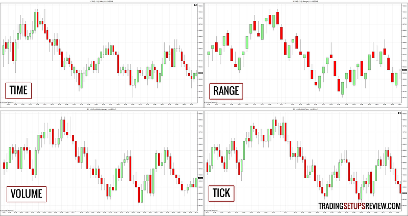
Oh yes, there are several ways to show price movement that aren’t affected by time at all. One is tick charts, which generate a new candle every time a certain number of trades occur. Another is range bars, which create candles that are all the same size as price moves through the levels. Finally, there are volume/dollar bars, which create a new candle whenever a certain volume/dollar amount is traded.
Most charting software will allow you to use these candles instead of the regular candlesticks, but it is generally a paid feature or plugin. If you want to do it yourself, you’ll need access to the log of every transaction occurring on an exchange.
Conclusion
I wrote this post because I thought it would be cool to see exactly how the look of the candlesticks change at different time offsets. Even when first learning about candlestick patterns, I thought they were silly because the trade times must drastically affect the shape of the candlestick.
I hope this article helps people avoid wasting their time trying to learn candlestick patterns. I am still trying to not lose money on the stock market, and these did not help me in that endeavor.
In conclusion, it’s natural to fit patterns onto things — that’s what we humans are good at. But in this case, it could be bad for your investments.


