
Learning Android Development
Building Custom Component with Kotlin
Making Custom Component with XML Layout

Assuming you want to build a page that consists of some repetitive common views. You might not want to duplicate the views and the code that handles it. So a better way is to build a custom component that group views together to be reused.
Example
Here, I will show you how to build the below example, in Kotlin (yeah, the first-class language of Android!!) .. in case you have a problem following the example here, do check out this link.
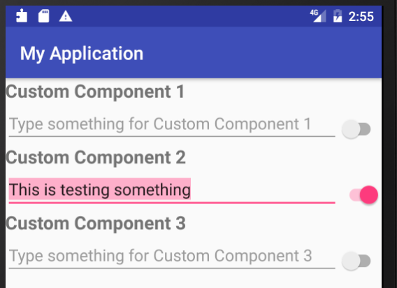
As you could see, each Section will have a TextView as Title, an EditView, and a Switch. Hence the three views could be grouped into a custom component.
Build Steps
Step 1. Create the common layout
Build the layout, as you would do for a normal layout. But just for the single component.
<?xml version="1.0" encoding="utf-8"?>
<merge xmlns:android="http://schemas.android.com/apk/res/android"
    android:layout_width="match_parent"
    android:layout_height="match_parent">

    <TextView
        android:id="@+id/my_title"
        style="@style/custom_component_title"
        android:layout_width="match_parent"
        android:layout_height="wrap_content" />

    <LinearLayout
        android:layout_width="match_parent"
        android:layout_height="wrap_content"
        android:orientation="horizontal">

        <EditText
            android:id="@+id/my_edit"
            android:layout_width="0dp"
            android:layout_height="wrap_content"
            android:layout_weight="1" />

        <android.support.v7.widget.SwitchCompat
            android:id="@+id/my_switch"
            android:layout_width="wrap_content"
            android:layout_height="wrap_content"
            android:layout_gravity="end|center"
            android:layout_marginTop="6dp" />
    </LinearLayout>

</merge>
Do note, in here I use merge to have this layout merge with its parent component, so that help reduces a single level of hierarchy.
Step 2. Create the Custom Component Class, inheriting the Layout Class
Since I want my component to layout vertically, I just create a custom Linear Layout
In Kotlin, we would just need to @JvmOverloads that could help to combine the 4 constructors into one. Note: refers here to the conventional Kotlin’s way to write 4 constructors.
class CustomComponent @JvmOverloads constructor(
        context: Context,
        attrs: AttributeSet? = null,
        defStyle: Int = 0,
        defStyleRes: Int = 0
) : LinearLayout(context, attrs, defStyle, defStyleRes) {

    init {
        LayoutInflater.from(context)
        .inflate(R.layout.view_custom_component, this, true)

        orientation = VERTICAL
    }
}
The init function is the commonly called function in a constructor. In it, you could then inflate the layout that you create in Step 1.
Also, since this is a linear layout, you might want to set its orientation, in this case, VERTICAL.
Update:
Note the above function will crash if you use KitKat and earlier. To address that, you need to split the Constructors as below
class CustomComponent : LinearLayout {
    @JvmOverloads
    constructor(
        context: Context,
        attrs: AttributeSet? = null,
        defStyleAttr: Int = 0)
        : super(context, attrs, defStyleAttr)

    @TargetApi(Build.VERSION_CODES.LOLLIPOP)
    constructor(
       context: Context,
       attrs: AttributeSet?,
       defStyleAttr: Int,
       defStyleRes: Int)
        : super(context, attrs, defStyleAttr, defStyleRes)
}Step 3. Create custom attributes to read.
You’ll notice in my example diagram above, the title is different for all 3 components. So we would like a way to supply them to our custom component, like we could do when naming TextView, by setting the text attribute.
To do that, just create a attrs.xml file in the res/values folder.
<?xml version="1.0" encoding="utf-8"?>
<resources>
    <declare-styleable name="custom_component_attributes">
        <attr name="custom_component_title" format="reference" />
    </declare-styleable>
</resources>
Step 3. Read your custom attributes
The above just defines what your custom attribute is. Now you’ll have to read it to set it to your title.
So in your init function, add these lines of codes to read and set it
attrs?.let {
    val typedArray = context.obtainStyledAttributes(it,
        R.styleable.custom_component_attributes, 0, 0)
    val title = resources.getText(typedArray
            .getResourceId(R.styleable
            .custom_component_attributes_custom_component_title,
            R.string.component_one))

    my_title.text = title
    my_edit.hint =
        "${resources.getString(R.string.hint_text)} $title"

    typedArray.recycle()
}
The attr? refers to if attr != null, then continue, where the it refers to attr. First, you get the typedArray from the attr and then extract the text from the resources. Now you could use the text to assign to the title and also append to the hint.
Before completing it, remember to call typedArray.recycler() to recycle it.
Step 4. Putting custom component in the layout
Now you are ready to use your custom component. Just use it like any other view, add them to the layout you want to use them and give them ID to identify them individually. Also, remember to set the custom_component_title that you define, so each has a different title.
<com.elyeproj.myapplication.CustomComponent
    android:layout_width="match_parent"
    android:layout_height="wrap_content"
    app:custom_component_title="@string/component_one" />

<com.elyeproj.myapplication.CustomComponent
    android:layout_width="match_parent"
    android:layout_height="wrap_content"
    app:custom_component_title="@string/component_two" />

<com.elyeproj.myapplication.CustomComponent
    android:layout_width="match_parent"
    android:layout_height="wrap_content"
    app:custom_component_title="@string/component_three" />
Note, with app:custom_component_title used, you’ll need to have xlmns:app="http://schemes.android.com/apk/res-auto" in your top-level XML tag of the layout.
Code could found in https://github.com/elye/demo_custom_component
Thanks for reading. You can check out my other topics here.
You can follow me on Medium, Twitter, Facebook, and Reddit for little tips and learning on mobile development, medium writing, etc related topics. ~Elye~


