
Build an Interactive Stock Performance Heatmap for your Portfolio Across Countries and Sectors
Use Python to show your portfolio allocation and performance over different time periods across countries, sectors and stocks
In this article, we will learn how to generate an interactive stock performance heatmap for your own portfolio, using Python. A screenshot of the end product is shown below, and you can interact with it via this link.
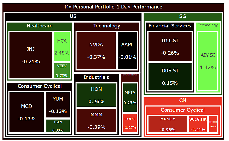
One look at this plot and you can instantly tell how diversified your portfolio is and what the recent performance of all your stocks is like.
Previously, I have also written this article showing how to build an interactive stock sentiment heatmap for your portfolio, where the color represents the sentiment of the stocks base on news.
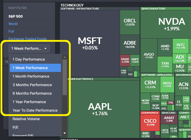
In that previous article I also compared it to the heatmap on Finviz (below) that shows the stock performance (colour represents change in stock prices over a time period, more green means more positive, more red means more negative). On the Finviz website’s heatmap , the companies are from the S&P 500 index, the size of each box represents the market cap of each company relative to the whole index, while the numbers and colors represent the percentage change of the stock’s price.

Motivation for this Article
Following the previous article, a number of people have asked me if I can also generate a heatmap of the stock performance instead, similar to the one above from Finviz. But allowing users to choose the tickers from their own portfolio, and size the boxes in the heatmap according to the value of the stock in their portfolio.
View Performance Over Different Time Periods
Since Finviz allows you to view the performance of the stocks over different time periods: 1 Day, 1 Week, 1 Month etc. as shown below, we will do the same thing too!
Once again, feel free to try it here: https://damianboh.github.io/stock_portfolio_performance_heatmaps.html
The full code of this project is given in the following repository on GitHub. Let’s get started!
1. Import Packages
First, we import the packages needed for data processing and to plot the treemap. We also need packages to deal with dates, as we will be scraping stock prices data across different time periods of interest to measure stock performance. We also need packages to parse different financial data from Financial Modelling Prep API before we put everything together. The data from Financial Modelling Prep API is in JSON format, which we will need to parse into a Python dictionary through the packages and function below.
# For data processing
import pandas as pd
import numpy as np

# For treemap
import plotly.express as px

# For extracting environment variables
import os

# To reference specific dates when scraping for stock prices
import datetime
from dateutil.relativedelta import relativedelta

# For parsing financial data from Financial Modeling Prep API base url
from urllib.request import urlopen
import json
def get_jsonparsed_data(url):
    response = urlopen(url)
    data = response.read().decode("utf-8")
    return json.loads(data)
2. Set Up API Key for FMP Endpoint
The Financial Modeling Prep (FMP) API is an accurate financial data (i.e. stocks, earnings, historical data, market sentiment, financial statements etc.) API. You need to obtain the Financial Modeling Prep (FMP) API key (sign up here). There is also a free version where you can get 250 calls per day for free, which is more than enough to track a decently large portfolio multiple times daily and run the steps below. The paid version gives you a lot more benefits though.
Today, we are using it to obtain the
- company profile data of each of your stocks
- prices of the stocks at different time periods of interest
- foreign exchange rate (if your stock is in a different currency other than USD, we need to convert it to USD to compare its portfolio value with other stocks)
Yes, we will learn to scrape for all 3 different things above from the API and put them together eventually.
2.1. FMP API Key and Endpoint
Next we define the base URL endpoint for the FMP API “https://financialmodelingprep.com/api/v3/", and we get our FMP API key from environment variables and store it in the apiKey variable. You may choose to copy the API key directly into the code like what I have done below if you are very sure no one will ever see your code and steal your key. Otherwise, you should set the API key as an environment variable called ‘FMP_API_KEY’ externally (not in the code), and use os.environ[‘FMP_API_KEY’] to obtain it without revealing it in the code.
# Financial Modeling Prep API base url
base_url = "https://financialmodelingprep.com/api/v3/"

# To be safe set this as an environment variable
os.environ['FMP_API_KEY'] = 'your_api_key'

# Get FMP API stored as environment variable
apiKey = os.environ['FMP_API_KEY']
3. List Down Tickers and Number of Shares in Portfolio
Then we will create a dictionary portfolio listing down the tickers and the corresponding number of shares in your portfolio. For example, in the imaginary portfolio of mine below, I have stocks from the Sectors Healthcare, Technology, Consumer Cyclical, Industrials, Financial Services and from the countries US, China and Singapore. Note that for the China stocks Alibaba and JD, I have chose to list the tickers 9988.HK and 9618.HK respectively from the Hong Kong exchange. Feel free to use the tickers BABA and JD instead for the same company listed on the US stock exchange.
portfolio = {
    "AAPL":8, # "ticker symbol": number of shares owned
    "TSLA":3,
    "META":3,
    "GOOG":5,
    "NVDA":6,
    "VEEV":3,
    "HCA":4,
    "AIY.SI":450,
    "D05.SI":100, # ticker can be for Singapore stocks too
    "U11.SI":130,
    "9988.HK":60, # ticker can be for stocks on Hong Kong Exchange too
    "9618.HK":80,
    "MPNGY": 80, # can be China stock listed in US too
    "JNJ": 25,
    "MMM": 20,
    "HON": 10,
    "MCD": 10,
    "YUM": 10
}
4. Get Company Profile Data for All Your Tickers
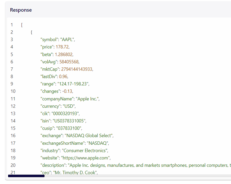
This FMP API endpoint https://financialmodelingprep.com/api/v3/profile/{ticker}?apikey={apikey} allows you to get the full company profile (current price and currency, which sector, country it is in, company name etc.). An example of the JSON that it returns is given here (also in screenshot below).
First, we create a profiles list to store all the company profies later. Then we loop through each ticker in the portfolio dictionary earlier, generate the appropriate url endpoint for the FMP API, and parse the JSON into a profile dictionary. We add a key called No. Shares to the profile dictionary with the value n_shares from our portfolio dictionary earlier (number of shares that we have for that ticker). We will need all these for the heatmap later.
profiles = [] # list to save all the company profiles data
for ticker, n_shares in portfolio.items():
  ticker = ticker.upper() # make sure ticker is caps
  print("Getting profile for", ticker)
  url = f"{base_url}profile/{ticker}?apikey={apikey}" # get company profile information
  profile = get_jsonparsed_data(url)[0]
  profile["No. Shares"] = n_shares # number of stocks in your portfolio in your input earlier
We are not done with this for loop yet, we will add more code to this for loop in the next section.
4.1. Get Foreign Exchange Rates if Price is Not in USD
To compare each stock you own relative to other stocks in your portfolio later, you will need to use the same currency. Some of the stocks may be in other currencies so we need the exchange rate to convert them to USD. FMP offers an endpoint for that too, shown in the code as https://financialmodelingprep.com/api/v3/fx/{currency}USD?apikey={apikey}.
Continuing on the same for loop in Section 4, we check the currency from the company profile dictionary to see if it is USD. If it is not, we get the exchange rate of this currency against USD from the respective FMP API endpoint shown below. We then store this value with the Exchange Rate key in the same profile dictionary. If the currency is already in USD, then we simply store this Exchange Rate as 1, for convenience when we use it later.
  currency = profile["currency"] # if this is not USD, this can be input into the FMP API endpoint below to get forex rates
  # get real time forex data if currency is not already in USD
  # so we can compare the stocks' allocation in portfolio equally
  if currency != "USD":
      # FMP endpoint for getting forex rate
      fx_url = f"{base_url}fx/{currency}USD?apikey={apikey}" # get exchange rate
      exchange_rate = float(get_jsonparsed_data(fx_url)[0]['ask'])
      profile['Exchange Rate'] = exchange_rate
  else:
      profile['Exchange Rate'] = 1 # price is already in USD

  profiles.append(profile)
4.2. Save Company Profiles in DataFrame and Convert Stock Price to USD
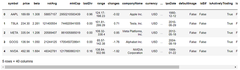
Now we save the scraped company profiles in a Pandas DataFrame called df_profiles. We calculate the price of each stock in USD (using the Exchange Rate above). We also calculate the total value each stock in the portfolio by multiplying by number of shares owned. Part of the DataFrame is shown below.
df_profiles = pd.DataFrame(profiles)
df_profiles["Price USD"] = df_profiles["price"]*df_profiles["Exchange Rate"]
df_profiles["Portfolio Value USD"] = df_profiles["Price USD"]*df_profiles["No. Shares"]
df_profiles.head()
Now we have all the information about the company that we want. We will display some of them in our heatmap later.
5. Get Stock Prices
Next, we will need to get the stock prices for each company at different time periods so we can look at the price changes (performance) and incorporate them into our heatmap.
5.1. Get Previous Dates of Interest for Stock Price Scraping
You likely may want to track the performance of your stocks for certain time periods, such as 1 Day, 1 Month, 3 Month, 6 Month, Year to Date and 1 Year Performance (same as that in Finviz shown at the start of the article) which I have included in the code below.
First, we get today’s date, then we get the previous dates of interest by subtracting the corresponding amount of days/months/years from today.
We convert everything to strings and store them in a dictionary called interested_prices_dates. We also store the earliest_date_string from the earliest dates below as input to the FMP API earlier to scrape the stock prices only from this date onwards. Feel free to change the code below to include previous dates of interest of your own choosing.
today = datetime.datetime.today() # get today's date
string_today = today.strftime('%Y-%m-%d') # convert to string

# get previous dates of interest by subtracting the corresponding amount of days/months/years from today
string_1_year = (today - relativedelta(years=1)).strftime('%Y-%m-%d')
string_1_month = (today - relativedelta(months=1)).strftime('%Y-%m-%d')
string_3_month = (today - relativedelta(months=3)).strftime('%Y-%m-%d')
string_6_month = (today - relativedelta(months=6)).strftime('%Y-%m-%d')
string_1_week = (today - relativedelta(days=7)).strftime('%Y-%m-%d')
string_ytd = datetime.datetime(today.year, 1, 1).strftime('%Y-%m-%d')

# store interested prices in dictonary
interested_prices_dates = {
    '1 Year': string_1_year,
    'Year to Date': string_ytd,
    '1 Month': string_1_month,
    '3 Month': string_3_month,
    '6 Month': string_6_month,
    '1 Week': string_1_week
}

earliest_date_string = string_1_year # this is the earliest date from which to scrape prices, needed as input to FMP API later

interested_prices_dates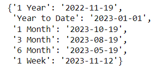
5.2. Scrape the Stock Prices
This FMP API endpoint https://financialmodelingprep.com/api/v3/historical-price-full/{ticker}?from={earliest_date_string}&apikey={apikey} allows you to get all the stock prices from the earliest date that you want, for any ticker.
A screenshot of the API response from the FMP documentation is shown below.
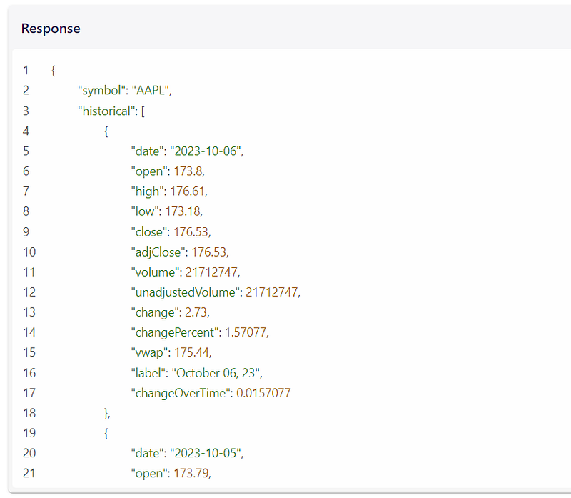
First we define a prices_of_interest list to store all the prices later. Then, for each ticker from our portfolio dictionary defined earlier, we define a dictionary called prices to store our results, and generate the url endpoint to get the prices from the FMP API, starting from the earliest date of interest (stored in earliest_date_string defined earlier). We also parse the returned json and store all historical prices into a DataFrame called df_historical_prices and turn it into a time series DataFrame by setting the date column to be the index.
prices_of_interest = [] # to store price data of all tickers for dates of interest

for ticker, n_stocks in portfolio.items():
    print(ticker)
    prices = {} # to store price data of each ticker
    prices['symbol'] = ticker

    # FMP API to get historical stock prices from the earliest interested date
    price_url = f"{base_url}historical-price-full/{ticker}?from={earliest_date_string}&apikey={apikey}"
    # call the API just once to get all prices, then extract prices for the interested dates below
    historical_prices = get_jsonparsed_data(price_url)['historical']
    df_historical_prices = pd.DataFrame(historical_prices).set_index('date') # turn DataFrame in time series by setting index to be the date column
5.3. Extract Stock Prices of Previous Dates of Interest
Next, continuing our for loop above, we get all the prices for our dates of interest defined in the interested_prices_dates dictionary defined earlier. We are using the adjusted Close price for each day, from the column adjClose.
For prices 1 Day ago, we simply extract it using df_historical_prices.iloc[1][‘adjClose’]. This is because .iloc[1] gives the second row of the results, which is the second most recent date. The most recent date will be in the first row.
For the other dates, we make use of the .truncate() function of Pandas DataFrames. Why do we do that? Note that our previous dates of interest may not always be present in the DataFrame itself, this is because the dates may fall on non-trading days, such as weekends or public holidays. By taking the last row of the DataFrame after we truncate all dates before our previous dates of interest, this row will correspond to either the date of interest itself (if present), or the earliest trading day after the date of interest. We extract the price of this row and append it to the prices_of_interest list earlier.
    # extract prices for interested dates
    # iloc[1] locates 2nd row, which is previous closing price, current day close is already in 'price' column pulled earlier
    prices['1 Day'] = df_historical_prices.iloc[1]['adjClose']  # price 1 day ago

    for label, date_string in interested_prices_dates.items():
        # why do we use .truncate() below?
        # if our date of interest is not inside the dataframe (i.e. it is a public holiday or non working day)
        # the truncate function help us to locate the first date that occurs after our date of interest
        prices[label] = df_historical_prices.truncate(before=date_string).iloc[-1]['adjClose']

    prices_of_interest.append(prices)
5.4. Store the Prices in a DataFrame
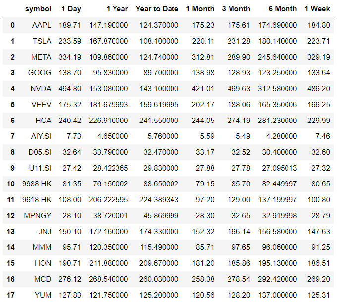
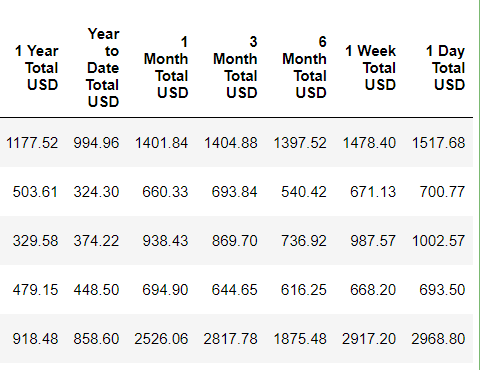
Let’s now store our prices into a DataFrame called df_prices.
df_prices = pd.DataFrame(prices_of_interest)
df_prices
Great, now we have all the prices that we want!
6. Merge the DataFrames of Company Profiles and Stock Prices Together
Now we merge our DataFrames from Section 4 and Section 5 (for company profile df_profiles and stock prices df_prices respectively) together, on the symbol column that both DataFrames share. The resulting DataFrame, called df, will be our main DataFrame.
df = df_profiles.merge(df_prices, left_on='symbol', right_on='symbol', how = 'left')
df.head()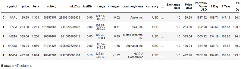
7. Calculate Stock Price Performance Over Different Periods of Time
Now we have the company information of all the stocks, and their stock prices at our previousdates of interests. We need to actually calculate the performance in terms of price changes over each time period of interest.
7.1. Calculate Total Portfolio Value in USD for Each Stock
For each of the different previous dates of interest (1 Day, 1 Week etc. in their respective columns), we calculate the total value of each stock in USD in our portfolio for each previous date of interest. This is done by multiplying the stock Price (at each date of interest) by the Exchange Rate (to convert to USD) and the No. Shares. This is used for performance measures later.
# For each of the different interested dates in each column, calculate total portfolio value in USD for each stock
# For performance measures later
past_prices_columns = list(interested_prices_dates.keys()) + ["1 Day"]
print(past_prices_columns)

for col in past_prices_columns:
     df[f"{col} Total USD"] = df[col] * df["Exchange Rate"] * df["No. Shares"]

df.head()
These are the new columns created for each ticker.
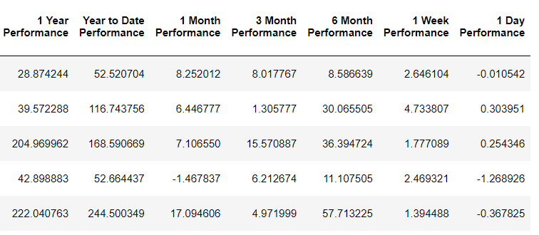
7.2. Calculate the Percentage Change in Price Over Different Time Periods
The performance over each time period is calculated in terms of percentage price difference over each time period of interest. Recall from Section 4.2. that the column Portfolio Value USD is the total value of the stock in the portfolio on the current date. The new columns created earlier in Section 7.1. are the values on the previous dates of interest. We simply calculate the percentage price difference between the current value and each of the different previous values (all in USD) below. We name the columns as ‘[whichever time period] Performance’, for e.g. 1 Day Performance, 1 Year Performance etc..
# Calculate Performance for each Period of Time
# Store them in columns with names like "1 Day Performance", "1 Year Performance etc."
for col in past_prices_columns:
   df[f"{col} Performance"] = (df["Portfolio Value USD"]/df[f"{col} Total USD"] - 1)*100
df.head()
These are the new columns created.
Some Final Touchup
Before we generate our portfolio heatmap. Let’s do some final touchup to rename our columns to something neater, and round everything off to 2 decimal places.
cols_rename = {
    'symbol': 'Symbol',
    'price': 'Current Price',
    'currency': 'Currency',
    'n_stocks': 'No. of Shares',
    'sector': 'Sector',
    'country': 'Country',
    'companyName': 'Company Name',
    'dcf': 'FMP Intrinsic Value',
}
df = df.rename(columns=cols_rename)
df = df.round(2)
8. Function to Generate Your Heatmap (or more appropriately, Treemap)!
We now have all the information we want to generate the heatmap! Actuall, more appropriate it is called the treemap plot. We will make use of the treemap method (documentation below) from the plotly express library.
Now let’s look at the code for generating the treemap!
8.1. Using Plotly Express’ treemap() Method
def generate_treemap(performance_to_track):
    range_color_value = df[performance_to_track].max()/2 # for range in color scale below, this seems to give nice shades of green and red

    fig = px.treemap(df,
                        # path parameter below means heatmap will first break portfolio up by Country, then Sector, then Symbol of each company (in that order)
                        path=[px.Constant(f"My Personal Portfolio {performance_to_track}"),'Country', 'Sector', 'Symbol'],
                        # values parameter is for stating what the size of each box in heatmap represents
                        # in this case we represent the total portfolio value of each stock in USD with the size
                        # larger portfolio allocation to the stock will result in a large size,
                        values='Portfolio Value USD',
                        hover_data=['Company Name', 'Current Price', 'Currency', 'No. of Shares'], # what to show when hovering over each box in heatmap
                        color=performance_to_track, # color will represent the performance measure (i.e. change in stock price over a specific time period)
                        range_color=[-range_color_value,range_color_value], # range of values for which the color scale below will apply
                        color_continuous_scale=['#FF0000',"#000000", '#00FF00'], # red for values below 0, black for 0, green for high values
                        color_continuous_midpoint=0 # midpoint will be 0, i.e. 0% change in price
                    )
Lets look at the px.treemap() code first, which returns the treemap as fig.
pathparameter: We pass the following list[px.Constant(f”My Personal Portfolio {performance_to_track}”),’Country’, ‘Sector’, ‘Symbol’]. The px.constant() means the top of the portfolio will be given a constant title as we shall see later. The rest of the values in the list means that the treemap will first break portfolio up by theCountrycolumn, thenSector, thenSymbolof each company (in that order), as we go down deeper and deeper at each level.valuesparameter: We pass in the column namePortfolio Value USDto thevaluesparameter. The values parameter is for stating what the size of each box in treemap represents. In this case we represent the total portfolio value of each stock in USD with the size. (We took all the effort of calculating everything in USD earlier for this purpose, as we cannot fairly compare the value of each stock in different currencies).hover_dataparameter: We pass in the list[‘Company Name’, ‘Current Price’, ‘Currency’, ‘No. of Shares’]to show these when we hover over each box in the treemap. Feel free to change this to show what you want!colorparameter: We pass inperformance_to_trackto thecolorparameter so the color represents the performance. Thisperformance_to_trackis also the function input argument. When we call this function later, we will pass in columns like1 Day Performance,1 Week Performanceetc.range_colorparameter: This parameter is for stating the range of values for which to map the color scale later. I pass in therange_color_valuecalulated in the first line of this function. Here I have found that getting half of the max value as the color range produces the best color plots. Feel free to experiment with this to get colors of your preference.color_continuous_scaleparameter: Here we pass in[‘#FF0000’,‘#000000’, ‘#00FF00’], which is the hex color codes for red, black and green respectively. (So we display negative performance as red, 0 as black and positive as green).color_continuous_midpointparameter: We pass in 0, so that the middle color above (black) is mapped to 0.
8.2. Adding Customizations
We are not done with the function yet, there’s more code below to enhance the appearance of our treemap fig. In short, we format the display of the text in each box to be at the center (rather than the top left which is the default), increase the line width of the border of each box. Of course, the aesthetics is subjective to the user, so feel free to change any of these to suit your preference!
    fig.update_traces(textposition="middle center", # by default the text in each box is at the top left, we change this to center
                      selector=dict(type='treemap'),
                      marker_line_width = 4)

    fig.update_layout(margin = dict(t=30, l=10, r=10, b=10), height=800, font_size=16) # add some margins and change font size to make it look nicer
The code below is an important one. By default, the plot would only show the ticker symbol in each box, and not the performance_to_track (i.e. percentage change in performance) under it. Thankfully, we are allowed to do some customization using the following code.
# by default, only the label (Symbol) will be shown, customdata[4] stores the performance measure of the stock, i.e. change in stock price
    fig.data[0].texttemplate = "%{label}<br><br>%{customdata[4]:.2f}%"

    return fig
The fig.data[0].texttemplate is just plotly’s way of adjusting the text field in each text block. The value “%{label}<br><br>%{customdata[2]:.2f}%” passed to it is a mixture of Python string formatting and HTML. First, plotly understands label as the ticker Symbol of each box (this is our final parameter to the path parameter input to the px.treemap() earlier). customdata[4] is exactly the performance_to_track (i.e. percentage change in performance) value. The :.2f formats it into a string with 2 decimals.
More on plotly’s customdata
How does customdata work? The first four values, i.e. customdata[0] to customdata[3] corresponds to the 4 values we passed into the hover_data parameter in px.treemap() earlier. The fifth value is what we passed into the color parameter, which is performance_to_track. Knowing how customdata works can help you to further customize your treemap!
9. Our Heatmaps for the Portfolio Performance Over Different Time Periods!
Let’s generate the heatmaps now!
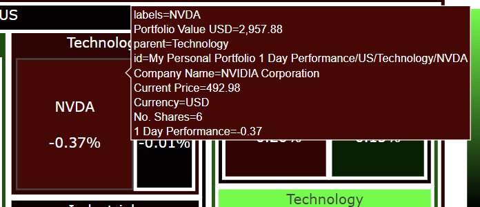
1 Day Performance
fig1 = generate_treemap('1 Day Performance')
fig1.show()
Hovering over NVDA shows this.
1 Week Performance
fig2 = generate_treemap('1 Week Performance')
fig2.show()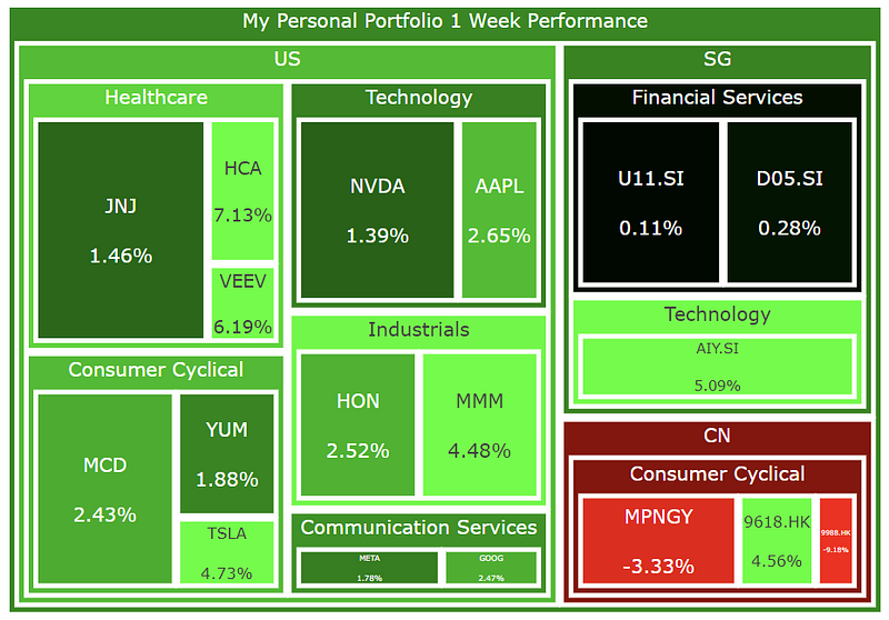
1 Month Performance
fig3 = generate_treemap('1 Month Performance')
fig3.show()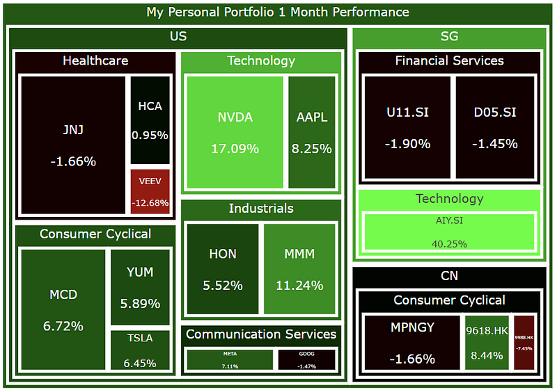
3 Month Performance
fig4 = generate_treemap('3 Month Performance')
fig4.show()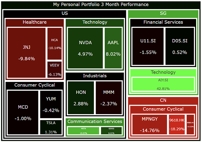
6 Month Performance
fig5 = generate_treemap('6 Month Performance')
fig5.show()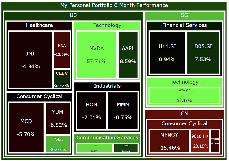
1 Year Performance
fig6 = generate_treemap('1 Year Performance')
fig6.show()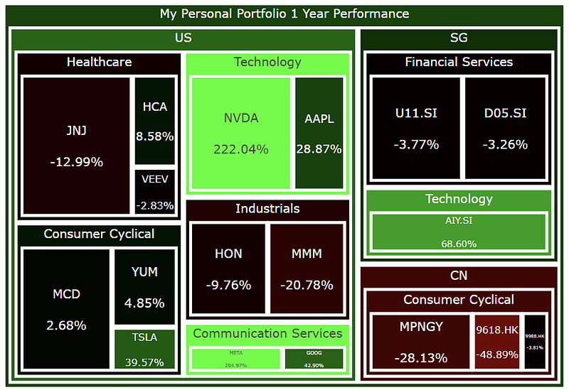
Year to Date Performance
fig7 = generate_treemap('Year to Date Performance')
fig7.show()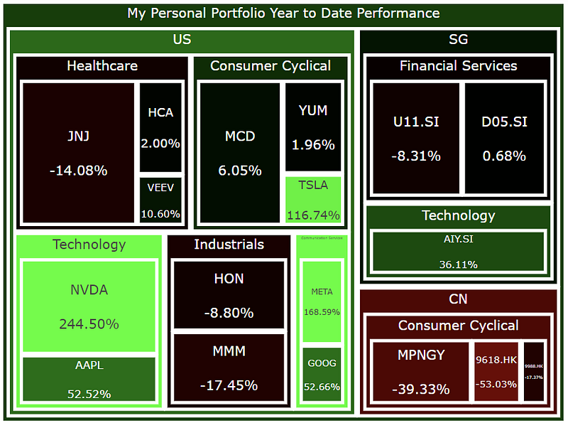
Optional: Generate HTML File for All 4 Heatmaps Above
# Generate HTML File with Updated Time and Treemap
with open('stock_portfolio_performance_heatmaps.html', 'a') as f:
    f.truncate(0) # clear file if something is already written on it
    title = "<h1>Stock Portfolio Performance Heatmaps for Different Time Periods</h1>"
    f.write(title
    f.write(fig1.to_html(full_html=False, include_plotlyjs='cdn'))
    f.write(fig2.to_html(full_html=False, include_plotlyjs='cdn')) # write the fig created above into the html file
    f.write(fig3.to_html(full_html=False, include_plotlyjs='cdn')) # write the fig created above into the html file
    f.write(fig4.to_html(full_html=False, include_plotlyjs='cdn')) # write the fig created above into the html file
    f.write(fig5.to_html(full_html=False, include_plotlyjs='cdn')) # write the fig created above into the html file
    f.write(fig6.to_html(full_html=False, include_plotlyjs='cdn')) # write the fig created above into the html file
    f.write(fig7.to_html(full_html=False, include_plotlyjs='cdn')) # write the fig created above into the html file
As an optional step, you can write all the figures above into a single HTML file. Once again, I have output all my plots into this file (interactive versions of the plots). Happy plotting! I hope you enjoyed this article and find this treemap to be informative in telling how diversified your portfolio is and what the recent performance of all your stocks is like.
The financial data from the above is scraped from the Financial Modeling Prep API, which is an accurate financial data (i.e. stocks, earnings, historical data, market sentiment, financial statements etc.) API. Once again, you can sign up for it at a discounted rate here, there is a free version too.
If you enjoyed this article, feel free to check out my other articles below and feel free to follow me. :)
Linkedin: https://www.linkedin.com/in/damian-boh/
Visit us at DataDrivenInvestor.com
Subscribe to DDIntel here.
Have a unique story to share? Submit to DDIntel here.
Join our creator ecosystem here.
DDIntel captures the more notable pieces from our main site and our popular DDI Medium publication. Check us out for more insightful work from our community.
DDI Official Telegram Channel: https://t.me/+tafUp6ecEys4YjQ1


