
Boost your Power BI reports with stunning Python visuals
Unlock the Full Potential of Power BI with Python: Leveraging Advanced Data Analysis with Stunning Visuals and Predictive Insights

Python is a powerful programming language that is widely used for data analysis, machine learning, and visualization. Power BI, on the other hand, is a popular business intelligence tool that helps users create interactive reports and dashboards. By combining these two technologies, users can take advantage of Python’s advanced capabilities to create highly customized and visually appealing visuals in Power BI.
One of the main advantages of using Python in Power BI is the ability to create advanced visuals that are not available out-of-the-box in Power BI. Python has a vast ecosystem of libraries for data visualization, such as Matplotlib, Seaborn, Plotly, and Bokeh, that can be used to create highly customized and interactive visuals.
Another advantage of using Python in Power BI is the ability to leverage Python’s powerful data analysis and machine learning capabilities. Python has a rich set of libraries for data manipulation, such as Pandas, Numpy, and Scipy, that can be used to preprocess and transform data before visualizing it in Power BI. Additionally, Python’s machine learning libraries, such as Scikit-learn and TensorFlow, can be used to build predictive models and integrate them into Power BI reports.
Here’s an example to get started with using Python to create advanced visuals in Power BI:
Step 1 : Install Python and required libraries
First, make sure you have Python installed on your machine. You will also need to install some Python libraries that will be used to create the visuals. To do this, open a command prompt or terminal and type the following commands:
pip install matplotlib
pip install seaborn
pip install pandas
Step 2 : Enable Python scripting in Power BI
To use Python in Power BI, you need to enable Python scripting in the Power BI options. To do this, go to File -> Options and settings -> Options -> Python scripting. Select the option to “Allow external Python scripts to be executed from within Power BI Desktop” and click OK.
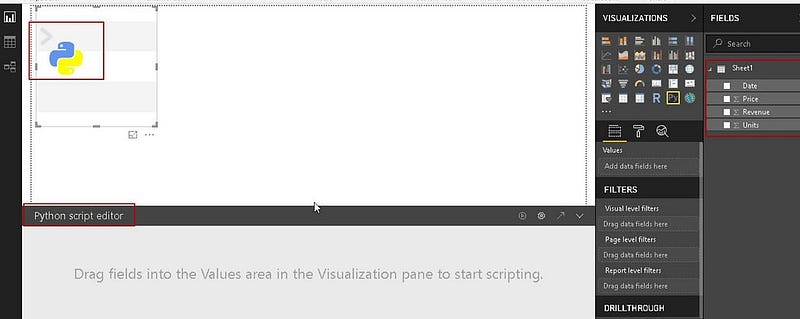
Step 3 : Create a Python script
In Power BI, click on the “New source” button and select “Python script” from the dropdown menu. This will open a new window where you can write your Python code. Here’s an example of a Python script that creates a scatter plot using the Seaborn library:
2 / 2

Sure, here's an example of how you can use Python to create advanced visuals in Power BI:

Step 1: Install Python and required libraries

First, make sure you have Python installed on your machine. You will also need to install some Python libraries that will be used to create the visuals. To do this, open a command prompt or terminal and type the following commands:

Copy code
pip install matplotlib
pip install seaborn
pip install pandas
Step 2: Enable Python scripting in Power BI

To use Python in Power BI, you need to enable Python scripting in the Power BI options. To do this, go to File -> Options and settings -> Options -> Python scripting. Select the option to "Allow external Python scripts to be executed from within Power BI Desktop" and click OK.

Step 3: Create a Python script

In Power BI, click on the "New source" button and select "Python script" from the dropdown menu. This will open a new window where you can write your Python code. Here's an example of a Python script that creates a scatter plot using the Seaborn library:

python
Copy code
import pandas as pd
import seaborn as sns
import matplotlib.pyplot as plt

# Load data from Power BI
data = pd.DataFrame(dataset['Data'])

# Create scatter plot using Seaborn
sns.scatterplot(x='X', y='Y', data=data)

# Set plot title and labels
plt.title('Scatter plot')
plt.xlabel('X')
plt.ylabel('Y')

# Show plot
plt.show()
This script first loads the data from Power BI into a Pandas DataFrame, then uses Seaborn to create a scatter plot of the data. Finally, it sets the plot title and labels and shows the plot using Matplotlib.
Step 4 : Bind the Python script to a visual
After you have written your Python script, you need to bind it to a visual in Power BI. To do this, click on the “Visualizations” tab and select the visual you want to use (e.g., a scatter plot). Then, click on the “Format” tab and scroll down to the “Python script” section. Paste your Python script into the text box and click “OK”.
Step 5 : Preview and customize your visual
You can now preview your visual by clicking on the “Run” button in the “Python script” section. If everything is working correctly, you should see your advanced visual displayed in the Power BI report. You can customize the visual further by adjusting the script or using the formatting options in Power BI.
That’s it! With these five steps, you can create beautiful advanced visuals using Python inside Power BI.
You can refer this article on creating custom python visuals in PowerBi-
You might also like this
https://readmedium.com/simplest-way-to-build-a-trading-system-and-backtest-in-python-bdaa49c86db6
About the author
Srihari Pramod
Design | Finance | AI Products | Data Analytics
LinkedIn: https://www.linkedin.com/in/sriharipramod/
P.S.: If you like to experience Medium yourself, consider supporting me and thousands of other writers by signing up for a membership. It only costs $5 per month; it supports me directly with a portion of your fee and won’t cost you more!