Beyond Words: Unleashing the Power of Text Visualization
The written word is a powerful thing. It started with the invention of the first written language by the ancient Sumerians, and later the introduction of the Gutenberg press enabled the written word to spread knowledge. Discovering latent insights and patterns in text data can be quite challenging, which is why visualizing it is an important step. In this article, we will explore stunning ways to visualize text data. First, we’ll use ScatterText to present the text data in sexy and interactive scatter plots to explore term frequencies and dispersion. Then, we’ll use two powerful topic modeling techniques — Latent Dirichlet Allocation (LDA) and BERTopic, to uncover and present word and topic distributions within the corpus. And last but not least, we’ll create n-gram word clouds and frequency to showcase the most frequent/important words in a corpus. Let’s get visualizing!
1. Data extraction and pre-processing
But first thing first, let us acquire the data and do some pre-processing ;)

This article uses a dataset composed of the corpus of texts of UN General Debate . It contains all the statements made by each country’s presentative at UN General Debate from 1970 to 2020. You can gain extra insight into its contents by reading this paper. This is open data and is available online here. You will need to request access to the data. The data is provided in the form of text files and the following block of code can be used to extract the texts and save them into a data frame format.
import pandas as pd
import os
import re
import nltk
from tqdm import tqdm

nltk.download("averaged_perceptron_tagger")

dir_path = os.path.dirname(os.path.abspath("__file__"))
main_data_dir = os.path.join(dir_path, "TXT")


def open_speech(file_path):
    """
    This function opens a file with the correct formatting
    :param file_path:
    :return:
    """

    file = open(file_path, encoding="utf-8-sig")
    data = file.read()

    return data


def remove_line_number(speech):
    """
    removes the line number at the beginning of speech

    Parameters
    ---------
    speech : str
        piece of text
    """

    pattern = "\n|^\d+.*?(\w)"
    speech = re.sub(pattern, "\n\g<1>", speech)
    pattern = "\t"
    speech = re.sub(pattern, "", speech)
    pattern = "\n\n"
    speech = re.sub(pattern, "\n", speech)
    pattern = "^\n *"
    speech = re.sub(pattern, "", speech)

    return speech


if __name__ == "__main__":
    # True --> run preprocessing and save the results, False --> just do the data analysis with your previously saved
    # dataframe file (always have to do a preprocessing run to save the dataframe of course)
    do_preprocessing = True

    if do_preprocessing:
        speeches_df = pd.DataFrame(
            columns=[
                "session_nr",
                "year",
                "country",
                "speech",
            ]
        )

        num_directories = len(next(os.walk(main_data_dir))[1])

        # loop through all directories of the data
        for root, subdirectories, files in tqdm(
            os.walk(main_data_dir), total=num_directories, desc="directory: "
        ):
            # remove all the files starting with '.' (files created by opening a mac directory on a windows PC,
            # so will only do something if you are working on a windows PC
            files_without_dot = [file for file in files if not file.startswith(".")]

            # loop through files and extract data
            for file in tqdm(files_without_dot, desc="files: ", leave=False):
                country, session_nr, year = file.replace(".txt", "").split("_")

                # open a speech with the correct formatting
                speech_data = open_speech(os.path.join(root, file))
                speech_data = remove_line_number(speech_data)

                # append the features to the dataframe
                speeches_df = speeches_df.append(
                    {
                        "session_nr": int(session_nr),
                        "year": int(year),
                        "country": country,
                        "speech": speech_data,
                    },
                    ignore_index=True,
                )
        speeches_df.to_csv("Data/Raw/raw_speeches.csv")
Data pre-processing pipeline
Technically, any text document is just a sequence of characters. To analyze the content, we first need to transform them into meaningful sequences of words or tokens and remove the noise such as frequent words carrying little meaning. As part of preprocessing, we will use the following configuration to build a simple data processing pipeline:
- Remove the first sentences of the speech (welcoming sentences which are nearly identical across documents)
- Lower case
- Tokenize (split the documents into tokens).
- Remove stop words
- Lemmatize
- Create a second filter — an (additional) list of stop words. Sometimes it is helpful to filter out specific frequent but uninteresting words for the visualization.
The following block of code can be used to do data processing. And feel free to use the processed data set in this link.
import pandas as pd
import nltk
from nltk.stem import WordNetLemmatizer
from nltk.stem import PorterStemmer
from nltk import pos_tag
import scattertext as st
nltk.download("averaged_perceptron_tagger")
nltk.download("omw-1.4")
nltk.download("wordnet")
try:
nltk.data.find("punkt")
except LookupError:
nltk.download("punkt")
try:
nltk.data.find("stopwords")
except LookupError:
nltk.download("stopwords")
try:
nltk.data.find("vader_lexicon")
except LookupError:
nltk.download("vader_lexicon")
def stem_token(token):
"""
Stems the given token using the PorterStemmer from the nltk library
Input: a single token
Output: the stem of the token
"""
ps = PorterStemmer()
stemmed_word = ps.stem(token)
return stemmed_word
def penn2morphy(penntag):
"""Converts Penn Treebank tags to WordNet."""
morphy_tag = {"NN": "n", "JJ": "a", "VB": "v", "RB": "r"}
try:
return morphy_tag[penntag[:2]]
except:
return "n"
def lemmatize_token(token):
"""
Lemmatize the token using nltk library
Input: a single token
Output: the lemmatization of the token
"""
wordnet = WordNetLemmatizer()
token_tagged = pos_tag([token])
tag = token_tagged[0][1]
morphy_tag = penn2morphy(tag)
lemmatized_word = wordnet.lemmatize(token, pos=morphy_tag)
return lemmatized_word
def remove_line_number(speech):
"""
removes the line number at the beginning of speech
Input: str
Output: str
"""
pattern = "\n|^\d+.*?(\w)"
speech = re.sub(pattern, "\n\g<1>", speech)
pattern = "\t"
speech = re.sub(pattern, "", speech)
pattern = "\n\n"
speech = re.sub(pattern, "\n", speech)
pattern = "^\n *"
speech = re.sub(pattern, "", speech)
return speech
def filter_common_words(words):
common_words = [
"first",
"like",
"welcome",
"pleased",
"let",
"good",
"afternoon",
"press",
"conference",
"meeting",
"would",
"outcome",
"going",
"know",
"said",
"along",
"together",
"also",
"formally",
"meetings",
"evening",
"annual",
"one",
"two",
"second",
"third",
"last",
"next",
"point",
"per",
"answer",
"ask",
"say",
"said",
"mention",
"talk",
"tell",
"told",
"suggest",
"think",
"wonder",
"mean",
"understand",
"know",
"maybe",
"perhaps",
"remain",
"generally",
"thus",
"member",
"seem",
"see",
"look",
"consider",
"regard",
"include",
"hear",
"going",
"go",
"goes",
"come",
"came",
"give",
"use",
"using",
"get",
"can",
"could",
"should",
"may",
"might",
"way",
"yes",
"no",
"lot",
"bit",
"also",
"case",
"fact",
"like",
"want",
"believe",
"feel",
"actual",
"well",
"kin",
"moment",
"time",
"now"
]
return [word for word in words if word not in common_words]
def remove_first_sentence(speech):
"""
remove the first sentence
"""
pattern = r"^.*?\."
speech = re.sub(pattern, "", speech)
return speech
def preprocess_speech(speech):
"""
This function does the preprocessing
"""
# put all characters in lower case
speech["Text"] = speech["Text"].str.lower()
speech["Tokens"] = speech["Text"].apply(lambda x: nltk.word_tokenize(str(x)))
# remove stop words and non-alphabetic from all the text
stop_word = nltk.corpus.stopwords.words("english")
speech["Tokens"] = speech["Tokens"].apply(
lambda x: [word for word in x if (word not in stop_word) and word.isalpha()]
)
# lemmatize
speech["Tokens"] = speech["Tokens"].apply(
lambda x: [lemmatize_token(token) for token in x]
)
# additional filter
speech["Tokens"] = speech["Tokens"].apply(filter_common_words)
speech["Joined_Tokens"] = speech["Tokens"].apply(lambda x: " ".join(x))
speech = speech.sort_values(by="year").reset_index(drop=True)
speech = country_code_cleanup(speech)
# create a scattertext object for visualization
speech['parse'] = speech.Joined_Tokens.apply(st.whitespace_nlp_with_sentences)
return speech
speech = pd.read_csv("Data/Raw/raw_speeches.csv", index_col=0)
speech = preprocess_speech(speech)
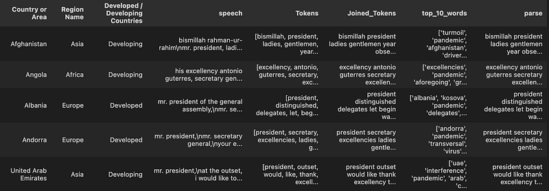
speech_happiness.to_csv("Data/Processed/preprocessed_speech.csv")The final data frame will have the following attributes:
2. Text Visualization
2.1 ScatterText for Term Frequency and Dispersion
ScatterText is a Python interactive, scalable tool to visualize text data in a scatter plot that can display a high number of words and phrases used in a corpus on an HTML page. Exploratory data analysis just gets so much more fun with this 😊 The official Github repo can be found here. I will only focus on the term frequency and dispersion, feel free to look into the repo for other types of text visualizations.
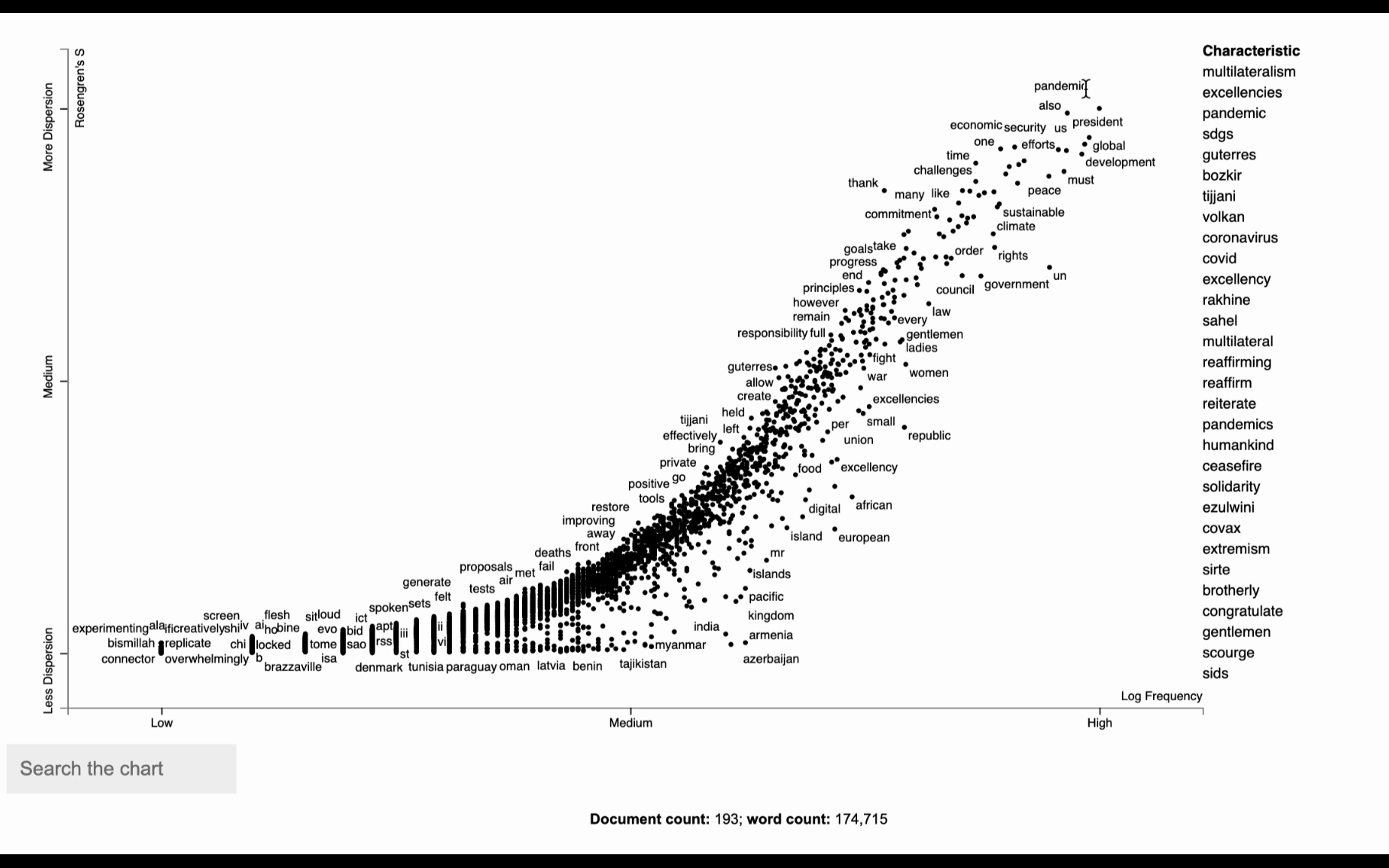
Term Frequency vs Dispersion without distinguishing document category
One insightful thing to do with text data is to plot term dispersion against term frequency and identify the terms which are the most and least dispersed given their frequencies. The term dispersion will tell us about how a term is distributed among different documents. A term that appears multiple times in one document, but not in any other will have a low dispersion, whereas if it appears in similar frequency across all documents it will have a high dispersion.
First, we need to prepare the data to be used in the ScatterText visualizations. The st.whitespace_nlp_with_sentences function is perfect for that. It is a pre-processing step that tokenizes the text using whitespace and performs sentence segmentation. The resulting output is a list of spaCy Doc objects, which represent the tokenized and parsed documents.
import scattertext as st
speeches['parse'] = speech.Joined_Tokens.apply(st.whitespace_nlp_with_sentences)
speeches_2020 = speeches[speeches["year"] == 2020]
At this point, we are not trying to distinguish between document categories, therefore we will use the st.CorpusWithoutCategoriesFromParsedDocuments class to create a ScatterText corpus object using the “parse” column created in the previous step as the input. This will return a version of the corpus where each document is represented by a bag of words using unigrams. Next, we remove infrequent words from the corpus using a minimum term count threshold of 6 and rank the terms in the corpus using their absolute frequency. This processed corpus can be used for further analysis and visualization with ScatterText.
import scattertext as st
from scattertext.termranking import AbsoluteFrequencyRanker

corpus = (
    st.CorpusWithoutCategoriesFromParsedDocuments(speeches_2020, parsed_col="parse")
    .build()
    .get_unigram_corpus()
)
corpus.remove_infrequent_words(
    minimum_term_count=6, term_ranker=AbsoluteFrequencyRanker
)
corpus.get_categories()
Next, to plot the frequency and dispersion of all the terms, we need a data frame with 2 columns: frequency and dispersion score. We will create this data frame that captures the frequency of each term and scores of various dispersion measures. These will be shown after a term is activated in the plot.
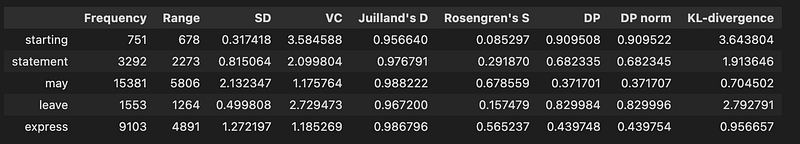
dispersion = st.Dispersion(corpus)
dispersion_df = dispersion.get_df()
dispersion_df.head(5)
The above code should return:
For this example, we will be using Rosengren’s S measure (Gries 2021) to display the dispersion of each term in the document. In order to start plotting, we need to add the coordinates for each term to the data frame. We will create Xpos and Ypos columns which are generated by scaling the original Frequency(X) and dispersion score(Y) values using log_scale() and scale() method from Scattertext.Scalers:
dispersion_df = dispersion_df.assign(
    X=lambda df: df.Frequency,
    Xpos=lambda df: st.Scalers.log_scale(df.X),
    Y=lambda df: df["Rosengren's S"],
    Ypos=lambda df: st.Scalers.scale(df.Y),
)
Finally, we can now plot the scatter graph using the dataframe_scattertext function and write the scatter plot in a stand-alone interactive HTML file:
html = st.dataframe_scattertext(
    corpus,
    plot_df=dispersion_df,
    ignore_categories=True,
    color_score_column="ColorScore",
    x_label="Log Frequency",
    y_label="Rosengren's S",
    y_axis_labels=["Less Dispersion", "Medium", "More Dispersion"],
)

open("unga_dispersion.html", "wb").write(html.encode("utf-8"))
Looking at the following visualization seems overwhelming at first. But in fact, it is a simple visualization of words used in the corpus. Each dot corresponds to a term mentioned. The visualization tells us about how the word is distributed among different documents. If a term appears the same amount of times in all documents, you will have a dispersion of 1. Meaning it has a constant/homogeneous dispersion. If the term appears many times but only in a single document, you have the opposite effect and dispersion of 0. It’s similar to TF-IDF, but the main difference is that TF-IDF is used for term importance in a specific document, whereas the dispersion looks at how the term is used across all documents.
Term frequency vs. dispersion with a document category
Finding words and phrases that discriminate categories of text is a common application of NLP. Scattertext is also intended for visualizing what words and phrases are more characteristic of a category than others. Let’s identify differences in word usage between developed and developing countries in the UN General Debate Corpus. For example, to look for differences in how developed and developing countries choose terms in their speeches, set the category_col parameter to the ‘Developed / Developing Countries’ indicator.
corpus_2020 = (
    st.CorpusFromParsedDocuments(
        speeches_2020,
        category_col="Developed / Developing Countries",
        parsed_col="parse",
    )
    .build()
    .get_unigram_corpus()
    .compact(st.AssociationCompactor(2000))
)

html = st.produce_scattertext_explorer(
    corpus_2020,
    category="Developing",
    category_name="Developing Countries",
    not_category_name="Developed Countries",
    minimum_term_frequency=5,
    pmi_threshold_coefficient=0,
    width_in_pixels=1000,
    metadata=corpus.get_df()["Country or Area"],
    transform=st.Scalers.dense_rank,
)
open("./un_dispersion_category.html", "w").write(html)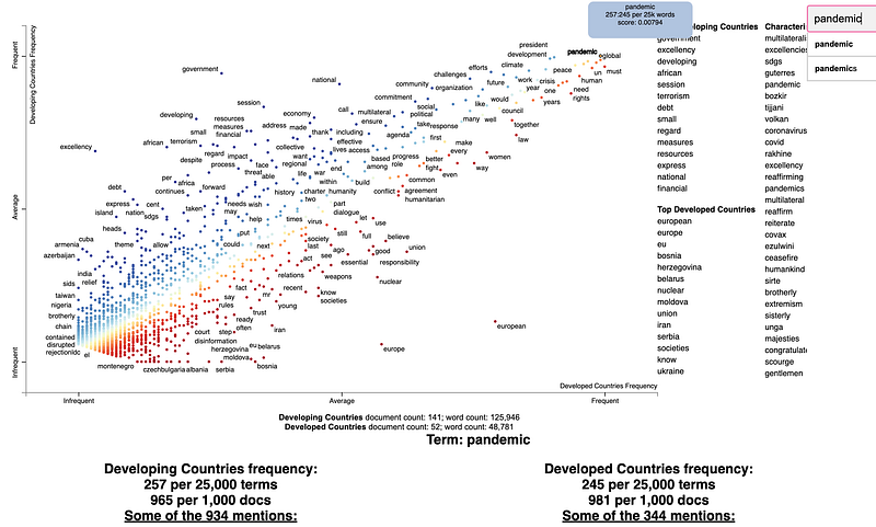
2.2 Topic Model Visualizations
An application of text visualization is Topic modeling, a technique used to uncover hidden (“latent”) topics and themes from a collection of documents. It will tell us which topics exist in the corpus and how they are distributed among each document.
A. Topic Model Visualization with Latent Dirichlet Allocation (LDA)
Latent Dirichlet Allocation (Blei, 2003) is a popular model for analyzing large amounts of text. It is a generative probabilistic model that returns the topic distribution in a document and the word distribution for each topic. If you are interested in knowing how LDA works, I have an article that is worth having a look at. In this example, we will use the LDA algorithm to discover topics that appear in the UN general debate corpus dataset and visualize it. The visualization allows us to quickly see words that are most relevant to a topic and the distances between topics.
Let’s install and import some relevant libraries:
pip install pyldavis
pip install gensim

from gensim.corpora import Dictionary
from gensim import corpora, models
from gensim.models import LdaModel
import pyLDAvis
import pyLDAvis.gensim_models as gensimvis
Moving on, we will create a training corpus from our texts. We start with converting a collection of words to a bag of words, which is a list of tuples (word, word_frequency). Gensim.corpora.Dictionary is a great tool for this:
#create a Gensim corpus from a list of texts
Texts = list(speeches_2020['Tokens'])
dictionary = corpora.Dictionary(Texts)
corpus = [dictionary.doc2bow(text) for text in Texts]
Now let’s build an LDA topic model. We will use models.ldamodel.LdaModel for training the LDA model and pyLDAvis for visualizing the topic. A lot of parameters can be tuned to optimize the training, such as the number of topics, chunk size, eta (a-priori belief on topic-word distribution), and alpha (a-priori belief on document-topic distribution).
lda_sym = models.ldamodel.LdaModel(
corpus=corpus,
id2word=dictionary,
num_topics=10,
update_every=1,
chunksize=100000,
passes=100,
alpha="auto",
eta="auto",
)
pyLDAvis.enable_notebook()
vis = gensimvis.prepare(lda_sym, corpus, dictionary)
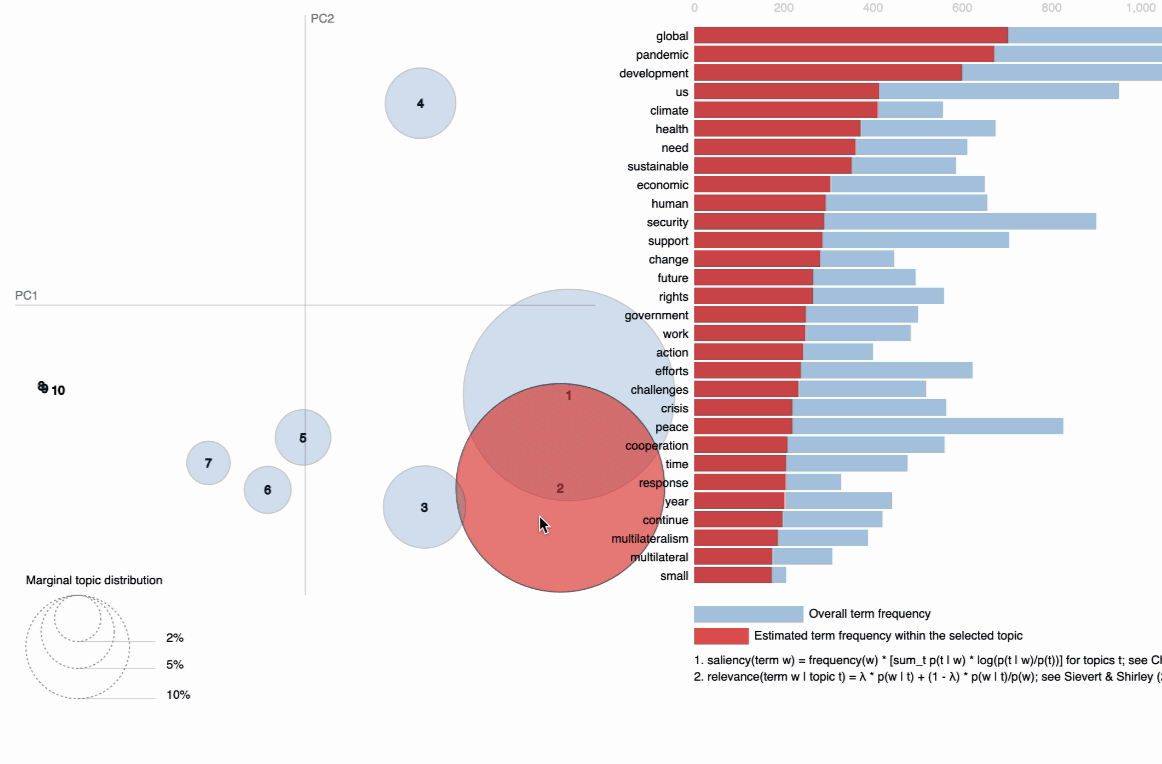
visIn the below visualization, you can see that there are 10 bubbles since I have chosen 10 topics for this corpus in the above code. The visualization provides information on the topics and the words that are important for each topic. You will see the most important words for each topic change while hovering over them. LDA, unfortunately, does not label the topic for us, but it returns the word distribution for each topic, from which we — as users have to make an inference on what the topic actually means. The further the bubbles are away from each other, the more different they are. As observed, topic 1 and topic 2 are more related than, for instance, topic 1 and topic 7; with topic 1 and 2 being more closely about pandemics and health while topic 7 is about social global, and economic developments in some countries around the middle east.
B. Topic model Visualization using BertTopic
Another technique for topic modeling is BERTopic, which is an algorithm that leverages 🤗 transformers and c-TF-IDF score — which is a modification of the traditional TF-IDF score that takes into account the distribution of words on cluster/categorical/topic level instead of a document level. This results in a score that reflects the importance of a word in a specific topic while also accounting for its overall frequency in the entire corpus. BERTopic embeds the c-TF-IDF representation of the topics in 2D and then visualizes the two dimensions using Plotly such that we can create an interactive view allowing for interpretable topics. As such, we can visualize the topics that were generated in a way similar to PyLDAvis for LDA.
Visualize Topics and Terms
First, we need to train our BERT model:
from bertopic import BERTopic
from sklearn.feature_extraction.text import CountVectorizer
# Convert training set to list of documents
docs = speech["Joined_Tokens"].drop_duplicates().to_list()
# Train the BERTopic model
vectorizer_model = CountVectorizer(ngram_range=(1, 3), stop_words="english")
topic_model = BERTopic(
vectorizer_model=vectorizer_model,
nr_topics=5,
min_topic_size=2,
calculate_probabilities=True,
)
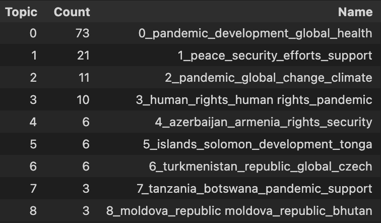
topics, probs = topic_model.fit_transform(docs)Moving on, let’s take a look at a few topics that we get out of training this way by running topic_model.get_topic_info(). We can see several interesting topics appearing here. They seem to relate to the topics returned by LDA:
Then, we can simply call.visualize_topics() to create a 2D representation of the topics within the corpus. The resulting graph is a Plotly interactive graph that tells you the general information of each topic, including the size of the topic and its corresponding most important words.
topic_model.visualize_topics(width=500, height=500)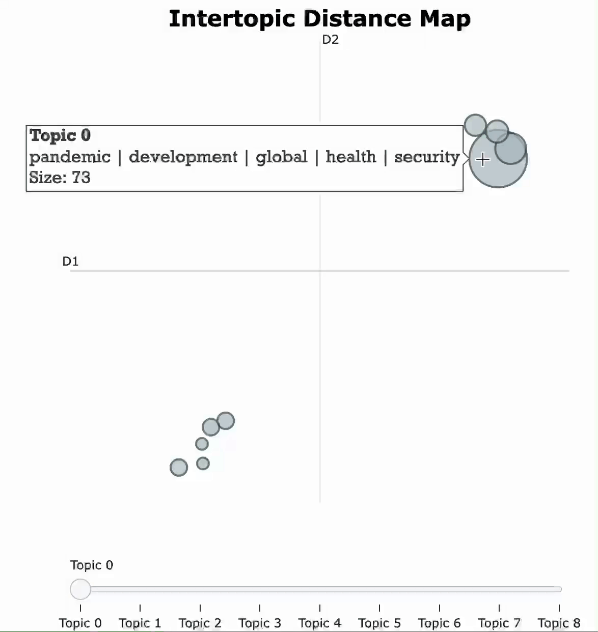
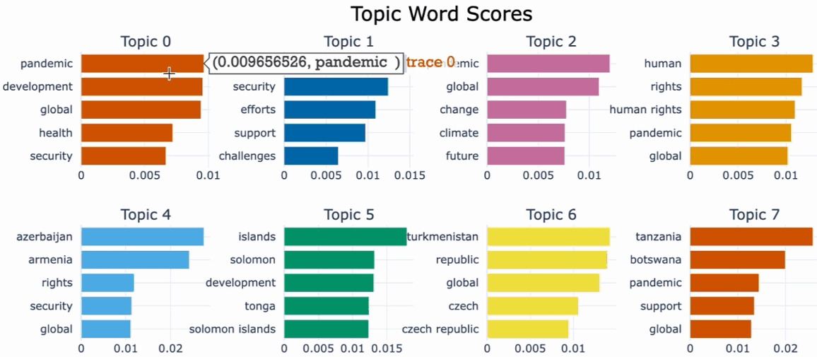
One useful tool for understanding the most important words in each topic and for interpreting and labeling the topics as well as comparing topic representation to each other is .visualize_barchart().We can visualize the top representative terms for each topic and their corresponding c-TF-IDF score by creating bar charts by simply calling .visualize_barchart().
Visualize documents
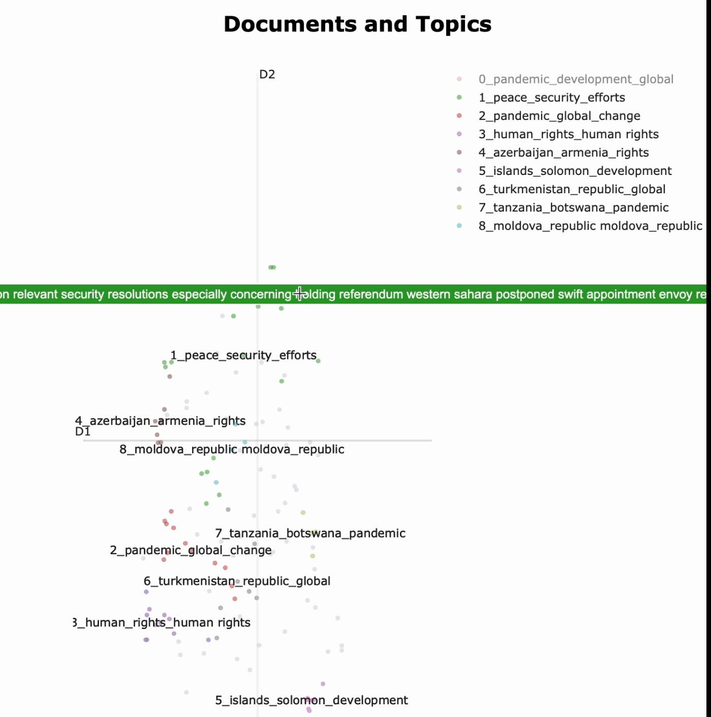
If you want to look for a tool for exploring the distribution of documents across topics and gaining insights into the structure of a corpus, topic_model.visualize_documents() is a great tool for that. By visualizing the distribution of documents across topics, it becomes possible to see which documents are most similar to each other, and it also helps to check whether documents were assigned correctly.
The first step is converting the documents to embedding (a fancy way of saying for representing text as an array of numbers). We will be using the pre-trained “all-MiniLM-L6-v2” model from SentenceTransformers, a framework for text and image embeddings to represent text as an array of numbers.
from sentence_transformers import SentenceTransformer

docs = list(speech["Joined_Tokens"].values)
sentence_model = SentenceTransformer("all-MiniLM-L6-v2")
embeddings = sentence_model.encode(docs, show_progress_bar=False)
topic_model.visualize_documents(docs, embeddings=embeddings,
width=600,
height=700)
Next, we can use the topic_model.visualize_documents()function to visualize the documents within each topic. What this function does is recalculate the document embeddings and reduce them to 2-dimensional space for easier visualization purposes:
2.3. N-gram Word Cloud
Word clouds visualize the term frequencies by different font sizes, which are much easier to comprehend and compare. The output is an image that depicts different words in different sizes and opacities relative to their frequency in the document.
The default Python module WordCloud generates unigrams (single words ), but we can explore a slightly more advanced version of the graph which, for instance, plots the frequency of bigrams, i.e., two consecutive words, by simply setting Collocation_threshold = 2 and collocations =True parameters to tell Python to display bigrams in generated wordcloud objects:
import numpy as np
import matplotlib.pyplot as plt
from wordcloud import WordCloud

text = "square"
x, y = np.ogrid[:300, :300]
mask = (x - 150) ** 2 + (y - 150) ** 2 > 130**2
mask = 255 * mask.astype(int)

#joins all the tokens in the "Joined_Tokens" column into a single string.
all_tokens = "".join(speech["Joined_Tokens"])

# generate unigram wordcloud
unigram_wordcloud = WordCloud(
    collocations=False, background_color="white", mask=mask
).generate(all_tokens)

# Generate a bi-gram word cloud
bigram_wordcloud = WordCloud(
    collocation_threshold=2, collocations=True, background_color="white", mask=mask
).generate(all_tokens)

# plot the wordclouds side by side
fig, axes = plt.subplots(nrows=1, ncols=2, figsize=(10, 5))

axes[0].imshow(unigram_wordcloud)
axes[0].set_title("Unigram Wordcloud")
axes[0].axis("off")

axes[1].imshow(bigram_wordcloud)
axes[1].set_title("Bigram Wordcloud")
axes[1].axis("off")

plt.show()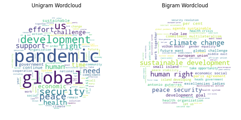
Both word clouds give a quick impression of the most talked-about topics in the United Nations General Assembly debates. While the unigram clearly talks about the pandemic and shows some words that on their own don’t mean much (e.g., right, support, global), the bigram word cloud tells a slightly different story about climate change and peace. Meanwhile, the pandemic is no longer present.
2.4. N-gram Frequencies
Frequently used words and phrases give us some basic understanding of the discussed topics. N-grams are used to describe the number of words used as observation points, e.g. unigram means singly-worded, bigram means the 2-worded phrase, and trigram means 3-worded phrase.
There are dozens of ways to produce N-gram frequencies in Python. We can make use of the CountVectorizer function from scikit-learn.
Let’s first create a function “get_top_ngrams” that tokenizes the input corpus, counts the occurrences of each n-gram in the corpus using CountVectorizer, and returns a data frame containing the n most frequent n-grams along with their frequency. Then applying, the function of the “speech” data frame to produce the top 20 most frequent unigrams, bigrams, and trigrams, respectively.
def get_top_ngrams(corpus, ngram_range, stop_words=None, n=None):
    vec = CountVectorizer(stop_words=stop_words, ngram_range=ngram_range).fit(corpus)
    bag_of_words = vec.transform(corpus)

    sum_words = bag_of_words.sum(axis=0)

    words_freq = [(word, sum_words[0, idx]) for word, idx in vec.vocabulary_.items()]
    words_freq = sorted(words_freq, key=lambda x: x[1], reverse=True)

    common_words = words_freq[:n]
    words = []
    freqs = []
    for word, freq in common_words:
        words.append(word)
        freqs.append(freq)

    df = pd.DataFrame({"Word": words, "Freq": freqs})
    return df


stop_words = "english"
n = 20
unigrams_st = get_top_ngrams(speeches_2020["Joined_Tokens"], (1, 1), stop_words, n)
bigrams_st = get_top_ngrams(speeches_2020["Joined_Tokens"], (2, 2), stop_words, n)
trigrams_st = get_top_ngrams(speeches_2020["Joined_Tokens"], (3, 3), stop_words, n)
Next, using the following code, we will create the bar charts, with the x-axis representing the frequency of the n-grams, the y-axis representing the n-grams themselves, and the color of the bars representing the frequency of the n-grams mapped to a color scheme.
# Now Plot
# Create a function to map bar length to color
cmap = plt.cm.get_cmap("RdPu")


def map_color(x):
    return cmap(x / max(unigrams_st["Freq"]))


# Plot unigram and bigram distribution side by side
fig, axes = plt.subplots(nrows=1, ncols=2, figsize=(10, 5))
axes[0].set_title("Top 20 Bigrams", size=10)
sns.barplot(
    x="Freq",
    y="Word",
    data=bigrams_st,
    ax=axes[0],
    palette=sns.color_palette([map_color(x) for x in unigrams_st["Freq"]]),
)
axes[1].set_title("Top 20 Trigrams", size=10)
sns.barplot(
    x="Freq",
    y="Word",
    data=trigrams_st,
    ax=axes[1],
    palette=sns.color_palette([map_color(x) for x in unigrams_st["Freq"]]),
)
fig.tight_layout()
plt.show()
The above code should return the following graph:
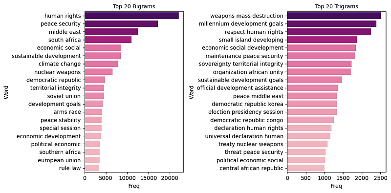
Comparing the top 20 bigrams with trigram frequencies also gives an additional view of what is talked about during the United Nations General Assembly debates. Focusing on bigrams, we would assume that the General Assembly talks in detail about human rights, peace, security, and sustainable development. At the same time, the trigrams add more contexts to the picture, such as peace and security in the Middle East or stories on small island developing states which are not present in the top 20 bigrams.
2.5. Top TF-IDF terms
While word count refers to the number of times a word appears in a document and tells us something about the topic in that document, TF-IDF is a more sophisticated method of determining the importance of a word in a document. If you are curious about how TF-IDF works, I have an article that might be useful. Let’s check what the most important words using TF-IDF are and whether they will tell a different story from the term frequencies. The following block of code can be used to create the top TF-IDF words:
class DenseTfIdf(TfidfVectorizer):

    def __init__(self, **kwargs):
        super().__init__(**kwargs)
        for k, v in kwargs.items():
            setattr(self, k, v)

    def transform(self, x, y=None) -> pd.DataFrame:
        res = super().transform(x)
        df = pd.DataFrame(res.toarray(), columns=self.get_feature_names_out() )
        return df

    def fit_transform(self, x, y=None) -> pd.DataFrame:
        # run sklearn's fit_transform
        res = super().fit_transform(x, y=y)
        df = pd.DataFrame(res.toarray(), columns=self.get_feature_names_out(), index=x.index)
        return df

df_docs_terms_corpus = DenseTfIdf(
    sublinear_tf=True, lowercase=True, stop_words="english"
).fit_transform(speech['Joined_Tokens'])

df_docs_terms_corpus.sum(axis=0).nlargest(n=30).reset_index().rename(
    {0: "score"}, axis=1
).plot.bar(x="index")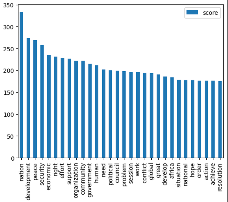
Conclusion
In this article, we have explored several powerful methods for visualizing text data, including ScatterText for term frequency and dispersion, word distribution, and topic distribution in topic modeling using LDA and BERTopic, and n-gram word clouds and word frequency. By using these visualization techniques, we can gain deeper insights into the structure and meaning of text data, enabling us to uncover hidden patterns and trends.