
Beyond Words: The Power of Typeface in Visual Narratives
Introduction: The Art and Science of Typeface Hierarchy
The hierarchy of typefaces acts as a silent conductor, precisely and clearly coordinating the flow of information. This thorough book reveals the subtleties of creating an effective hierarchy, guaranteeing that your message has resonance and impact. Learn about the psychology of fonts and useful integration strategies as you explore the art and science of typeface hierarchy to improve your visual communication.
Decoding Typeface Psychology: Beyond Aesthetics
Typefaces are more than just decorative decisions; they may elicit strong feelings, define a brand, and influence how the spectator perceives a piece of work. Researchers like Kevin Larson have studied the psychology of fonts, which shows that various typefaces can evoke diverse emotional responses. Serif fonts, on the other hand, give off an air of formality and tradition, while sans-serif fonts are typically connected with modernity and simplicity. By being aware of the psychological subtleties, designers may better match typefaces to the main points of their messages and build stronger bonds with their audience.
Think about the famous Coca-Cola logo. Its distinctive typeface’s flowing script not only exudes a feeling of timeless elegance but also symbolizes the brand’s dedication to indulgence and enjoyment. The thoughtful selection of typography enhances the brand’s visual identity and gives customers an emotionally impactful and unforgettable experience.
The Hierarchy Blueprint: Structuring Information with Intent
The deliberate arrangement of information, carefully utilizing headers, subheaders, and body text to lead the reader through a smooth comprehension journey, is the foundation of an efficient typographic hierarchy. Studies by Colin Ware and colleagues demonstrate how deeply ingrained this idea is in cognitive psychology. According to these research, information presented in a hierarchical framework is processed by the human brain more efficiently, leading to improved comprehension and retention.
Essentially, designers use different fonts, weights, and sizes to create a visual hierarchy in their designs. By carefully selecting the typographic elements, it is possible to make sure that the most important information stands out and commands attention right away, while supporting features are subtly incorporated into the background. This deliberate orchestration creates a harmonious experience for the spectator by reflecting the way our minds naturally prioritize and assimilate information.
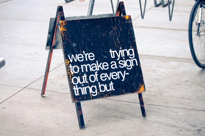
Editorial design methods are a good example of this, as they carefully create the hierarchy to lead readers through the information. Bold, sans-serif typefaces are frequently used in headlines to grab the reader’s attention and emphasize the significance of the underlying topic. A lighter serif typeface is used in the following parts to lead the reader through supporting details and extra material.
This deliberate hierarchy guarantees that the reader interacts with the text in a methodical and understandable way while also improving the layout’s aesthetic appeal. Beyond aesthetics, this typographic dance improves the reader’s experience in terms of comprehension and engagement.
Font Pairing Alchemy: Creating Harmonious Visual Compositions
The art of font matching is combining types that elegantly compliment one another. A lively visual interplay is produced by contrasting styles — bold with light, sans-serif with serif. The International Journal of Human-Computer Studies reports that readability and visual attractiveness are influenced by font matching. With this information, designers may create compositions that visually attract the spectator in addition to communicating successfully.
Consider the logo for Airbnb. The skill of font pairing is demonstrated by the combination of a unique, hand-drawn symbol with a custom-designed sans-serif wordmark. The distinctive symbol and the sleek, contemporary wordmark complement each other, showcasing the brand’s dedication to both modernism and human connection. This intentional combination helps create a unified and memorable brand image.
Responsive Typography: Adapting to Diverse Platforms
It becomes clear that responsive typography is essential to good visual communication. Variations in screen sizes and device configurations can affect the readability and visual consistency of a given typeface. Adopting responsive typography entails changing font sizes for ideal viewing and choosing typefaces that remain readable on various platforms. Studies published in the Journal of Usability Studies highlight how responsive typography can improve user experience, especially when it comes to online design.
Examine how Google has changed the typefaces it uses on each of its interfaces. Google’s adoption of the Sans typeface for their logo and user interface components is indicative of their dedication to responsive design. The principles of responsive typography are embodied by Google Sans’ simplicity and clarity, which guarantee legibility on a variety of screens, including desktop monitors and mobile devices.
Inclusivity and Accessibility: Fonts for All Audiences
An effective typeface hierarchy takes diversity and accessibility into account. The selection of typefaces and their attributes can have a substantial effect on how easily people with visual impairments can read. In its principles for accessible typography, the World Wide Web Consortium (W3C) promotes legible contrasts, sensible font sizes, and flexible spacing. By putting accessibility first, designers can create a visual communication environment that is more inclusive.
Using typefaces that are favorable to dyslexia, like OpenDyslexic, highlights the dedication to diversity. These typefaces show how well-considered typography may improve information accessibility for a wide range of audiences by using design aspects that improve readability for people with dyslexia.
Typeface hierarchy becomes the conductor in the visual communication symphony, leading the viewer through an impactful and well defined story. Every facet of typeface hierarchy adds to the composition’s overall harmony, from the subtleties of psychological resonance to the practical requirements of responsive design. When you set out on your design journey, keep in mind that the science and art of typeface hierarchy provide a nuanced palette. Make thoughtful decisions, act with purpose, and let your visual message to sound like a symphony of impact and clarity.
If you enjoyed my article, I would greatly appreciate your support in my creative work. The easiest way to do so is by simply buying me a coffee. Thank you very much for your support.