
Best practices for Calendar design — FIX-UX
One of the most complex and demanding components for UI/UX designers is definitely the Calendar. With the addition of features, the calendar becomes a table of strange information and misinformation if it is not well designed.
There are many calendar options with different usages on different platforms. For example, Booking.com offers date-picker in form of a calendar, or Skyscanner, and Apple, Google, and Microsoft offer calendars in form of productivity & organizing tools.
I won’t write about do’s, it is just the opposite of don’t do.
- Interface overload — too much text, too many colors, too many unexplained icons (mostly issue on the booking apps) note: user can remember ~4 icons on the first sign
- Limited customization — we are visual beings, and we like to customize
- Performance issue — if the calendar is slow, users cannot rely on the truthness of shown data and it is annoying, and not acceptable for 2023.y
- Inconsistent data display — imagine having a calendar in the bottom right, or a searchbar on the left side below the calendar, without context. Users cannot expect it there, it offers a bad user experience and kills constancy.
Let’s see it on some practical examples comparing and looking into Apple & Google calendars.
Apple Calendar
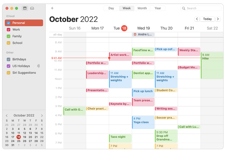
Why is good?
- Offers consistency — you can expect the same features ( base features ) as on every other calendar
- Clear and visible agenda — personal/work/fam.. part nicely separated not only with the grid but with colors, which is scientifically proven to improve memorization
- The current date points clearly
- Timeslots are marked with an event name/first word, perfect for the UX because the user is not misled, with this approach user is saved of one additional click to expand the event to read what is about
- Noticeable weekends/non-working days
- Easy navigation, searching, and filtering
- Partial customization — you can customize the calendar by color, grids, visibility, etc. Easy to keep things organized
- Letters large enough
- Event creation is easy, clear, and understandable, they also support additional notes and links, and even file attachments
- The icon for bday is clearly marked and points to the exact thing, user as soon as sees the icon connects event with the bday, the same is with the other apple icons
Why is not so good?
- Customization of the main interface is unable same as on the other Apple products
- It doesn’t offer many features outside of the standard package
- Not clear where the DOWNLOAD calendar option stands, it is an important feature and should be on the first sight visible
- Price — same as all Apple products, high and someone cannot use Apple calendar without buying some Apple product
2. Google calendar
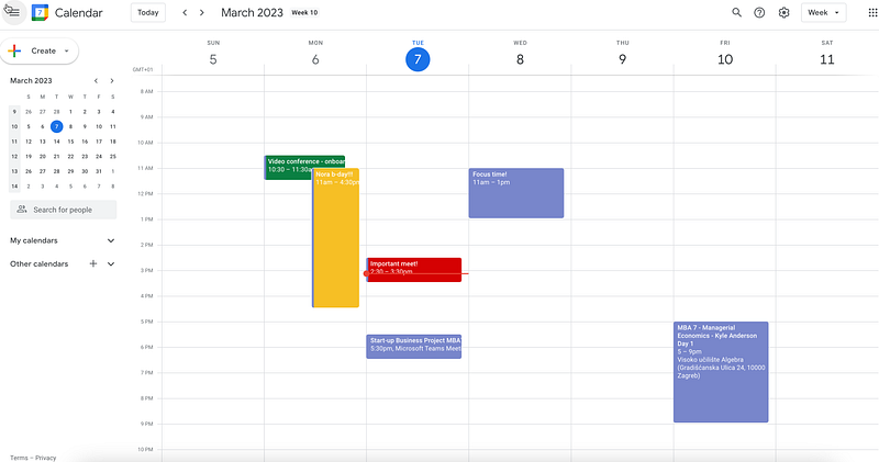
Why is good?
- Easy manipulating, for example: if you want to delete an event just click on the delete on the keyboard
- More powerful than the Apple calendar
- Offers a range of customization options, allowing users to change the color, font, and layout/interface of their calendar
- Awesome integrated with other Google apps, such as Gmail, Google Drive, and Google Meet, making it easy to access
- Follows standards (for example, date pickers on the left side, current date in the colored circle, marked clearly, navigation on the expected position)
- It is free
Why is bad?
- Privacy — google is well known for data collecting
- All fonts are almost the same and look monotonous
- It is supposed to be intuitive but it is difficult for first-time users to know how to navigate
- No agenda for the icons in the right navigation
There is much more to write about in the context of calendars(mobile versions, date pickers etc.), I will probably cover that in the next post.
Hope you liked the post! Share your thoughts