
Beginner’s Data Science Project Using Numpy, Pandas, and Matplotlib
Just get any dataset and start exploring

Data is everywhere. Data Science is all about data. I have taken covid-19 data and started working on that dataset. It’s fun to explore the data. Remember, the dataset is not perfect but we can improve it by analyzing and processing it to get our answers.
You can download the covid-data set from here. Just click on the “Download” option located at the bottom right. You will get a CSV file till today’s date of covid data.
You can download Jupyter notebook to run all the commands or simply open Goggle Colab online and start a new notebook and get working. Google Colab is free, you don’t have to download anything.
Import a file to Goggle Colab
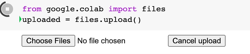
Write this command in your Goggle Colab and you will get an option to upload a file. Click on Choose Files and browse your CSV dataset file and upload it.
We will import libraries:
import matplotlib.pyplot as plt
import pandas as pd
import numpy as np
from sklearn.impute import SimpleImputer
Read the data:
df = pd.read_csv('owid-covid-data.csv')owid-covid-data.csv is the name of our dataset that we uploaded in Google Colab.
View the Data:
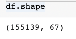
df.shape: will show you several rows and columns in the dataset
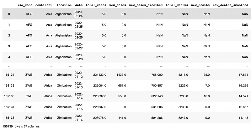
df: will show you the whole dataset
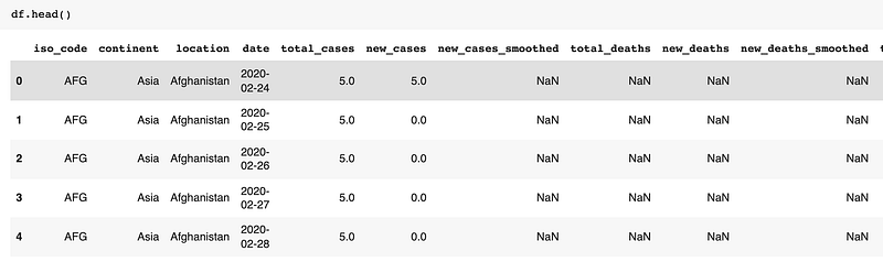
df.head(): It will show the first 5 rows as default. If you want to return the first 10 rows then insert a value in parenthesis — df.head(10)
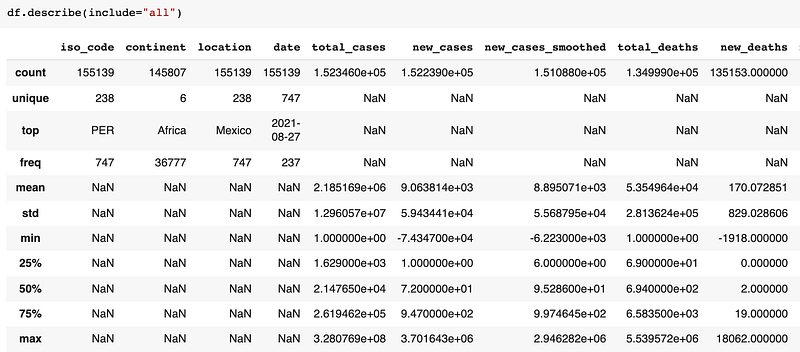
df.describe(): It will show the basic summary of data such as count, min, max, unique values, etc.
Dropping the column:
df.drop(): It drops the specific column or row of a dataset. We will look at how to drop a column
Syntax: df.drop('column_name', axis=1,inplace=True)
df.drop(['new_cases_smoothed'],axis=1,inplace=True)
#For multiple deletion of column
df.drop(['new_deaths_smoothed','new_cases_per_million','total_cases_per_million'],axis=1,inplace=True)axis =1 specifies column axis=0 specifies row inplace=True: It specifies that drop should happen in the same data frame.
After dropping columns our dataset has now 63 columns instead of 67.

Renaming the column name:
df.rename(): We can rename column name, row name, or index. In our dataset we will rename the columns:
df.rename(columns={'date': 'Date','location':'Country','continent': 'Continent','iso_code':'ISO_code'},inplace=True)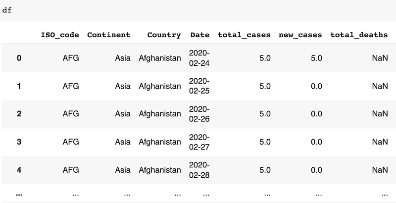
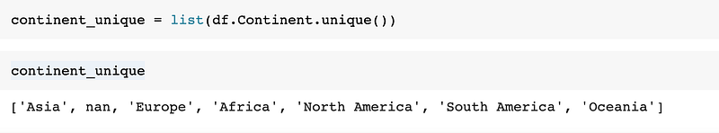
List the continent name:
Using simple imputer:
Simple imputer helps with missing values in a dataset. In the below code, a simple imputer will replace a missing value with a constant value.
imputer = SimpleImputer(strategy='constant')df2 = pd.DataFrame(imputer.fit_transform(df),columns=df.columns)Form a subset of data using Group by:
df.groupby(): The groupby command allows us to divide our data into different groups and perform our data analysis.
df3 = df2.groupby(['Date','Country',])[['Date','Country','total_cases','total_deaths','total_vaccinations']].sum().reset_index()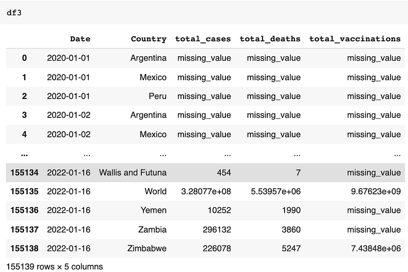
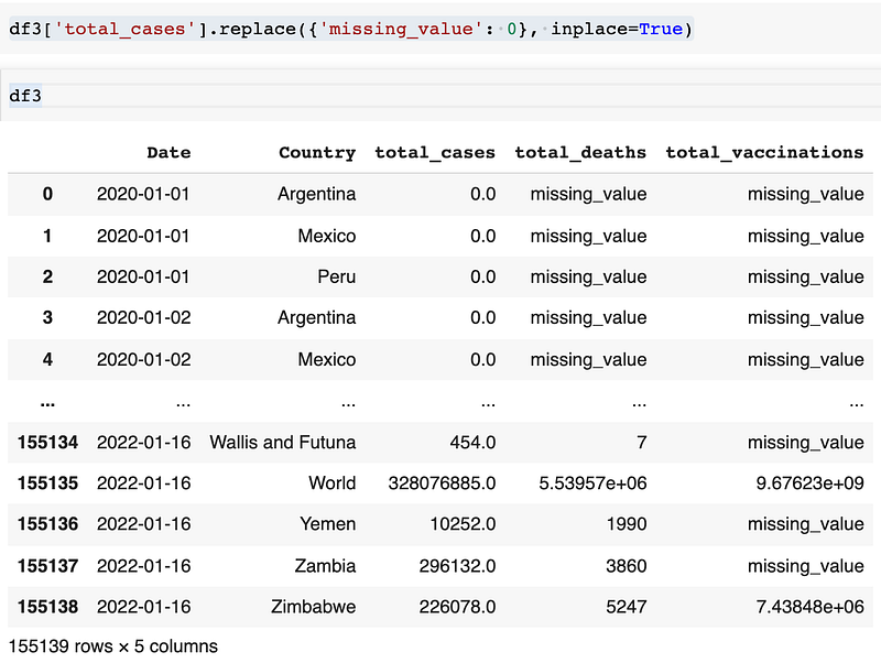
You can see there are missing_value because we have used simple imputer to add constant value at all missing places. If you want you can even replace that missing_value with 0. The command below is to change missing_value to 0 in the total_cases column:
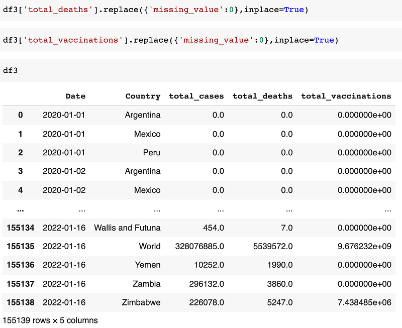
Similarly do it for, total_deaths and total_vaccinations columns.
Will plot subset of specific data:
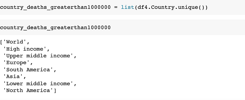
We will find total countries where total_deaths is greater than 1000000.
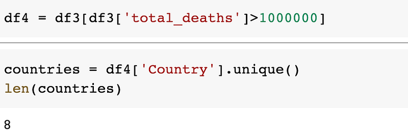
There are 8 countries where total_deaths is greater than 1000000. We will find out which are those countries in a table.
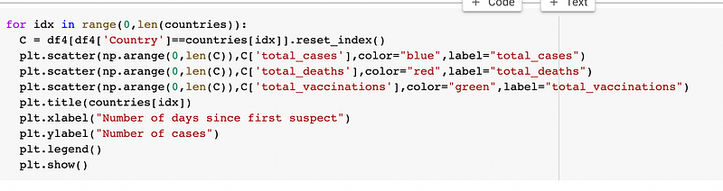
We will show the trend of total_cases, total_deaths, total_vaccinations of these 8 countries using a scatter plot. We will use a for loop to get all those 8 countries' graphs.
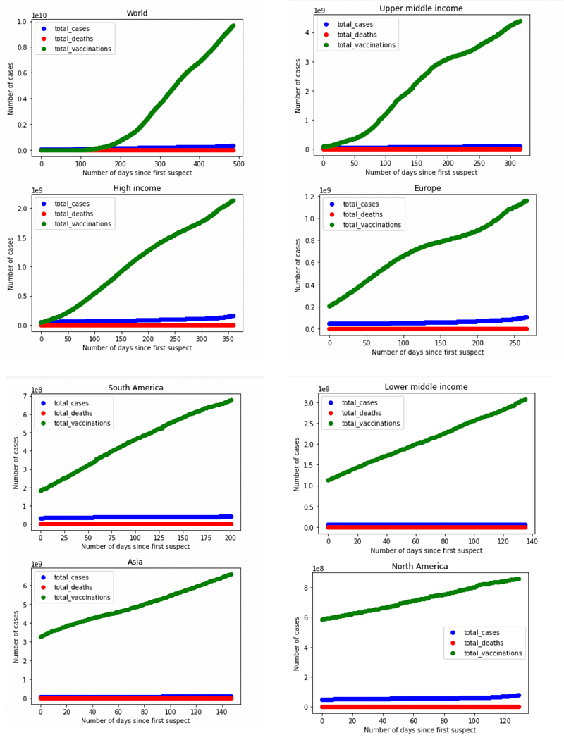
You will see the above 8 graph trends in your Goggle Colab. I have merged those and taken a picture of them.
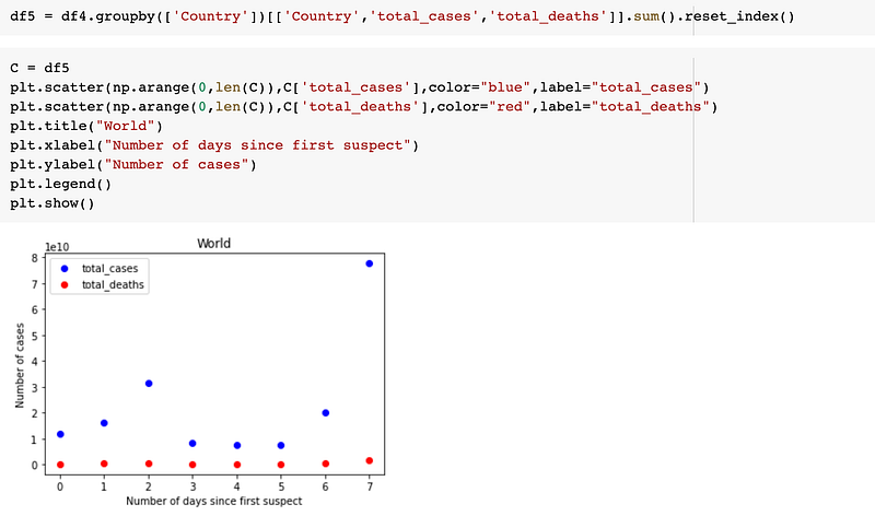
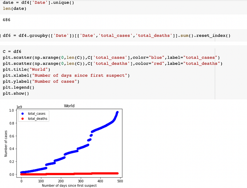
We will do another analysis where we will group all countries.
We will do another analysis by date. First, we will look at how many dates we have in total where total_deaths is greater than 1000000
This way you can do data analysis of the dataset available with you. I have shown just the basics, you can explore it and have fun exploring different columns of the dataset.
Enjoy unlimited reading on Medium by becoming a Medium Member here. I will receive a small commission if you sign up using my link.
More content at plainenglish.io. Sign up for our free weekly newsletter. Get exclusive access to writing opportunities and advice in our community Discord.


