
Beautify the PowerBI Reports — Year-on-year Charts
Year-on-year (YoY) charts allow us to compare the performance against the same period in previous years, which is essential for evaluating business performance. It also helps to eliminate skewed perceptions caused by season-specific surges or dips in sales or other metrics(e.g. Xmas), delivering a more accurate understanding of the business’s actual performance trajectory.
- The simplest multiple lines chart
- Sentiment trend chart reflecting the increased ratio
- Updating the colours
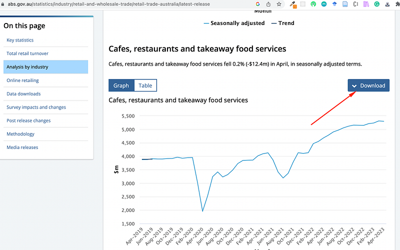
Use the data from the government on cafes, restaurants and takeaway food services here.
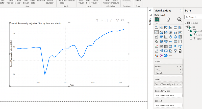
1. The simplest multiple lines chart
This is the most straightforward way to compare the performance of the current year and last year's performance. As shown above, there is only one line with a continuous line by default. By dragging the “Year” as the legend, we can get multiple lines instantly.
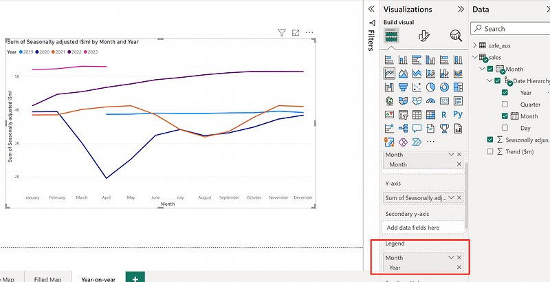
It’s better to add a filter allowing the selection of “Year”
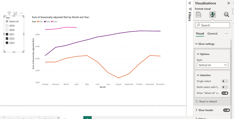
Refer to my previous post to update the look of the line chart.
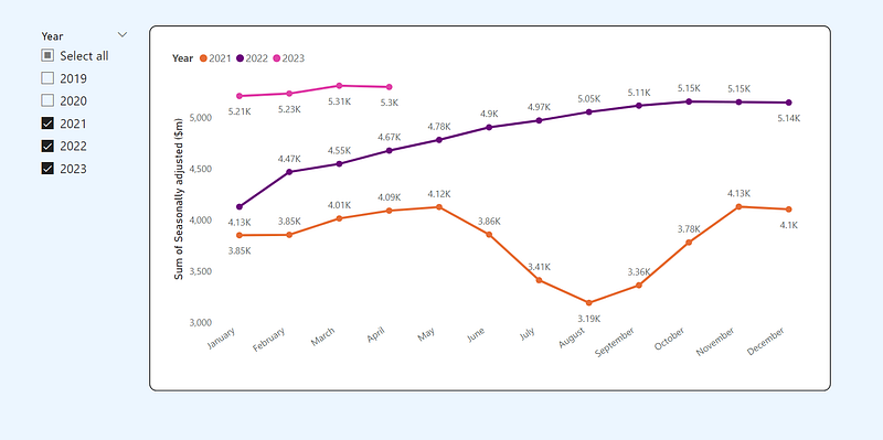
We can see sales in 2023 are higher than in 2022 and 2021; hopefully, there will be an increasing trend like last year. However, we can’t see an increased ratio. We could introduce bars and turn this line chart into a sentiment trend chart.
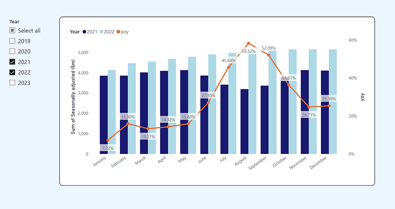
2. Sentiment trend chart
Simply change the chart type to the line and clustered column chart. Adding three measures:
SumSales = Sum(sales[Seasonally adjusted ($m)])
LastYearSales = Calculate([SumSales],DATEADD(DATESYTD(sales[Month]),-1,YEAR))
yoy = ([SumSales]-[LastYearSales])/[LastYearSales]-1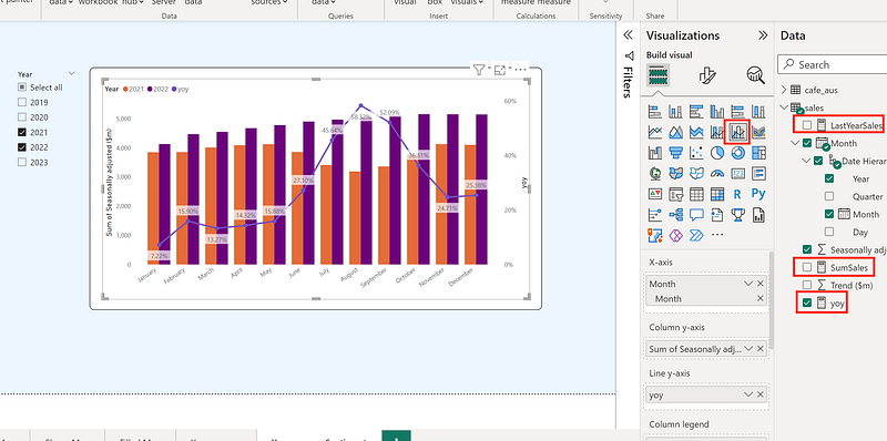
Now, it’s more apparent that in the middle of 2022, the sales jumped compared to 2021. It only compares the adjacent two years, so I updated the “LastYearSales” to “MinYearSales”(the sales of the smallest year), and update “yoy” to use this new measure.
MinYearSales =
VAR SelectedYearsTable = ALLSELECTED(sales[Month].[Year])
VAR MinYear = MINX(SelectedYearsTable, [Year])
RETURN
CALCULATE(
    SUM(sales[Seasonally adjusted ($m)]),
    sales[Month].[Year] = MinYear
)

yoy = ([SumSales]-[MinYearSales])/[MinYearSales]-1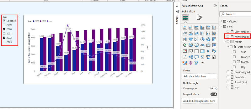
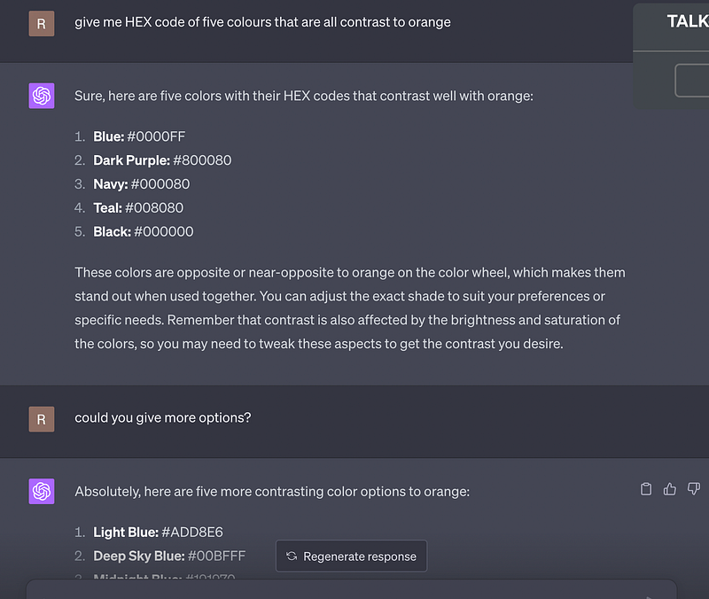
3. Updating the colours
I picked orange for the line and updated the column colours referring to GPT’s suggestions.
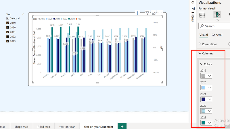
That’s it. You could play around the other colours.
Similar posts on this topic:
- Top 3 PowerBI Dashboard/Report Examples
- Beautify the PowerBI Reports — Basic Graphs
- Beautify the PowerBI Reports — Maps
If you liked posts like this, you might also like a Medium membership. It’s only $5 a month, but it will give you unlimited access to articles while supporting your favourite writers. If you sign up using this link, I’ll earn a small commission. Thanks!