avatarThiago Carvalho

Summary

Free AI web copilot to create summaries, insights and extended knowledge, download it at here

8514

Abstract

an>,<span class="hljs-number">6</span>))</pre></div><div id="4d96"><pre><span class="hljs-keyword">for</span> idx, val <span class="hljs-keyword">in</span> df_apple<span class="hljs-selector-class">.iterrows</span>(): <span class="hljs-attribute">color</span> = <span class="hljs-string">'#2CA453'</span> <span class="hljs-keyword">if</span> val<span class="hljs-selector-attr">[<span class="hljs-string">'open'</span>]</span> > val<span class="hljs-selector-attr">[<span class="hljs-string">'close'</span>]</span>: <span class="hljs-attribute">color</span>= <span class="hljs-string">'#F04730'</span> plt<span class="hljs-selector-class">.plot</span>(<span class="hljs-selector-attr">[x[idx]</span>, x<span class="hljs-selector-attr">[idx]</span>], <span class="hljs-selector-attr">[val[<span class="hljs-string">'low'</span>]</span>, val<span class="hljs-selector-attr">[<span class="hljs-string">'high'</span>]</span>], <span class="hljs-attribute">color</span>=color) plt<span class="hljs-selector-class">.plot</span>(<span class="hljs-selector-attr">[x[idx]</span>, x<span class="hljs-selector-attr">[idx]</span>-<span class="hljs-number">0.1</span>], <span class="hljs-selector-attr">[val[<span class="hljs-string">'open'</span>]</span>, val<span class="hljs-selector-attr">[<span class="hljs-string">'open'</span>]</span>], <span class="hljs-attribute">color</span>=color) plt<span class="hljs-selector-class">.plot</span>(<span class="hljs-selector-attr">[x[idx]</span>, x<span class="hljs-selector-attr">[idx]</span>+<span class="hljs-number">0.1</span>], <span class="hljs-selector-attr">[val[<span class="hljs-string">'close'</span>]</span>, val<span class="hljs-selector-attr">[<span class="hljs-string">'close'</span>]</span>], <span class="hljs-attribute">color</span>=color)</pre></div><div id="dd67"><pre>plt.<span class="hljs-keyword">show</span>()</pre></div><figure id="4445"><img src="https://cdn-images-1.readmedium.com/v2/resize:fit:800/1*a3LOcmD-LncTR0ZFdUEdPA.png"><figcaption>Color-coded OHLC chart— Image by the Author</figcaption></figure><p id="1164">Adding color to our OHLC charts makes the past trends way more visible and our visualization more insightful.</p><h2 id="e09a">Ticks</h2><p id="7c2d">Our visualization already looks great, but the x-axis is useless as it is.</p><p id="d2db">Using a numerical sequence as our x helped drawing the lines and markers, but we can’t tell the dates like this.</p><p id="087e">We’ll use x to position our ticks and the dates as the labels. We also need to consider that if we print every date, our x-axis will be unreadable, so we’ll skip some values when plotting.</p><div id="3d5f"><pre><span class="hljs-attribute">x</span> = np.arange(<span class="hljs-number">0</span>,len(df_apple)) <span class="hljs-attribute">fig</span>, ax = plt.subplots(<span class="hljs-number">1</span>, figsize=(<span class="hljs-number">12</span>,<span class="hljs-number">6</span>))</pre></div><div id="953b"><pre>for idx, val in df_apple.iterrows(): color = <span class="hljs-string">'#2CA453'</span> if val[<span class="hljs-string">'open'</span>] > val[<span class="hljs-string">'close'</span>]: color= <span class="hljs-string">'#F04730'</span> plt.plot([x[idx], x[idx]], [val[<span class="hljs-string">'low'</span>], val[<span class="hljs-string">'high'</span>]], color=color) plt.plot([x[idx], x[idx]<span class="hljs-number">-0.1</span>], [val[<span class="hljs-string">'open'</span>], val[<span class="hljs-string">'open'</span>]], color=color) plt.plot([x[idx], x[idx]+<span class="hljs-number">0.1</span>], [val[<span class="hljs-string">'close'</span>], val[<span class="hljs-string">'close'</span>]], color=color)

ticks

plt.xticks(x[::<span class="hljs-number">3</span>], df_apple.date.dt.date[::<span class="hljs-number">3</span>])</pre></div><div id="b7d0"><pre>plt.<span class="hljs-keyword">show</span>()</pre></div><figure id="d7bd"><img src="https://cdn-images-1.readmedium.com/v2/resize:fit:800/1*Tuq_h015X2HnYr9lCKEnxA.png"><figcaption>OHLC chart with a proper x-axis— Image by the Author</figcaption></figure><p id="f44e">That’s great! Now we can add some styling to our visualization to make it more appealing.</p><div id="f6b1"><pre><span class="hljs-attribute">x</span> = np.arange(<span class="hljs-number">0</span>,len(df_apple)) <span class="hljs-attribute">fig</span>, ax = plt.subplots(<span class="hljs-number">1</span>, figsize=(<span class="hljs-number">12</span>,<span class="hljs-number">6</span>))</pre></div><div id="be83"><pre>for idx, val in df_apple.iterrows(): color = <span class="hljs-string">'#2CA453'</span> if val[<span class="hljs-string">'open'</span>] > val[<span class="hljs-string">'close'</span>]: color= <span class="hljs-string">'#F04730'</span> plt.plot([x[idx], x[idx]], [val[<span class="hljs-string">'low'</span>], val[<span class="hljs-string">'high'</span>]], color=color) plt.plot([x[idx], x[idx]<span class="hljs-number">-0.1</span>], [val[<span class="hljs-string">'open'</span>], val[<span class="hljs-string">'open'</span>]], color=color) plt.plot([x[idx], x[idx]+<span class="hljs-number">0.1</span>], [val[<span class="hljs-string">'close'</span>], val[<span class="hljs-string">'close'</span>]], color=color)

ticks

plt.xticks(x[::<span class="hljs-number">3</span>], df_apple.date.dt.date[::<span class="hljs-number">3</span>]) ax.set_xticks(x, minor=<span class="hljs-symbol">True</span>)</pre></div><div id="ec41"><pre><span class="hljs-meta"># labels</span> plt.ylabel('USD')</pre></div><div id="09a1"><pre><span class="hljs-comment"># grid</span> ax.xaxis.grid(<span class="hljs-attribute">color</span>=<span class="hljs-string">'black'</span>, <span class="hljs-attribute">linestyle</span>=<span class="hljs-string">'dashed'</span>, <span class="hljs-attribute">which</span>=<span class="hljs-string">'both'</span>, <span class="hljs-attribute">alpha</span>=0.1)</pre></div><div id="e74b"><pre># remove spines ax<span class="hljs-selector-class">.spines</span><span class="hljs-selector-attr">[<span class="hljs-string">'right'</span>]</span><span class="hljs-selector-class">.set_visible</span>(False) ax<span class="hljs-selector-class">.spines</span><span class="hljs-selector-attr">[<span class="hljs-string">'top'</span>]</span><span class="hljs-selector-class">.set_visible</span>(False)</pre></div><div id="39dd"><pre><span class="hljs-comment"># title</span> plt.title(<span class="hljs-string">'Apple Stock Price'</span>, <span class="hljs-attribute">loc</span>=<span class="hljs-string">'left'</span>, <span class="hljs-attribute">fontsize</span>=20) plt.show()</pre></div><figure id="c374"><img src="https://cdn-images-1.readmedium.com/v2/resize:fit:800/1*3tUcqrIN4pI9L2yfym08pw.png"><figcaption>OHLC chart with details — Image by the Author</figcaption></figure><p id="72a8">OHLC charts are a great starting point for analysis since they give us a decent overview on which we can build upon.</p><h2 id="14c3">Improving and customizing</h2><p id="1503">You can plot some predicted prices, confidence intervals, moving averages, trades volume, and many more variables and statistics to complement your visualization.</p><p id="72e6">Building our visualization from scratch with Matplotlib gives us a lot of freedom.</p><div id="64d7"><pre>x = np<span class="hljs-selector-class">.arange</span>(<span class="hljs-number">0</span>,<span class="hljs-built_in">len</span>(df_apple)) fig, (ax, ax2) = plt<span class="hljs-selector-class">.subplots</span>(<span class="hljs-number">2</span>, figsize=(<span class="hljs-number">12</span>,<span class="hljs-number">8</span>), gridspec_kw={<span class="hljs-string">'height_ratios'</span>: <span class="hljs-selector-attr">[4, 1]</span>})</pre></div><div id="4fd8"><pre>for idx, val in df_apple.iterrows(): color = <span class="hljs-string">'#2CA453'</span> if val[<span class="hljs-string">'open'</span>] > val[<span class="hljs-string">'close'</span>]: color= <span class="hljs-string">'#F04730'</span> ax.plot([x[idx], x[idx]], [val[<span class="hljs-string">'low'</span>], val[<span class="hljs-string">'high'</span>]], color=color) ax.plot([x[idx], x[idx]<span class="hljs-number">-0.1</span>], [val[<span class="hljs-string">'open'</span>], val[<span class="hl

Options

js-string">'open'</span>]], color=color) ax.plot([x[idx], x[idx]+<span class="hljs-number">0.1</span>], [val[<span class="hljs-string">'close'</span>], val[<span class="hljs-string">'close'</span>]], color=color)

ticks top plot

ax2.set_xticks(x[::<span class="hljs-number">3</span>]) ax2.set_xticklabels(df_apple.date.dt.date[::<span class="hljs-number">3</span>]) ax.set_xticks(x, minor=<span class="hljs-symbol">True</span>)</pre></div><div id="1603"><pre><span class="hljs-meta"># labels</span> ax.set_ylabel('USD') ax2.set_ylabel('Volume')</pre></div><div id="1cdf"><pre><span class="hljs-comment"># grid</span> ax.xaxis.grid(<span class="hljs-attribute">color</span>=<span class="hljs-string">'black'</span>, <span class="hljs-attribute">linestyle</span>=<span class="hljs-string">'dashed'</span>, <span class="hljs-attribute">which</span>=<span class="hljs-string">'both'</span>, <span class="hljs-attribute">alpha</span>=0.1) ax2.set_axisbelow(<span class="hljs-literal">True</span>) ax2.yaxis.grid(<span class="hljs-attribute">color</span>=<span class="hljs-string">'black'</span>, <span class="hljs-attribute">linestyle</span>=<span class="hljs-string">'dashed'</span>, <span class="hljs-attribute">which</span>=<span class="hljs-string">'both'</span>, <span class="hljs-attribute">alpha</span>=0.1)</pre></div><div id="ad8c"><pre># remove spines ax<span class="hljs-selector-class">.spines</span><span class="hljs-selector-attr">[<span class="hljs-string">'right'</span>]</span><span class="hljs-selector-class">.set_visible</span>(False) ax<span class="hljs-selector-class">.spines</span><span class="hljs-selector-attr">[<span class="hljs-string">'left'</span>]</span><span class="hljs-selector-class">.set_visible</span>(False) ax<span class="hljs-selector-class">.spines</span><span class="hljs-selector-attr">[<span class="hljs-string">'top'</span>]</span><span class="hljs-selector-class">.set_visible</span>(False) ax2<span class="hljs-selector-class">.spines</span><span class="hljs-selector-attr">[<span class="hljs-string">'right'</span>]</span><span class="hljs-selector-class">.set_visible</span>(False) ax2<span class="hljs-selector-class">.spines</span><span class="hljs-selector-attr">[<span class="hljs-string">'left'</span>]</span><span class="hljs-selector-class">.set_visible</span>(False)</pre></div><div id="5529"><pre><span class="hljs-comment"># plot volume</span> ax2.bar(x, df_apple[<span class="hljs-string">'volume'</span>], <span class="hljs-attribute">color</span>=<span class="hljs-string">'lightgrey'</span>) <span class="hljs-comment"># get max volume + 10%</span> mx = df_apple[<span class="hljs-string">'volume'</span>].max()<span class="hljs-number">*1</span>.1 <span class="hljs-comment"># define tick locations - 0 to max in 4 steps</span> yticks_ax2 = np.arange(0, mx+1, mx/4) <span class="hljs-comment"># create labels for ticks. Replace 1.000.000 by 'mi'</span> yticks_labels_ax2 = [<span class="hljs-string">'{:.2f} mi'</span>.format(i/1000000) <span class="hljs-keyword">for</span> i <span class="hljs-keyword">in</span> yticks_ax2] ax2.yaxis.tick_right() # Move ticks <span class="hljs-keyword">to</span> the left side <span class="hljs-comment"># plot y ticks / skip first and last values (0 and max)</span> plt.yticks(yticks_ax2[1:-1], yticks_labels_ax2[1:-1]) plt.ylim(0,mx)

<span class="hljs-comment"># title</span> ax.set_title(<span class="hljs-string">'Apple Stock Price\n'</span>, <span class="hljs-attribute">loc</span>=<span class="hljs-string">'left'</span>, <span class="hljs-attribute">fontsize</span>=20) <span class="hljs-comment"># no spacing between the subplots</span> plt.subplots_adjust(<span class="hljs-attribute">wspace</span>=0, <span class="hljs-attribute">hspace</span>=0) plt.show()</pre></div><figure id="b9d1"><img src="https://cdn-images-1.readmedium.com/v2/resize:fit:800/1*p4cI_WFIS06M_WSZgX6_uQ.png"><figcaption>OHLC chart with volume — Image by the Author</figcaption></figure><h2 id="b8c2">Matplotlib Finance</h2><p id="b7fc">At the beginning of the article, I mentioned an easier way to plot OHLC charts. <a href="https://github.com/matplotlib/mplfinance">mplfinance </a>is an excellent pack of utilities for financial visualizations.</p><div id="9fb9"><pre>pip install <span class="hljs-comment">--upgrade mplfinance</span></pre></div><p id="c07b">Let’s take a look at how easy it is to use it.</p><p id="11c5">The data frame should contain the fields: Open, Close, High, Low, and Volume. It also should have a DateTime index.</p><p id="b450">Our data has the proper fields, so we only need to change the index.</p><div id="d46c"><pre><span class="hljs-keyword">import</span> mplfinance <span class="hljs-keyword">as</span> mpf</pre></div><div id="2e20"><pre>df_google = df<span class="hljs-selector-attr">[df[<span class="hljs-string">'Name'</span>]</span> == <span class="hljs-string">'GOOGL'</span>]<span class="hljs-selector-class">.copy</span>() df_google<span class="hljs-selector-attr">[<span class="hljs-string">'date'</span>]</span> = pd<span class="hljs-selector-class">.to_datetime</span>(df_google<span class="hljs-selector-attr">[<span class="hljs-string">'date'</span>]</span>) df_google = df_google<span class="hljs-selector-attr">[df_google[<span class="hljs-string">'date'</span>]</span> > pd<span class="hljs-selector-class">.to_datetime</span>(<span class="hljs-string">'2017-12-31'</span>)] df_google = df_google<span class="hljs-selector-class">.set_index</span>(<span class="hljs-string">'date'</span>)</pre></div><div id="b948"><pre>mpf.plot<span class="hljs-comment">(df_google)</span></pre></div><figure id="9b29"><img src="https://cdn-images-1.readmedium.com/v2/resize:fit:800/1*1s6xWf6mGsnbrG6MNEegBg.png"><figcaption>OHLC chart — Image by the Author</figcaption></figure><p id="3135">Just like that, we have our OHLC chart!</p><p id="9232">We can also add lines for moving average and visualize the volume with a single line of code.</p><div id="9d31"><pre>mpf.plot(df_google,<span class="hljs-attribute">type</span>=<span class="hljs-string">'candle'</span>,mav=(3, 5),<span class="hljs-attribute">volume</span>=<span class="hljs-literal">True</span>, <span class="hljs-attribute">title</span>=<span class="hljs-string">'Google'</span>)</pre></div><figure id="4c2b"><img src="https://cdn-images-1.readmedium.com/v2/resize:fit:800/1*CouIeXNXGDGLGMQ5HrsoBQ.png"><figcaption>OHLC chart with moving averages and volume — Image by the Author</figcaption></figure><p id="95d7">Matplotlib Finance utilities are easier to use than drawing the chart from scratch, but they are not easily customizable.</p><p id="bd40">For most quick analysis, you need a functional and readable chart, and mplfinance will be more than enough.</p><p id="9185">For other more specific constraints, when you need to add a particular component to your visualization or customize the style to follow some design standards, mplfinance may fall short.</p><p id="7bde">Those are the cases where drawing the chart from scratch with Matplotlib pays off. We can easily add, modify, or remove any part of the visualization, making it a great tool to have under your belt.</p><p id="9104">Thanks for reading my article. I hope you enjoyed it!</p><p id="afa2"><a href="https://linktr.ee/thiagobc23">Check out more Python DataViz tutorials.</a></p><p id="07ee"><b>References:</b> <a href="https://github.com/matplotlib/mpl-finance">mplfinance</a>; <a href="https://github.com/matplotlib/mplfinance/blob/master/examples/styles.ipynb">mplfinance — Styles and Customizations</a>;</p><p id="9328"><a href="https://matplotlib.org/3.1.0/tutorials/intermediate/gridspec.html">Matplotlib — Subplots Gridspec</a>; <a href="https://matplotlib.org/stable/api/_as_gen/matplotlib.pyplot.xticks.html">Matplotlib —x-ticks</a>, <a href="https://matplotlib.org/stable/api/_as_gen/matplotlib.pyplot.yticks.html">y-ticks</a>; <a href="https://matplotlib.org/3.3.4/api/_as_gen/matplotlib.axis.YAxis.tick_right.html">Matplotlib — Ticks right</a>; <a href="https://matplotlib.org/stable/api/spines_api.html">Matplotlib — Spines</a>; <a href="https://matplotlib.org/stable/api/_as_gen/matplotlib.pyplot.grid.html">Matplotlib — Gridlines</a>, <a href="https://www.w3schools.com/python/matplotlib_grid.asp">W3</a>; <a href="https://matplotlib.org/stable/api/_as_gen/matplotlib.pyplot.plot.html">Matplotlib — Lines</a>; <a href="https://matplotlib.org/stable/api/_as_gen/matplotlib.pyplot.bar.html">Matplotlib — Bars</a>;</p></article></body>

Basics of OHLC charts with Python’s Matplotlib

A quick guide on how to draw these essential charts for stock analysis
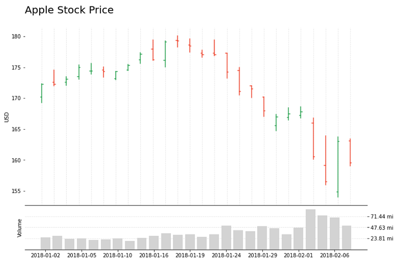
OHLC chart with volume — Image by the Author

With a history going back to the 18th century, Open-High-Low-Close (OHLC) charts are among the most popular financial analysis tools, typically used to illustrate stock prices over time.

In this article, we’ll see how to build an OHLC chart with Matplotlib from scratch, explore the advantages and limitations of this visualization, and get a look at a more straightforward approach with mplfinance.

How does an OHLC chart work?

The chart is composed of a series of vertical lines that pack four critical variables about the price; The minimum, maximum, initial, and ending values over time, commonly measured in hours, days, or weeks.

OHLC — Image by the author

What's the difference from a Candlestick chart?

OHLC is very similar to Candlestick charts as they both display the same information and are used to illustrate the price over time. Usually of a stock, currency, bond, commodity, and others.
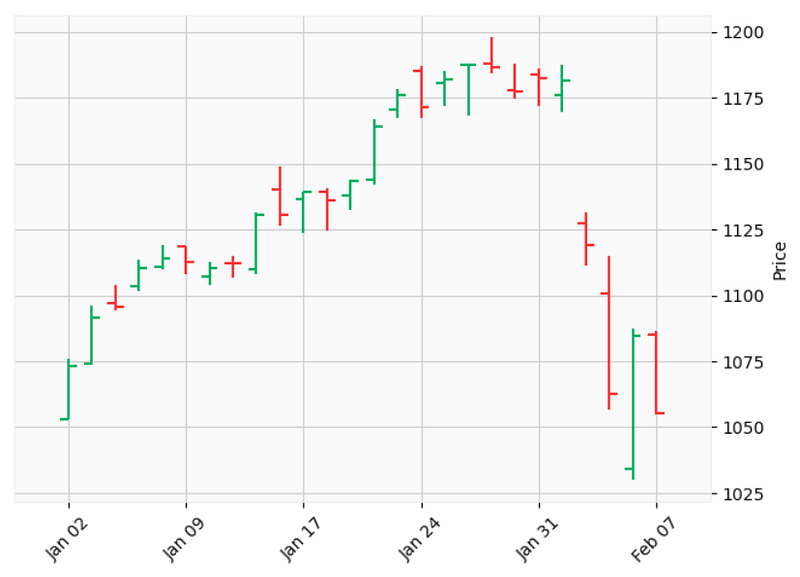
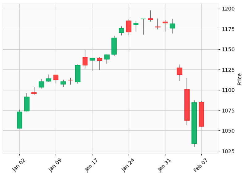
OHLC and Candlestick charts — Image by the Author

They slightly differ in how they display the data; OHLC open price is always on the stick's left side and the close price on the right.

Candlesticks don’t have markers on the left or right. They have a box.

The box's filling represents the price's direction. Usually, a filled or red box means the price went down (Bearish market), so the open price is the rectangle's top part.

An empty or green box means the opposite (Bullish market), and the top part of the box is the closing price.
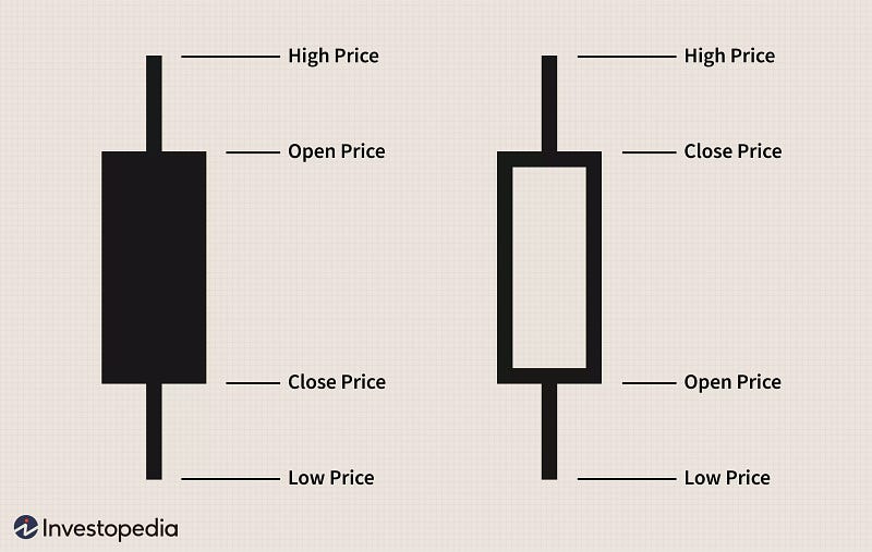
Candlestick — From Investopedia

Matplotlib

Let’s start building our OHLC chart. First, we’ll import the required libraries.

import pandas as pd
import matplotlib.pyplot as plt
import numpy as np
import math

The data in this example comes from a Kaggle dataset titled S&P 500 stock data.

df = pd.read_csv('../data/all_stocks_5yr.csv')
df.head()
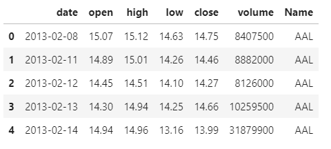
Data frame’s first five rows — Image by the Author

It’s an extensive dataset, and we won’t be plotting all this data at once, so before we start, let’s select a smaller subset.

# filter Apple stocks
df_apple = df[df['Name'] == 'AAPL'].copy()
# convert date column from string to date
df_apple['date'] = pd.to_datetime(df_apple['date']) 
# filter records after 2017
df_apple = df_apple[df_apple['date'].dt.year > 2017] 
df_apple.reset_index(inplace=True)

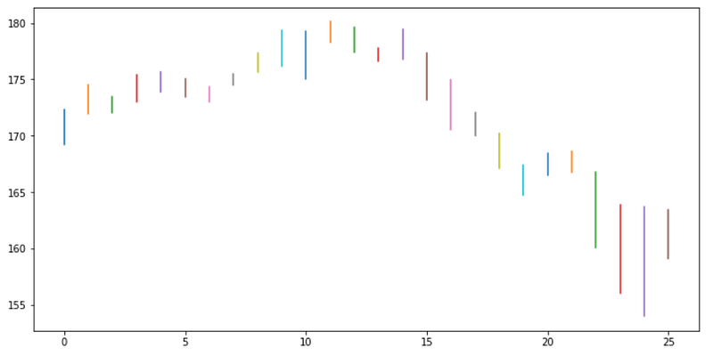
Now let’s plot the sticks. They should extend from the lowest to the highest price.

Instead of using the date as our x, we’ll create a NumPy array for it. That array will go from 0 to the length of our data frame. It’s easier to manipulate a numerical sequence, which will help position the sticks and the markers for open/close prices.

To draw the lines, we’ll iterate through our data frame, plotting a line for each record of data.

x = np.arange(0,len(df_apple))
fig, ax = plt.subplots(1, figsize=(12,6))
for idx, val in df_apple.iterrows():
    plt.plot([x[idx], x[idx]], [val['low'], val['high']])
plt.show()
Rainbow lines in a rectangle — Image by the Author

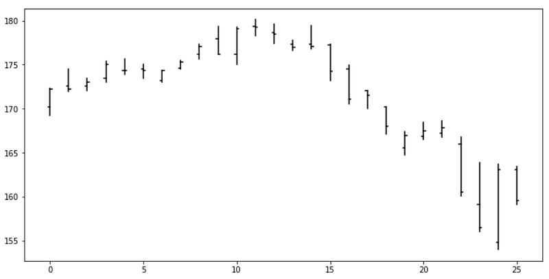
Awesome, now we can add the markers.

x = np.arange(0,len(df_apple))
fig, ax = plt.subplots(1, figsize=(12,6))
for idx, val in df_apple.iterrows():
    # high/low lines
    plt.plot([x[idx], x[idx]], 
             [val['low'], val['high']], 
             color='black')
    # open marker
    plt.plot([x[idx], x[idx]-0.1], 
             [val['open'], val['open']], 
             color='black')
    # close marker
    plt.plot([x[idx], x[idx]+0.1], 
             [val['close'], val['close']], 
             color='black')
plt.show()
OHLC chart — Image by the Author

There it is! It’s pretty easy to plot an OHLC chart with Matplotlib. Unlike candlesticks, you don’t need color or different fillings in the symbols to understand the visualization.

In its simplest form, this chart is readable and relatively straightforward.

Colors

They are not necessary but can take our visualization to another level.

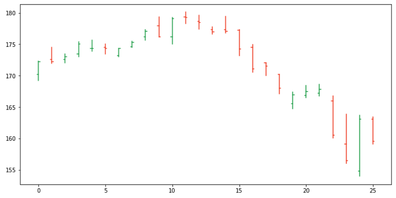
We’ll add a variable with green color at the beginning of the loop; then we’ll add a condition to check if the open price was higher than the closing price; when true, we’ll change the color to red.

x = np.arange(0,len(df_apple))
fig, ax = plt.subplots(1, figsize=(12,6))
for idx, val in df_apple.iterrows():
    color = '#2CA453'
    if val['open'] > val['close']: color= '#F04730'
    plt.plot([x[idx], x[idx]], 
             [val['low'], val['high']], 
             color=color)
    plt.plot([x[idx], x[idx]-0.1], 
             [val['open'], val['open']], 
             color=color)
    plt.plot([x[idx], x[idx]+0.1], 
             [val['close'], val['close']], 
             color=color)
plt.show()
Color-coded OHLC chart— Image by the Author

Adding color to our OHLC charts makes the past trends way more visible and our visualization more insightful.

Ticks

Our visualization already looks great, but the x-axis is useless as it is.

Using a numerical sequence as our x helped drawing the lines and markers, but we can’t tell the dates like this.

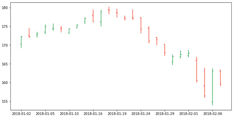
We’ll use x to position our ticks and the dates as the labels. We also need to consider that if we print every date, our x-axis will be unreadable, so we’ll skip some values when plotting.

x = np.arange(0,len(df_apple))
fig, ax = plt.subplots(1, figsize=(12,6))
for idx, val in df_apple.iterrows():
    color = '#2CA453'
    if val['open'] > val['close']: color= '#F04730'
    plt.plot([x[idx], x[idx]], 
             [val['low'], val['high']], 
             color=color)
    plt.plot([x[idx], x[idx]-0.1], 
             [val['open'], val['open']], 
             color=color)
    plt.plot([x[idx], x[idx]+0.1], 
             [val['close'], val['close']], 
             color=color)
    
# ticks
plt.xticks(x[::3], df_apple.date.dt.date[::3])
plt.show()
OHLC chart with a proper x-axis— Image by the Author

That’s great! Now we can add some styling to our visualization to make it more appealing.

x = np.arange(0,len(df_apple))
fig, ax = plt.subplots(1, figsize=(12,6))
for idx, val in df_apple.iterrows():
    color = '#2CA453'
    if val['open'] > val['close']: color= '#F04730'
    plt.plot([x[idx], x[idx]], [val['low'], val['high']], color=color)
    plt.plot([x[idx], x[idx]-0.1], [val['open'], val['open']], color=color)
    plt.plot([x[idx], x[idx]+0.1], [val['close'], val['close']], color=color)
    
# ticks
plt.xticks(x[::3], df_apple.date.dt.date[::3])
ax.set_xticks(x, minor=True)
# labels
plt.ylabel('USD')
# grid
ax.xaxis.grid(color='black', linestyle='dashed', which='both', alpha=0.1)
# remove spines
ax.spines['right'].set_visible(False)
ax.spines['top'].set_visible(False)
# title
plt.title('Apple Stock Price', loc='left', fontsize=20)
plt.show()
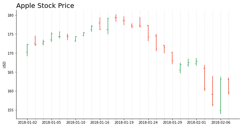
OHLC chart with details — Image by the Author

OHLC charts are a great starting point for analysis since they give us a decent overview on which we can build upon.

Improving and customizing

You can plot some predicted prices, confidence intervals, moving averages, trades volume, and many more variables and statistics to complement your visualization.

Building our visualization from scratch with Matplotlib gives us a lot of freedom.

x = np.arange(0,len(df_apple))
fig, (ax, ax2) = plt.subplots(2, figsize=(12,8), gridspec_kw={'height_ratios': [4, 1]})
for idx, val in df_apple.iterrows():
    color = '#2CA453'
    if val['open'] > val['close']: color= '#F04730'
    ax.plot([x[idx], x[idx]], [val['low'], val['high']], color=color)
    ax.plot([x[idx], x[idx]-0.1], [val['open'], val['open']], color=color)
    ax.plot([x[idx], x[idx]+0.1], [val['close'], val['close']], color=color)
    
# ticks top plot
ax2.set_xticks(x[::3])
ax2.set_xticklabels(df_apple.date.dt.date[::3])
ax.set_xticks(x, minor=True)
# labels
ax.set_ylabel('USD')
ax2.set_ylabel('Volume')
# grid
ax.xaxis.grid(color='black', linestyle='dashed', which='both', alpha=0.1)
ax2.set_axisbelow(True)
ax2.yaxis.grid(color='black', linestyle='dashed', which='both', alpha=0.1)
# remove spines
ax.spines['right'].set_visible(False)
ax.spines['left'].set_visible(False)
ax.spines['top'].set_visible(False)
ax2.spines['right'].set_visible(False)
ax2.spines['left'].set_visible(False)
# plot volume
ax2.bar(x, df_apple['volume'], color='lightgrey')
# get max volume + 10%
mx = df_apple['volume'].max()*1.1
# define tick locations - 0 to max in 4 steps
yticks_ax2 = np.arange(0, mx+1, mx/4)
# create labels for ticks. Replace 1.000.000 by 'mi'
yticks_labels_ax2 = ['{:.2f} mi'.format(i/1000000) for i in yticks_ax2]
ax2.yaxis.tick_right() # Move ticks to the left side
# plot y ticks / skip first and last values (0 and max)
plt.yticks(yticks_ax2[1:-1], yticks_labels_ax2[1:-1])
plt.ylim(0,mx)
 
# title
ax.set_title('Apple Stock Price\n', loc='left', fontsize=20)
# no spacing between the subplots
plt.subplots_adjust(wspace=0, hspace=0)
plt.show()
OHLC chart with volume — Image by the Author

Matplotlib Finance

At the beginning of the article, I mentioned an easier way to plot OHLC charts. mplfinance is an excellent pack of utilities for financial visualizations.

pip install --upgrade mplfinance

Let’s take a look at how easy it is to use it.

The data frame should contain the fields: Open, Close, High, Low, and Volume. It also should have a DateTime index.

Our data has the proper fields, so we only need to change the index.

import mplfinance as mpf
df_google = df[df['Name'] == 'GOOGL'].copy()
df_google['date'] = pd.to_datetime(df_google['date'])
df_google = df_google[df_google['date'] > pd.to_datetime('2017-12-31')]
df_google = df_google.set_index('date')
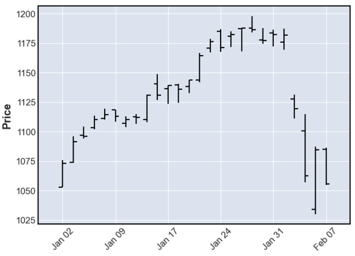
mpf.plot(df_google)
OHLC chart — Image by the Author

Just like that, we have our OHLC chart!

We can also add lines for moving average and visualize the volume with a single line of code.

mpf.plot(df_google,type='candle',mav=(3, 5),volume=True, title='Google')
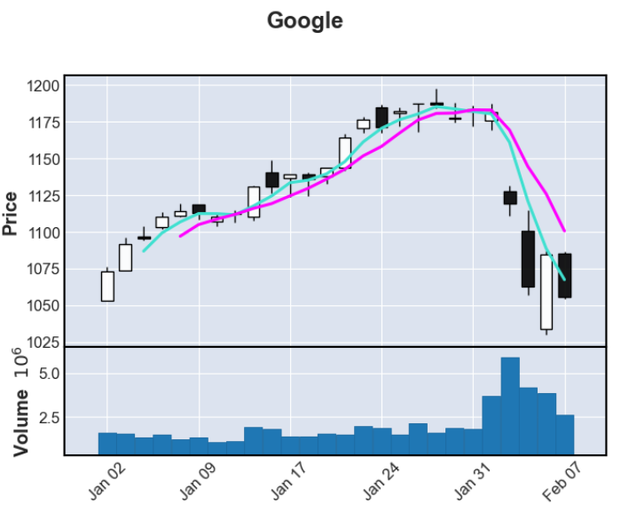
OHLC chart with moving averages and volume — Image by the Author

Matplotlib Finance utilities are easier to use than drawing the chart from scratch, but they are not easily customizable.

For most quick analysis, you need a functional and readable chart, and mplfinance will be more than enough.

For other more specific constraints, when you need to add a particular component to your visualization or customize the style to follow some design standards, mplfinance may fall short.

Those are the cases where drawing the chart from scratch with Matplotlib pays off. We can easily add, modify, or remove any part of the visualization, making it a great tool to have under your belt.

Thanks for reading my article. I hope you enjoyed it!

Check out more Python DataViz tutorials.

References: mplfinance; mplfinance — Styles and Customizations;

Matplotlib — Subplots Gridspec; Matplotlib —x-ticks, y-ticks; Matplotlib — Ticks right; Matplotlib — Spines; Matplotlib — Gridlines, W3; Matplotlib — Lines; Matplotlib — Bars;

Data Visualization
Data Analysis
Python
Matplotlib
Finance
Recommended from ReadMedium