
Basic Tools and Techniques for Data Visualization

Data is more persuasive than words. With regard to data visualization, this aphorism is particularly accurate.
It might be difficult to understand insights and patterns in data by merely looking at the raw statistics.
However, well-designed data visualization can convey these insights and patterns in data efficiently.
According to the proverb, a picture speaks a thousand words. Now is the time to explore the exciting world of data visualization!
Data visualization is a technique for presenting data in a graphical format that makes it easier to understand, analyze, and communicate. It allows data analysts, scientists, and business professionals to quickly identify patterns, trends, and relationships in data.
Some common data visualization tools and techniques include:
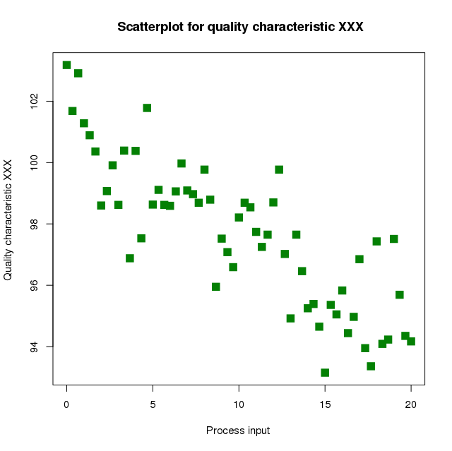
Scatter Plots
A scatter plot is a two-dimensional representation of data, where each data point is plotted as a dot on a coordinate plane.
Scatter plots are used to identify relationships between two variables, such as the relationship between height and weight.
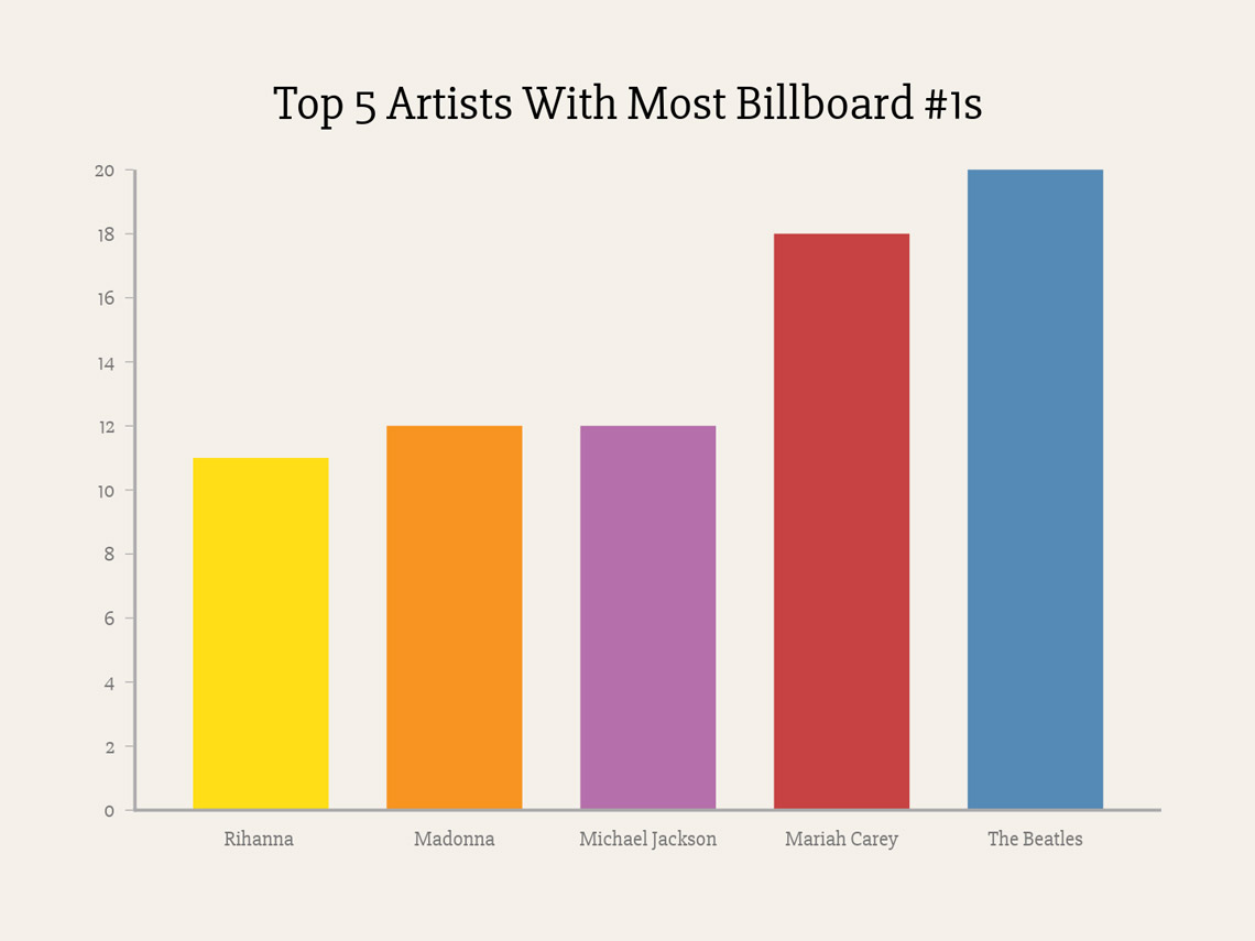
Bar Charts

A bar chart is a chart that represents data as horizontal or vertical bars, where the height or length of the bars represents the value of the data.
Bar charts are commonly used to compare the values of different categories.
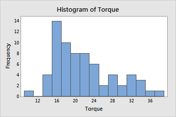
Histograms
A histogram is a representation of the distribution of a set of numerical data. It is a bar graph that shows the frequency of data points that fall within a specified range of values.
Suppose a company wants to analyze the sales of its products in different regions.
A bar chart can be used to compare the sales of each product in each region, while a histogram can be used to visualize the distribution of sales across all regions.
A scatter plot can be used to analyze the relationship between sales and advertising expenses in each region.
Line Charts
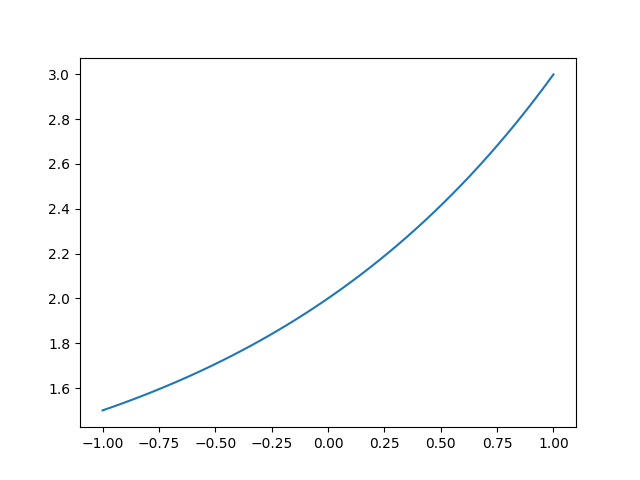
Pie Charts

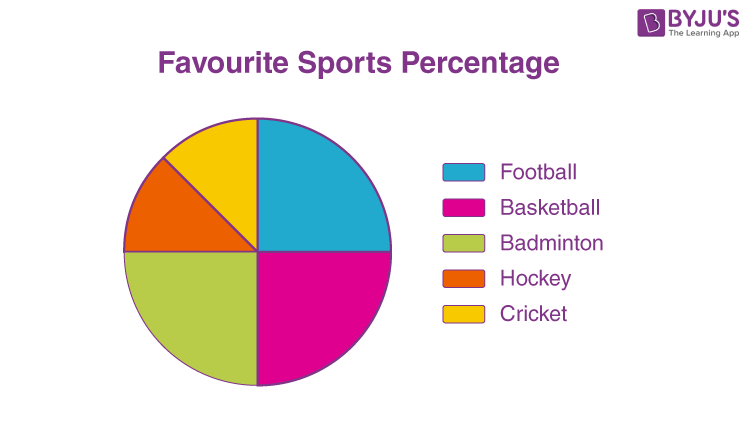
Pie charts are used to represent proportions and percentages. They are particularly useful for showing the distribution of data across different categories.
Box Plots
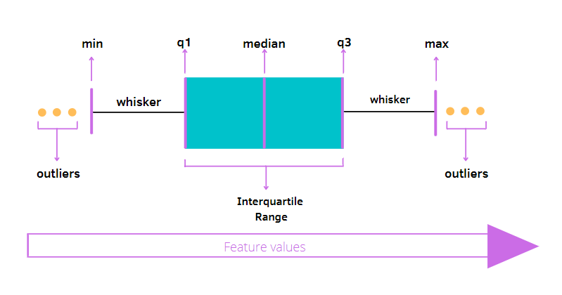
Box plots are used to represent the distribution of data, especially when there are outliers present.
Box plots show the minimum and maximum values, the median, and the first and third quartiles.
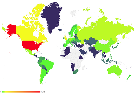
Heat Maps
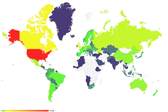
Heat maps are used to represent the density of data points on a two-dimensional plane.
They are often used to show patterns in data, such as the distribution of crime incidents in a city or the popularity of a product in different regions.
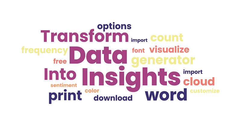
Word Clouds
Word clouds are used to represent the frequency of words in a text document. They are often used to analyze social media posts, customer reviews, or survey responses.
Suppose a company wants to analyze customer feedback from a survey. A word cloud can be used to represent the most common words used in customer feedback, while a pie chart can be used to show the distribution of feedback across different categories, such as product quality, customer service, and delivery. A line chart can be used to show the trend in customer satisfaction over time.
Furthermore, data visualization is a powerful tool for understanding, analyzing, and communicating data.
By using the right visualization tools and techniques, you can effectively communicate complex data patterns and insights to a wide range of audiences.
Whether you are a data analyst, scientist, or business professional, mastering the art of data visualization is an essential skill that can help you turn data into actionable insights and drive informed decision-making.
Thanks…
References
- Data Visualization with Python and Matplotlib — Ben Root
- Data Visualization: A Practical Guide — Ahmed AlAjlouni
- Data Visualization with ggplot2 — Hadley Wickham
- Data Visualization with Seaborn — Michael Waskom