
Awesome Angular Material Responsive Grid List With Cards Example
Angular Material Cards can be added to the Grid List component as a child of a mat-grid-tile component. Adding responsive handling to the Grid List really makes an excellent user interface. However, styling the Cards can be challenging.
In this example we will learn how to do the following:
- Make the Grid List responsive
- Right align the avatar in the Card Header
- Make the avatar a circular image
- Increase Card Header font size
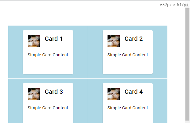
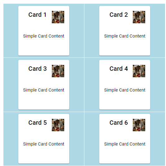
We will create the Grid List and Cards shown below:

Full code for this example is in the Resources section.
How to Add Cards to an Angular Material Grid List
We will construct a mat-grid-list filled with children mat-grid-tile components. Inside each tile we will have one mat-card component. This allows us to do several things:
- iterate over data to render multiple tiles and cards
- change the tiles per column on resize
- write our card code only once
In our card-grid.ts file, I have an array of card objects that have two fields:
{title: "Card 1", content: "Simple Card Content"}We can iterate over this array to construct all of our cards with <mat-grid-tile *ngFor="let card of cards">. This will create one tile plus any children in the tile for each card object.
Finally we want to add subcomponents to our cards. I’ve added a mat-card-header, mat-card-content, and mat-card-actions. Inside the header I added mat-card-title and mat-icon with the mat-card-avatar directive.
Here’s the code to create a simple Grid List with Cards, but the Cards are not styled ( learn how to style Cards here):
<mat-grid-list cols=3 rowHeight="3:2"> <mat-grid-tile *ngFor="let card of cards"> <mat-card> <mat-card-header><mat-card-title>{{card.title}}</mat-card-title><mat-icon mat-card-avatar ><img src="https://picsum.photos/40"/></mat-icon></mat-card-header> <mat-card-content>{{card.content}}</mat-card-content> <mat-card-actions></mat-card-actions> </mat-card> </mat-grid-tile> </mat-grid-list>If your Angular Material Grid List is not showing, add some width to it with the following CSS selector:
.mat-grid-list { width: 80vw; }We can align the cards horizontally and vertically if needed.
How to Make the Angular Material Grid List Responsive
We can add window resize detection on the Grid List with the following code:
(window:resize)="handleResize($event)"Now in our card-grid.ts we need to add the resize handler plus an initialization function in case the app is loaded on a small screen:
export class CardGrid { columns = 1; cards = cards; ngOnInit() { this.columns = (window.innerWidth <= 400) ? 1 : (window.innerWidth <= 800) ? 2 : 3 ; } handleResize(event: UIEvent) { const window = event.target as Window; this.columns = (window.innerWidth <= 400) ? 1 : (window.innerWidth <= 800) ? 2 : 3; } }The event.target needed to be casted as Window in order for TypeScript to understand that innerWidth existed on the target. Here is a guide to events in Angular Material.
This code will set the Grid column count to 3 on large screens, 2 between 400px and 800px, and 1 when the screen is less than or equal to 400px.
With this we have all the functionality in our Grid, but we still need to style the Cards.
How to Align the Avatar to the Right in the Angular Material Card Header
For some reason Angular Material wants to place the Card Header Avatar on the left side of the Header text. Even though in my template the Avatar is the second child in the mat-card-header, in the DOM Angular Material renders it as the first child:

We can fix this with some flex alignment. The Card Header wrapping the Avatar and Header Text has display: flex. This means we can simply add flex-direction: row-reverse to it and the Avatar will be right aligned.
.mat-mdc-card-header { flex-direction: row-reverse; padding-bottom: 16px; }I also added some padding to separate the header and body.
Here is the result:
How to Add Circular Image to the Angular Material Card Avatar
Next we need to fix the image inside the Avatar so that it is circular. The mat-mdc-card-avatar class has border-radius: 50% which seems like it should be enough to make the image circular.

However, the image corners overflow the mat-icon making it appear square. We need to set overflow to hidden:
.mat-mdc-card-avatar { overflow: hidden; margin-bottom: 0px; }That simple styling fixes the issue. I also removed the margin bottom that was present on the avatar but not the Header text.
How to Vertically Align the Angular Material Card Header Text
Finally we need to get the Header text vertically centered. It can be difficult to override default Angular Material stylings. In this case I had to use ::ng-deep in order to have my nested selector properly select the mat-mdc-card-title component.
The best way to center the Header text is by adjusting the line height to match the default 40px height of the Avatar. Here’s the code:
.mat-mdc-card-header ::ng-deep { .mat-mdc-card-header-text .mat-mdc-card-title { height: 100%; line-height: 2.5rem; --mdc-typography-headline6-font-size: 30px; } }I also decided to bump up the font size. I overrode the existing Angular Material variable --mdc-typography-headline6-font-size so that any other Card Headers added to this component will have font size of 30px. Finally, the height needed to match the Avatar element for styling consistency.
Resources
Consider adding an Angular Material Divider to separate Cards in a UI, or adding a styled Slider component to your cards.
Here is the full code for this tutorial:
// card-grid.ts import { Component } from "@angular/core"; import { DemoMaterialModule } from "../material-module"; const cards = [ {title: "Card 1", content: "Simple Card Content"}, {title: "Card 2", content: "Simple Card Content"}, {title: "Card 3", content: "Simple Card Content"}, {title: "Card 4", content: "Simple Card Content"}, {title: "Card 5", content: "Simple Card Content"}, {title: "Card 6", content: "Simple Card Content"}, {title: "Card 7", content: "Simple Card Content"}, {title: "Card 8", content: "Simple Card Content"}, {title: "Card 9", content: "Simple Card Content"} ] @Component({ selector: "card-grid", templateUrl: "card-grid.html", styleUrls: ["card-grid.scss"], standalone: true, imports: [DemoMaterialModule] }) export class CardGrid { columns = 1; cards = cards; ngOnInit() { this.columns = (window.innerWidth <= 400) ? 1 : (window.innerWidth <= 800) ? 2 : 3 ; } handleResize(event: UIEvent) { const window = event.target as Window; this.columns = (window.innerWidth <= 400) ? 1 : (window.innerWidth <= 800) ? 2 : 3; } } // card-grid.html <mat-grid-list [cols]="columns" rowHeight="3:2" (window:resize)="handleResize($event)"> <mat-grid-tile *ngFor="let card of cards"> <mat-card> <mat-card-header><mat-card-title>{{card.title}}</mat-card-title><mat-icon mat-card-avatar ><img src="https://picsum.photos/40"/></mat-icon></mat-card-header> <mat-card-content>{{card.content}}</mat-card-content> <mat-card-actions></mat-card-actions> </mat-card> </mat-grid-tile> </mat-grid-list> // card-grid.scss .mat-grid-list { width: 80vw; } .mat-mdc-card-header { flex-direction: row-reverse; padding-bottom: 16px; } .mat-mdc-card-header ::ng-deep { .mat-mdc-card-header-text .mat-mdc-card-title { height: 100%; line-height: 2.5rem; --mdc-typography-headline6-font-size: 30px; } } .mat-mdc-card-avatar { overflow: hidden; margin-bottom: 0px; } mat-grid-tile { background: lightblue; }Considering a Medium subscription?
If this article was helpful and you want to sign up for a Medium subscription, please consider doing so through my referral page. This supports me financially so that I can continue creating excellent dev articles.


