
Automate Your Reporting Process With Python, Vue.js, And Gmail
A concrete step-by-step example to automate your reports without the need for a server.

If your organization does not have a data visualization solution like Tableau or PowerBI nor means to host a server to deploy open source solutions like Dash then you are probably stuck doing reports with Excel or exporting your notebooks.
In this post, I will walk you through an example of how you can do reports using Python and Vue.js and send them by email to stakeholders.
Overview of the process
First, let’s see from a global point of view the process we are trying to automate. Reporting process generally consists of :
- Pulling data from one or multiple sources
- Updating a template report with the new data
- Send notification or newly created report to stakeholders
We are going to create an HTML file that will contain our report’s template then using python and the jinja2 library we are going to inject data into our template to create an instance of our report as a static HTML file. Finally, we’ll send our static HTML file by email.
Requirements
Before we get started, you will need to have Python 3.7 or greater installed and a google account. The final report is using some ES6 features that are not supported by old browsers so make sure to use a modern web browser. Finally, we’ll be using the jinja2 library so you’ll need to install it with : pip install Jinja2 .
Creating the template engine
We first start by creating a script that will allow us to input a template location, a destination, and data and will output a file to the specified destination with data injected in it. I created a DefaultTemplater class that wraps the process here is the code.
The DefaultTemplater class is created with a template location and an output destination. The important piece here is the replace method, it uses the Template class from jinja2 to search for tags into the template. Tags are named markup made inside the template file that tells jinja2 to replace the markup with some value. Let’s test our script.
- Create a text file and put in it a tag :
{{test}} - Create an app.py python file and copy/paste the code below
- Change
with your text file path; - Run the app.py file
- Look in the templated.txt you should see that the markup
{{test}}has been replaced by Hello world.
Now that our template engine is ready, we need to create the report’s template.
Creating the report’s template using Vue.js
In this part, we will create an HTML page with the Vue.js Framework. It will display a basic bar chart representing some fake sales.
If you don’t know what Vue.js is I’ll recommend going and read the official website that is great. Basically it’s a progressive javascript Framework, it means you are not forced to used build tools like Webpack, npm. In our example, we will use Vue simply by adding it in a script tag. In addition, Vue simplifies the workflow of interacting with the DOM.
Finally, we will be using some libraries that are specific to Vue :
- Vuetify: It will allow us to use their material design components out of the box. We will have a little configuration to do in order to have a nice looking page.
- v-chart: A wrapper library around apache Echarts that will make our life easier in creating interactive charts.
Now that we have an overview of the tooling let’s create a template.html file :
The template is quite basic :
- We start by loading some CSS styles (lines 3 to 6);
- In the body, we create a div tag that will host our Vue app (line 11);
- Inside the div, we make use of Vuetify components;
- We bind data value and settings property from the ve-histogram component (line 30). It means that any changes made to chartData and chartSetting will be propagated;
- We load libraries Vue, Vuetify and Echarts (lines 44–50);
- Finally, inside the last script tag ( lines 52–72) reside our Vue app. The Vue app is made of a data function that returns some property that we can use in the HTML section. We have defined 3 objects that are used in HTML, one for display the date, one for the chart data, and one for the settings of the chart. We attach to each of these 3 objects a jinja2 markups so that our python script will replace them with real data.
If you are not familiar with Front end technologies such as Javascript, HTML it might be hard to understand the code. In this post I won’t go deep into Vue.js mechanisms, the official tutorial is a good starting point. So make sure to take a look at it if you have trouble understanding the code.
Now let’s write code to send an email with an attachment.
Creating the code to send an email with an attachment
In this example, I will be using Gmail. In order to interact with Gmail from a script, you’ll need to configure your Google account. Fortunately, there is a great medium post that will walk you through how to configure your google account.
We could have used the yagmail library as the story shows us in the first part however while testing it, it is not possible to send an HTML extension file as an attachment see GitHub issue here.
So, we’ll need to create a script to send an email with the standard library as the related story shows us in the second part. I started from the code the story’s author provided and wrapped it into a class. Here is the result:
The Gmail class connects to the Gmail SMTP server with provided credentials when a new object is created. It’s possible to use context manager as special methods __enter__ and __exit__ are implemented. Finally, the send method allows us to send an email with or without attachment.
Now that our Gmail class is written, let’s put all our components to work together in order to automate our reporting process.
Putting it all together to create the final report
In this example, I will simply use a list of dicts as data for the report. However, it could have been a pandas data frame fetching data from an SQL database. So let’s look at the final code that will allow us to automate our reporting. You will need to put in your Google credentials in order to work.
Launch the script and if you go to your Gmail account you should see that the email was sent by looking in the email sent section. If you download the report.html attached to it and open it with chrome you should see this :
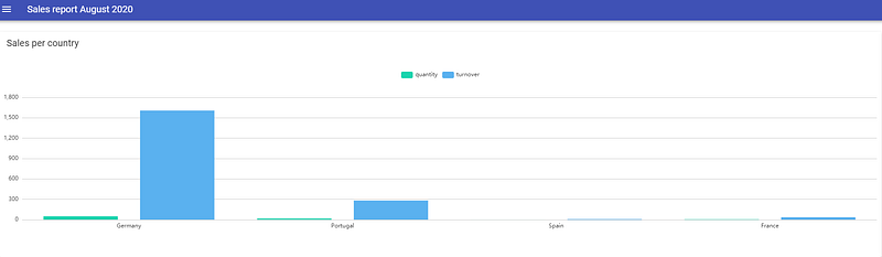
Thanks to Python and Vue.js we were able to produce a yet simple histogram, but more importantly, we have configured the basics to automate the reporting process.
Where to go from here?
Now that the basics are set up, you could improve your template in order to make your report look greater. For instance, you can use advanced features from Echarts library to implement interactive features.
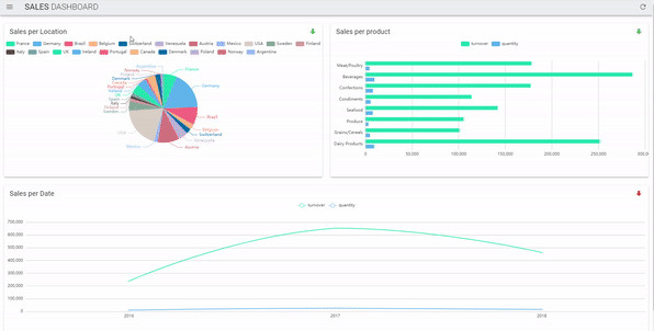
If you are not familiar with web technologies such as javascript or HTML, you can purchase here a working example and template of the drill-down/filter dashboard.
Drawbacks & Other considerations
I want to draw attention to some important points before concluding this story. First, the reporting solution presented here is designed to display a small amount of data because of the limitations of web browsers available memory and by email size.
Second, be aware that data injected is shipped with the report so make sure to take care of data confidentiality before starting to use a solution like this.
Finally, always prefer using solutions that are pushed by your team or your company.
Conclusion
As a Data analyst, reporting tasksare important in order to communicate on key business metrics. Being able to automate some of them could help you save some time.


