
Audience Stats: You Have Stats Now For Your Number of Followers and Subscribers!
Woohoo, lots of great changes this year on Medium. First, searching was improved, including finding new writers’ stories via a “Latest” option. Next, came Lists (just after I laboriously created “Celine’s Creations” with pages with lists which I manually created, but never mind).
And now ~~ drum-roll please! Ta-dahhh. 😃
We have Stats for our number of followers and email subscribers now.
If you have 1 or 2 email subscribers, you can find the email addresses and the Medium usernames of those email subscribers, too! Howzat !
So today I visited Medium’s “3 Min Read” blog ( there’s a link to the blog at the bottom right of your homepage, in case you didn’t know ) to find out these stats enhancements.
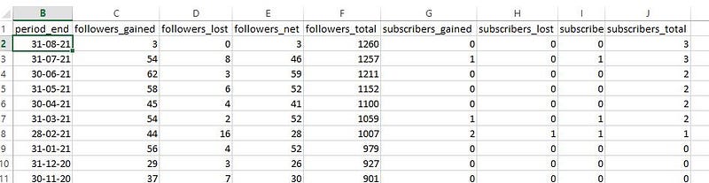
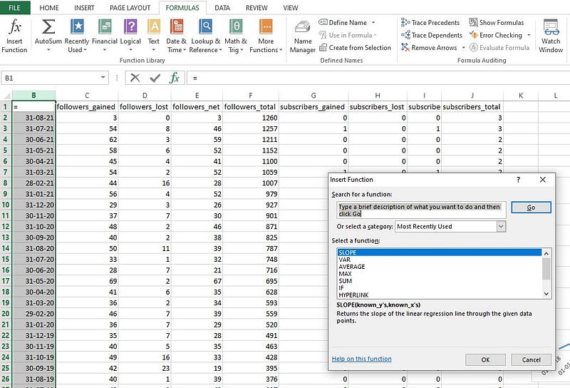
When you go to your Stats page you will see a new “Audience stats” button at the top right. Click on that and you will see your number of followers, month by month, as well as your number of subscribers, month by month.
I am in love with this Table, LOL. And I am excused for being so, because I am the “data girl.” If you know anything about Western Astrology, you won’t be surprised to know that I have 4 out of the 7 planets in Virgo, haha.
If you click on “View details” you will go to a page showing the email addresses and Medium usernames of your Email Subscribers. I have 2 genuine subscribers (although my Total shows 3, well, one of them is me, using a test account with Medium).
If you’re thinking about subscribing by email to my stories, don’t worry because I don’t send out Emails for every single story that I publish. Admittedly in April 2021 I began writing a lot more stories on Medium, and that was without knowing about the Bonuses!
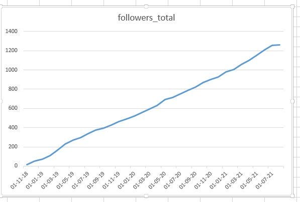
I have even plotted a Line Graph of my number of Followers since I started publishing on Medium in mid-November 2018. And I am happy to say that the slope is greater than one!
What the heck is a Slope, you may ask? It is the rise over the run or the gradient of the best fitting line for your Line Graph. If your line’s Slope is 1 that means the rise is equal to the run, or the amount of increase is constant. I calculated that the slope of my line is 1.23 and if the slope is greater than one, it means that the line raises faster than it goes forward. 😆
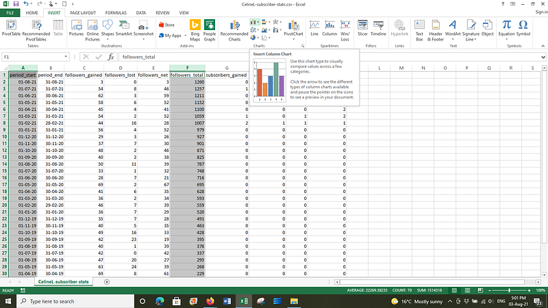
Click on “Download CSV” to save your data to your computer into an Excel or spreadsheet document. You can double-click the vertical lines to expand the columns and show all the data in each column.
If you want to create a line graph, click on the Insert tab. Then left-mouse click above the column with the “period-end dates” then press the Ctrl (Control) key and left-mouse click above the column with “followers-total”, then click on Recommended Charts and select the first Line Graph (or you can create a Column chart, but I recommend the good old beautiful line graph)!
Hey presto! Your beautiful line graph with the wonderful line of best fit, will pop up on the same page. You can magnify it to glorify over it or cry over it. Like me, you can use the snipping tool to snip it. Then it is shareable or at least you can keep it as a record on your computer, for your good self.
I think you can tell from my groovy blue line, that it takes time to build up your Followers.
If you want to work out the slope or gradient of your Line graph, click in an empty cell first, such as K1 shown below. Then you have to go to the Formulas tab, and click on the squiggly thing in the top left of Microsoft Excel, being the “Function” symbol ~~ f x Insert function, then where it has the box with “Type a brief description ….” type in SLOPE then press Go.
Click on SLOPE in the bottom white box, then on OK, and a frightful looking thing pops up, shown below. You need to know your A, B, C for the next part. Not really, just joking.
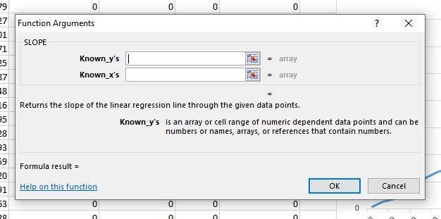
Now you can capture or highlight the X values and the Y values. You may remember from school that the X values are usually the independent values and the Y values are the dependent values. In this case, the known Xs are the Dates (being the last day, i.e. the 30th or the 31st, of a month) and the known Ys are the number of Followers at the end of a month.
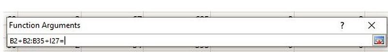
Click on the square that looks a bit like a checkerboard at the end of the long white box next to “Known_y’s” and the “Function Arguments” box pops up. No, you don’t start arguing with you computer. But you then carefully use your Mouse to click in the first cell of your Y values. This was for me the cell found in the grid, by B2 or Column B and Row 2. See screenshot at the top of this article.
Hold onto your mouse for dear life, and drag it down the Column, to the last cell with data ~~ for the Month / Date, then let go of your Mouse. Excel will fill in the range of cells into the Function box, similiar to below.
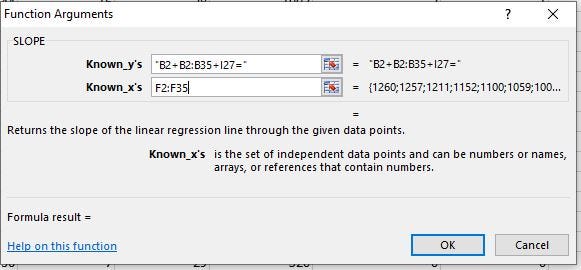
Next, click on the little checker-board thing at the end on the right, and return to the “Function arguments” boxes for the Y and the X values. Click on the checkerboard looking thing for the X values this time, and left-mouse click on the first cell for followers-total (TOTAL NUMBER OF FOLLOWERS).
Drag the Mouse down to the last cell containing the last figure, and let the mouse go. 🐭
Then click on the little checkerboard, and admire your handiwork. Then click on OK. Wherever you had your mouse positioned when you began the Slope calculation, is where the answer will appear!
Last but not least, here is an article about the Email function, and Medium’s official post about Stats for followers and email subscribers.


