
Apples, Oranges, and Pandemics
Caveats to consider when examining global data

What do apples and oranges have to do with pandemics? Not a lot, except perhaps to highlight the problems with comparing a modern-day pandemic to one that occurred over a century ago. While there are lessons to be learned from the past, direct comparisons can be misleading when the details are not placed in the proper context.
If you know anything about epidemiology and basic biostatistics, you’ve probably heard some variation of the phrase “lies, more lies and statistics”. It’s easy to present data in a manner that is misleading, despite being factually accurate. This happens on a regular basis and is not limited to statisticians.
Comparing the 1918 and COVID-19 pandemics
A comparison of the COVID-19 pandemic to the 1918 flu pandemic (erroneously referred to as the Spanish flu) is in some ways akin to comparing apples and oranges. While there are some valid comparisons to be made and lessons that should have informed our response to the current pandemic, there are significant problems with making direct comparisons.
Given that far more lives were lost globally during the 1918 pandemic, some argue that the perceived threat and public health response related to the COVID-19 pandemic were exaggerated. In response, one could question the basis for making direct comparisons between pandemics that happened a century apart. In 1918, there was no flu vaccine, no antibiotics to treat secondary infections, and deaths from other infectious diseases were rampant, not to mention the ongoing world war. Considering the fact that we are better off in so many ways, is this really a cause for celebration?
Pooled data can be misleading
Another issue is the problem of drawing wrong conclusions from aggregated data. There are inherent dangers in drawing conclusions that are based on combining results from disparate groups. For example, in a clinical trial, the intervention can be detrimental to all subgroups of patients, while appearing to be beneficial when the results are combined. Known as Simpson’s paradox, this can happen when there is an imbalance in the subgroups (1). A detailed explanation of this phenomenon can be found here.
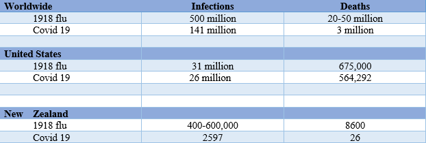
How does this apply to the pandemics in question? An estimated 500 million people or one-third of the world’s population at the time became infected with the H1N1 virus during the pandemic that lasted from 1918 to 20. The number of deaths was estimated to be between 20 and 50 million worldwide (2–4).
One could argue that 3 million deaths from Covid-19 (as of this writing) is a relatively small number (5), compared to even a conservative estimate of 20 million in the 1918 pandemic. But is that the full picture? Let’s take a closer look.
The US numbers tell a different story, as shown in the table below. Despite all our advances in medicine and technology over the past century, the death toll from a pandemic that is not yet behind us is already closely approaching that of the flu pandemic that occurred a century ago. The US currently accounts for 20% of the global deaths from Covid-19.
To put things into perspective, the number of Covid-19 deaths in the US at the time of this writing is approximately equal to the number of American lives lost in three wars combined (the Vietnam and Korean wars and World War II) (6). As of April 2021, the number of Covid-19 deaths in the US is over 190 times the number of deaths that resulted from the 9/11 attacks.
On the other hand, examining data from individual countries helps us appreciate the success stories of nations like New Zealand, where stringent and timely measures curbed the spread of the virus, resulting in a relatively low number of cases and even fewer deaths.
Lessons from New Zealand (7–9)
New Zealand has shown that early implementation of stringent measures can effectively limit the burden of and lead to the eradication of a disease. While the measures may have appeared Draconian, that nation successfully demonstrated that prevention works.
Take-home message
Aggregated data can be misleading. Data can be presented in different ways to paint a “rosier” or “gloomier” picture, depending on the intended message. When comparing a situation with the “worst-case scenario”, it may not look so bad. Conversely, a situation can be made to look worse by comparing it with the “best-case scenario”. The person reporting on the data may not even be aware of their own biases. As consumers of information, we should be informed and ask the right questions. In order to do this, we need to know which questions to ask. As one of my public health professors said, “Be skeptical, but not cynical”. Look at all the data that is available and ask the right questions so you can make your own conclusions.
References
- https://www.realclearscience.com/articles/2017/04/05/common_statistical_fallacies_and_paradoxes_110241.html
- https://ourworldindata.org/spanish-flu-largest-influenza-pandemic-in-history
4. https://www.cdc.gov/flu/pandemic-resources/1918- commemoration/pandemic-timeline-1918.htm
5. https://coronavirus.jhu.edu/map.html
7. https://www.thelancet.com/journals/lanpub/article/PIIS2468-2667(20)30225-5/fulltext
8. https://www.worldometers.info/coronavirus/country/new-zealand/
9. https://my.christchurchcitylibraries.com/1918-influenza-pandemic/