Angular 17: Build a Modal with ngx-bootstrap
In web applications, modals can be used to catch your attention by displaying additional information about a page or section. They appear like pop-ups over a page, making other contents on the page slightly visible. We use modals to create forms, confirmation and warning messages, alerts, menus, and much more. This article is your sure bet in learning how to create a modal using the ngx-bootstrap library in Angular 17.
The Angular ngx-bootstrap library provides a range of components, and one of these is the modal component, which spares us the stress of creating a modal from scratch. With this library, we don’t always need to go with the styles the modal component comes with. This gives us room to customize the modal component to our liking.
This is what a modal component in the ngx-bootstrap library appears like:
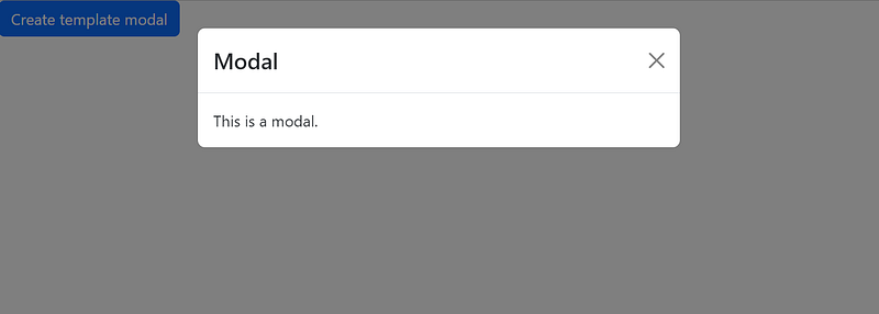
If you are familiar with Angular, you will know there has been a recent release of a new version of Angular, which is version 17. This new release comes with new features, which also affect the way we normally create a project in Angular. This article will cover everything you need to know about creating a modal component in Angular 17.
Let’s get started.
Getting Started: Setting up our Modal Project
Before we get started with the project, let’s start with setting up our project, which is very important as it helps us to install all the necessary packages we need for the project and also build a good project structure.
If you don’t already have Angular CLI installed on your system, use the code below:
// do this
npm install -g @angular/cli

// then this
Set-ExecutionPolicy -Scope CurrentUser -ExecutionPolicy RemoteSignedb
This installs the latest version of Angular, which is the one we are currently using for this project.
Next, we create a new Angular app using the code below in your terminal:
ng new ngx-bootstrap-Modal
Adding ngx-bootstrap
ngx-bootstrap is an Angular library that contains components that are made available to developers to ease the stress of creating those components from scratch. We will use the ngx-bootstrap modal component.
To do that, let’s install this library in our project.
npm install ngx-bootstrap --save
Add the following code to line 22 of your angular.json file to make the styles of the ngx-bootstrap modal component available to use.
"styles": [
    "./node_modules/ngx-bootstrap/datepicker/bs-datepicker.css",
    "src/styles.css"
],
Creating our Modal Component
In this article, we’ll go through two different methods of creating a modal. The first method will involve embedding the content of our modal in our root component, which is the AppComponent. In the second method, we’ll create a modal component that will serve as a child component to AppComponent.
Apart from having
AppComponentas the parent component to the modal component, any other component can be created and used as the modal’s parent component.
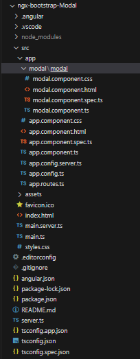
To create the modal component, use the following code:
ng g c modal/modal
The structure of our project will be like the image below:
Using the First Method to Create our Modal Component
Here, we’ll embed the content of our modal component in our AppComponent. This is a very straightforward method.
In your app.component.html file, add the code below:
<section class="p-5 userDetails">
  <h4>List of Users</h4>
  <div class="grid mt-3 fs-6 fw-bold">
    <p class="">S/N</p>
    <p class="">First Name</p>
    <p class="">Last Name</p>
    <p class="">Body Size</p>
    <p class="">Description</p>
  </div>

  <main>
    @for (user of userData; track user.id) {
    <div class="grid mt-3">
      <p class="">{{ user.id }}</p>
      <p class="" (click)="openModal(viewUserTemplate, user.id)" class="cursor">
        {{ user.firstName }}
      </p>
      <p class="">{{ user.lastName }}</p>
      <p class="">{{ user.bodySize }}</p>
      <p class="">{{ user.description }}</p>
    </div>
    }
  </main>

  <!-- modal section -->
  <ng-template #viewUserTemplate>
    <div class="p-4 text-dark">
      @if (user) {
      <p>First Name: {{ user.firstName }}</p>
      <hr />
      <p>Last name: {{ user.lastName }}</p>
      <hr />
      <p>Body Size: {{ user.bodySize }}</p>
      <hr />
      <p>Description: {{ user.description }}</p>
      }@else{
      <p>User does not exist</p>
      }
    </div>
    <div class="modalButton mb-3">
      <button (click)="exitModal()">close</button>
    </div>
  </ng-template>
</section>
Code explanation:
- We use the
@fordirective to loop through theuserDataarray and display its item. `track user.id` is used to monitor the changes of each item in the array. {{user.firstName}}has aclickevent that, when clicked, calls theopenModalfunction.- The contents in
ng-templaterepresent our modal, and it is not rendered by default until theopenModalfunction is called. It uses the@ifdirective to check ifuserhas a value before it displays its data. - When the close button in
ng-templateis clicked, it calls theexitModalfunction, which closes the modal.
In your app.component.ts file, add the code below:
import { Component, TemplateRef, OnInit } from "@angular/core";
import { CommonModule } from "@angular/common";
import { RouterOutlet } from "@angular/router";

import { BsModalRef, BsModalService } from "ngx-bootstrap/modal";

@Component({
  selector: "app-root",
  standalone: true,
  imports: [CommonModule, RouterOutlet],
  templateUrl: "./app.component.html",
  styleUrl: "./app.component.css",
  providers: [BsModalService],
})
export class AppComponent implements OnInit {
  user!: any;
  modalRef?: BsModalRef;
  public userData = [
    {
      id: 1,
      firstName: "Emmanuel",
      lastName: "Luke",
      bodySize: 11,
      description: "I love art",
    },
    {
      id: 2,
      firstName: "Ugo",
      lastName: "Ebuka",
      bodySize: 19,
      description: "skating gives me so much joy.",
    },
    {
      id: 3,
      firstName: "hilda",
      lastName: "tules",
      bodySize: 10,
      description: "photography is my happy place",
    },
    {
      id: 4,
      firstName: "Gerald",
      lastName: "Emelda",
      bodySize: 12,
      description: "italian pasta is the best",
    },
  ];

  constructor(private modalService: BsModalService) {}

  ngOnInit() {}

  openModal(viewUserTemplate: TemplateRef<any>, userId: number) {
    if (userId) {
      this.user = this.userData.find((x) => x.id === userId);
      console.log(this.user);
      this.modalRef = this.modalService.show(viewUserTemplate);
    }
  }
  exitModal = (): void => {
    this.modalRef?.hide();
  };
}
Code explanation:
- We imported
TemplateRefto reference the content of our modal component,BsModalRefandBsModalServiceprovides functionalities that allow us to open, close, and interact with a modal. - Since
AppComponentis a standalone component, which means that it does not need to be included in the declarations array ofapp.module.ts, which does not even exist in Angular 17, this makes it have theimportarray that allows us to import directives, pipes, and components. - We add
BsModalServiceto theprovidersarray as an alternative to addingModalModule.forRoot()toapp.module.ts. - For the declarations, we defined the
uservariable, created an array of users and their details and made itpublic, and used themodalRefproperty for open and close modal functionalities. - We use
constructorto injectBsModalServiceinto theAppComponent. By doing so, we can have access to ngx-bootstrap modal functionalities. - The
openModalfunction takes two parameters:viewUserTemplateanduserId. When this function is called, it checks ifuserIdhas a value, then proceeds to find an object in theuserDataarray whose value of itsidis the same as theuserIdparameter. When the object is found, it is assigned to theuservariable. Then the modal is opened and has the content of the object in it. - The
exitModalfunction, when called, closes the modal.
In your app.component.css file, add the code below:
.userDetails {
  background-color: rgb(6, 12, 67);
  color: white;
}
.cursor {
  cursor: pointer;
}
.grid {
  display: grid;
  grid-template-columns: repeat(5, 1fr);
  grid-gap: 10px;
}
.modalButton {
  text-align: end;
  justify-content: end;
}
.modalButton button {
  border: 1px solid rgb(6, 12, 67);
  background-color: rgb(6, 12, 67);
  color: white;
  padding: 5px;
  width: 100px;
  height: 40px;
}
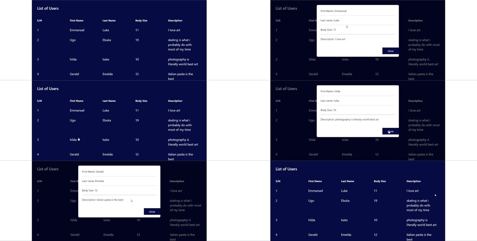
This is what our output looks like in the browser.
Using the Second Method to Create our Modal Component
This process provides a cleaner and more structured way of creating a modal. We’ll make minor changes to the code we already have.
Update your app.component.ts file with the code below:
import { ModalComponent } from './modal/modal/modal.component';

@Component({
  imports: [CommonModule, RouterOutlet, ModalComponent],
})
In the code snippet above, we imported our modal component and also added it to the imports array. This is because we want the modal component to have access to some properties in AppComponent.
Update your app.component.html file with the code below:
<section class="p-5 userDetails">
  <h4>List of Users</h4>
  <div class="grid mt-5 fs-6 fw-bold">
    <p class="">S/N</p>
    <p class="">First Name</p>
    <p class="">Last Name</p>
    <p class="">Body Size</p>
    <p class="">Description</p>
  </div>

  <main>
    @for (user of userData; track user.id) {
    <div class="grid mt-3">
      <p class="">{{ user.id }}</p>
      <p class="" (click)="openModal(viewUserTemplate, user.id)" class="cursor">
        {{ user.firstName }}
      </p>
      <p class="">{{ user.lastName }}</p>
      <p class="">{{ user.bodySize }}</p>
      <p class="">{{ user.description }}</p>
    </div>
    }
  </main>

  <!-- modal section -->

  <ng-template #viewUserTemplate>
    <app-modal [user]="user" [exitModal]="exitModal" />
  </ng-template>
</section>
Here, we added our modal component directive, which is <app-modal/>, and passed the `user` property and exitModal function to it.
In your modal.component.ts file, add this code:
import { Component, Input, OnInit } from "@angular/core";
import { CommonModule } from "@angular/common";

@Component({
  selector: "app-modal",
  standalone: true,
  imports: [CommonModule],
  templateUrl: "./modal.component.html",
  styleUrl: "./modal.component.css",
})
export class ModalComponent {
  @Input() user: any;
  @Input() exitModal = (): void => {};
}
In our modal component, we used the Input decorator to make user and exitModal accessible.
To display the user data, add this code to your modal.component.html file.
<section>
  <div class="p-4 text-dark">
    @if (user) {
    <p>First Name: {{ user.firstName }}</p>
    <hr />
    <p>Last name: {{ user.lastName }}</p>
    <hr />
    <p>Body Size: {{ user.bodySize }}</p>
    <hr />
    <p>Description: {{ user.description }}</p>
    }
  </div>
  <div class="modalButton mb-3">
    <button (click)="exitModal()">close</button>
  </div>
</section>
The output of the first and second methods is the same. What we just did was create a modal in two different ways.
Conclusion
This article has taken you through two different processes of creating a modal using the Angular ngx-bootstrap library, one of which is embedding the modal content in its parent component, and the other is creating a separate component for the modal and adding its directive in its parent component. Apart from Angular 17, this article also gives you an idea of how to create a modal component in any other version of an Angular application.


