
Analyzing Stock Performance Across Key Sectors (Crypto, Metals, Energy, Weed)
As part of developing a backtesting framework, we need to plot time series data and evaluate the performance of various strategies. In this post, I will demonstrate how to use both the Trading framework and functions from the qlib library to fetch historical stock data, calculate performance metrics, and visualize the results for a selection of tickers across various sectors, including Crypto, Copper, Silver, Gold, Energy, and Weed.
We often hear about trending stocks, equities, or commodities being good investment opportunities. Regardless of the selection process, sometimes it’s worth checking the performance of these assets, especially if we value someone’s opinion. Although this code is quite simple, this post will showcase the capabilities of our built library (quant-lib) and provide a quick way to assess the performance of trending assets.
Today morning, I read about various themes driving the market:
“Themes Driving the Market Right Now Crypto ~ $COIN $MSTR $IBIT $MARA Copper ~ $COPX FC 0.00%↑ X $SCCO Silver ~ $AGQ $PAAS $SVM $AG $MAG Gold ~ $GFI $EGO $AU $AEM Energy ~ $XOM $CVX $OXY$CVE Weed ~ $TLRY ACB 0.00%↑ CGC 0.00%↑”
So, I decided to check the performance of these tickers and write a general function for similar checks in the future.
Let’s start defining a dictionary called tickers that maps sector categories to their respective stock tickers, we want to analyze. This allows us to easily organize and iterate over the tickers for each sector further:
# Define the tickers and categories
 tickers = {
  "Crypto": ["COIN", "MSTR", "IBIT", "MARA"],
  "Copper": ["COPX", "FCX", "SCCO"],
  "Silver": ["AGQ", "PAAS", "SVM", "AG", "MAG"],
  "Gold": ["GFI", "EGO", "AU", "AEM"],
  "Energy": ["XOM", "CVX", "OXY", "CVE"],
  "Weed": ["TLRY", "ACB", "CGC"]
 }
Now, we can create a function that takes a sector name as input, fetches the historical data for the corresponding tickers, calculates performance metrics, and visualizes the results. This function will allow us to quickly check the performance of any sector in the future.
# Fetch data for each category
 for category, category_tickers in tickers.items():
  category_data = {}
  legend_labels = []
  for ticker in category_tickers:
   logger.info(f"Fetching data for {ticker}...")
   try:
    data = await dc.equities.async_get_ohlcv(
     tickers=[ticker],
     exchanges=["US"],
     granularity="1d",
     period_starts=[start_date],
     period_ends=[end_date],
     source='eod'
    )
    if data:
     df = data[0]
     if 'datetime' in df.columns and not pd.api.types.is_datetime64_any_dtype(df.index):
      df['datetime'] = pd.to_datetime(df['datetime'])
      df.set_index('datetime', inplace=True)
     category_data[ticker] = df['close']
     logger.info(f"Data for {ticker} fetched successfully.")

     # Calculate changes and append to legend labels
     changes = calculate_changes(df['close'])
     change_label = ', '.join([f"{k}: {v:.2f}%" for k, v in changes.items()])
     legend_labels.append(f"{ticker} ({change_label})")
   except Exception as e:
    print(f"Error fetching data for {ticker}: {e}")
The full code is available on GitHub for paid subscribers at https://quantjourney.substack.com/
If you wish to access the complete code, please subscribe to support my work. Thank you.
So now we will plot the historical data, calculate performance metrics, and save the plots as PNG files for each sector.
In the example usage section, we iterate over each sector and its corresponding tickers. For each sector, we fetch the historical data, calculate the performance metrics, print the metrics, and generate and save the plot as a PNG file.
The performance metrics are calculated as follows:
- 1W: Average percentage change over the last 5 trading days (1 week)
- 1M: Average percentage change over the last 21 trading days (1 month)
- 3M: Average percentage change over the last 63 trading days (3 months)
- 6M: Average percentage change over the last 126 trading days (6 months)
The plots will be saved as PNG files with the naming convention “{sector}_performance.png”.
# Plotting line chart
   fig = pl.plot_line(df=combined_df,
          legend_labels=legend_labels,
          legend_stats=put.LegendStats.NONE,  # Adjust as needed
          title=f"{category} - Closing Prices and Performance (Past Year)",
          ylabel='Closing Price',
          legend_title="Ticker (Change: 1W, 1M, 3M, 6M)",
          x_date_freq='M',
          fontsize=8
          )
   if fig is not None:
    fig.savefig(f"{category}_closing_prices.png", format='png', dpi=300, bbox_inches='tight')
So, let’s see results saved as pictures per each category.
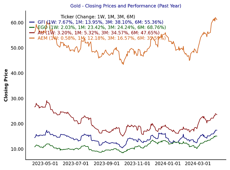
Gold:
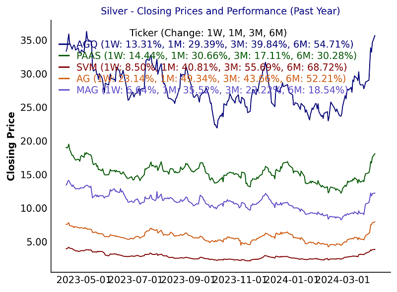
Silver:
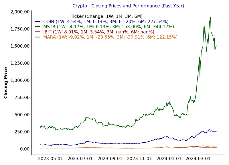
Crypto:
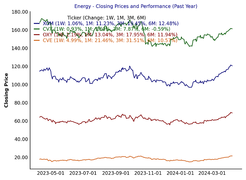
Energy:
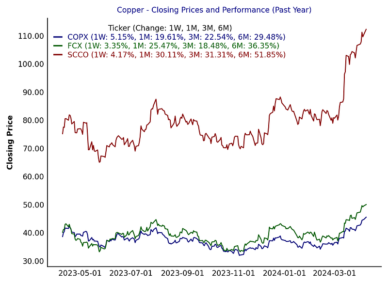
and Copper:
Conclusion
This analysis can be extended and customized based on specific requirements and preferences, such as adding more tickers, adjusting the time range, or incorporating additional performance metrics. Happy analyzing!
As always, the full code is available on GitHub for paid subscribers. If you wish to access the complete code, please subscribe to support my work. Thank you.