
An easy Guide for creating stunning, interactive Candlestick Charts (Python)
When I do research for my blog I often come across some pretty ugly charts. I mean, the kind that makes your eyes bleed: Neon-bright colors, pixelated, too tiny, disproportioned, incompatible color scheme — I’ve seen it all. Sometimes there are more candles cramped into the chart than on an 90 year-old’s birthday cake.
This is a step-by-step guide on how to create stunning, interactive candlestick charts in Python.
This story is solely for general information purposes, and should not be relied upon for trading recommendations or financial advice. Source code and information is provided for educational purposes only, and should not be relied upon to make an investment decision. Please review my full cautionary guidance before continuing.
How much data to display?
When creating candlestick charts, the first guideline is not to display too many candles in the chart.
If you need to display a huge amount of data each individual candle may not be visible and it may be more useful to use a line chart unless you want to use the interactive zoom-in functionality of an interactive chart.
When reviewing the charts from the experts at ‘stockcharts.com’ I noticed that they display between 200 and 250 bars in a single chart so that seems like a good guideline.
There are situations in which you want to focus the viewer’s attention on a particular scenario like a candlestick pattern in which case you want to display less data in a chart.
Trade Ideas provides AI stock suggestions, AI alerts, scanning, automated trading, real-time stock market data, charting, educational resources, and more. Get a 15% discount with promo code ‘BOTRADING15’.
Picking an Image Size
Oftentimes the chart images I see are blurry or pixelated, which means that the image was created at a smaller size and then resized to be bigger.
The size of the chart naturally depends on the space available and your particular use case.
If you don’t have the exact dimensions, it’s better to create a larger image and let the browser resize it to fit the available space to prevent loss of quality. Make sure to preserve the aspect ratio of the chart to avoid distortion.
If you don’t have an exact size for your image, Shutterstock.com recommends the following image sizes, which are commonly used across the web.
- 1920 x 1080 px
- 1280 x 720 px
- 1080 x 1080 px.
Picking a Color Scheme
When creating candlestick charts, you want to pick a color scheme of compatible colors. However, the shades have to be sufficiently different so that the viewer can differentiate between the different lines and pieces of information.
If you are not great at picking colors yourself like me, I suggest using a predefined color scheme for your chart. There are a lot of options out there:
- ‘Learn UI Design’ provides an easy-to-use color palette generator
- Here a color palette generator from colors.co.
- This blog has a list of color palettes specifically for data visualization.
Plotly Express also has a set of color swatches you can check out with the following statement:
import plotly.express as pxfig = px.colors.qualitative.swatches()
fig.show()These swatches are basically just Python lists, so you can access a particular hex color code by using the list index.
Python Libraries to Use
There are a lot of Python library you can use for plotting candlestick charts, for example mplfinance, plotly, bokeh, bqplot, and cufflinks.
In my opinion plotly is the most popular and has great documentation. This is the one we are going to use for this tutorial.
However, I encourage you to try out the different options and see which one you like best.
To make the chart interactive, we are going to use the low-code framework for building app called ‘Dash’ developed by Plotly. It’s built on top of the web app framework ‘Flask’ and provides the ability to create an app with a few lines of code.
Implementation
You can download the complete script from my blog ‘B/O Trading Blog’.
First we need to import the necessary Python packages. You may have to install them using pip if you don’t already have them installed.
import plotly.graph_objects as go
import pandas as pd
import pandas as pd
import pandas_ta as ta
import yfinance as yf
import numpy as np
from plotly.subplots import make_subplots
import os
from ta.volatility import BollingerBands
from dash import Dash, dcc, html, Input, Output
This function is to download some sample data from Yahoo Finance and create the indicators we want to visualize.
def load_data(symbol, interval):
    data = yf.download(tickers=symbol, period="1d", interval=interval)
    df = pd.DataFrame(data)
    df.dropna(inplace=True)
df = df.iloc[10:190] df['Date'] = pd.to_datetime(df.index) # Create some indicators
df['EMA_9'] = ta.ema(df['Close'], length=9)
df['EMA_21'] = ta.ema(df['Close'], length=21) # Initialize Bollinger Bands Indicator
indicator_bb = BollingerBands(close=df['Close'], window=20, window_dev=2) # Add Bollinger Bands features
df['BB_HIGH'] = indicator_bb.bollinger_hband()
df['BB_LOW'] = indicator_bb.bollinger_lband() return dfThis function is the plot the candlestick chart.
- You can see that I’m first defining the dark and light color palettes I’m going to use.
- Notice that the ‘theme’ function parameter controls which color palette is used.
- Notice that I’m using a proportion of 3:1 between the candlestick chart on the top and the histogram below.
- The image output is sized to 1280x720 which preserves the popular aspect ratio of 16:9 and allows me so resize the chart to a smaller size if needed without loss of quality.
def plot_chart(symbol, df, theme): dark_palette = {}
dark_palette["bg_color"] = "#2e2e2e"
dark_palette["plot_bg_color"] = "#2e2e2e"
dark_palette["grid_color"] = "#595656"
dark_palette["text_color"] = "#ffffff"
dark_palette["dark_candle"] = "#226287"
dark_palette["light_candle"] = "#a6a4a4"
dark_palette["volume_color"] = "#5c285b"
dark_palette["border_color"] = "#ffffff"
dark_palette["color_1"] = "#5c285b"
dark_palette["color_2"] = "#802c62"
dark_palette["color_3"] = "#a33262"
dark_palette["color_4"] = "#c43d5c"
dark_palette["color_5"] = "#de4f51"
dark_palette["color_6"] = "#f26841"
dark_palette["color_7"] = "#fd862b"
dark_palette["color_8"] = "#ffa600"
dark_palette["color_9"] = "#3366d6" light_palette = {}
light_palette["bg_color"] = "#ffffff"
light_palette["plot_bg_color"] = "#ffffff"
light_palette["grid_color"] = "#e6e6e6"
light_palette["text_color"] = "#2e2e2e"
light_palette["dark_candle"] = "#4d98c4"
light_palette["light_candle"] = "#b1b7ba"
light_palette["volume_color"] = "#c74e96"
light_palette["border_color"] = "#2e2e2e"
light_palette["color_1"] = "#5c285b"
light_palette["color_2"] = "#802c62"
light_palette["color_3"] = "#a33262"
light_palette["color_4"] = "#c43d5c"
light_palette["color_5"] = "#de4f51"
light_palette["color_6"] = "#f26841"
light_palette["color_7"] = "#fd862b"
light_palette["color_8"] = "#ffa600"
light_palette["color_9"] = "#3366d6" palette = light_palette
if theme == "Dark Mode":
palette = dark_palette # Create sub plots
fig = make_subplots(rows=4, cols=1, subplot_titles=[f"{symbol} Chart", '', '', 'Volume'], \
specs=[[{"rowspan": 3, "secondary_y": True}], [{"secondary_y": True}], [{"secondary_y": True}],
[{"secondary_y": True}]], \
vertical_spacing=0.04, shared_xaxes=True) # Plot close price
fig.add_trace(go.Candlestick(x=df.index,
open=df['Open'],
close=df['Close'],
low=df['Low'],
high=df['High'],
increasing_line_color=palette['light_candle'], decreasing_line_color=palette['dark_candle'], name='Price'), row=1, col=1) # Add EMAs
fig.add_trace(go.Scatter(x=df.index, y=df['EMA_9'], line=dict(color=palette['color_3'], width=1), name="EMA 9"),
row=1, col=1)
fig.add_trace(go.Scatter(x=df.index, y=df['EMA_21'], line=dict(color=palette['color_8'], width=1), name="EMA 21"), row=1,
col=1) # Add Bollinger Bands
fig.add_trace(go.Scatter(x=df.index, y=df['BB_HIGH'], line=dict(color=palette['color_5'], width=1), name="BB High"),
row=1, col=1)
fig.add_trace(go.Scatter(x=df.index, y=df['BB_LOW'], line=dict(color=palette['color_9'], width=1), name="BB Low"), row=1,
col=1) # Volume Histogram
fig.add_trace(go.Bar(
name='Volume',
x=df.index, y=df['Volume'], marker_color=palette['volume_color']), row=4,col=1) fig.update_layout(
title={'text': '', 'x': 0.5},
font=dict(family="Verdana", size=12, color=palette["text_color"]),
autosize=True,
width=1280, height=720,
xaxis={"rangeslider": {"visible": False}},
plot_bgcolor=palette["plot_bg_color"],
paper_bgcolor=palette["bg_color"])
fig.update_yaxes(visible=False, secondary_y=True)
# Change grid color
fig.update_xaxes(showline=True, linewidth=1, linecolor=palette["grid_color"],gridcolor=palette["grid_color"])
fig.update_yaxes(showline=True, linewidth=1, linecolor=palette["grid_color"],gridcolor=palette["grid_color"]) # Create output file
#file_name = f"{symbol}_chart.png"
#fig.write_image(file_name, format="png") return figThe main function loads the data and then creates the Dash app with the title and a dropdown to select the color scheme. In the @app.callback function we call the plot_chart() function with the symbol, price data and theme.
The app.run_server() function starts the Dash server and once loaded, the app becomes available in a local browser at http://127.0.0.1:8050/.
if __name__ == '__main__':
    symbol = "GOOGL"
    interval = "1m"
df = load_data(symbol, interval) # Run Dash server
app = Dash(__name__)
app.layout = html.Div([
html.H2('Candlestick Chart Demo'),
html.P("Select Theme:"),
dcc.Dropdown(
id="dropdown",
options=['Dark Mode', 'Light Mode'],
value='Dark Mode',
clearable=False,
),
dcc.Graph(id="graph"),
])
    @app.callback(
        Output("graph", "figure"),
        Input("dropdown", "value"))
    def display_color(theme):
        fig = plot_chart(symbol, df, theme)
return fig app.run_server(debug=True)Results
Once the dash app is started, open a browser and go to the following URL: http://127.0.0.1:8050/.
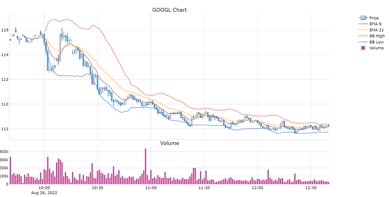
You should see the interactive candlestick chart below. The dropdown let’s you pick between light mode and dark mode.
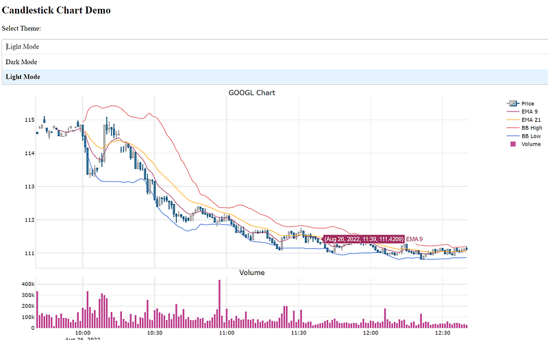
The Dash app provides controls to zoom, pan, box-select and download an image.
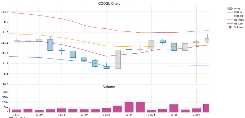
Here a zoomed-in view of the chart:
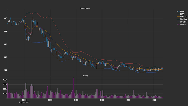
This is the dark-mode version, which presents 200 bars of one-minute Google OHLC data along with EMA 9 and 21, Bollinger Bands and Volume as a histogram below. Click on the image for a larger view.
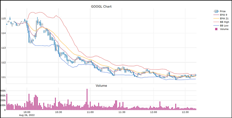
Here the corresponding light mode version of the chart.
Wrapping Up
In this tutorial we went over guidelines to consider when creating candlestick charts. Then we went over the steps on how to implement esthetic charts using Plotly and Dash. In the last section, we reviewed the chart output generated by the script.
I hope you found this post worth your time. Thanks for reading.
You can support my writing for free using this link. Don’t miss another story — subscribe to my stories by email. For more premium content, check out my ‘B/O Trading Blog’ on Substack.
This post contains affiliate marketing links.
Have a great day!


