
An easier-to-interpret alternative to paired barplots in R
Check out a great alternative to cluttered, hard-to-read paired barplots using R!
Introduction
The easiness to plot makes paired barplots very popular among researchers and data scientists.
However, they may become cluttered if many groups are included in the plot and often impose a challenge to scale.
In today’s post, we will explore an alternative to paired barplots that can facilitate data visualization and comparison between groups.
We will look at the variation in average farm size between 1960 and 2000 in various countries.
The dataset can be retrieved at Our World in Data (https://ourworldindata.org/agricultural-production).
Loading necessary libraries and preparing our plotting theme
In the next three code chunks, we will load the necessary libraries for this exercise, load and process our data, and prepare our plotting theme.
#install.packages(c("xxx"))

library(readr)
library(tidyverse)
library(dplyr)
library(tidyr)
library(ggtext)
library(ggplot2)
library(glue)
library(ggtext)
library(showtext)
library(showtext)
library(patchwork){r data-load, include=T}
setwd("address of your drive")
d <- read_csv("average-farm-size.csv") |>
mutate(country=as.factor(Entity),
year=as.factor(Year),
size=as.numeric(average_farm_size_ha)) |>
filter(year=="1960" | year== "2000") |>
filter(country=="Argentina" | country=="Brazil" | country=="Chile" | country=="India" | country=="Netherlands" | country=="Denmark" | country=="France" | country=="Germany" | country=="Spain" | country=="Italy" | country=="United States" | country=="Canada" | country=="Ireland" | country=="Uruguay" | country=="United Kingdom" | country=="Austria")my_theme <- theme_minimal(base_size = 16, base_family = 'serif') +
theme(
legend.position = 'none',
plot.title.position = 'plot',
text = element_text(color = 'grey20'),
plot.title = element_markdown(size = 20, margin = margin(b = 5, unit = 'mm'))
)
theme_set(my_theme)
color_palette <- c("#0072B2", "#D55E00")
names(color_palette) <- c(1960, 2000)
title_text <- glue(
"Comparison of average farm size between <span style = 'color:{color_palette['1960']}'>1960</span> and <span style = 'color:{color_palette['2000']}'>2000</span>")Plotting a paired barplot
The chunk below demonstrates how to plot the paired barplot using the processed dataset “d”.
 d |>
          mutate(country = fct_reorder(country, size, max)) |>
          ggplot(aes(x=size, y=country, col=year,fill=year)) +
          geom_bar(position="dodge", stat="identity") +
          labs(x = 'Average farm size, in hectares',
          y = element_blank(),
          title = title_text) +
          scale_color_manual(values = color_palette) +
          scale_fill_manual(values =color_palette)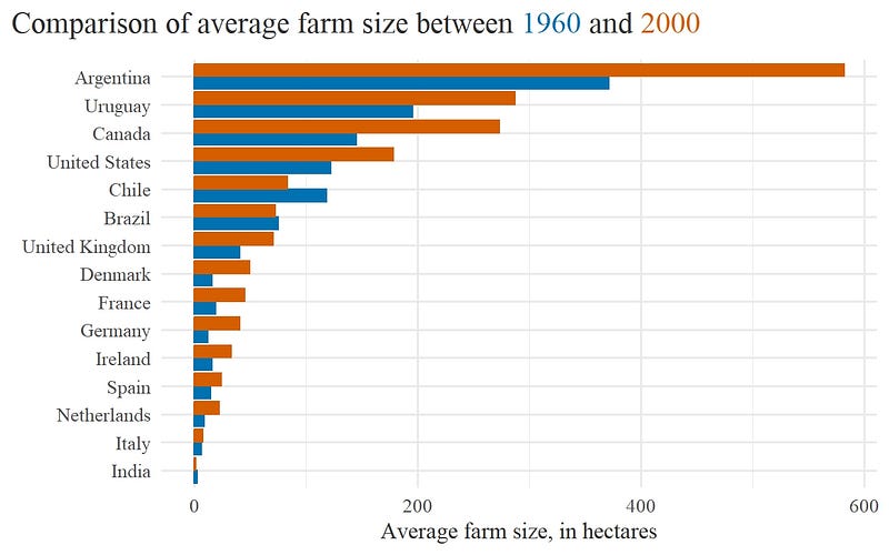
Although relatively easy to plot, the paired barplot looks quite cluttered and forces the reader to move the eyes around to make comparisons. Certainly this can be improved!
Alternative: Dumbbell plot!
The alternative is the dumbbell plot, a combination of dotplots with connecting horizontal lines.
Below you can find the code chunk to draw a dumbbell plot of the same data. Keep in mind that: - Points need to be plotted above the horizontal lines. - Y-axis gridlines were removed, as they became superfluous. - Dumbbells are sorted by decreasing average farm size in 2000 after using *fct_reorder()* when we computed *segment_helper*. The same step also ensured that countries where the green dot is left of the orange dot are grouped together (and vice-versa).
Not least important, the dumbbell plotting code is presented in form of function so you can decide how to change the graph without duplicating the script and save time!
create_dot_plot <- function(d, sort_var = NULL) {
  segment_helper <- d |>
    select(country, year, size) |>
    pivot_wider(names_from = year, values_from = size, names_prefix = 'year_') |>
    mutate(change = year_2000 - year_1960,
      country = fct_reorder(country, year_2000 * if_else(change < 0, -1, 1)))

  if (!missing(sort_var)) {
    segment_helper <- segment_helper |>
      mutate(country = fct_reorder(country, {{sort_var}} * if_else(change < 0, -1, 1)))
  }

  ggplot() +
    geom_segment(data = segment_helper,
      aes(y = country, yend = country, x = year_1960, xend = year_2000),
      col = 'grey30',
      size = 1.25 ) +
    geom_point(data = d,
      aes(x = size, y = country, col = year), size = 4) +
    labs(x = 'Average farm size, in ha',
      y = element_blank(),
      title = title_text,
      caption = 'Our World in Data') +
    scale_color_manual(values = color_palette) +
    theme(panel.grid.major.y = element_blank(),
      panel.grid.minor.x = element_blank()) +
    scale_x_continuous(expand = expansion(mult = 0.01))
}

create_dot_plot(d, desc(year_2000))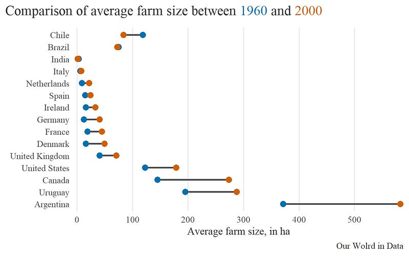
The dumbbell plot above displays the data sorted according to the lowest average farm size in 2000.
We can see that Chile, Brazil, and India showed a reduction in average farm size between 1960 and 2000, while other countries witnessed an increase in average farm size.
This dumbbell plot can be further improved by replacing the dumbbells with arrows and respective legends.
The chunk below demonstrates how to make this change.
This chunk includes the steps to make the plot and a custom legend explaining the temporal order of each arrow.
The arrow plot and the custom legend were put together using the R library patchwork.
arrow_plot <- d |>

  select(country, year, size) |>

  pivot_wider(names_from = year, names_prefix = 'year_', values_from = size) |>

  mutate(change = year_2000 - year_1960,
    sign_change = (change > 0),
    country = fct_reorder(country, year_2000 * if_else(sign_change, -1, 1))) |>

  ggplot( aes(x = year_1960, xend = year_2000,
      y = country, yend = country,
      color = sign_change)) +
  geom_segment( arrow = arrow(angle = 30, length = unit(0.2, 'cm')), size = 1) +
  labs(x = 'Average farm size, in ha',
    y = element_blank(),
    title = 'Comparison of average farm size between 1960 and 2000',
     caption = 'Our World in Data') +
  scale_color_manual( values = unname(color_palette))

dat <- tibble(country = c(1.1, 1),
  year_1960 = c(2, 1),
  year_2000 = c(1, 2))

dat_longer <- dat |>
  pivot_longer( cols = -country,
    names_to = 'label',
    values_to = 'size',
    names_prefix = 'year_')

custom_legend <- ggplot() +
  geom_rect(aes(xmin = 0.8, xmax = 2.2,
        ymin = 0.9, ymax = 1.2),
    fill = 'white',
    col = 'grey30') +
  geom_segment( data = dat,
    mapping = aes(x = year_1960, xend = year_2000,
      y = country, yend = country),
    arrow = arrow(angle = 30, length = unit(0.2, 'cm')),
    color = color_palette,
    size = 1) +
  geom_text(data = dat_longer,
    mapping = aes(x = size, y = country, label = label),
    hjust = c(-0.1, 1.1, 1.1, -0.1),
    family = 'serif',
    color = rep(color_palette, each = 2))  +
  theme_void() +
  coord_cartesian(ylim = c(0.8, 1.3),
    xlim = c(0.75, 2.25),
    expand = F)

arrow_plot +
  inset_element(custom_legend, left = 0.55, right = 1, top = 1, bottom = 0.8)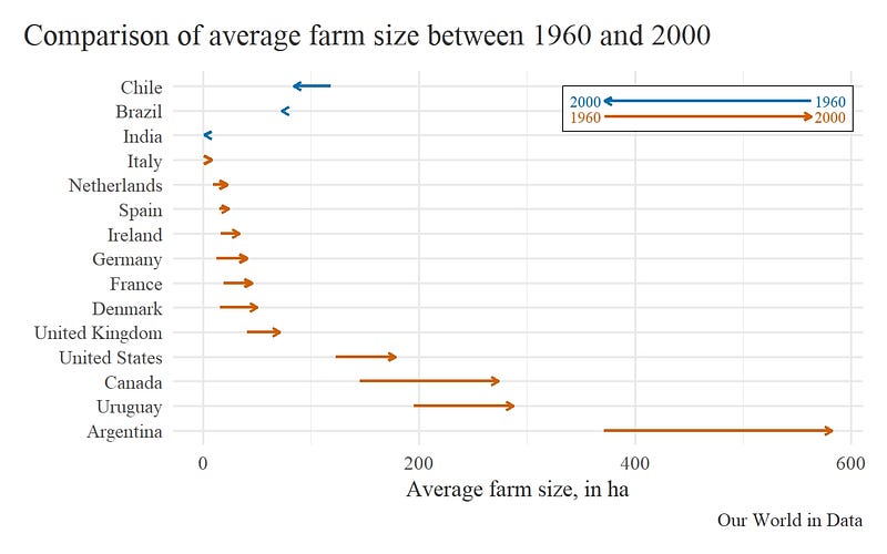
The arrow plot more clearly shows the directions in variation of average farm size across selected countries.
Conclusion
Great! We learned how to make Dumbbell and Arrow plots and, perhaps, ditch barplots(?).
We also managed to cover the use of two extra R libraries: glue to annotate a nice plot title with year colors and dispensing the use of plot legends, and patchwork to insert annotations, shapes or illustrations into our plots.
See you next time!