
Alerts in Action: Powering Real-Time Insights by Integrating Custom Alerts in Power BI
Leveraging Visualization to Unlock Actionable Insights
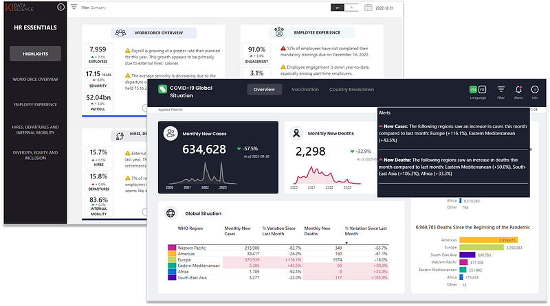
A powerful feature that can be integrated to Power BI reports are custom alerts. These alerts can notify report viewers of certain conditions or parameters you’ve set. For instance, in tracking global situations like the COVID-19 pandemic, these alerts can be instrumental in quickly identifying regions experiencing sudden surges in cases or deaths.
Below is step-by-step guide on how to integrate such alerts in your Power BI dashboard. All data used in this example is retrieved from here.
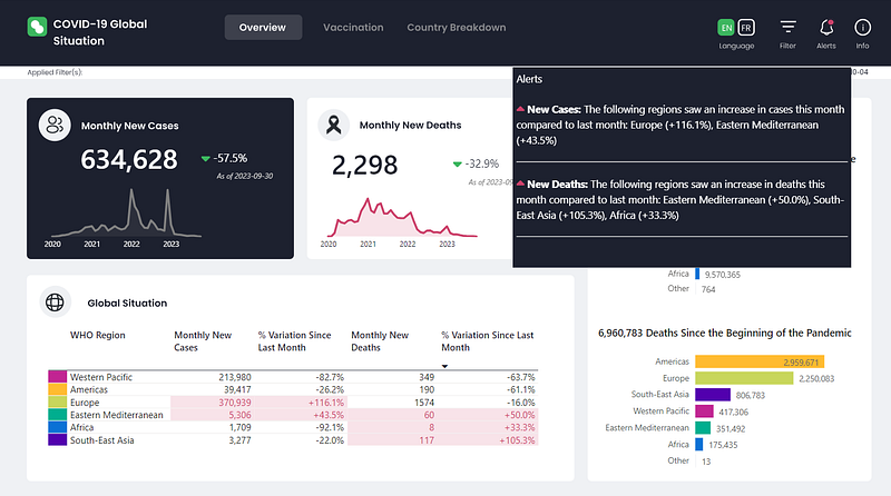
1. Create the DAX Measure for Rendering the Alert
Here, we're building an alert to monitor changes in COVID-19 cases and deaths across different World Health Organization (WHO) regions.
The calculation details are shown below for reference on how the alert in the featured dashboard was built. However, you should modify this step by coming up with a measure that will display the alert message(s) that are relevant in your dashboard/report context.
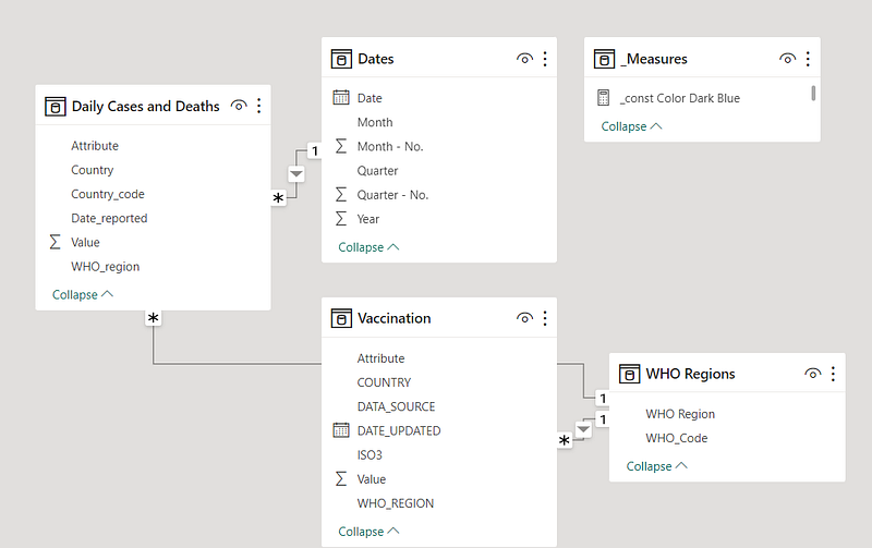
- For reference, here is the data model for this dashboard.
- Here are the initial measures that were created to calculate the variation in new cases. Various DAX functions help collate and compute the data for new cases, including
CALCULATE,FILTER, and date-related functions likeEOMONTH.
New cases =
    CALCULATE(
        SUM('Daily Cases and Deaths'[Value]),
        FILTER(
            'Daily Cases and Deaths',
            'Daily Cases and Deaths'[Attribute] = "New_cases"
        )
    )


Maximum date = MAX('Daily Cases and Deaths'[Date_reported])


Maximum month = EOMONTH([Maximum date],-1)


Minimum month = EOMONTH([Maximum month],-1)


Last month start date = EOMONTH([Minimum month],-1)


New cases last month =
VAR _MaxDate = [Maximum month]
VAR _MinDate = [Minimum month]
VAR _NewCases =
    CALCULATE(
        [New cases],
        FILTER(
            Dates,
            Dates[Date]> _MinDate &&
            Dates[Date]<= _MaxDate
        )
    )
RETURN _NewCases


New cases previous month =
VAR _MaxDate = [Minimum month]
VAR _MinDate = [Last month start date]
VAR _NewCases =
    CALCULATE(
        [New cases],
        FILTER(
            Dates,
            Dates[Date]> _MinDate &&
            Dates[Date]<= _MaxDate
        )
    )
RETURN _NewCases


New Cases Variation = [New cases last month] - [New cases previous month]


New Cases Percentage Variation =
VAR _Percentage =
    DIVIDE(
        [New Cases Variation],
        [New cases previous month]
    )
RETURN
    IF(
        _Percentage>0,
        "+" & FORMAT(_Percentage, "0.0%"),
        FORMAT(_Percentage, "0.0%")
)- Similarly, here is a separate set of DAX functions that calculate the variations in deaths.
New deaths =
    CALCULATE(
        SUM('Daily Cases and Deaths'[Value]),
        FILTER(
            'Daily Cases and Deaths',
            'Daily Cases and Deaths'[Attribute] = "New_deaths"
        )
    )


New deaths last month =
VAR _MaxDate = [Maximum month]
VAR _MinDate = [Minimum month]
VAR _NewDeaths =
    CALCULATE(
        [New deaths],
        FILTER(
            Dates,
            Dates[Date]> _MinDate &&
            Dates[Date]<= _MaxDate
        )
    )
RETURN _NewDeaths


New deaths previous month =
VAR _MaxDate = [Minimum month]
VAR _MinDate = [Last month start date]
VAR _NewDeaths =
    CALCULATE(
        [New deaths],
        FILTER(
            Dates,
            Dates[Date]> _MinDate &&
            Dates[Date]<= _MaxDate
        )
    )
RETURN _NewDeaths


New Deaths Variation = [New deaths last month] - [New deaths previous month]


New Deaths Percentage Variation =
VAR _Percentage =
    DIVIDE(
        [New Deaths Variation],
        [New deaths previous month]
    )
RETURN
    IF(
        _Percentage>0,
        "+" & FORMAT(_Percentage, "0.0%"),
        FORMAT(_Percentage, "0.0%")
)- To highlight regions with escalating cases or deaths, functions such as
CONCATENATEX,FILTER, andSWITCHare employed. - The alert is formatted to display the region alongside its percentage variation. Notably, the presence of HTML tags within the DAX formula helps enhance the visual appeal of the alert, including bolding text or adding horizontal lines for separation. If you’re not interested in using an HTML-based visualization, you can opt for DAX’s
UNICHARfunction and assign the alert to a regular text box.
Alerts =
VAR _WHORegionsCaseIncrease =
    CONCATENATEX(
        CALCULATETABLE(
            'WHO Regions',
            FILTER(
                'WHO Regions',
                [New Cases Variation]>0
            )
        ),
        'WHO Regions'[WHO Region] & " (" & [New Cases Percentage Variation] & ")",
        ", "
    )
VAR _NumberOfRegionsCaseIncrease =
    LEN(_WHORegionsCaseIncrease) - LEN(SUBSTITUTE(_WHORegionsCaseIncrease,",", ""))
VAR _CasesAlert =
    SWITCH(
        TRUE(),
        _WHORegionsCaseIncrease = "", "",
        _NumberOfRegionsCaseIncrease = 0, "<b>" & "New Cases: " & "</b>" & "The following region saw an increase in cases this month compared to last month: " & _WHORegionsCaseIncrease  & "<hr color=""#86878B"" /> " ,
        _NumberOfRegionsCaseIncrease > 0, "<b>" & "New Cases: " & "</b>" &  "The following regions saw an increase in cases this month compared to last month: " & _WHORegionsCaseIncrease  & "<hr color=""#86878B"" /> "
    )
VAR _WHORegionsDeathIncrease =
    CONCATENATEX(
        CALCULATETABLE(
            'WHO Regions',
            FILTER(
                'WHO Regions',
                [New Deaths Variation]>0
            )
        ),
        'WHO Regions'[WHO Region] & " (" & [New Deaths Percentage Variation] & ")",
        ", "
    )
VAR _NumberOfRegionsDeathIncrease =
    LEN(_WHORegionsDeathIncrease) - LEN(SUBSTITUTE(_WHORegionsDeathIncrease,",", ""))
VAR _DeathsAlert =
    SWITCH(
        TRUE(),
        _WHORegionsDeathIncrease = "", "",
        _NumberOfRegionsDeathIncrease = 0, "<b>" & "New Cases: " & "</b>" & "The following region saw an increase in deaths this month compared to last month: " & _WHORegionsDeathIncrease  & "<hr color=""#86878B"" /> " ,
        _NumberOfRegionsDeathIncrease > 0, "<b>" & "New Cases: " & "</b>" &  "The following regions saw an increase in deaths this month compared to last month: " & _WHORegionsDeathIncrease  & "<hr color=""#86878B"" /> "
    )
RETURN
    "Alerts" & "<br><br>" &
    IF(
        _CasesAlert = "" && _DeathsAlert == "",
        "No new alerts",
        _CasesAlert & _DeathsAlert
    )
2. Incorporate a Custom HTML Content Visual
- As previously emphasized, a custom visual is ideal for rendering our HTML-enhanced alert. However, if you chose the simpler route without HTML, you could assign it to a standard text box or shape.
- To procure this custom visual, head to “Get more Visuals” within Power BI and search for the HTML Content Visual. Upon integration, feed it the DAX measure we crafted earlier.
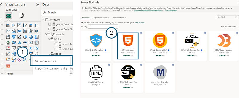
- Once added, incorporate the previously written DAX measure into this visual to ensure it is displayed within the dashboard.
3. Enhance Visual Appeal with an Alert Icon
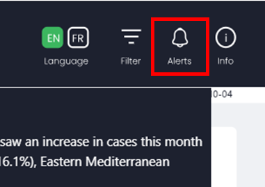
- Visual cues can greatly enhance user experience. Insert an image of an alert icon on your dashboard to draw attention to these critical alerts.
- In my case, I had actually designed the whole background in Figma, including icon images. However, you can get and format some cool icon images from Flaticon.
4. Customize the Icon by Adding a Small Circle to Notify if There are Alerts

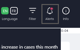
Here, we will be adding a small circle on top of the icon image. It will be red if there are alerts or else invisible. The goal is to attract the user’s attention if there are alert they should look into.
A. Add a Circle Shape: From the Insert tab, insert a Circle shape and overlay it on top of the icon.
B. Specify Colors: Determine the color palette you wish to use. Here, we’ve identified dark blue, transparent, and red as the main colors.
_const Color Dark Blue = "#1D212F"
_const Color Transparent = "#FFFFFF00"
_const Color Red = "#CC426B"
C. Define Circle Fill with DAX: Write a DAX measure that will determine the fill color of the circle based on the alert’s status. If there are no new alerts, the circle remains transparent. If there are new alerts, it turns red.
Color Alerts Icon Fill =
    IF(
        CONTAINSSTRING([Alerts], "No new alerts"),
        [_const Color Transparent],
        [_const Color Red]
    )
D. Set Circle Border with DAX: Similarly, use a DAX measure to set the border color of the circle based on the alert. The absence of new alerts makes the border dark blue (to match the theme), while the presence of new alerts makes it transparent.
Color Alerts Icon Border =
    IF(
            CONTAINSSTRING([Alerts], "No new alerts"),
            [_const Color Dark Blue],
            [_const Color Transparent])
        )
E. Apply Measures to Circle Properties: Within Power BI, navigate to the fill and border options of the shape. Here, apply the DAX measures written for both fill and border to ensure they dynamically change based on the alert conditions.
5. Incorporate Interactivity with a Button
- Overlay a button on top of the alert icon image. You can get the buton under “Insert”, and select it from “Elements”.
- Utilize Power BI’s bookmark feature to assign actions to the action of displaying the alerts visual when clicked on and hiding it. This way, users can interactively open and close the alerts panel, adding another layer of engagement and functionality to your dashboard.
Conclusion
In essence, these steps can be employed to create a dynamic and interactive dashboard that not only displays data but also alerts users to critical changes. This ensures your audience stays informed and can act promptly based on real-time insights.
Don’t forget to subscribe to
👉 Power BI Publication
👉 Power BI Newsletter
and join our Power BI community
👉 Power BI Masterclass


